Benvenuto nelle Font Più Popolari — dove popolarità e qualità si incontrano. Qui trovi i font più scaricati e usati dell'anno. Se cerchi scelte sicure per logo, web o social, inizia da qui.
Ogni font top si distingue per equilibrio, leggibilità e versatilità. Troverai sans serif moderne, script eleganti, serif vintage e display minimalisti.
-
( weknow - Wino S Kadir - www.creativefabrica.com/designer/weknow/ )
A bold, italicized font with a flowing, cursive-like design.
 Scaricare 702 Downloads@WebFont
 -
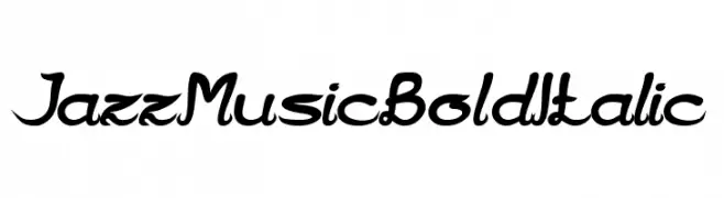
( 7NTypes - Situjuh Nazara - 7ntypes.com )
A bold, flowing script font with a playful yet elegant style.
![Pulen font caratteri gratis]() Scaricare 702 Downloads@WebFont
Scaricare 702 Downloads@WebFont -
![Gringo font caratteri gratis]() Scaricare 702 Downloads@WebFont
Scaricare 702 Downloads@WebFont -
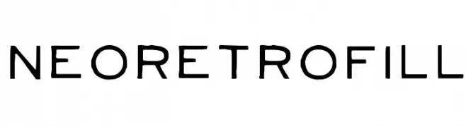
( Fonts by Heinrich Lischka www.fontboutique.de - Personal-use only. For commercial use please contact owner. )
A modern, geometric font with consistent stroke width and rounded edges.
![NeoRetroFill font caratteri gratis]() Scaricare 702 Downloads@WebFont
Scaricare 702 Downloads@WebFont -
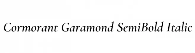
( Copyright (c) 2015, Christian Thalmann and the Cormorant Project Authors (github.com/CatharsisFonts/Cormorant) )
A classic serif font with semi-bold weight and italic style, offering medium contrast and elegant curves.
![Cormorant Garamond SemiBold Italic font caratteri gratis]() Scaricare 702 Downloads@WebFont
Scaricare 702 Downloads@WebFont -
-
![GentlemanontheRainbow font caratteri gratis]() Scaricare 702 Downloads@WebFont
Scaricare 702 Downloads@WebFont -
( Fonts by Chequered Ink )
A bold, geometric font with a modern and impactful style.
![Niagaraphobia font caratteri gratis]() Scaricare 702 Downloads@WebFont
Scaricare 702 Downloads@WebFont -
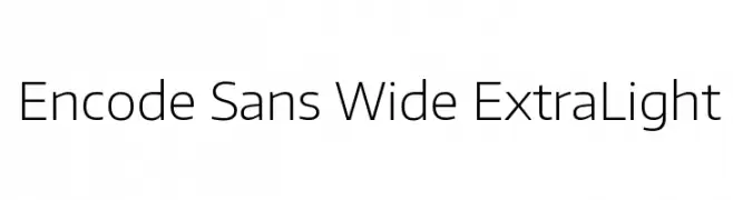
( Copyright (c) 2012, Impallari Type (www.impallari.com), with Reserved Font Name Encode Sans. )
A modern, wide, and extra light sans-serif font with clean lines and spacious design.
![Encode Sans Wide ExtraLight font caratteri gratis]() Scaricare 702 Downloads@WebFont
Scaricare 702 Downloads@WebFont -
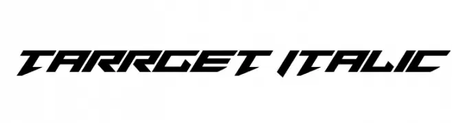
( Fonts by Daniel Zadorozny - www.iconian.com - Free for personal use )
A bold, italic, and futuristic font with angular, geometric characters.
![Tarrget Italic font caratteri gratis]() Scaricare 702 Downloads@WebFont
Scaricare 702 Downloads@WebFont -
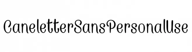
![CaneletterSansPersonalUse font caratteri gratis]() Scaricare 702 Downloads@WebFont
Scaricare 702 Downloads@WebFont


Quali sono i font più popolari adesso?
Poppins, Roboto, Montserrat, Open Sans e Lato sono molto usati per le forme pulite e l'ampia applicabilità — dall'identità di marca alle landing page e ai poster.
Quali font si usano spesso nei loghi?
Le sans serif geometriche (es. Poppins, famiglie in stile Gotham) sono scelte comuni per un branding pulito e scalabile. Per un tocco personale restano valide script e stili manoscritti. Abbina un display deciso per i titoli a un corpo testo neutro per riconoscibilità ed equilibrio.
Ogni quanto si aggiorna la lista?
Con regolarità, in base ai download e all'attività reale. Torna spesso per scoprire in anticipo le nuove preferite.
💡 Consiglio: aggiungi ai preferiti — le tendenze cambiano in fretta e i font top di oggi possono ispirare il rebranding di domani.