Benvenuto nelle Font Più Popolari — dove popolarità e qualità si incontrano. Qui trovi i font più scaricati e usati dell'anno. Se cerchi scelte sicure per logo, web o social, inizia da qui.
Ogni font top si distingue per equilibrio, leggibilità e versatilità. Troverai sans serif moderne, script eleganti, serif vintage e display minimalisti.
-
( Fonts by Febri_Creative - Febrianto Yuwono - Personal-use only. For commercial use please contact owner. )
An elegant, flowing script font with interconnected letterforms and artistic curves.
 Scaricare 687 Downloads@WebFont
 -
( Fonts by Erik Studio )
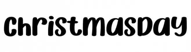
A playful, bold, and rounded handwritten font.
![Christmas Day font caratteri gratis]() Scaricare 687 Downloads@WebFont
Scaricare 687 Downloads@WebFont -
Caratteri di defharo. For commercial use please contact the owner.
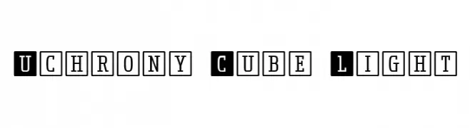
( Uchrony is a condensed proportion slab serif typeface. The font family is made up of 3 styles, Roman, Small Caps & Italics, with 6 weights each (Extra Light, Light, Regular, Medium, Bold and Extra Bold). )
A bold, boxed font with a modern and structured design.
![Uchrony Cube Light font caratteri gratis]() Scaricare 687 Downloads@WebFont
Scaricare 687 Downloads@WebFont -
( Fonts by Alit Suarnegara - Alit Design - www.alitdesign.net - Personal-use only. For commercial use please contact owner. )
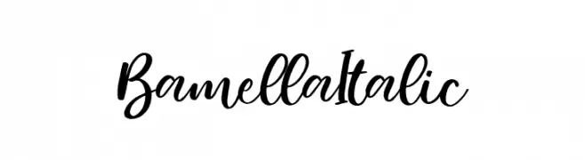
A cursive, handwritten font with elegant curves and a calligraphic style.
![Bamella Italic font caratteri gratis]() Scaricare 687 Downloads@WebFont
Scaricare 687 Downloads@WebFont -
( Fonts by Catharsis - Personal-use only. For commercial use please contact owner. )
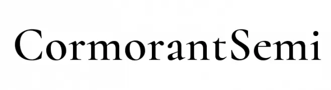
A classic serif font with elegant strokes and a refined, modern appearance.
![Cormorant Semi font caratteri gratis]() Scaricare 687 Downloads@WebFont
Scaricare 687 Downloads@WebFont -
-
( imagex - www.imagex-fonts.com )
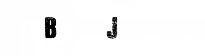
A bold, textured font with a distressed, vintage look.
![Black Jeans font caratteri gratis]() Scaricare 687 Downloads@WebFont
Scaricare 687 Downloads@WebFont -
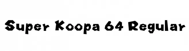
Caratteri di HammerBro101. For commercial use please contact the owner.
![Super Koopa 64 Regular font caratteri gratis]() Scaricare 687 Downloads@WebFont
Scaricare 687 Downloads@WebFont -
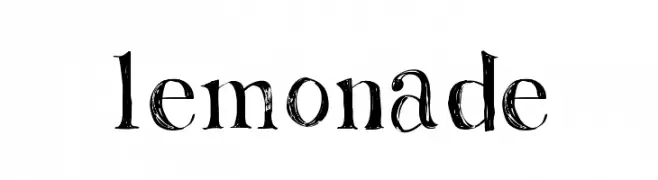
( Fonts by Rachel Adams - www.rlaurendesign.com - Personal-use only. For commercial use please contact owner. )
A distressed, textured font with a hand-drawn, artistic style.
![Lemonade font caratteri gratis]() Scaricare 687 Downloads@WebFont
Scaricare 687 Downloads@WebFont -
![Memory Inline font caratteri gratis]() Scaricare 687 Downloads@WebFont
Scaricare 687 Downloads@WebFont -
( Fonts by Jonathan S. Harris - www.tattoowoo.com. Personal-use only. For commercial use please contact owner. )
A dynamic, cursive script font with high contrast and elegant flow.
![Early Bird font caratteri gratis]() Scaricare 687 Downloads@WebFont
Scaricare 687 Downloads@WebFont


Quali sono i font più popolari adesso?
Poppins, Roboto, Montserrat, Open Sans e Lato sono molto usati per le forme pulite e l'ampia applicabilità — dall'identità di marca alle landing page e ai poster.
Quali font si usano spesso nei loghi?
Le sans serif geometriche (es. Poppins, famiglie in stile Gotham) sono scelte comuni per un branding pulito e scalabile. Per un tocco personale restano valide script e stili manoscritti. Abbina un display deciso per i titoli a un corpo testo neutro per riconoscibilità ed equilibrio.
Ogni quanto si aggiorna la lista?
Con regolarità, in base ai download e all'attività reale. Torna spesso per scoprire in anticipo le nuove preferite.
💡 Consiglio: aggiungi ai preferiti — le tendenze cambiano in fretta e i font top di oggi possono ispirare il rebranding di domani.