Benvenuto nelle Font Più Popolari — dove popolarità e qualità si incontrano. Qui trovi i font più scaricati e usati dell'anno. Se cerchi scelte sicure per logo, web o social, inizia da qui.
Ogni font top si distingue per equilibrio, leggibilità e versatilità. Troverai sans serif moderne, script eleganti, serif vintage e display minimalisti.
-
( Fonts by Clement Nicolle - www.stereo-type.fr - Personal-use only. For commercial use please contact owner. )
A lively, expressive handwritten font with dynamic strokes and artistic flair.
 Scaricare 2214 Downloads@WebFont
 -
( Fonts by MuraKnockout Media + Design - muraknockout.com. Personal-use only. For commercial use please contact owner. )
A tall, narrow, and modern font with clean lines and a sleek design.
![Sessions font caratteri gratis]() Scaricare 2214 Downloads@WebFont
Scaricare 2214 Downloads@WebFont -
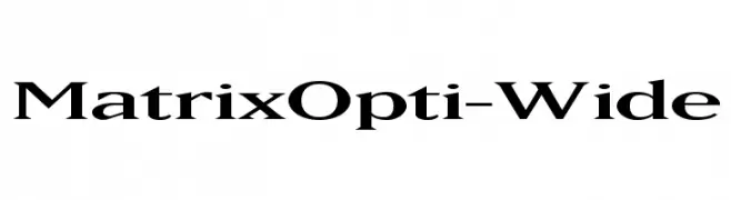
( Fonts by Castcraft Software - opti.netii.net - check the website before use )
A bold, wide serif font with sharp serifs and high contrast strokes.
![MatrixOpti-Wide font caratteri gratis]() Scaricare 2214 Downloads@WebFont
Scaricare 2214 Downloads@WebFont -
( Fonts by Altsys Metamorphosis )
An ornate Blackletter font with sharp serifs and intricate details.
![Burgundian font caratteri gratis]() Scaricare 2214 Downloads@WebFont
Scaricare 2214 Downloads@WebFont -
![VNI-Thufap2 Normal font caratteri gratis]() Scaricare 2214 Downloads@WebFont
Scaricare 2214 Downloads@WebFont -
-
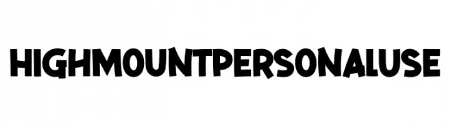
( Fonts by twinletter )
A bold, playful font with a hand-drawn, energetic style.
![High Mount Personal Use font caratteri gratis]() Scaricare 2213 Downloads@WebFont
Scaricare 2213 Downloads@WebFont -
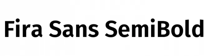
( Copyright (c) 2012-2015, The Mozilla Foundation and Telefonica S.A. )
A modern, semi-bold sans-serif font with clean lines and excellent legibility.
![Fira Sans SemiBold font caratteri gratis]() Scaricare 2213 Downloads@WebFont
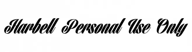
Scaricare 2213 Downloads@WebFont -
![Harbell Personal Use Only font caratteri gratis]() Scaricare 2213 Downloads@WebFont
Scaricare 2213 Downloads@WebFont -
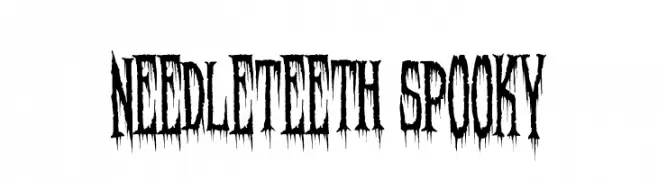
( Fonts by Sinister Visions - Chad Savage - www.sinisterfonts.com )
A jagged, eerie font with sharp, needle-like edges and a dripping effect.
![Needleteeth Spooky font caratteri gratis]() Scaricare 2213 Downloads@WebFont
Scaricare 2213 Downloads@WebFont -
![Dickens Regular font caratteri gratis]() Scaricare 2213 Downloads@WebFont
Scaricare 2213 Downloads@WebFont -
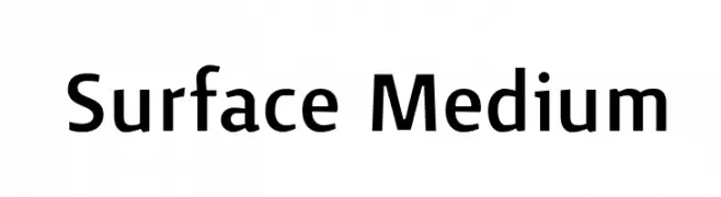
![Surface Medium font caratteri gratis]() Scaricare 2213 Downloads@WebFont
Scaricare 2213 Downloads@WebFont -
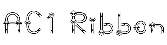
![AC1 Ribbon font caratteri gratis]() Scaricare 2213 Downloads
Scaricare 2213 Downloads -
![101! Strawberry Delight font caratteri gratis]() Scaricare 2212 Downloads@WebFont
Scaricare 2212 Downloads@WebFont -
( Copyright (c) 2014, Indian Type Foundry (info@indiantypefoundry.com). )
A bold, high-contrast serif font with elegant, sharp serifs and a modern touch.
![Rozha One Regular font caratteri gratis]() Scaricare 2211 Downloads@WebFont
Scaricare 2211 Downloads@WebFont -
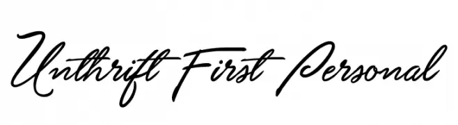
![Unthrift First Personal font caratteri gratis]() Scaricare 2211 Downloads@WebFont
Scaricare 2211 Downloads@WebFont -
![Essence Sans Regular font caratteri gratis]() Scaricare 2211 Downloads@WebFont
Scaricare 2211 Downloads@WebFont -
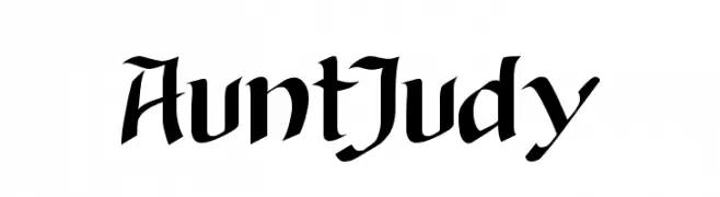
![AuntJudy font caratteri gratis]() Scaricare 2211 Downloads@WebFont
Scaricare 2211 Downloads@WebFont -
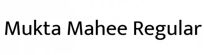
( Copyright (c) 2017, Ek Type. All rights reserved. )
A modern sans-serif typeface with clean lines and balanced proportions.
![Mukta Mahee Regular font caratteri gratis]() Scaricare 2210 Downloads@WebFont
Scaricare 2210 Downloads@WebFont -
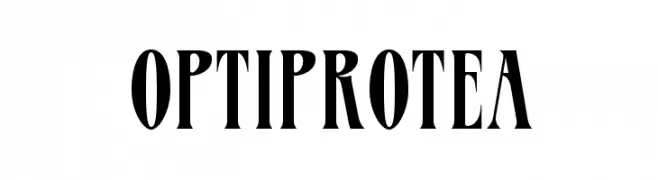
( Fonts by Castcraft Software - OPTI Fonts Archive - opti.netii.net - Personal-use only. For commercial use please contact owner. )
A bold, high-contrast serif font with elongated characters and sharp serifs.
![OPTIProtea font caratteri gratis]() Scaricare 2210 Downloads@WebFont
Scaricare 2210 Downloads@WebFont -
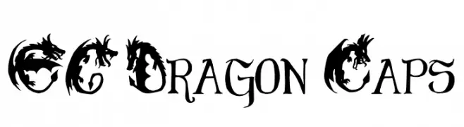
( Free )
A decorative font with dragon-themed uppercase letters and bold, gothic-inspired characters.
![EG Dragon Caps font caratteri gratis]() Scaricare 2210 Downloads@WebFont
Scaricare 2210 Downloads@WebFont -
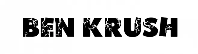
( Fonts by Altsys Metamorphosis )
A bold, distressed font with a cracked texture for impactful designs.
![Ben Krush font caratteri gratis]() Scaricare 2210 Downloads
Scaricare 2210 Downloads -
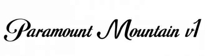
( Fonts by Khiam Mincey )
An elegant, flowing script font with graceful curves and dynamic strokes.
![Paramount Mountain v1 font caratteri gratis]() Scaricare 2209 Downloads@WebFont
Scaricare 2209 Downloads@WebFont -
![BBC TV Channel Logos font caratteri gratis]() Scaricare 2209 Downloads@WebFont
Scaricare 2209 Downloads@WebFont -
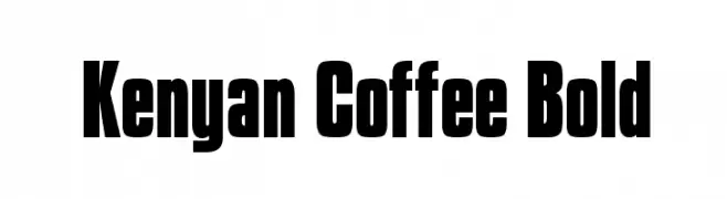
![Kenyan Coffee Bold font caratteri gratis]() Scaricare 2209 Downloads@WebFont
Scaricare 2209 Downloads@WebFont -
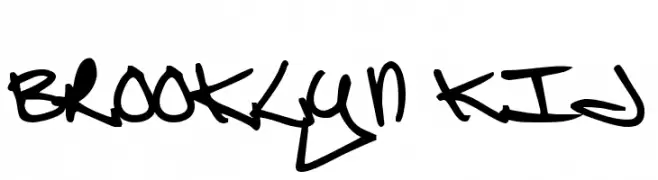
![Brooklyn Kid font caratteri gratis]() Scaricare 2209 Downloads@WebFont
Scaricare 2209 Downloads@WebFont -
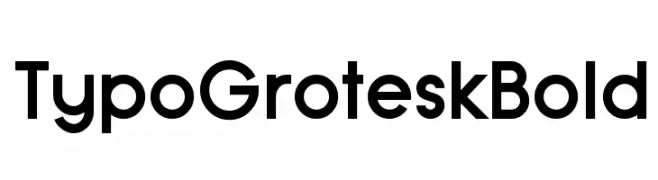
( Fonts by www.studiotypo.com - Personal-use only. For commercial use please contact owner. )
A bold, modern font with a clean geometric design and uniform stroke width.
![Typo Grotesk Bold font caratteri gratis]() Scaricare 2208 Downloads@WebFont
Scaricare 2208 Downloads@WebFont -
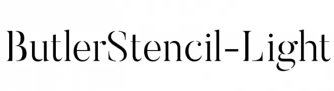
( Fonts by fabiandesmet.com )
A modern, stencil-inspired font with high contrast and elegant design.
![ButlerStencil-Light font caratteri gratis]() Scaricare 2208 Downloads@WebFont
Scaricare 2208 Downloads@WebFont -
( Fonts by www.smeltery.net )
A bold, impactful font with strong strokes and high contrast.
![MEgalopolisExtra font caratteri gratis]() Scaricare 2208 Downloads@WebFont
Scaricare 2208 Downloads@WebFont -
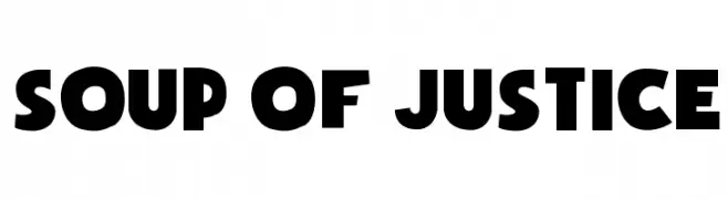
![Soup of Justice font caratteri gratis]() Scaricare 2208 Downloads@WebFont
Scaricare 2208 Downloads@WebFont -
![Andrade Swash font caratteri gratis]() Scaricare 2208 Downloads@WebFont
Scaricare 2208 Downloads@WebFont -
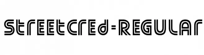
( Fonts by www.typodermicfonts.com - Ray Larabie )
A bold, geometric font with a modern, futuristic style.
![StreetCred-Regular font caratteri gratis]() Scaricare 2208 Downloads@WebFont
Scaricare 2208 Downloads@WebFont -
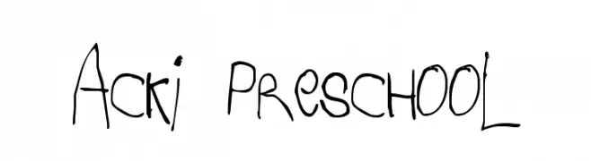
( Fonts by Anke Arnold - www.anke-art.de )
A playful, child-like handwritten font with irregular strokes and spacing.
![Acki Preschool font caratteri gratis]() Scaricare 2208 Downloads@WebFont
Scaricare 2208 Downloads@WebFont -
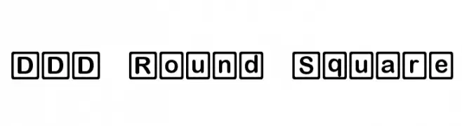
![DDD Round Square font caratteri gratis]() Scaricare 2208 Downloads@WebFont
Scaricare 2208 Downloads@WebFont -
( Fonts by sajjadhussain - Personal-use only. For commercial use please contact owner. )
A high-contrast, elegant serif typeface with refined strokes and classic flourishes.
![Brand font caratteri gratis]() Scaricare 2207 Downloads@WebFont
Scaricare 2207 Downloads@WebFont -
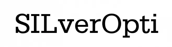
( Fonts by Castcraft Software - OPTI Fonts Archive - opti.netii.net - Personal-use only. For commercial use please contact owner. )
A classic slab serif font with bold, block-like serifs and a strong, authoritative presence.
![SILverOpti font caratteri gratis]() Scaricare 2207 Downloads@WebFont
Scaricare 2207 Downloads@WebFont


Quali sono i font più popolari adesso?
Poppins, Roboto, Montserrat, Open Sans e Lato sono molto usati per le forme pulite e l'ampia applicabilità — dall'identità di marca alle landing page e ai poster.
Quali font si usano spesso nei loghi?
Le sans serif geometriche (es. Poppins, famiglie in stile Gotham) sono scelte comuni per un branding pulito e scalabile. Per un tocco personale restano valide script e stili manoscritti. Abbina un display deciso per i titoli a un corpo testo neutro per riconoscibilità ed equilibrio.
Ogni quanto si aggiorna la lista?
Con regolarità, in base ai download e all'attività reale. Torna spesso per scoprire in anticipo le nuove preferite.
💡 Consiglio: aggiungi ai preferiti — le tendenze cambiano in fretta e i font top di oggi possono ispirare il rebranding di domani.