Benvenuto nelle Font Più Popolari — dove popolarità e qualità si incontrano. Qui trovi i font più scaricati e usati dell'anno. Se cerchi scelte sicure per logo, web o social, inizia da qui.
Ogni font top si distingue per equilibrio, leggibilità e versatilità. Troverai sans serif moderne, script eleganti, serif vintage e display minimalisti.
-
( Fonts by CannotIntoSpaceFonts - KineticPlasma Fonts - Personal-use only. For commercial use please contact owner. )
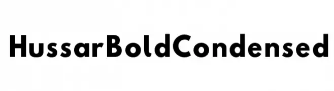
A bold, condensed font with strong strokes and compact design.
 Scaricare 2183 Downloads@WebFont
 -
( Fonts by ijemrockart - https://creativemarket.com/ijemrockart - Personal-use only. For commercial use please contact owner. )
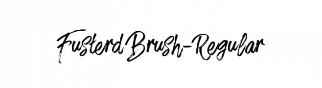
A dynamic, brush-style font with bold, fluid strokes.
![FusterdBrush-Regular font caratteri gratis]() Scaricare 2183 Downloads@WebFont
Scaricare 2183 Downloads@WebFont -
( Fonts by Digital Graphics Labs - www.digitalgraphiclabs.com )
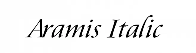
An elegant italic typeface with smooth, flowing curves and a refined appearance.
![Aramis Italic font caratteri gratis]() Scaricare 2183 Downloads@WebFont
Scaricare 2183 Downloads@WebFont -
![ElliotSans-Bold font caratteri gratis]() Scaricare 2182 Downloads@WebFont
Scaricare 2182 Downloads@WebFont -
![Saffron font caratteri gratis]() Scaricare 2182 Downloads@WebFont
Scaricare 2182 Downloads@WebFont -
-
( Fonts by Castcraft Software - opti.netii.net - check the website before use )
An elegant serif italic font with graceful curves and refined strokes.
![OPTIDeRoos-Italic font caratteri gratis]() Scaricare 2182 Downloads@WebFont
Scaricare 2182 Downloads@WebFont -
( Fonts by Jens R. Ziehn - www.filmhimmel.com )
A futuristic, angular font with a sleek and dynamic appearance.
![AVP font caratteri gratis]() Scaricare 2182 Downloads@WebFont
Scaricare 2182 Downloads@WebFont -
( Fonts by ShyFonts )
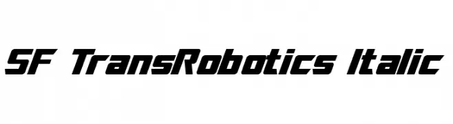
A futuristic, bold italic font with angular, geometric shapes.
![SF TransRobotics Italic font caratteri gratis]() Scaricare 2182 Downloads@WebFont
Scaricare 2182 Downloads@WebFont -
( Fonts by Omnibus Type )
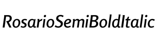
A sleek, semi-bold italic font with a modern and slightly condensed design.
![Rosario SemiBold Italic font caratteri gratis]() Scaricare 2181 Downloads@WebFont
Scaricare 2181 Downloads@WebFont -
( Fonts by Factor Vector - elfactorvector.blogspot.com )
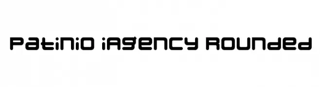
A modern, rounded font with a bold, uniform appearance and a futuristic feel.
![Patinio iAgency Rounded font caratteri gratis]() Scaricare 2181 Downloads@WebFont
Scaricare 2181 Downloads@WebFont -
![Rickshaw font caratteri gratis]() Scaricare 2180 Downloads
Scaricare 2180 Downloads -
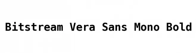
![Bitstream Vera Sans Mono Bold font caratteri gratis]() Scaricare 2180 Downloads@WebFont
Scaricare 2180 Downloads@WebFont -
( Fonts by Peter Stanton )
A whimsical, hand-drawn font with curly, ornate details.
![Angelica font caratteri gratis]() Scaricare 2180 Downloads@WebFont
Scaricare 2180 Downloads@WebFont -
![SEA GARDENS font caratteri gratis]() Scaricare 2179 Downloads@WebFont
Scaricare 2179 Downloads@WebFont -
( Fonts by Castcraft Software - OPTI Fonts Archive - opti.netii.net - Personal-use only. For commercial use please contact owner. )
A tall, narrow, and modern font with consistent stroke width.
![OPTIPhoenix-Nine font caratteri gratis]() Scaricare 2179 Downloads@WebFont
Scaricare 2179 Downloads@WebFont -
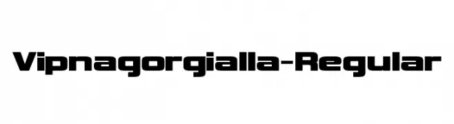
( Fonts by www.typodermicfonts.com - Ray Larabie )
A bold, geometric font ideal for impactful headlines and modern designs.
![Vipnagorgialla-Regular font caratteri gratis]() Scaricare 2179 Downloads@WebFont
Scaricare 2179 Downloads@WebFont -
( Fonts by Fonts by Rasmus Andersson / Changes by Cristiano Sobral with parts from Marc Monis - Personal-use only. For commercial use please contact owner. )
A modern, clean sans-serif font with uniform strokes and balanced proportions.
![LinikSans-Medium font caratteri gratis]() Scaricare 2178 Downloads@WebFont
Scaricare 2178 Downloads@WebFont -
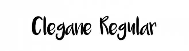
( Fonts by Typotopia Studio - Personal-use only. For commercial use please contact owner. )
A playful, bold handwritten font with a friendly and energetic style.
![Clegane Regular font caratteri gratis]() Scaricare 2178 Downloads@WebFont
Scaricare 2178 Downloads@WebFont -
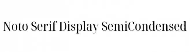
( Noto is a trademark of Google Inc. Noto fonts are open source. All Noto fonts are published under the SIL Open Font License, Version 1.1 )
A refined serif font with semi-condensed letterforms and elegant contrast.
![Noto Serif Display SemiCondensed font caratteri gratis]() Scaricare 2178 Downloads@WebFont
Scaricare 2178 Downloads@WebFont -
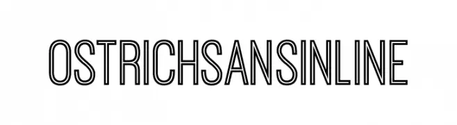
![OstrichSansInline font caratteri gratis]() Scaricare 2178 Downloads@WebFont
Scaricare 2178 Downloads@WebFont -
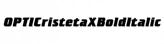
( Fonts by Castcraft Software - opti.netii.net - check the website before use )
A bold, italic font with strong, dynamic strokes and a modern, assertive style.
![OPTICristetaXBoldItalic font caratteri gratis]() Scaricare 2178 Downloads@WebFont
Scaricare 2178 Downloads@WebFont -
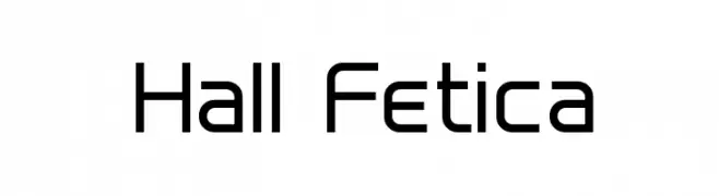
( Fonts by Graham Meade - GemFonts )
A modern, geometric sans-serif font with clean lines and a structured appearance.
![Hall Fetica font caratteri gratis]() Scaricare 2178 Downloads@WebFont
Scaricare 2178 Downloads@WebFont -
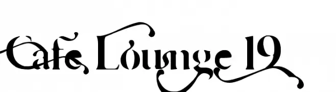
( Fonts by Barry Bujol - theoriginal19.blogspot.com )
An ornate, calligraphic font with intricate swashes and flourishes.
![Cafe Lounge 19 font caratteri gratis]() Scaricare 2178 Downloads@WebFont
Scaricare 2178 Downloads@WebFont -
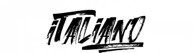
![Italiano font caratteri gratis]() Scaricare 2177 Downloads@WebFont
Scaricare 2177 Downloads@WebFont -
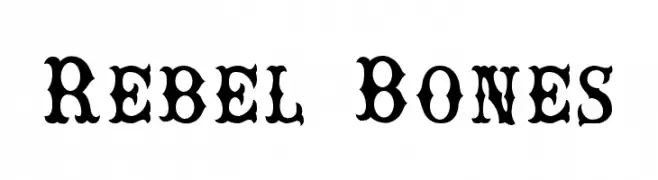
![Rebel Bones font caratteri gratis]() Scaricare 2177 Downloads@WebFont
Scaricare 2177 Downloads@WebFont -
( Copyright (c) 2010, Igino Marini (mail@iginomarini.com) )
A classic, italic font with a hand-drawn, vintage English style.
![IM FELL English Italic font caratteri gratis]() Scaricare 2177 Downloads@WebFont
Scaricare 2177 Downloads@WebFont -
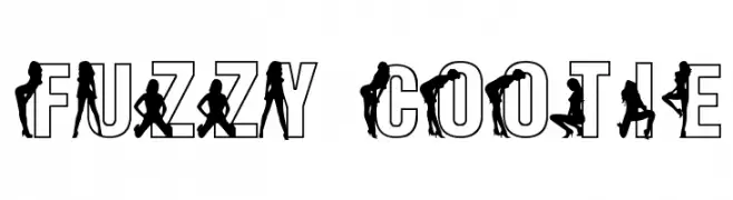
![Fuzzy Cootie font caratteri gratis]() Scaricare 2177 Downloads@WebFont
Scaricare 2177 Downloads@WebFont -
![Liberation Sans Narrow Bold Italic font caratteri gratis]() Scaricare 2176 Downloads@WebFont
Scaricare 2176 Downloads@WebFont -
( Fonts by Jens R. Ziehn - www.filmhimmel.com )
A bold, hand-drawn font with dynamic, brush-like strokes and a lively appearance.
![Twister font caratteri gratis]() Scaricare 2176 Downloads@WebFont
Scaricare 2176 Downloads@WebFont -
![Candela Bold font caratteri gratis]() Scaricare 2176 Downloads@WebFont
Scaricare 2176 Downloads@WebFont -
( Fonts by Grzegorz l - www.glukfonts.pl )
A modern serif font with elegant curves and flared strokes.
![kawoszeh font caratteri gratis]() Scaricare 2176 Downloads@WebFont
Scaricare 2176 Downloads@WebFont -
![SISTEMAS FONT BT font caratteri gratis]() Scaricare 2176 Downloads@WebFont
Scaricare 2176 Downloads@WebFont -
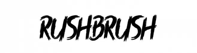
![Rush Brush font caratteri gratis]() Scaricare 2175 Downloads@WebFont
Scaricare 2175 Downloads@WebFont -
( weknow - Wino S Kadir - www.creativefabrica.com/designer/weknow/ )
A bold, distressed font with a rugged, textured appearance.
![The Lazy Dog Bold font caratteri gratis]() Scaricare 2175 Downloads@WebFont
Scaricare 2175 Downloads@WebFont -
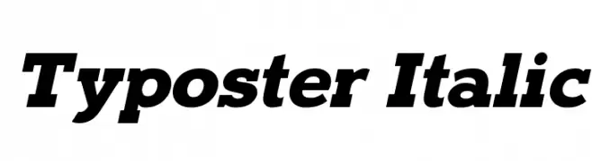
![Typoster Italic font caratteri gratis]() Scaricare 2174 Downloads@WebFont
Scaricare 2174 Downloads@WebFont


Quali sono i font più popolari adesso?
Poppins, Roboto, Montserrat, Open Sans e Lato sono molto usati per le forme pulite e l'ampia applicabilità — dall'identità di marca alle landing page e ai poster.
Quali font si usano spesso nei loghi?
Le sans serif geometriche (es. Poppins, famiglie in stile Gotham) sono scelte comuni per un branding pulito e scalabile. Per un tocco personale restano valide script e stili manoscritti. Abbina un display deciso per i titoli a un corpo testo neutro per riconoscibilità ed equilibrio.
Ogni quanto si aggiorna la lista?
Con regolarità, in base ai download e all'attività reale. Torna spesso per scoprire in anticipo le nuove preferite.
💡 Consiglio: aggiungi ai preferiti — le tendenze cambiano in fretta e i font top di oggi possono ispirare il rebranding di domani.