Benvenuto nelle Font Più Popolari — dove popolarità e qualità si incontrano. Qui trovi i font più scaricati e usati dell'anno. Se cerchi scelte sicure per logo, web o social, inizia da qui.
Ogni font top si distingue per equilibrio, leggibilità e versatilità. Troverai sans serif moderne, script eleganti, serif vintage e display minimalisti.
-
 Scaricare 680 Downloads@WebFont
 -
( Fonts by Daniel Zadorozny - www.iconian.com - Free for personal use )
A bold, italicized font with a futuristic and dynamic style.
![Quark Storm Bold Italic font caratteri gratis]() Scaricare 680 Downloads@WebFont
Scaricare 680 Downloads@WebFont -
( www.pixelfailure.com/ )
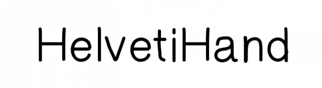
A clean, rounded font with even spacing and subtle stroke variations.
![HelvetiHand font caratteri gratis]() Scaricare 680 Downloads@WebFont
Scaricare 680 Downloads@WebFont -
( Fonts by www.kimberlygeswein.com - Kimberly Geswein )
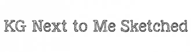
A playful, hand-drawn font with a sketched, rope-like appearance.
![KG Next to Me Sketched font caratteri gratis]() Scaricare 680 Downloads@WebFont
Scaricare 680 Downloads@WebFont -
( Fonts by www.legacyofdefeat.com )
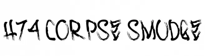
A bold, distressed font with a grunge aesthetic and textured, brush-like strokes.
![H74 Corpse Smudge font caratteri gratis]() Scaricare 680 Downloads@WebFont
Scaricare 680 Downloads@WebFont -
-
( Fonts by Paul - viciousink.net )
A bold, superhero-themed font with diamond-shaped outlines and intricate line work.
![Pauls SUPER Font font caratteri gratis]() Scaricare 680 Downloads@WebFont
Scaricare 680 Downloads@WebFont -
( Fonts by Buddha Graphix - buddha.graphix.dk/fonts.html )
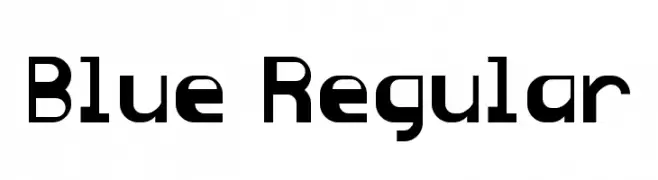
A bold, geometric font with a modern and structured design.
![Blue Regular font caratteri gratis]() Scaricare 680 Downloads@WebFont
Scaricare 680 Downloads@WebFont -
( Fonts by Bartek Nowak - www.nowak.tv/fontoholic/ )
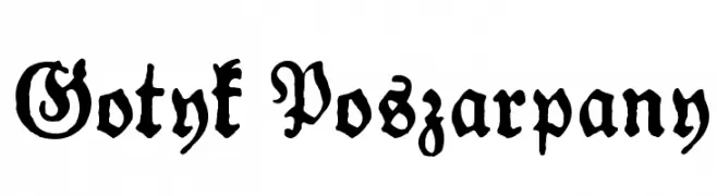
A bold, blackletter font with a distressed, gothic appearance.
![Gotyk Poszarpany font caratteri gratis]() Scaricare 680 Downloads@WebFont
Scaricare 680 Downloads@WebFont -
( Paul Lloyd Fonts )
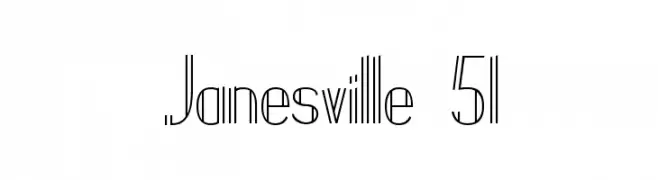
A modern, geometric font with tall, narrow characters and clean lines.
![Janesville 51 font caratteri gratis]() Scaricare 680 Downloads@WebFont
Scaricare 680 Downloads@WebFont -
![GE Christmas Joy font caratteri gratis]() Scaricare 680 Downloads@WebFont
Scaricare 680 Downloads@WebFont


Quali sono i font più popolari adesso?
Poppins, Roboto, Montserrat, Open Sans e Lato sono molto usati per le forme pulite e l'ampia applicabilità — dall'identità di marca alle landing page e ai poster.
Quali font si usano spesso nei loghi?
Le sans serif geometriche (es. Poppins, famiglie in stile Gotham) sono scelte comuni per un branding pulito e scalabile. Per un tocco personale restano valide script e stili manoscritti. Abbina un display deciso per i titoli a un corpo testo neutro per riconoscibilità ed equilibrio.
Ogni quanto si aggiorna la lista?
Con regolarità, in base ai download e all'attività reale. Torna spesso per scoprire in anticipo le nuove preferite.
💡 Consiglio: aggiungi ai preferiti — le tendenze cambiano in fretta e i font top di oggi possono ispirare il rebranding di domani.