Benvenuto nelle Font Più Popolari — dove popolarità e qualità si incontrano. Qui trovi i font più scaricati e usati dell'anno. Se cerchi scelte sicure per logo, web o social, inizia da qui.
Ogni font top si distingue per equilibrio, leggibilità e versatilità. Troverai sans serif moderne, script eleganti, serif vintage e display minimalisti.
-
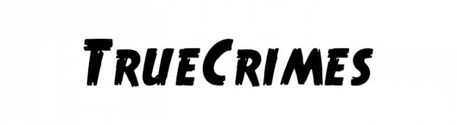
( Fonts by Walter Velez )
A bold, hand-painted style font with thick strokes and dynamic energy.
 Scaricare 672 Downloads@WebFont
 -
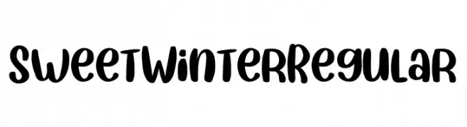
( Fonts by Yumna Type By din )
A bold, handwritten font with rounded strokes and a playful, whimsical style.
![Sweet Winter Regular font caratteri gratis]() Scaricare 672 Downloads@WebFont
Scaricare 672 Downloads@WebFont -
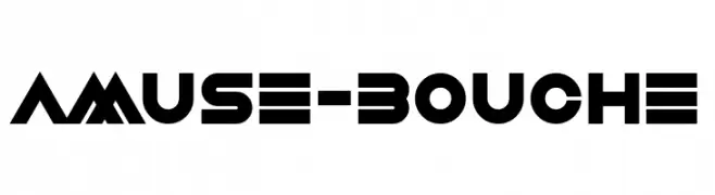
( Fonts by www.chequered.ink - Chequered Ink - Personal-use only. For commercial use please contact owner. )
A bold, geometric font with a futuristic and modern design.
![Amuse-Bouche font caratteri gratis]() Scaricare 672 Downloads@WebFont
Scaricare 672 Downloads@WebFont -
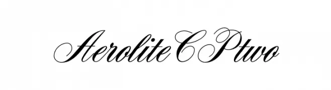
( Diogene )
An elegant script font with high contrast and flowing cursive style.
![AeroliteCPtwo font caratteri gratis]() Scaricare 672 Downloads@WebFont
Scaricare 672 Downloads@WebFont -
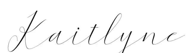
( Halim Antoni - fontbundles.net/halimstudio )
An elegant, flowing script font with high contrast and delicate strokes.
![Kaitlyne font caratteri gratis]() Scaricare 672 Downloads@WebFont
Scaricare 672 Downloads@WebFont -
-
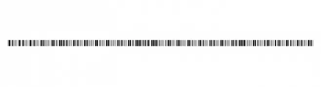
( Copyright 2017 The Libre Barcode Project Authors (lasse@graphicore.de) )
A barcode-style font with vertical line patterns for each character.
![Libre Barcode 39 Extended Regular font caratteri gratis]() Scaricare 672 Downloads@WebFont
Scaricare 672 Downloads@WebFont -
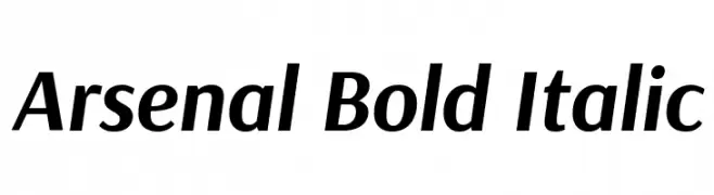
( Copyright 2012 The Arsenal Project Authors (andrij.design@gmail.com) )
A modern, bold, and italicized font with a sleek and dynamic appearance.
![Arsenal Bold Italic font caratteri gratis]() Scaricare 672 Downloads@WebFont
Scaricare 672 Downloads@WebFont -
( Fonts by a Adolfo Rojas - www.estacionazul.com . Personal-use only. For commercial use please contact owner. )
A modern, geometric font with a tall, narrow, and consistent stroke design.
![Alanya font caratteri gratis]() Scaricare 672 Downloads@WebFont
Scaricare 672 Downloads@WebFont -
![Eazy font caratteri gratis]() Scaricare 672 Downloads@WebFont
Scaricare 672 Downloads@WebFont -
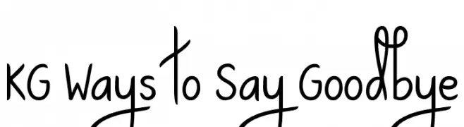
( Fonts by www.kimberlygeswein.com - Kimberly Geswein )
A playful, handwritten-style font with a whimsical and casual appearance.
![KG Ways to Say Goodbye font caratteri gratis]() Scaricare 672 Downloads@WebFont
Scaricare 672 Downloads@WebFont


Quali sono i font più popolari adesso?
Poppins, Roboto, Montserrat, Open Sans e Lato sono molto usati per le forme pulite e l'ampia applicabilità — dall'identità di marca alle landing page e ai poster.
Quali font si usano spesso nei loghi?
Le sans serif geometriche (es. Poppins, famiglie in stile Gotham) sono scelte comuni per un branding pulito e scalabile. Per un tocco personale restano valide script e stili manoscritti. Abbina un display deciso per i titoli a un corpo testo neutro per riconoscibilità ed equilibrio.
Ogni quanto si aggiorna la lista?
Con regolarità, in base ai download e all'attività reale. Torna spesso per scoprire in anticipo le nuove preferite.
💡 Consiglio: aggiungi ai preferiti — le tendenze cambiano in fretta e i font top di oggi possono ispirare il rebranding di domani.