Benvenuto nelle Font Più Popolari — dove popolarità e qualità si incontrano. Qui trovi i font più scaricati e usati dell'anno. Se cerchi scelte sicure per logo, web o social, inizia da qui.
Ogni font top si distingue per equilibrio, leggibilità e versatilità. Troverai sans serif moderne, script eleganti, serif vintage e display minimalisti.
-
 Scaricare 661 Downloads
 -
( Fonts by www.aenigmafonts.com Commerciali Caratteri )
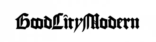
A bold, jagged font with sharp, thorn-like edges for dramatic impact.
![Aftermath BRK font caratteri gratis]() Scaricare 661 Downloads
Scaricare 661 Downloads -
( Fonts by Sharkshock Productions----www.sharkshock.com. Personal-use only. For commercial use please contact owner. )
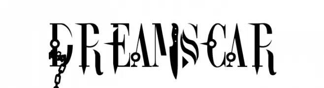
A bold, weapon-themed decorative font with gothic influences.
![DreamScar font caratteri gratis]() Scaricare 661 Downloads@WebFont
Scaricare 661 Downloads@WebFont -
( Fonts by JSH creates )
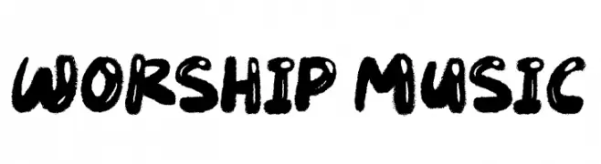
A bold, brush-style font with a hand-drawn, energetic appearance.
![Worship Music font caratteri gratis]() Scaricare 660 Downloads@WebFont
Scaricare 660 Downloads@WebFont -
( Fonts by IBM )
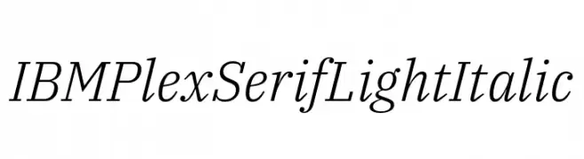
A light, elegant serif font with a subtle italic slant and classic design.
![IBM Plex Serif Light Italic font caratteri gratis]() Scaricare 660 Downloads@WebFont
Scaricare 660 Downloads@WebFont -
-
( Fonts by Syaf Rizal - www.creativefabrica.com/ref/53/ - Personal-use only. For commercial use please contact owner. )
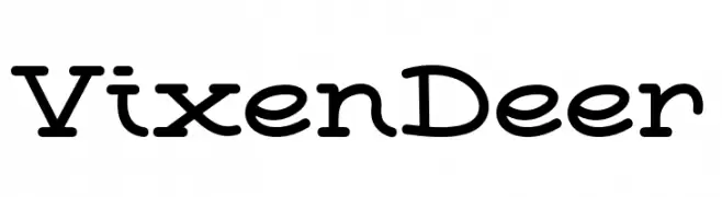
A playful, rounded font with a handwritten feel, perfect for informal projects.
![Vixen Deer font caratteri gratis]() Scaricare 660 Downloads@WebFont
Scaricare 660 Downloads@WebFont -
( Fonts by Typefactoryco )
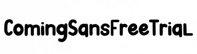
A playful, rounded font with a bold and friendly style.
![Coming Sans Free Trial font caratteri gratis]() Scaricare 660 Downloads@WebFont
Scaricare 660 Downloads@WebFont -
( Fonts by Pablo Impallari, Rodrigo Fuenzalida (Modified by Dan O. Williams) - Personal-use only. For commercial use please contact owner. )
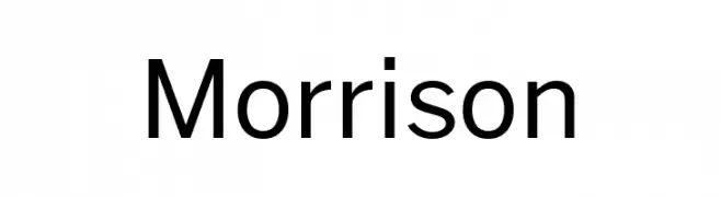
A modern, clean sans-serif font with balanced spacing and consistent stroke width.
![Morrison font caratteri gratis]() Scaricare 660 Downloads@WebFont
Scaricare 660 Downloads@WebFont -
( Fonts by Philipp H. Poll - Personal-use only. For commercial use please contact owner. )
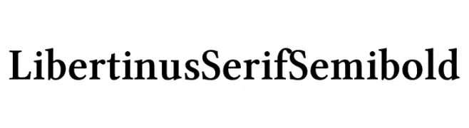
A classic serif font with semi-bold weight, offering a strong and authoritative presence.
![Libertinus Serif Semibold font caratteri gratis]() Scaricare 660 Downloads@WebFont
Scaricare 660 Downloads@WebFont -
( Copyright (c) 2015 Ek Type (www.ektype.in) )
A playful, rounded font with smooth curves and a friendly appearance.
![Baloo Paaji 2 Medium font caratteri gratis]() Scaricare 660 Downloads@WebFont
Scaricare 660 Downloads@WebFont

Quali sono i font più popolari adesso?
Poppins, Roboto, Montserrat, Open Sans e Lato sono molto usati per le forme pulite e l'ampia applicabilità — dall'identità di marca alle landing page e ai poster.
Quali font si usano spesso nei loghi?
Le sans serif geometriche (es. Poppins, famiglie in stile Gotham) sono scelte comuni per un branding pulito e scalabile. Per un tocco personale restano valide script e stili manoscritti. Abbina un display deciso per i titoli a un corpo testo neutro per riconoscibilità ed equilibrio.
Ogni quanto si aggiorna la lista?
Con regolarità, in base ai download e all'attività reale. Torna spesso per scoprire in anticipo le nuove preferite.
💡 Consiglio: aggiungi ai preferiti — le tendenze cambiano in fretta e i font top di oggi possono ispirare il rebranding di domani.