Benvenuto nelle Font Più Popolari — dove popolarità e qualità si incontrano. Qui trovi i font più scaricati e usati dell'anno. Se cerchi scelte sicure per logo, web o social, inizia da qui.
Ogni font top si distingue per equilibrio, leggibilità e versatilità. Troverai sans serif moderne, script eleganti, serif vintage e display minimalisti.
-
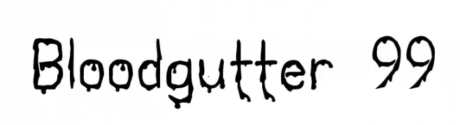 Scaricare 654 Downloads@WebFont
 -
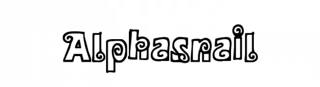
![Alphasnail font caratteri gratis]() Scaricare 654 Downloads@WebFont
Scaricare 654 Downloads@WebFont -
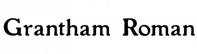
( Fonts by Paul Lloyd )
A classic serif font with elegant, bold characters and traditional serifs.
![Grantham Roman font caratteri gratis]() Scaricare 654 Downloads
Scaricare 654 Downloads -
( Fonts by Mike Hind - Stick Fonts )
A bold, playful font with chunky, rounded letterforms and a whimsical style.
![Fatty Bombatty font caratteri gratis]() Scaricare 654 Downloads@WebFont
Scaricare 654 Downloads@WebFont -
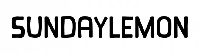
( Fonts by Khurasan )
A playful, rounded font with bold, consistent strokes and a friendly appearance.
![Sunday Lemon font caratteri gratis]() Scaricare 653 Downloads@WebFont
Scaricare 653 Downloads@WebFont -
-
( Fonts by Nirmala Creative )
A playful, bold, and hand-drawn style font with thick strokes and rounded edges.
![Zahra font caratteri gratis]() Scaricare 653 Downloads@WebFont
Scaricare 653 Downloads@WebFont -
( Fonts by nomlimofont - Personal-use only. For commercial use please contact owner. )
A lively and flowing script font with elegant, connected letterforms.
![Blinking font caratteri gratis]() Scaricare 653 Downloads@WebFont
Scaricare 653 Downloads@WebFont -
( Fonts by LyonsType - Daniel Lyons - Personal-use only. For commercial use please contact owner. )
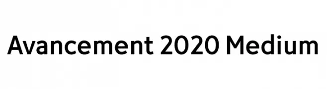
A modern, clean sans-serif font with geometric letterforms.
![Avancement 2020 Medium font caratteri gratis]() Scaricare 653 Downloads@WebFont
Scaricare 653 Downloads@WebFont -
( Fonts by FatmaStudio - Fatmawati - Personal-use only. For commercial use please contact owner. )
A bold, hand-drawn font with a playful and energetic style.
![Sweet Talk font caratteri gratis]() Scaricare 653 Downloads@WebFont
Scaricare 653 Downloads@WebFont -
Caratteri di minhayk. For commercial use please contact the owner.
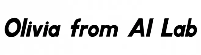
( Liam; Olivia AI Fonts )
A bold, italic sans-serif font with a dynamic and modern style.
![Olivia from AI Lab font caratteri gratis]() Scaricare 653 Downloads@WebFont
Scaricare 653 Downloads@WebFont


Quali sono i font più popolari adesso?
Poppins, Roboto, Montserrat, Open Sans e Lato sono molto usati per le forme pulite e l'ampia applicabilità — dall'identità di marca alle landing page e ai poster.
Quali font si usano spesso nei loghi?
Le sans serif geometriche (es. Poppins, famiglie in stile Gotham) sono scelte comuni per un branding pulito e scalabile. Per un tocco personale restano valide script e stili manoscritti. Abbina un display deciso per i titoli a un corpo testo neutro per riconoscibilità ed equilibrio.
Ogni quanto si aggiorna la lista?
Con regolarità, in base ai download e all'attività reale. Torna spesso per scoprire in anticipo le nuove preferite.
💡 Consiglio: aggiungi ai preferiti — le tendenze cambiano in fretta e i font top di oggi possono ispirare il rebranding di domani.