Benvenuto nelle Font Più Popolari — dove popolarità e qualità si incontrano. Qui trovi i font più scaricati e usati dell'anno. Se cerchi scelte sicure per logo, web o social, inizia da qui.
Ogni font top si distingue per equilibrio, leggibilità e versatilità. Troverai sans serif moderne, script eleganti, serif vintage e display minimalisti.
-
 Scaricare 647 Downloads@WebFont
 -
( Fonts by Graham Meade - GemFonts )
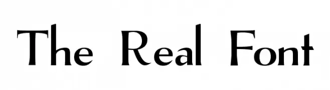
A classic serif font with high contrast and elegant, sharp serifs.
![The Real Font font caratteri gratis]() Scaricare 647 Downloads@WebFont
Scaricare 647 Downloads@WebFont -
( Fonts by www.stimuleyefonts.com )
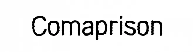
A bold, textured font with a rope-like appearance, perfect for playful designs.
![Comaprison font caratteri gratis]() Scaricare 647 Downloads@WebFont
Scaricare 647 Downloads@WebFont -
( Fonts by Daniel Zadorozny - www.iconian.com - Free for personal use )
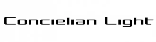
A modern, geometric font with a clean and futuristic design.
![Concielian Light font caratteri gratis]() Scaricare 647 Downloads@WebFont
Scaricare 647 Downloads@WebFont -
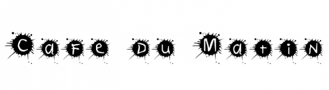
![Cafe du Matin font caratteri gratis]() Scaricare 647 Downloads@WebFont
Scaricare 647 Downloads@WebFont -
-
( Fonts by Edric Studio - Personal-use only. For commercial use please contact owner. )
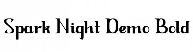
A bold, modern serif font with sharp serifs and high contrast.
![Spark Night Demo Bold font caratteri gratis]() Scaricare 646 Downloads@WebFont
Scaricare 646 Downloads@WebFont -
( Fonts by Alpaprana - Personal-use only. For commercial use please contact owner. )
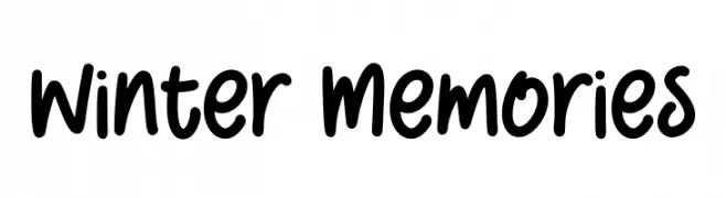
A playful, bold handwritten font with smooth, rounded edges.
![Winter Memories font caratteri gratis]() Scaricare 646 Downloads@WebFont
Scaricare 646 Downloads@WebFont -
( Fonts by Perspectype Studio )
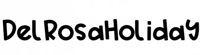
A playful, hand-drawn font with bold, rounded characters.
![Delrosa Holiday font caratteri gratis]() Scaricare 646 Downloads@WebFont
Scaricare 646 Downloads@WebFont -
( Fonts by Letterayu )
A bold, decorative font with star-shaped cutouts in each character.
![StarBold font caratteri gratis]() Scaricare 646 Downloads@WebFont
Scaricare 646 Downloads@WebFont -
( Fonts by Kong Font )
A playful, bold font with a whimsical, hand-drawn style.
![Babydoo font caratteri gratis]() Scaricare 646 Downloads@WebFont
Scaricare 646 Downloads@WebFont

Quali sono i font più popolari adesso?
Poppins, Roboto, Montserrat, Open Sans e Lato sono molto usati per le forme pulite e l'ampia applicabilità — dall'identità di marca alle landing page e ai poster.
Quali font si usano spesso nei loghi?
Le sans serif geometriche (es. Poppins, famiglie in stile Gotham) sono scelte comuni per un branding pulito e scalabile. Per un tocco personale restano valide script e stili manoscritti. Abbina un display deciso per i titoli a un corpo testo neutro per riconoscibilità ed equilibrio.
Ogni quanto si aggiorna la lista?
Con regolarità, in base ai download e all'attività reale. Torna spesso per scoprire in anticipo le nuove preferite.
💡 Consiglio: aggiungi ai preferiti — le tendenze cambiano in fretta e i font top di oggi possono ispirare il rebranding di domani.