Benvenuto nelle Font Più Popolari — dove popolarità e qualità si incontrano. Qui trovi i font più scaricati e usati dell'anno. Se cerchi scelte sicure per logo, web o social, inizia da qui.
Ogni font top si distingue per equilibrio, leggibilità e versatilità. Troverai sans serif moderne, script eleganti, serif vintage e display minimalisti.
-
( Fonts by Maelle.K - Thomas Boucherie )
A bold, angular font with a futuristic and edgy design.
 Scaricare 631 Downloads@WebFont
 -
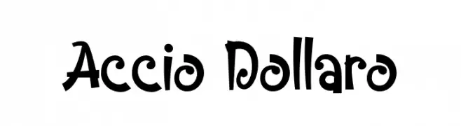
( Fonts by Tokokoo Studio )
A playful, bold font with whimsical curves and a lively style.
![Accio Dollaro font caratteri gratis]() Scaricare 631 Downloads@WebFont
Scaricare 631 Downloads@WebFont -
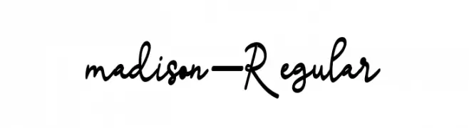
( Mr Letters - fontbundles.net/mrletters/rel=mur3FT )
A cursive, script-style font with elegant, flowing strokes.
![madison-Regular font caratteri gratis]() Scaricare 631 Downloads@WebFont
Scaricare 631 Downloads@WebFont -
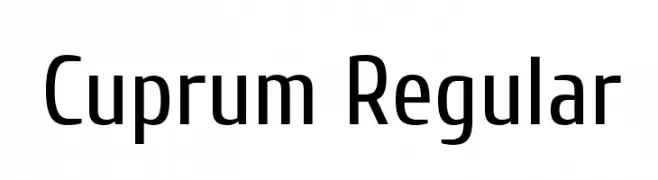
( Copyright 2010 The Cuprum Project Authors (lemonad@jovanny.ru), with Reserved Font Name "Cuprum". )
A modern, clean sans-serif font with a slightly condensed style.
![Cuprum Regular font caratteri gratis]() Scaricare 631 Downloads@WebFont
Scaricare 631 Downloads@WebFont -
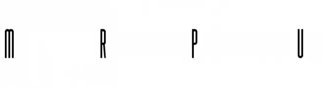
( SOFDesign - www.creativefabrica.com/ref/188871/ )
A tall, narrow, and modern font with consistent stroke thickness.
![Muhaqu-RegularPersonalUse font caratteri gratis]() Scaricare 631 Downloads@WebFont
Scaricare 631 Downloads@WebFont -
-
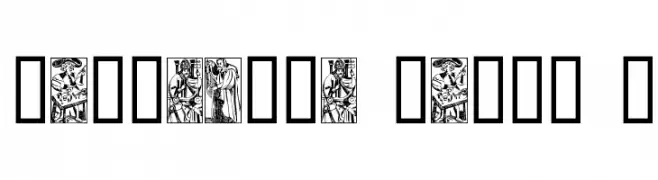
( Fonts by The Scriptorium - Dave Nalle )
Ornate, illustrated tarot card images in a vintage style.
![Marseille Tarot A font caratteri gratis]() Scaricare 631 Downloads@WebFont
Scaricare 631 Downloads@WebFont -
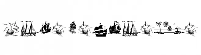
( Fonts by Manfred Klein - manfred-klein.ina-mar.com )
A maritime-themed decorative dingbat font with pirate ships and nautical icons.
![ArmadaPirata font caratteri gratis]() Scaricare 631 Downloads@WebFont
Scaricare 631 Downloads@WebFont -
![Kitty Katt font caratteri gratis]() Scaricare 631 Downloads@WebFont
Scaricare 631 Downloads@WebFont -
![Undercut font caratteri gratis]() Scaricare 631 Downloads@WebFont
Scaricare 631 Downloads@WebFont -
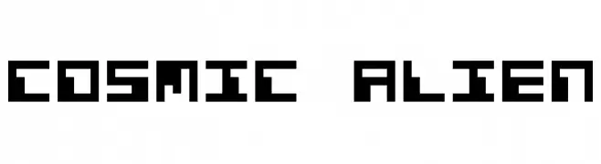
( Fonts by www.freakyfonts.de )
A bold, pixelated font with a retro, digital aesthetic.
![Cosmic Alien font caratteri gratis]() Scaricare 631 Downloads@WebFont
Scaricare 631 Downloads@WebFont

Quali sono i font più popolari adesso?
Poppins, Roboto, Montserrat, Open Sans e Lato sono molto usati per le forme pulite e l'ampia applicabilità — dall'identità di marca alle landing page e ai poster.
Quali font si usano spesso nei loghi?
Le sans serif geometriche (es. Poppins, famiglie in stile Gotham) sono scelte comuni per un branding pulito e scalabile. Per un tocco personale restano valide script e stili manoscritti. Abbina un display deciso per i titoli a un corpo testo neutro per riconoscibilità ed equilibrio.
Ogni quanto si aggiorna la lista?
Con regolarità, in base ai download e all'attività reale. Torna spesso per scoprire in anticipo le nuove preferite.
💡 Consiglio: aggiungi ai preferiti — le tendenze cambiano in fretta e i font top di oggi possono ispirare il rebranding di domani.