Benvenuto nelle Font Più Popolari — dove popolarità e qualità si incontrano. Qui trovi i font più scaricati e usati dell'anno. Se cerchi scelte sicure per logo, web o social, inizia da qui.
Ogni font top si distingue per equilibrio, leggibilità e versatilità. Troverai sans serif moderne, script eleganti, serif vintage e display minimalisti.
-
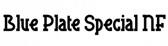
( Fonts by Nick Curtis - www.nicksfonts.com )
A bold slab serif font with a distinctive, geometric style.
 Scaricare 2019 Downloads@WebFont
 -
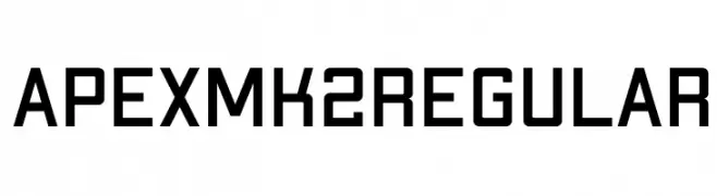
( Fonts by Jeremy Nelson - Personal-use only. For commercial use please contact owner. )
A bold, geometric sans-serif font with a modern, industrial style.
![Apex Mk2 Regular font caratteri gratis]() Scaricare 2018 Downloads@WebFont
Scaricare 2018 Downloads@WebFont -
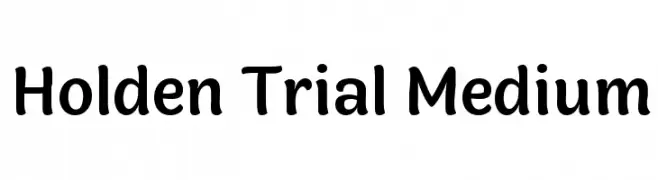
( Fonts by Zetafonts - Personal-use only. For commercial use please contact owner. )
A playful, rounded font with a friendly and approachable style.
![Holden Trial Medium font caratteri gratis]() Scaricare 2018 Downloads@WebFont
Scaricare 2018 Downloads@WebFont -
![VNI-Disney Normal font caratteri gratis]() Scaricare 2018 Downloads
Scaricare 2018 Downloads -
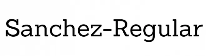
( Latinotype - Latinotype LTDA - www.latinotype.com )
A robust slab serif font with balanced proportions and strong serifs.
![Sanchez-Regular font caratteri gratis]() Scaricare 2018 Downloads@WebFont
Scaricare 2018 Downloads@WebFont -
-
( Copyright (c) 2011 Natanael Gama (exo@ndiscovered.com) )
A modern, italic font with a sleek, futuristic design and consistent stroke width.
![Exo DemiBold Italic font caratteri gratis]() Scaricare 2018 Downloads@WebFont
Scaricare 2018 Downloads@WebFont -
![SF Florencesans SC font caratteri gratis]() Scaricare 2018 Downloads@WebFont
Scaricare 2018 Downloads@WebFont -
( Fonts by Tom Robin Karlsson - tomrobin.co - Personal-use only. For commercial use please contact owner. )
A classic serif font with high contrast and elegant strokes.
![Krylon Regular font caratteri gratis]() Scaricare 2017 Downloads@WebFont
Scaricare 2017 Downloads@WebFont -
( Fonts by wepfont - Wahyu Eka Prasetya - Personal-use only. For commercial use please contact owner. )
A bold, impactful font with thick, uniform strokes and a blocky appearance.
![Big Deal font caratteri gratis]() Scaricare 2017 Downloads@WebFont
Scaricare 2017 Downloads@WebFont -
( Copyright 2017 The Literata Project Authors (https://github.com/googlefonts/literata) )
A refined serif font with balanced proportions and smooth curves.
![Literata Regular font caratteri gratis]() Scaricare 2017 Downloads@WebFont
Scaricare 2017 Downloads@WebFont -
( Fonts by PampaType - Personal-use only. For commercial use please contact owner. )
A classic serif typeface with elegant strokes and balanced proportions.
![Reforma 1918 Gris font caratteri gratis]() Scaricare 2017 Downloads@WebFont
Scaricare 2017 Downloads@WebFont -
( Fargun Studio - Fajar Gunawan - creativemarket.com/FargunStudio )
A vibrant and expressive script font with fluid, brush-like strokes.
![Faradisa Script font caratteri gratis]() Scaricare 2017 Downloads@WebFont
Scaricare 2017 Downloads@WebFont -
( Boris Garic )
A bold, rounded sans-serif font with smooth curves and thick strokes.
![SomberSansDemo font caratteri gratis]() Scaricare 2017 Downloads@WebFont
Scaricare 2017 Downloads@WebFont -
( Copyright (c) 2002-2008, Khaled Hosny (http://www.arabeyes.org) )
A bold slab serif font with strong serifs and uniform strokes.
![Thabit-Bold Bold font caratteri gratis]() Scaricare 2017 Downloads@WebFont
Scaricare 2017 Downloads@WebFont -
![Greg's Hand font caratteri gratis]() Scaricare 2017 Downloads@WebFont
Scaricare 2017 Downloads@WebFont -
( Noto is a trademark of Google Inc. Noto fonts are open source. All Noto fonts are published under the SIL Open Font License, Version 1.1 )
A refined, extra condensed italic serif typeface with high contrast strokes.
![Noto Serif Display ExtraCondensed Italic font caratteri gratis]() Scaricare 2016 Downloads@WebFont
Scaricare 2016 Downloads@WebFont -
( Fonts by www.gliphmaker.com. Personal-use only. For commercial use please contact owner. )
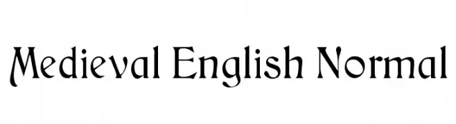
An ornate medieval-style font with intricate curves and flourishes.
![Medieval English Normal font caratteri gratis]() Scaricare 2015 Downloads@WebFont
Scaricare 2015 Downloads@WebFont -
( Fonts by Kat`s Fun Fonts - Personal-use only. For commercial use please contact owner. )
A whimsical font with characters inside cupcake outlines, perfect for playful designs.
![KR Cupcake font caratteri gratis]() Scaricare 2015 Downloads@WebFont
Scaricare 2015 Downloads@WebFont -
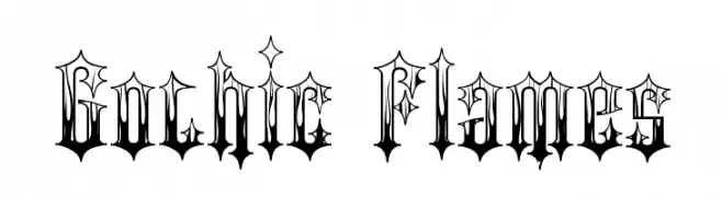
![Gothic Flames font caratteri gratis]() Scaricare 2015 Downloads@WebFont
Scaricare 2015 Downloads@WebFont -
![Bachelor Pad JL font caratteri gratis]() Scaricare 2015 Downloads@WebFont
Scaricare 2015 Downloads@WebFont -
( Fonts by Microsoft )
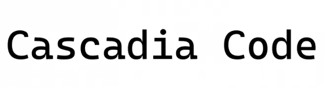
A modern, monospaced font ideal for coding with clear, evenly spaced characters.
![Cascadia Code font caratteri gratis]() Scaricare 2014 Downloads@WebFont
Scaricare 2014 Downloads@WebFont -
( imagex - www.imagex-fonts.com )
![Grunge Strokes 01 font caratteri gratis]() Scaricare 2014 Downloads@WebFont
Scaricare 2014 Downloads@WebFont -
![Need Every Sound Bold font caratteri gratis]() Scaricare 2014 Downloads@WebFont
Scaricare 2014 Downloads@WebFont -
( nalgames.com )
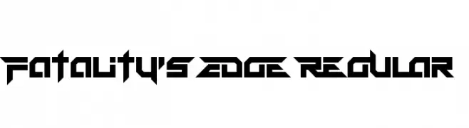
A bold, angular font with a futuristic and aggressive design.
![Fatality's Edge Regular font caratteri gratis]() Scaricare 2014 Downloads@WebFont
Scaricare 2014 Downloads@WebFont -
Caratteri di JuanCasco. For commercial use please contact the owner.
( Fonts by Juan Casco - www.juancasco.net )
A decorative font with organic, vine-like embellishments.
![Bosque font caratteri gratis]() Scaricare 2014 Downloads@WebFont
Scaricare 2014 Downloads@WebFont -
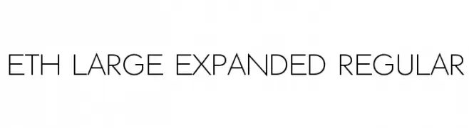
![ETH Large Expanded Regular font caratteri gratis]() Scaricare 2014 Downloads@WebFont
Scaricare 2014 Downloads@WebFont -
![Absinth Flourishes I font caratteri gratis]() Scaricare 2014 Downloads@WebFont
Scaricare 2014 Downloads@WebFont -
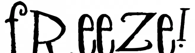
( Free for a personal use. For a commercial use please visit www.kevinandamanda.com )
A playful, hand-drawn font with whimsical, decorative characters.
![Freeze! font caratteri gratis]() Scaricare 2014 Downloads@WebFont
Scaricare 2014 Downloads@WebFont -
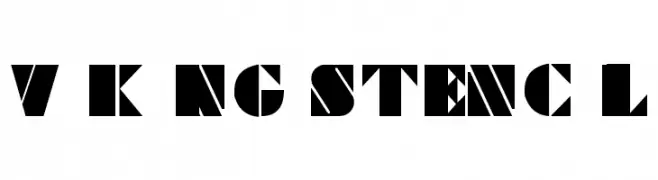
![Viking Stencil font caratteri gratis]() Scaricare 2014 Downloads@WebFont
Scaricare 2014 Downloads@WebFont -
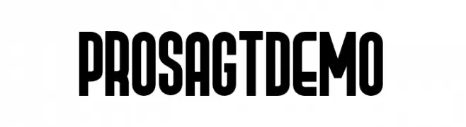
( Fonts by Gartype Studio - Gartype Studio - Personal-use only. For commercial use please contact owner. )
A bold, condensed font with geometric letterforms ideal for striking headlines.
![Prosa GT Demo font caratteri gratis]() Scaricare 2013 Downloads@WebFont
Scaricare 2013 Downloads@WebFont -
( Fonts by Halymunt Studio - fontbundles.net/halymunt-studio - Personal-use only. For commercial use please contact owner. )
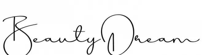
An elegant, flowing script font with a handwritten style.
![Beauty Dream font caratteri gratis]() Scaricare 2013 Downloads@WebFont
Scaricare 2013 Downloads@WebFont -
( Fonts by Hanken Design Co. - Personal-use only. For commercial use please contact owner. )
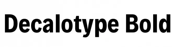
A bold, modern sans-serif font with clean, uniform lines.
![Decalotype Bold font caratteri gratis]() Scaricare 2012 Downloads@WebFont
Scaricare 2012 Downloads@WebFont -
( Locomotype - Arwan Sutanto - www.locomotype.com )
A sleek, modern font with clean lines and a light weight, perfect for contemporary designs.
![Sumptuous-Light font caratteri gratis]() Scaricare 2012 Downloads@WebFont
Scaricare 2012 Downloads@WebFont -
![FANCY! font caratteri gratis]() Scaricare 2012 Downloads@WebFont
Scaricare 2012 Downloads@WebFont -
( Fonts by Daniel Zadorozny - www.iconian.com - Free for personal use )
A modern, dynamic font with bold, angular characters and a futuristic style.
![Lightsider Regular font caratteri gratis]() Scaricare 2012 Downloads@WebFont
Scaricare 2012 Downloads@WebFont


Quali sono i font più popolari adesso?
Poppins, Roboto, Montserrat, Open Sans e Lato sono molto usati per le forme pulite e l'ampia applicabilità — dall'identità di marca alle landing page e ai poster.
Quali font si usano spesso nei loghi?
Le sans serif geometriche (es. Poppins, famiglie in stile Gotham) sono scelte comuni per un branding pulito e scalabile. Per un tocco personale restano valide script e stili manoscritti. Abbina un display deciso per i titoli a un corpo testo neutro per riconoscibilità ed equilibrio.
Ogni quanto si aggiorna la lista?
Con regolarità, in base ai download e all'attività reale. Torna spesso per scoprire in anticipo le nuove preferite.
💡 Consiglio: aggiungi ai preferiti — le tendenze cambiano in fretta e i font top di oggi possono ispirare il rebranding di domani.