Benvenuto nelle Font Più Popolari — dove popolarità e qualità si incontrano. Qui trovi i font più scaricati e usati dell'anno. Se cerchi scelte sicure per logo, web o social, inizia da qui.
Ogni font top si distingue per equilibrio, leggibilità e versatilità. Troverai sans serif moderne, script eleganti, serif vintage e display minimalisti.
-
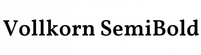
( Copyright 2017 The Vollkorn Project Authors (https://github.com/FAlthausen/Vollkorn-Typeface) )
A classic serif font with a semi-bold weight, offering readability and a traditional yet modern look.
 Scaricare 1991 Downloads@WebFont
 -
![DISCIPLINA PERSONAL USE font caratteri gratis]() Scaricare 1991 Downloads@WebFont
Scaricare 1991 Downloads@WebFont -
( Fonts by Jovanny Lemonad - typetype.ru - Personal-use only. For commercial use please contact owner. )
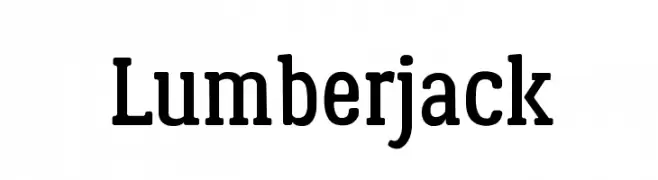
A bold slab serif font with strong, block-like serifs and a cohesive design.
![Lumberjack font caratteri gratis]() Scaricare 1991 Downloads@WebFont
Scaricare 1991 Downloads@WebFont -
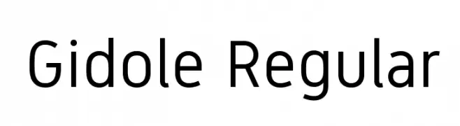
![Gidole Regular font caratteri gratis]() Scaricare 1991 Downloads@WebFont
Scaricare 1991 Downloads@WebFont -
![cursive font caratteri gratis]() Scaricare 1991 Downloads@WebFont
Scaricare 1991 Downloads@WebFont -
-
( Fonts by Alvaro Thomaz - alvarothomaz.com )
A bold, modern sans-serif font with clean lines and excellent legibility.
![Homizio Bold font caratteri gratis]() Scaricare 1991 Downloads@WebFont
Scaricare 1991 Downloads@WebFont -
( Fonts by weknow - Wino S Kadir )
A bold, geometric font with a modern and futuristic style.
![Jaguar font caratteri gratis]() Scaricare 1991 Downloads@WebFont
Scaricare 1991 Downloads@WebFont -
![SF Florencesans SC Exp font caratteri gratis]() Scaricare 1991 Downloads@WebFont
Scaricare 1991 Downloads@WebFont -
( Fonts by Digital Graphics Labs - www.digitalgraphiclabs.com )
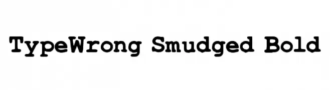
A bold, smudged font with a playful, textured style.
![TypeWrong Smudged Bold font caratteri gratis]() Scaricare 1991 Downloads@WebFont
Scaricare 1991 Downloads@WebFont -
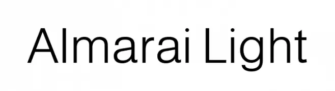
( Copyright 2019 The Almarai Project Authors (https://github.com/JuergenWillrodt/Almarai) )
A modern, light sans-serif font with clean lines and balanced spacing.
![Almarai Light font caratteri gratis]() Scaricare 1990 Downloads@WebFont
Scaricare 1990 Downloads@WebFont -
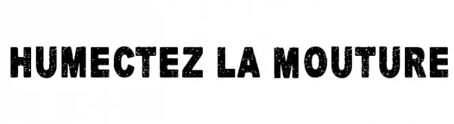
( Fonts by junkohanhero )
A bold, distressed font with a vintage, textured appearance.
![Humectez La Mouture font caratteri gratis]() Scaricare 1990 Downloads@WebFont
Scaricare 1990 Downloads@WebFont -
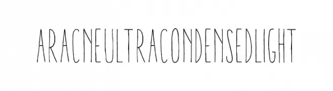
Caratteri di antipixel. For commercial use please contact the owner.
![AracneUltraCondensedLight font caratteri gratis]() Scaricare 1990 Downloads@WebFont
Scaricare 1990 Downloads@WebFont -
( Download for Personal Use. For Commercial: http://www.k-type.com )
A bold, slab serif font with a vintage Western flair.
![Zabars font caratteri gratis]() Scaricare 1990 Downloads@WebFont
Scaricare 1990 Downloads@WebFont -
( Fonts by Daniel Gauthier )
A bold, decorative font with intricate line patterns and a strong, blocky structure.
![Burris font caratteri gratis]() Scaricare 1990 Downloads@WebFont
Scaricare 1990 Downloads@WebFont -
Caratteri di typotopia. For commercial use please contact the owner.
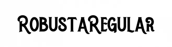
( Fonts bt Typotopia - Typotopia.co - Personal Use Only, for Commercial Use, please contact us )
A bold and dynamic font with thick, curved strokes and a slight slant.
![Robusta Regular font caratteri gratis]() Scaricare 1989 Downloads@WebFont
Scaricare 1989 Downloads@WebFont -
![Budget 2012 font caratteri gratis]() Scaricare 1989 Downloads@WebFont
Scaricare 1989 Downloads@WebFont -
![Hussar Ekologiczne 1 font caratteri gratis]() Scaricare 1989 Downloads@WebFont
Scaricare 1989 Downloads@WebFont -
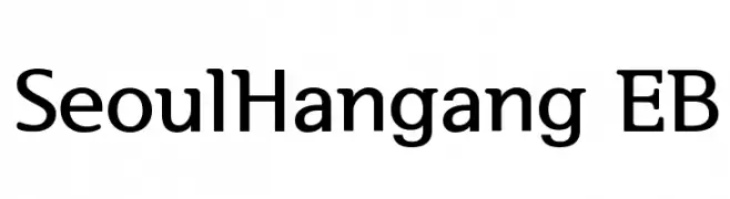
( Copyright 2013 Seoul Metropolitan Government (gonabis@seoul.go.kr) )
A modern, clean font with balanced characters and strong readability.
![SeoulHangang EB font caratteri gratis]() Scaricare 1989 Downloads@WebFont
Scaricare 1989 Downloads@WebFont -
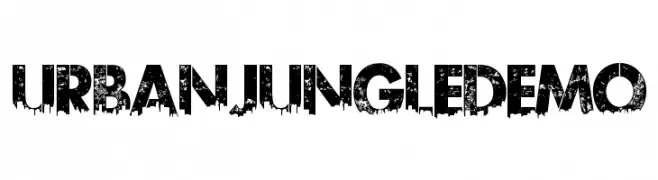
( Fonts by Kevin Christopher - www.kcfonts.com )
A bold, distressed font with an urban, gritty aesthetic.
![UrbanJungleDEMO font caratteri gratis]() Scaricare 1989 Downloads@WebFont
Scaricare 1989 Downloads@WebFont -
( Fonts by Manfred Klein - manfred-klein.ina-mar.com )
A clean, modern sans-serif font with smooth curves and uniform strokes.
![MankSans-Medium font caratteri gratis]() Scaricare 1989 Downloads@WebFont
Scaricare 1989 Downloads@WebFont -
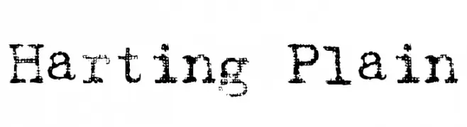
( Fonts by David Rakowski )
A distressed, grunge-style font with a textured, vintage appearance.
![Harting Plain font caratteri gratis]() Scaricare 1989 Downloads@WebFont
Scaricare 1989 Downloads@WebFont -
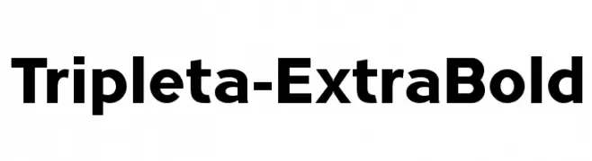
![Tripleta-ExtraBold font caratteri gratis]() Scaricare 1988 Downloads@WebFont
Scaricare 1988 Downloads@WebFont -
![NCAA Utah St Aggies Bold font caratteri gratis]() Scaricare 1988 Downloads@WebFont
Scaricare 1988 Downloads@WebFont -
![Clear Line - PERSONAL USE ONLY font caratteri gratis]() Scaricare 1988 Downloads@WebFont
Scaricare 1988 Downloads@WebFont -
( Fonts by German Olaya - www.typo5.com )
A bold, italicized decorative font with strong outlines and a retro vibe.
![oil font caratteri gratis]() Scaricare 1988 Downloads@WebFont
Scaricare 1988 Downloads@WebFont -
![Cartoon Party Time font caratteri gratis]() Scaricare 1988 Downloads@WebFont
Scaricare 1988 Downloads@WebFont -
![Myfont Regular font caratteri gratis]() Scaricare 1987 Downloads@WebFont
Scaricare 1987 Downloads@WebFont -
Caratteri di IDAutomation. For commercial use please contact the owner.
![IDAHC39MCode39Barcode font caratteri gratis]() Scaricare 1987 Downloads@WebFont
Scaricare 1987 Downloads@WebFont -
( Copyright (c) 2012, Eduardo Tunni (http://www.tipo.net.ar), with Reserved Font Name 'Merienda' )
A bold, playful script font with a friendly and inviting style.
![Merienda Bold font caratteri gratis]() Scaricare 1987 Downloads@WebFont
Scaricare 1987 Downloads@WebFont -
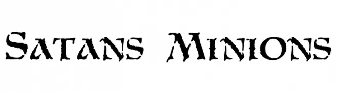
( Fonts by Mickey Rossi - www.subflux.com )
A rugged, distressed font with sharp, jagged edges and a bold appearance.
![Satans Minions font caratteri gratis]() Scaricare 1987 Downloads@WebFont
Scaricare 1987 Downloads@WebFont -
( Fonts by CannotIntoSpaceFonts - KineticPlasma Fonts - Personal-use only. For commercial use please contact owner. )
A modern, bold sans-serif font with clean lines and excellent readability.
![Warownia Extended font caratteri gratis]() Scaricare 1986 Downloads@WebFont
Scaricare 1986 Downloads@WebFont -
![Deansgate Condensed Bold font caratteri gratis]() Scaricare 1986 Downloads@WebFont
Scaricare 1986 Downloads@WebFont -
( Fonts by Fernando Haro - defharo.com )
A bold, textured font with diagonal line patterns for a dynamic look.
![ABebedera-Heavy font caratteri gratis]() Scaricare 1986 Downloads@WebFont
Scaricare 1986 Downloads@WebFont -
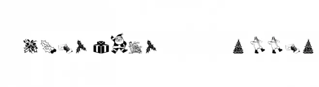
![Christmas - Debbie font caratteri gratis]() Scaricare 1986 Downloads@WebFont
Scaricare 1986 Downloads@WebFont -
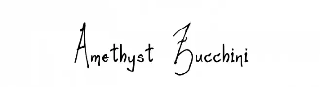
![Amethyst Zucchini font caratteri gratis]() Scaricare 1986 Downloads@WebFont
Scaricare 1986 Downloads@WebFont


Quali sono i font più popolari adesso?
Poppins, Roboto, Montserrat, Open Sans e Lato sono molto usati per le forme pulite e l'ampia applicabilità — dall'identità di marca alle landing page e ai poster.
Quali font si usano spesso nei loghi?
Le sans serif geometriche (es. Poppins, famiglie in stile Gotham) sono scelte comuni per un branding pulito e scalabile. Per un tocco personale restano valide script e stili manoscritti. Abbina un display deciso per i titoli a un corpo testo neutro per riconoscibilità ed equilibrio.
Ogni quanto si aggiorna la lista?
Con regolarità, in base ai download e all'attività reale. Torna spesso per scoprire in anticipo le nuove preferite.
💡 Consiglio: aggiungi ai preferiti — le tendenze cambiano in fretta e i font top di oggi possono ispirare il rebranding di domani.