Ricerca
nuovo caratteri
Fonti superiori
Trending
Strumenti ▾
❤ Font Instagram
♡ Generatore corsivo
⇋ Compare Fonts
✨ Text Effect
NEW
🔎 Identifica font ↗
Firmi dentro
Free Fonts
»
Fonti superiori (4,097)
Fonti superiori
4,097 fonts
35 / caratteri per pagina
50 / caratteri per pagina
100 / caratteri per pagina
Top primo scaricati
Più recenti prima
Nome carattere
Andare
✕
GRATIS
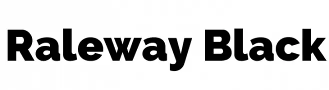
Raleway Black Font
Raleway Black Font
74,483 downloads
2017-12-19
Copyright (c) 2010, Matt McInerney (matt@pixelspread.com)
Scaricare
@ Web Font
GRATIS
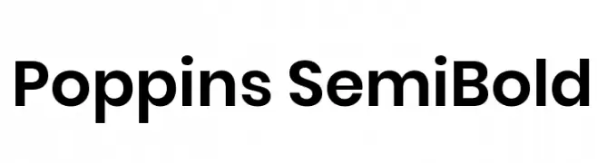
Poppins SemiBold Font
Poppins SemiBold Font
74,023 downloads
2015-09-02
Copyright 2014-2017 Indian Type Foundry (info@indiantypefoundry.com)
Scaricare
@ Web Font
GRATIS
Lucida Sans Unicode Font
Lucida Sans Unicode Font
74,006 downloads
2009-10-12
Scaricare
@ Web Font
GRATIS
NBA Bulls Font
NBA Bulls Font
73,822 downloads
2011-03-22
Scaricare
@ Web Font
GRATIS
Satluj Font
Satluj Font
73,375 downloads
2010-03-03
Scaricare
@ Web Font
GRATIS
Haettenschweiler Font
Haettenschweiler Font
72,295 downloads
2010-09-17
Scaricare
@ Web Font
GRATIS
Agra Thin Font
Agra Thin Font
71,991 downloads
2009-06-20
Scaricare
Aggiorna
GRATIS
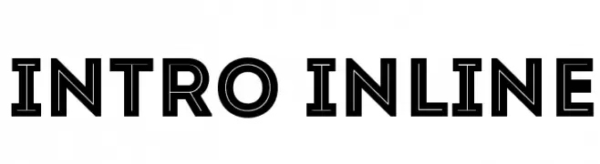
Intro-Inline Font
Intro-Inline Font
71,146 downloads
2013-01-14
Font di www.Fontfabric.com
Scaricare
@ Web Font
GRATIS
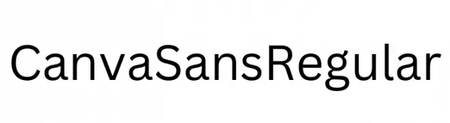
Canva Sans Regular Font
Canva Sans Regular Font
69,546 downloads
2025-07-15
Font di canva.com - Personal-use only. For commercial use please contact owner.
Scaricare
@ Web Font
GRATIS
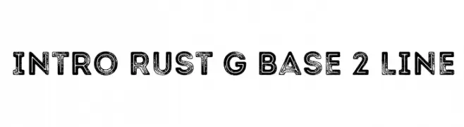
Intro Rust G Base 2 Line Font
Intro Rust G Base 2 Line Font
69,438 downloads
2016-02-11
Font di a www.fontfabric.com. Personal-use only. For commercial use please contact owner.
Scaricare
@ Web Font
GRATIS
HomepageBaukasten-Bold Font
HomepageBaukasten-Bold Font
69,064 downloads
2016-10-31
Font di
HomepageBaukasten
Scaricare
@ Web Font
GRATIS
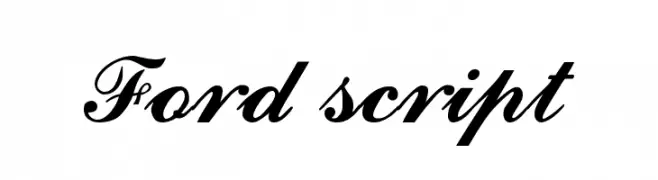
Ford script Font
Ford script Font
67,759 downloads
2009-10-02
Scaricare
@ Web Font
GRATIS
Crillee Font
Crillee Font
67,729 downloads
2009-05-26
Scaricare
Aggiorna
GRATIS
DV-TTYogesh Normal Font
DV-TTYogesh Normal Font
67,368 downloads
2009-10-13
Scaricare
@ Web Font
GRATIS
NBA Lakers Font
NBA Lakers Font
66,737 downloads
2011-03-22
Scaricare
@ Web Font
GRATIS
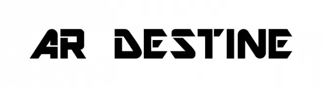
AR DESTINE Font
AR DESTINE Font
65,520 downloads
2013-01-03
Scaricare
@ Web Font
GRATIS
Bebas Font
Bebas Font
65,507 downloads
2009-05-27
Font di Ryoichi Tsunekawa - www.dharmatype.com
Scaricare
@ Web Font
GRATIS
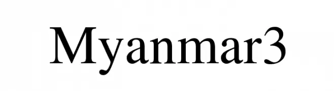
Myanmar3 Font
Myanmar3 Font
64,893 downloads
2012-02-14
Scaricare
@ Web Font
GRATIS
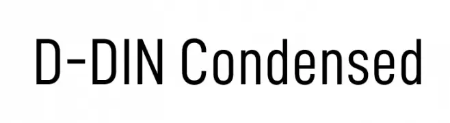
D-DIN Condensed Font
D-DIN Condensed Font
64,505 downloads
2019-02-22
Font di Datto Inc. - Personal-use only. For commercial use please contact owner.
Scaricare
@ Web Font
GRATIS
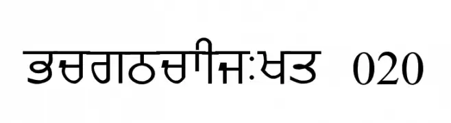
GurmukhiLys 020 Font
GurmukhiLys 020 Font
64,493 downloads
2010-03-03
Scaricare
@ Web Font
GRATIS
Antonio Bold Font
Antonio Bold Font
63,848 downloads
2013-08-21
Copyright (c) 2011-2013, Vernon Adams (vern@newtypography.co.uk), with Reserved Font Name 'Antonio'
Scaricare
@ Web Font
GRATIS
BebasNeueBold Font
BebasNeueBold Font
63,847 downloads
2016-02-11
Font di a www.fontfabric.com. Personal-use only. For commercial use please contact owner.
Scaricare
@ Web Font
GRATIS
Liverpool Font
Liverpool Font
63,722 downloads
2010-12-14
Font di Kreative Korporation - www.kreativekorp.com
Scaricare
@ Web Font
GRATIS
Montserrat ExtraBold Italic Font
Montserrat ExtraBold Italic Font
63,689 downloads
2017-12-11
Copyright 2011 The Montserrat Project Authors (https://github.com/JulietaUla/Montserrat)
Scaricare
@ Web Font
GRATIS
Carlsberg Font
Carlsberg Font
63,391 downloads
2013-02-20
Scaricare
@ Web Font
GRATIS
Rye Regular Font
Rye Regular Font
63,078 downloads
2013-09-09
Copyright (c) 2011 by Sorkin Type Co (www.sorkintype.com)
Scaricare
@ Web Font
GRATIS
Revue Font
Revue Font
62,892 downloads
2009-05-27
Scaricare
@ Web Font
GRATIS
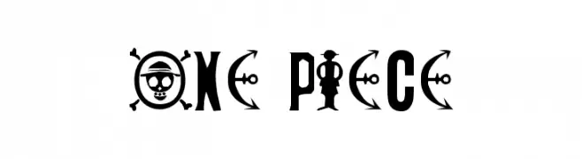
ONE PIECE Font
ONE PIECE Font
62,281 downloads
2013-01-19
Scaricare
@ Web Font
GRATIS
Bebas Neue Font
Bebas Neue Font
62,258 downloads
2010-10-07
Scaricare
@ Web Font
GRATIS
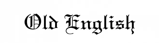
Old English Font
Old English Font
61,894 downloads
2009-08-31
Scaricare
Aggiorna
GRATIS
Langdon Font
Langdon Font
61,783 downloads
2013-03-12
Font di
garygreenall
Scaricare
@ Web Font
GRATIS
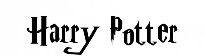
Harry Potter Font
Harry Potter Font
61,692 downloads
2009-05-27
Scaricare
@ Web Font
GRATIS
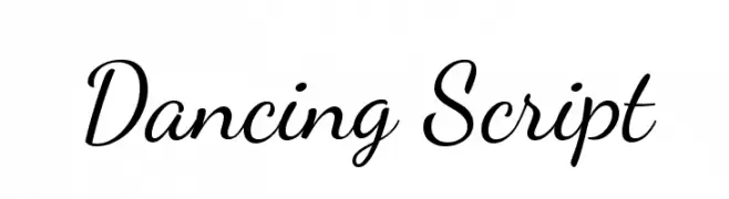
Dancing Script Font
Dancing Script Font
61,515 downloads
2011-03-26
Copyright (c) 2010, Pablo Impallari (www.impallari.com|impallari@gmail.com)
Scaricare
@ Web Font
GRATIS
Poppins Light Font
Poppins Light Font
61,395 downloads
2015-09-02
Copyright 2014-2017 Indian Type Foundry (info@indiantypefoundry.com)
Scaricare
@ Web Font
GRATIS
Open Sans Extrabold Font
Open Sans Extrabold Font
59,976 downloads
2011-05-12
Google Web Fonts
Scaricare
@ Web Font
⇋
Compare Fonts
Side by side
NEW
✨
Text Effect
Neon / 3D / Gold / Y2K
« Prev
1
2
3
4
5
6
7
8
9
…
118
Next »
×
‹
›