Benvenuto nelle Font Più Popolari — dove popolarità e qualità si incontrano. Qui trovi i font più scaricati e usati dell'anno. Se cerchi scelte sicure per logo, web o social, inizia da qui.
Ogni font top si distingue per equilibrio, leggibilità e versatilità. Troverai sans serif moderne, script eleganti, serif vintage e display minimalisti.
-
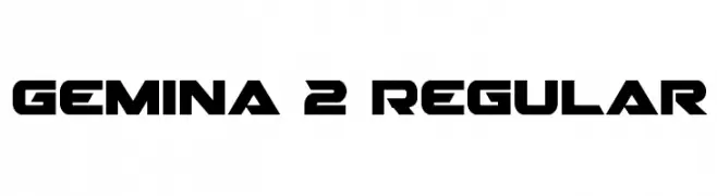
( Fonts by Daniel Zadorozny - www.iconian.com )
A bold, geometric font with sharp, angular shapes, ideal for modern and impactful designs.
 Scaricare 603 Downloads@WebFont
 -
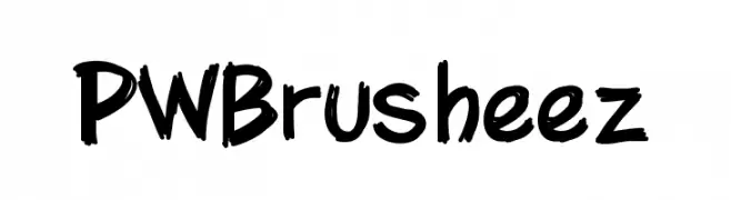
( Fonts by Peax Webdesign - www.peax-webdesign.com. Personal-use only. For commercial use please contact owner. )
A bold, expressive brush-style font with dynamic, hand-drawn strokes.
![PWBrusheez font caratteri gratis]() Scaricare 603 Downloads@WebFont
Scaricare 603 Downloads@WebFont -
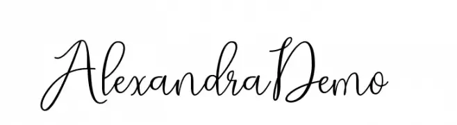
( Cooldesignlab - Kurniadi Saputra - creativemarket.com/cooldesignlab?u=cooldesignlab )
A graceful and elegant script font with fluid, cursive strokes.
![AlexandraDemo font caratteri gratis]() Scaricare 603 Downloads@WebFont
Scaricare 603 Downloads@WebFont -
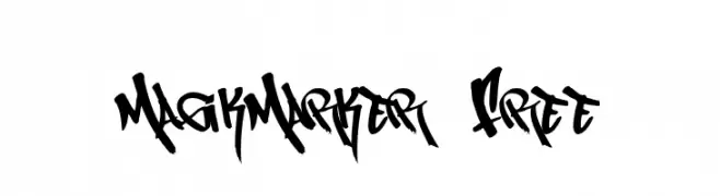
( Fonts by or from www.graffitifonts.net )
A bold, graffiti-inspired font with dynamic strokes and sharp angles.
![MagikMarker_Free font caratteri gratis]() Scaricare 603 Downloads@WebFont
Scaricare 603 Downloads@WebFont -
![Grimey font caratteri gratis]() Scaricare 603 Downloads@WebFont
Scaricare 603 Downloads@WebFont -
-
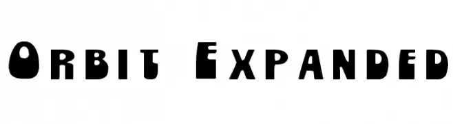
( Character )
A bold, expansive font with a strong, blocky appearance.
![Orbit Expanded font caratteri gratis]() Scaricare 603 Downloads@WebFont
Scaricare 603 Downloads@WebFont -
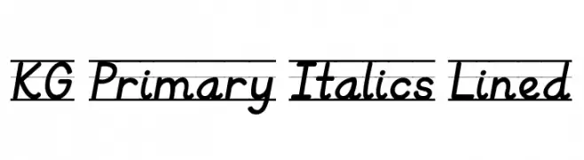
( Fonts by www.kimberlygeswein.com - Kimberly Geswein )
A playful, italicized font ideal for educational materials.
![KG Primary Italics Lined font caratteri gratis]() Scaricare 603 Downloads@WebFont
Scaricare 603 Downloads@WebFont -
![Drip font caratteri gratis]() Scaricare 603 Downloads@WebFont
Scaricare 603 Downloads@WebFont -
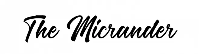
( Fonts by RaffaSyad Studio - www.creativefabrica.com/designer/r-studio/ - Personal-use only. For commercial use please contact owner. )
A bold, cursive script font with elegant, flowing lines.
![The Micrander font caratteri gratis]() Scaricare 603 Downloads@WebFont
Scaricare 603 Downloads@WebFont -
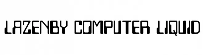
( Fonts by Disaster Fonts )
A futuristic, geometric font with bold, tech-inspired letterforms.
![Lazenby Computer Liquid font caratteri gratis]() Scaricare 603 Downloads@WebFont
Scaricare 603 Downloads@WebFont


Quali sono i font più popolari adesso?
Poppins, Roboto, Montserrat, Open Sans e Lato sono molto usati per le forme pulite e l'ampia applicabilità — dall'identità di marca alle landing page e ai poster.
Quali font si usano spesso nei loghi?
Le sans serif geometriche (es. Poppins, famiglie in stile Gotham) sono scelte comuni per un branding pulito e scalabile. Per un tocco personale restano valide script e stili manoscritti. Abbina un display deciso per i titoli a un corpo testo neutro per riconoscibilità ed equilibrio.
Ogni quanto si aggiorna la lista?
Con regolarità, in base ai download e all'attività reale. Torna spesso per scoprire in anticipo le nuove preferite.
💡 Consiglio: aggiungi ai preferiti — le tendenze cambiano in fretta e i font top di oggi possono ispirare il rebranding di domani.