Benvenuto nelle Font Più Popolari — dove popolarità e qualità si incontrano. Qui trovi i font più scaricati e usati dell'anno. Se cerchi scelte sicure per logo, web o social, inizia da qui.
Ogni font top si distingue per equilibrio, leggibilità e versatilità. Troverai sans serif moderne, script eleganti, serif vintage e display minimalisti.
-
( Fonts by www.peter-wiegel.de. Personal-use only. For commercial use please contact owner. )
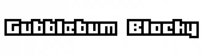
A bold, geometric font with tall, narrow characters and a modern aesthetic.
 Scaricare 1984 Downloads@WebFont
 -
![Gubblebum Blocky font caratteri gratis]() Scaricare 1984 Downloads@WebFont
Scaricare 1984 Downloads@WebFont -
![Pupcat font caratteri gratis]() Scaricare 1984 Downloads@WebFont
Scaricare 1984 Downloads@WebFont -
( Fonts by allsuperfont.com - Personal-use only. For commercial use please contact owner. )
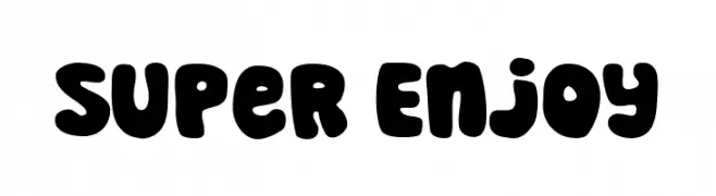
A bold, playful font with thick, rounded characters and a whimsical style.
![Super Enjoy font caratteri gratis]() Scaricare 1983 Downloads@WebFont
Scaricare 1983 Downloads@WebFont -
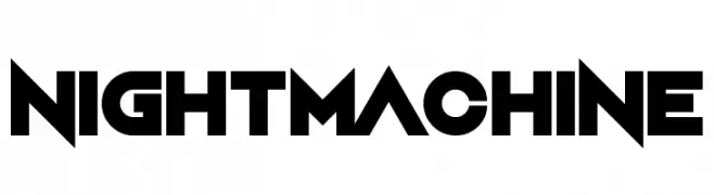
![Night Machine font caratteri gratis]() Scaricare 1983 Downloads@WebFont
Scaricare 1983 Downloads@WebFont -
-
( K-Type Freebies (Free for Personal Use Only) FROM http://www.k-type.com )
A bold, serif font with a classic and authoritative style.
![Norton font caratteri gratis]() Scaricare 1983 Downloads@WebFont
Scaricare 1983 Downloads@WebFont -
( Fonts by Wei Huang - Personal-use only. For commercial use please contact owner. )
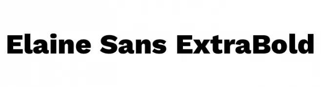
A bold, modern sans-serif typeface with strong, uniform strokes.
![Elaine Sans ExtraBold font caratteri gratis]() Scaricare 1982 Downloads@WebFont
Scaricare 1982 Downloads@WebFont -
( Fonts by The Inter Project Authors - This Font Software is licensed under the SIL Open Font License. )
A bold, italicized sans-serif font with a modern and dynamic style.
![Inter Extra Bold Italic font caratteri gratis]() Scaricare 1982 Downloads@WebFont
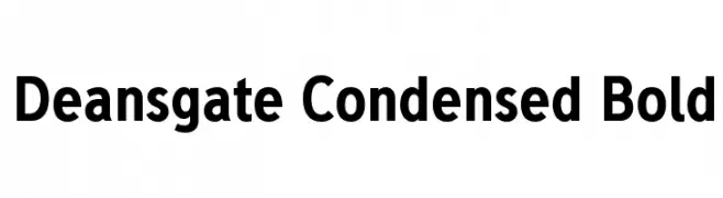
Scaricare 1982 Downloads@WebFont -
![Deansgate Condensed Bold font caratteri gratis]() Scaricare 1982 Downloads@WebFont
Scaricare 1982 Downloads@WebFont -
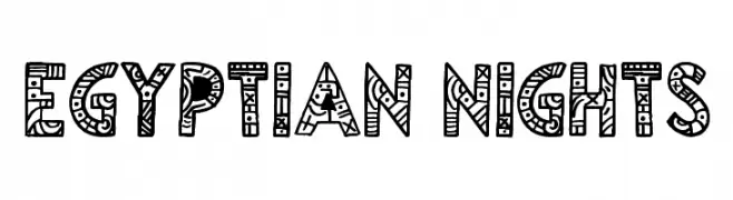
( Fonts by Jonathan Harris - www.tattoowoo.com )
A bold, decorative font with intricate patterns and geometric shapes.
![Egyptian Nights font caratteri gratis]() Scaricare 1982 Downloads@WebFont
Scaricare 1982 Downloads@WebFont -
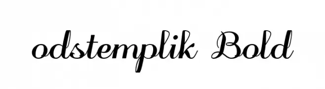
( Fonts by Grzegorz l - www.glukfonts.pl )
An elegant, bold script font with flowing, cursive characters.
![odstemplik Bold font caratteri gratis]() Scaricare 1982 Downloads@WebFont
Scaricare 1982 Downloads@WebFont -
( Copyright (c) 2010, 2011 José Nicolás Silva Schwarzenberg
An elegant serif font with an italic slant and moderate contrast.
![Poly-Italic font caratteri gratis]() Scaricare 1982 Downloads@WebFont
Scaricare 1982 Downloads@WebFont -
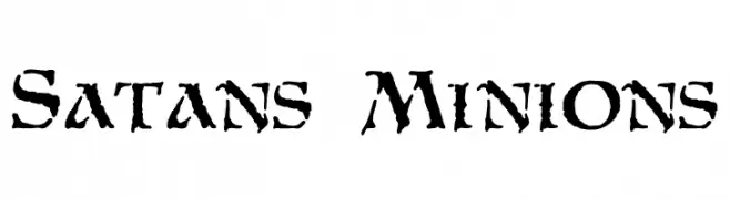
( Fonts by Mickey Rossi - www.subflux.com )
A rugged, distressed font with sharp, jagged edges and a bold appearance.
![Satans Minions font caratteri gratis]() Scaricare 1982 Downloads@WebFont
Scaricare 1982 Downloads@WebFont -
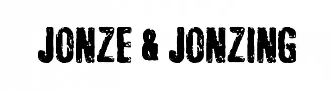
( Fonts by Kevin Christopher - www.kcfonts.com. Personal-use only. For commercial use please contact owner. )
A bold, distressed font with a rugged, textured appearance.
![Jonze & Jonzing font caratteri gratis]() Scaricare 1981 Downloads@WebFont
Scaricare 1981 Downloads@WebFont -
( Fonts by a kmzero font foundry - www.zetafonts.com. Personal-use only. For commercial use please contact owner. )
A modern, clean sans-serif font with uniform stroke width.
![Filetto font caratteri gratis]() Scaricare 1981 Downloads@WebFont
Scaricare 1981 Downloads@WebFont -
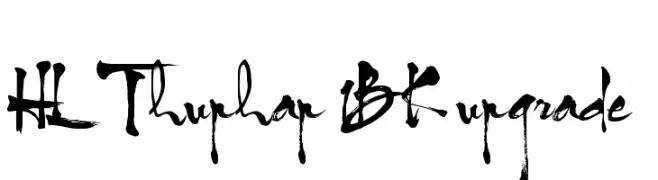
( Fonts by HungLan Design - www.hunglandesign.com )
A bold, expressive calligraphic font with dynamic strokes and artistic flair.
![HL Thuphap 1BK upgrade font caratteri gratis]() Scaricare 1981 Downloads@WebFont
Scaricare 1981 Downloads@WebFont -
( Fonts by Rodrigo German - RASDESIGN )
Cartoon face-based decorative display font with expressive characters.
![EL CUBANO font caratteri gratis]() Scaricare 1981 Downloads@WebFont
Scaricare 1981 Downloads@WebFont -
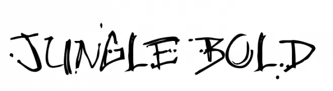
( Fonts by or from www.graffitifonts.net )
A bold, graffiti-inspired font with rugged, splatter-like details.
![Jungle Bold font caratteri gratis]() Scaricare 1981 Downloads@WebFont
Scaricare 1981 Downloads@WebFont -
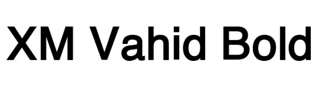
( Fonts by Behnam - Personal-use only. For commercial use please contact owner. )
A bold, modern sans-serif typeface with clean lines and strong presence.
![XM Vahid Bold font caratteri gratis]() Scaricare 1980 Downloads@WebFont
Scaricare 1980 Downloads@WebFont -
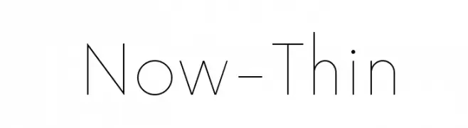
( Fonts by Hanken Design Co. - Personal-use only. For commercial use please contact owner. )
A sleek, minimalist font with thin lines and a modern aesthetic.
![Now-Thin font caratteri gratis]() Scaricare 1980 Downloads@WebFont
Scaricare 1980 Downloads@WebFont -
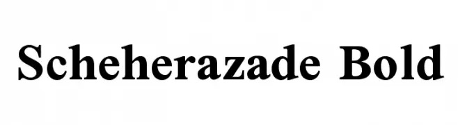
( Copyright (c) 1994-2014, SIL International (http://www.sil.org/). )
A bold, classic serif typeface with strong, defined strokes and sharp serifs.
![Scheherazade Bold font caratteri gratis]() Scaricare 1980 Downloads@WebFont
Scaricare 1980 Downloads@WebFont -
( Fonts by Castcraft Software - OPTI Fonts Archive - opti.netii.net - Personal-use only. For commercial use please contact owner. )
An elegant and ornate script font with flowing, cursive letterforms.
![OPTIYork-Script font caratteri gratis]() Scaricare 1980 Downloads@WebFont
Scaricare 1980 Downloads@WebFont -
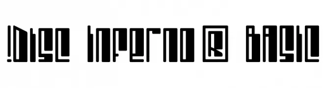
( Fonts by www.exclamachine.com )
A bold, geometric font with blocky, angular letterforms and tight spacing.
![!Disc Inferno® BASIC font caratteri gratis]() Scaricare 1980 Downloads@WebFont
Scaricare 1980 Downloads@WebFont -
![Web Hebrew Monospace font caratteri gratis]() Scaricare 1980 Downloads@WebFont
Scaricare 1980 Downloads@WebFont -
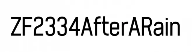
( Fonts by ZF2334 - Salim Zouaghi - www.zedfonts2334.xyz - This font is free for both personal and commercial use. )
A modern, geometric sans-serif font with bold uppercase and harmonious lowercase letters.
![ZF2334 After A Rain font caratteri gratis]() Scaricare 1979 Downloads@WebFont
Scaricare 1979 Downloads@WebFont -
( Fonts by Andrew McCluskey - nalgames.com. Personal-use only. For commercial use please contact owner. )
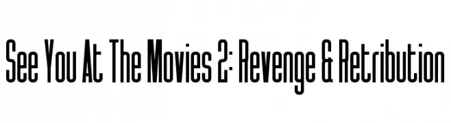
A tall, condensed font with a modern and sleek appearance.
![See You At The Movies 2: Revenge & Retribution font caratteri gratis]() Scaricare 1979 Downloads@WebFont
Scaricare 1979 Downloads@WebFont -
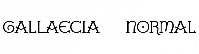
![GALLAECIA Normal font caratteri gratis]() Scaricare 1979 Downloads@WebFont
Scaricare 1979 Downloads@WebFont -
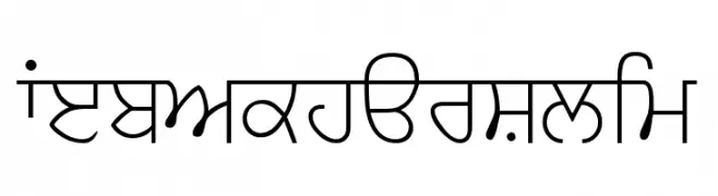
![WebAkharSlim font caratteri gratis]() Scaricare 1979 Downloads@WebFont
Scaricare 1979 Downloads@WebFont -
![UNCONFORM ROUND font caratteri gratis]() Scaricare 1979 Downloads@WebFont
Scaricare 1979 Downloads@WebFont -
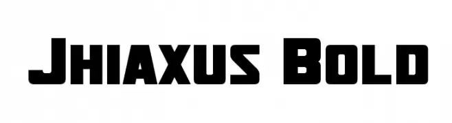
( Fonts by a Neale Davidson - www.pixelsagas.com. Personal-use only. For commercial use please contact owner. )
A bold, blocky font with a modern, industrial feel.
![Jhiaxus Bold font caratteri gratis]() Scaricare 1978 Downloads@WebFont
Scaricare 1978 Downloads@WebFont -
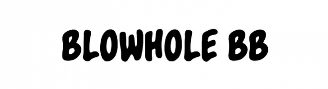
( Fonts by www.blambot.com )
A bold, playful font with rounded, whimsical characters.
![Blowhole BB font caratteri gratis]() Scaricare 1978 Downloads@WebFont
Scaricare 1978 Downloads@WebFont -
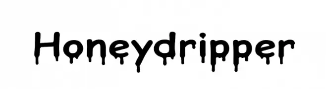
( Fonts by www.someshinzz.com )
A bold, dripping font with a playful and creative style.
![Honeydripper font caratteri gratis]() Scaricare 1978 Downloads@WebFont
Scaricare 1978 Downloads@WebFont -
( Fonts by dartcanada.tripod.com - Darren Rigby )
A modern geometric font with rounded and angular elements, offering a clean and creative style.
![Radian font caratteri gratis]() Scaricare 1978 Downloads@WebFont
Scaricare 1978 Downloads@WebFont -
( Copyright (c) 2012 by Brian J. Bonislawsky DBA Astigmatic (AOETI) )
A bold, angular font with sharp edges and a dynamic style.
![Shojumaru font caratteri gratis]() Scaricare 1978 Downloads@WebFont
Scaricare 1978 Downloads@WebFont -
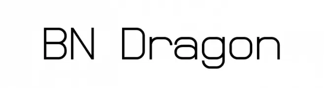
( Fonts by Ben Nathan )
A modern, geometric font with clean lines and a minimalist style.
![BN Dragon font caratteri gratis]() Scaricare 1978 Downloads@WebFont
Scaricare 1978 Downloads@WebFont


Quali sono i font più popolari adesso?
Poppins, Roboto, Montserrat, Open Sans e Lato sono molto usati per le forme pulite e l'ampia applicabilità — dall'identità di marca alle landing page e ai poster.
Quali font si usano spesso nei loghi?
Le sans serif geometriche (es. Poppins, famiglie in stile Gotham) sono scelte comuni per un branding pulito e scalabile. Per un tocco personale restano valide script e stili manoscritti. Abbina un display deciso per i titoli a un corpo testo neutro per riconoscibilità ed equilibrio.
Ogni quanto si aggiorna la lista?
Con regolarità, in base ai download e all'attività reale. Torna spesso per scoprire in anticipo le nuove preferite.
💡 Consiglio: aggiungi ai preferiti — le tendenze cambiano in fretta e i font top di oggi possono ispirare il rebranding di domani.