Benvenuto nelle Font Più Popolari — dove popolarità e qualità si incontrano. Qui trovi i font più scaricati e usati dell'anno. Se cerchi scelte sicure per logo, web o social, inizia da qui.
Ogni font top si distingue per equilibrio, leggibilità e versatilità. Troverai sans serif moderne, script eleganti, serif vintage e display minimalisti.
-
( www.hanodedfonts.com )
A bold, geometric font with sharp angles and a modern style.
 Scaricare 1787 Downloads@WebFont
 -
![Arenq font caratteri gratis]() Scaricare 1787 Downloads@WebFont
Scaricare 1787 Downloads@WebFont -
( Copyright (c) 2003-2013 SIL International (http://www.sil.org/) )
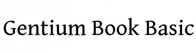
A classic serif typeface with elegant, readable letterforms and balanced proportions.
![Gentium Book Basic font caratteri gratis]() Scaricare 1787 Downloads@WebFont
Scaricare 1787 Downloads@WebFont -
![Bulgarian Garamond font caratteri gratis]() Scaricare 1787 Downloads@WebFont
Scaricare 1787 Downloads@WebFont -
( Fonts by www.peter-wiegel.de. Personal-use only. For commercial use please contact owner. )
An elegant, flowing script font with a classic, handwritten style.
![Wiegel Latein Medium font caratteri gratis]() Scaricare 1787 Downloads@WebFont
Scaricare 1787 Downloads@WebFont -
-
( Fonts by Manfred Klein - manfred-klein.ina-mar.com )
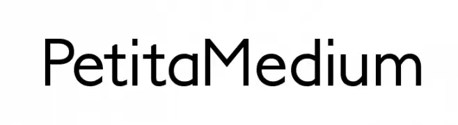
A modern, geometric sans-serif font with clean lines and balanced proportions.
![PetitaMedium font caratteri gratis]() Scaricare 1787 Downloads@WebFont
Scaricare 1787 Downloads@WebFont -
( Fonts by Levi Halmos )
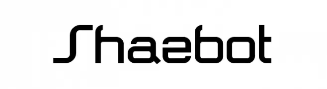
A modern, geometric font with a futuristic design and sharp angles.
![Shazbot font caratteri gratis]() Scaricare 1787 Downloads@WebFont
Scaricare 1787 Downloads@WebFont -
Caratteri di glyphstyle. For commercial use please contact the owner.
( NOTE: This demo font is for PERSONAL USE ONLY! But any donation are very appreciated. Paypal account for donation : https://www.paypal.me/dimasardhi full version: https://www.glyphstyle.net/bestone/ contact us at styleglyph@gmail.com )
A fluid, elegant handwritten font with a personal touch.
![Bestone font caratteri gratis]() Scaricare 1786 Downloads@WebFont
Scaricare 1786 Downloads@WebFont -
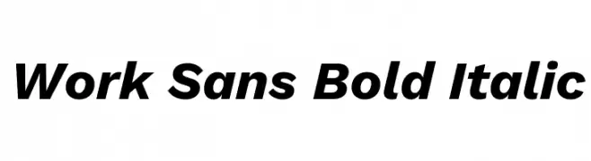
( Fonts by Wei Huang - Personal-use only. For commercial use please contact owner. )
A bold, italic sans-serif font with a modern and dynamic style.
![Work Sans Bold Italic font caratteri gratis]() Scaricare 1786 Downloads@WebFont
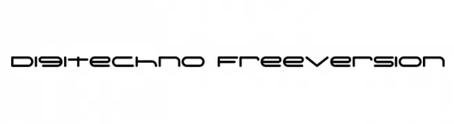
Scaricare 1786 Downloads@WebFont -
![Digitechno FreeVersion font caratteri gratis]() Scaricare 1786 Downloads@WebFont
Scaricare 1786 Downloads@WebFont -
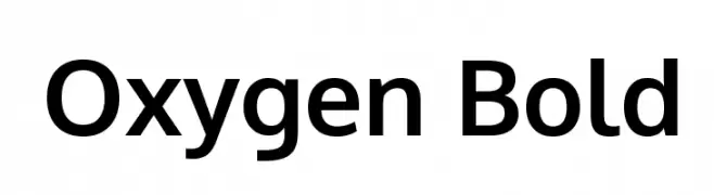
( Copyright (c) 2012, vernon adams (vern@newtypography.co.uk), with Reserved Font Names 'Oxygen' )
A bold, modern sans-serif font with geometric shapes and uniform stroke width.
![Oxygen Bold font caratteri gratis]() Scaricare 1786 Downloads@WebFont
Scaricare 1786 Downloads@WebFont -
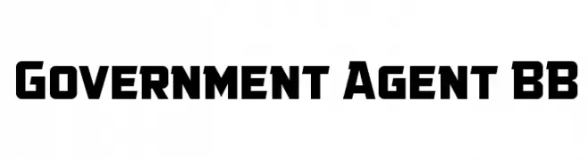
( Fonts by www.blambot.com )
A bold, geometric font with a modern and authoritative style.
![Government Agent BB font caratteri gratis]() Scaricare 1786 Downloads@WebFont
Scaricare 1786 Downloads@WebFont -
![21 font caratteri gratis]() Scaricare 1786 Downloads@WebFont
Scaricare 1786 Downloads@WebFont -
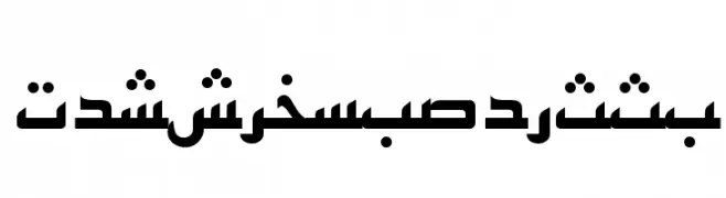
![PersianKufiSSK font caratteri gratis]() Scaricare 1786 Downloads@WebFont
Scaricare 1786 Downloads@WebFont -
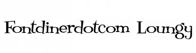
( Fonts by www.fontdiner.com )
A playful, retro font with quirky serifs and dynamic letterforms.
![Fontdinerdotcom Loungy font caratteri gratis]() Scaricare 1786 Downloads@WebFont
Scaricare 1786 Downloads@WebFont -
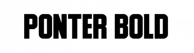
( Fonts by Daymarius - www.creativefabrica.com/designer/daymarius - Personal-use only. For commercial use please contact owner. )
A bold, geometric font with strong, thick strokes and a modern aesthetic.
![Ponter Bold font caratteri gratis]() Scaricare 1785 Downloads@WebFont
Scaricare 1785 Downloads@WebFont -
( imagex - www.imagex-fonts.com )
A futuristic and geometric font with clean lines and angular shapes.
![Grandissimo font caratteri gratis]() Scaricare 1785 Downloads@WebFont
Scaricare 1785 Downloads@WebFont -
( Copyright HanYang I&C Co.,Ltd. All rights reserved. )
A modern sans-serif typeface with geometric shapes and uniform strokes.
![Gothic A1 Medium font caratteri gratis]() Scaricare 1785 Downloads@WebFont
Scaricare 1785 Downloads@WebFont -
![Sofye Demo font caratteri gratis]() Scaricare 1785 Downloads@WebFont
Scaricare 1785 Downloads@WebFont -
![Cursive Serif font caratteri gratis]() Scaricare 1785 Downloads@WebFont
Scaricare 1785 Downloads@WebFont -
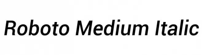
( Fonts by developer.android.com )
A modern, italicized sans-serif font with medium weight and normal spacing.
![Roboto Medium Italic font caratteri gratis]() Scaricare 1785 Downloads@WebFont
Scaricare 1785 Downloads@WebFont -
![soma Regular font caratteri gratis]() Scaricare 1785 Downloads@WebFont
Scaricare 1785 Downloads@WebFont -
( Fonts by uatype.faithweb.com - UnAuthorized Type )
A playful, hand-drawn font with irregular, wavy lines and a whimsical style.
![Wesley font caratteri gratis]() Scaricare 1785 Downloads@WebFont
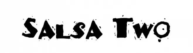
Scaricare 1785 Downloads@WebFont -
![Salsa Two font caratteri gratis]() Scaricare 1785 Downloads@WebFont
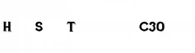
Scaricare 1785 Downloads@WebFont -
![Hand Shop Typography C30_demo font caratteri gratis]() Scaricare 1784 Downloads@WebFont
Scaricare 1784 Downloads@WebFont -
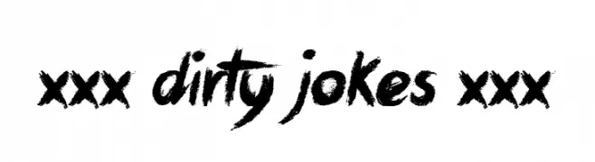
( Font by Jonathan Harris - www.tattoowoo.com )
A bold, expressive brush-style font with a textured, hand-painted look.
![xxx Dirty Jokes xxx font caratteri gratis]() Scaricare 1784 Downloads@WebFont
Scaricare 1784 Downloads@WebFont -
( Fonts by Manfred Klein. Free for private and charity use. Free for commercial with donation to organizations )
A cartoon illustration-based decorative font with a festive, cultural theme.
![Hispaniola font caratteri gratis]() Scaricare 1784 Downloads@WebFont
Scaricare 1784 Downloads@WebFont -
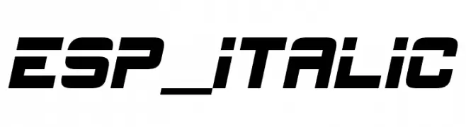
( Font by Nick A. Lynch )
A bold, italicized font with a modern and dynamic style.
![ESP_Italic font caratteri gratis]() Scaricare 1784 Downloads@WebFont
Scaricare 1784 Downloads@WebFont -
![Attract more women font caratteri gratis]() Scaricare 1784 Downloads@WebFont
Scaricare 1784 Downloads@WebFont -
![NFL Broncos font caratteri gratis]() Scaricare 1784 Downloads@WebFont
Scaricare 1784 Downloads@WebFont -
( Fonts by Noah Type - noahtype.com - Personal-use only. For commercial use please contact owner. )
A dynamic, fluid script font with smooth, flowing lines and elegant curves.
![Harella Demo font caratteri gratis]() Scaricare 1783 Downloads@WebFont
Scaricare 1783 Downloads@WebFont -
( Fonts by Michel Martinsson - lunchtype.com - Personal-use only. For commercial use please contact owner. )
A modern, expanded sans-serif font with medium contrast and excellent readability.
![Lunchtype24 Expanded Medium font caratteri gratis]() Scaricare 1783 Downloads@WebFont
Scaricare 1783 Downloads@WebFont -
Caratteri di spideraysfonts. For commercial use please contact the owner.
( THE GIFTED )
A bold, futuristic font with geometric shapes and segmented elements.
![THE GIFTED font caratteri gratis]() Scaricare 1783 Downloads@WebFont
Scaricare 1783 Downloads@WebFont -
![Sosa Regular font caratteri gratis]() Scaricare 1783 Downloads@WebFont
Scaricare 1783 Downloads@WebFont -
( Fonts by Arkandis Digital Foundry )
A modern, clean typeface with uniform stroke widths and excellent readability.
![SwitzeraADF-DemiBold font caratteri gratis]() Scaricare 1783 Downloads@WebFont
Scaricare 1783 Downloads@WebFont


Quali sono i font più popolari adesso?
Poppins, Roboto, Montserrat, Open Sans e Lato sono molto usati per le forme pulite e l'ampia applicabilità — dall'identità di marca alle landing page e ai poster.
Quali font si usano spesso nei loghi?
Le sans serif geometriche (es. Poppins, famiglie in stile Gotham) sono scelte comuni per un branding pulito e scalabile. Per un tocco personale restano valide script e stili manoscritti. Abbina un display deciso per i titoli a un corpo testo neutro per riconoscibilità ed equilibrio.
Ogni quanto si aggiorna la lista?
Con regolarità, in base ai download e all'attività reale. Torna spesso per scoprire in anticipo le nuove preferite.
💡 Consiglio: aggiungi ai preferiti — le tendenze cambiano in fretta e i font top di oggi possono ispirare il rebranding di domani.