Benvenuto nelle Font Più Popolari — dove popolarità e qualità si incontrano. Qui trovi i font più scaricati e usati dell'anno. Se cerchi scelte sicure per logo, web o social, inizia da qui.
Ogni font top si distingue per equilibrio, leggibilità e versatilità. Troverai sans serif moderne, script eleganti, serif vintage e display minimalisti.
-
 Scaricare 1777 Downloads@WebFont
 -
( Fonts by Dieter Steffmann )
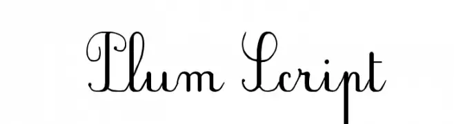
An elegant script font with intricate loops and decorative flourishes.
![Plum Script font caratteri gratis]() Scaricare 1777 Downloads@WebFont
Scaricare 1777 Downloads@WebFont -
![Moto font caratteri gratis]() Scaricare 1777 Downloads@WebFont
Scaricare 1777 Downloads@WebFont -
( Fonts by Apostrophic Lab )
A bold, italicized font with a dynamic and impactful style.
![Impossible - 1000 font caratteri gratis]() Scaricare 1777 Downloads@WebFont
Scaricare 1777 Downloads@WebFont -
( Fonts by Utopiafonts )
A modern, geometric font with clean lines and consistent stroke width.
![Azrael font caratteri gratis]() Scaricare 1777 Downloads@WebFont
Scaricare 1777 Downloads@WebFont -
-
( Alifia )
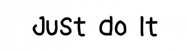
A playful, hand-drawn font with rounded, informal characters.
![Just Do It font caratteri gratis]() Scaricare 1776 Downloads@WebFont
Scaricare 1776 Downloads@WebFont -
( Fonts by Galdino Otten - galdinootten.com )
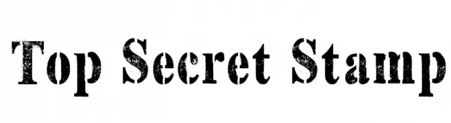
A bold, distressed font with a vintage, stamp-like appearance.
![Top Secret Stamp font caratteri gratis]() Scaricare 1776 Downloads@WebFont
Scaricare 1776 Downloads@WebFont -
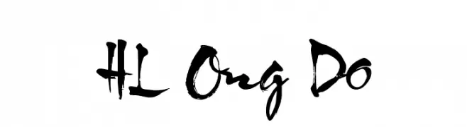
( Fonts by HungLan Design - www.hunglandesign.com )
A bold, brush-style font with dynamic and expressive strokes.
![HL Ong Do font caratteri gratis]() Scaricare 1776 Downloads@WebFont
Scaricare 1776 Downloads@WebFont -
![Markus Ink font caratteri gratis]() Scaricare 1776 Downloads@WebFont
Scaricare 1776 Downloads@WebFont -
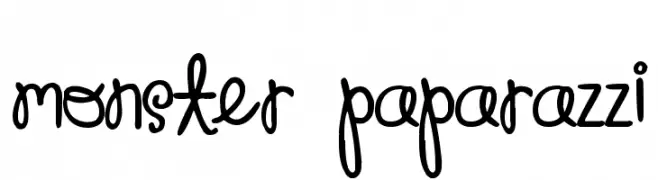
( Free for a personal use. For a commercial use please visit www.kevinandamanda.com )
A playful, handwritten font with a whimsical and friendly appearance.
![Monster Paparazzi font caratteri gratis]() Scaricare 1776 Downloads@WebFont
Scaricare 1776 Downloads@WebFont -
( Fonts by Rick Mueller )
A bold, playful italic font with rounded, flowing forms and a vintage flair.
![Advert Italic font caratteri gratis]() Scaricare 1776 Downloads@WebFont
Scaricare 1776 Downloads@WebFont -
![ap_hearts font caratteri gratis]() Scaricare 1776 Downloads@WebFont
Scaricare 1776 Downloads@WebFont -
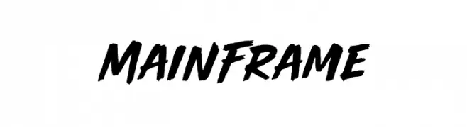
( Fonts by BLKBK Fonts - www.blkbk.shop - Personal-use only. For commercial use please contact owner. Commerciali Caratteri )
A bold, dynamic brush script font with energetic strokes and a hand-painted look.
![Main Frame font caratteri gratis]() Scaricare 1775 Downloads
Scaricare 1775 Downloads -
( Fonts by Pustudio )
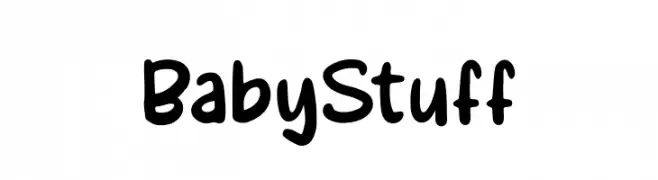
A playful, rounded font with a hand-drawn, whimsical style.
![BabyStuff font caratteri gratis]() Scaricare 1775 Downloads@WebFont
Scaricare 1775 Downloads@WebFont -
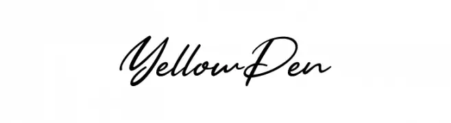
![Yellow Pen font caratteri gratis]() Scaricare 1775 Downloads@WebFont
Scaricare 1775 Downloads@WebFont -
( Copyright (c) 2011, Cyreal (www.cyreal.org) )
A classic serif font with elegant proportions and subtle contrast.
![Amethysta font caratteri gratis]() Scaricare 1775 Downloads@WebFont
Scaricare 1775 Downloads@WebFont -
( Fonts by www.typodermicfonts.com - Ray Larabie )
A futuristic, bold geometric font with sharp angles and clean lines.
![SofachromeRg-Regular font caratteri gratis]() Scaricare 1775 Downloads@WebFont
Scaricare 1775 Downloads@WebFont -
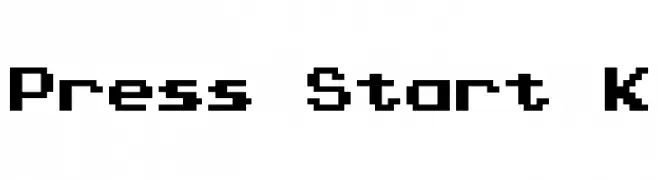
![Press Start K font caratteri gratis]() Scaricare 1775 Downloads@WebFont
Scaricare 1775 Downloads@WebFont -
( Fonts by Daniel Gauthier )
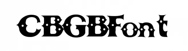
A bold, decorative font with punk rock influences and unique cut-out shapes.
![CBGBFont font caratteri gratis]() Scaricare 1775 Downloads@WebFont
Scaricare 1775 Downloads@WebFont -
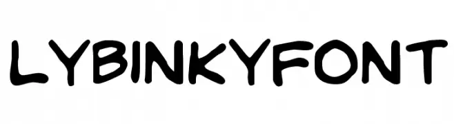
![LYBinkyFont font caratteri gratis]() Scaricare 1775 Downloads@WebFont
Scaricare 1775 Downloads@WebFont -
( Copyright 2018 The KoHo Project Authors (https://github.com/cadsondemak/Koho) )
A bold, modern sans-serif font with geometric influences and rounded edges.
![KoHo Bold font caratteri gratis]() Scaricare 1774 Downloads@WebFont
Scaricare 1774 Downloads@WebFont -
![UKNumberPlate font caratteri gratis]() Scaricare 1774 Downloads@WebFont
Scaricare 1774 Downloads@WebFont -
( Fonts by fabiandesmet.com )
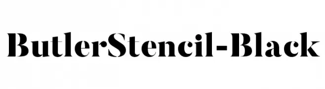
A bold stencil font with high contrast and modern appeal.
![ButlerStencil-Black font caratteri gratis]() Scaricare 1773 Downloads@WebFont
Scaricare 1773 Downloads@WebFont -
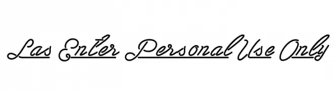
![Las Enter Personal Use Only font caratteri gratis]() Scaricare 1773 Downloads@WebFont
Scaricare 1773 Downloads@WebFont -
![ManuskriptGotisch font caratteri gratis]() Scaricare 1773 Downloads@WebFont
Scaricare 1773 Downloads@WebFont -
![Kingthings Calligraphica font caratteri gratis]() Scaricare 1773 Downloads@WebFont
Scaricare 1773 Downloads@WebFont -
![National Primary font caratteri gratis]() Scaricare 1773 Downloads@WebFont
Scaricare 1773 Downloads@WebFont -
( Fonts by BLKBK - https://blkbk.ink - Personal-use only. For commercial use please contact owner. Commerciali Caratteri )
A playful, bold font with rounded edges and a hand-drawn feel.
![Alpha Beta font caratteri gratis]() Scaricare 1772 Downloads
Scaricare 1772 Downloads -
![Volstead font caratteri gratis]() Scaricare 1772 Downloads@WebFont
Scaricare 1772 Downloads@WebFont -
( Fonts by weknow - Wino S Kadir )
An artistic font with characters designed to resemble bird feathers.
![Bird Feather font caratteri gratis]() Scaricare 1772 Downloads@WebFont
Scaricare 1772 Downloads@WebFont -
( Copyright (c) 2011, Vernon Adams (vern@newtypography.co.uk) )
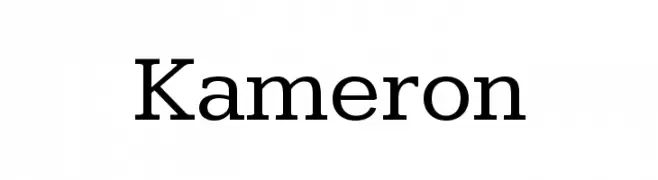
A modern serif font with elegant, balanced letterforms and refined serifs.
![Kameron font caratteri gratis]() Scaricare 1772 Downloads@WebFont
Scaricare 1772 Downloads@WebFont -
( Fonts by Manfred Klein - manfred-klein.ina-mar.com )
A bold, condensed font ideal for impactful headlines.
![Santana-BlackCondensed font caratteri gratis]() Scaricare 1772 Downloads@WebFont
Scaricare 1772 Downloads@WebFont -
( Fonts by Bartek Nowak - www.nowak.tv/fontoholic/ )
A bold, angular font with a modern, geometric style.
![Manifest font caratteri gratis]() Scaricare 1772 Downloads@WebFont
Scaricare 1772 Downloads@WebFont -
( Fonts by Dieter Steffmann )
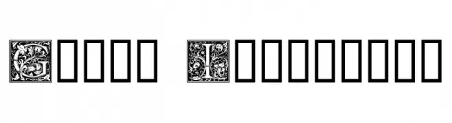
An ornate, decorative font with intricate floral patterns in each letter.
![Goudy Initialen font caratteri gratis]() Scaricare 1772 Downloads@WebFont
Scaricare 1772 Downloads@WebFont -
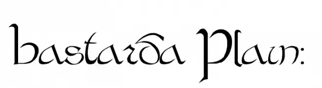
![Bastarda Plain: font caratteri gratis]() Scaricare 1772 Downloads@WebFont
Scaricare 1772 Downloads@WebFont


Quali sono i font più popolari adesso?
Poppins, Roboto, Montserrat, Open Sans e Lato sono molto usati per le forme pulite e l'ampia applicabilità — dall'identità di marca alle landing page e ai poster.
Quali font si usano spesso nei loghi?
Le sans serif geometriche (es. Poppins, famiglie in stile Gotham) sono scelte comuni per un branding pulito e scalabile. Per un tocco personale restano valide script e stili manoscritti. Abbina un display deciso per i titoli a un corpo testo neutro per riconoscibilità ed equilibrio.
Ogni quanto si aggiorna la lista?
Con regolarità, in base ai download e all'attività reale. Torna spesso per scoprire in anticipo le nuove preferite.
💡 Consiglio: aggiungi ai preferiti — le tendenze cambiano in fretta e i font top di oggi possono ispirare il rebranding di domani.