Benvenuto nelle Font Più Popolari — dove popolarità e qualità si incontrano. Qui trovi i font più scaricati e usati dell'anno. Se cerchi scelte sicure per logo, web o social, inizia da qui.
Ogni font top si distingue per equilibrio, leggibilità e versatilità. Troverai sans serif moderne, script eleganti, serif vintage e display minimalisti.
-
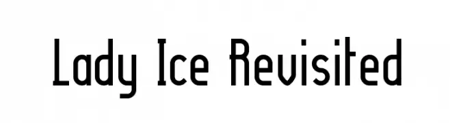
( Fonts by Apostrophic Lab )
A modern, narrow font with a sleek and elegant design.
 Scaricare 518 Downloads@WebFont
 -
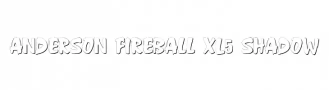
( Fonts by Steve Ferrera )
A bold, playful font with a shadow effect for added depth.
![Anderson Fireball XL5 Shadow font caratteri gratis]() Scaricare 518 Downloads@WebFont
Scaricare 518 Downloads@WebFont -
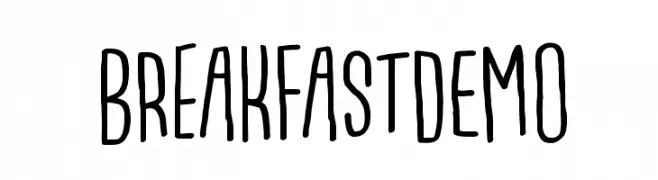
( Fonts by Pizzadude )
A playful, irregular handwritten font with tall, narrow letterforms.
![BreakfastDEMO font caratteri gratis]() Scaricare 518 Downloads@WebFont
Scaricare 518 Downloads@WebFont -
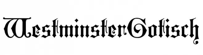
( Fonts by Dieter Steffmann )
A classic blackletter font with ornate, intricate letterforms.
![WestminsterGotisch font caratteri gratis]() Scaricare 518 Downloads@WebFont
Scaricare 518 Downloads@WebFont -
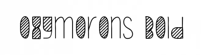
( Fonts by skomii - Personal-use only. For commercial use please contact owner. )
A playful, whimsical font with a mix of outlined and filled elements, ideal for creative projects.
![Oxymorons Bold font caratteri gratis]() Scaricare 518 Downloads@WebFont
Scaricare 518 Downloads@WebFont -
-
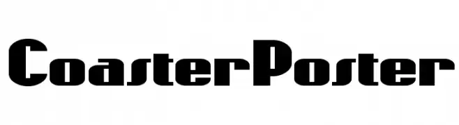
( Fonts by Nick Curtis - www.nicksfonts.com )
A bold, geometric font with a modern yet vintage-inspired style.
![CoasterPoster font caratteri gratis]() Scaricare 518 Downloads
Scaricare 518 Downloads -
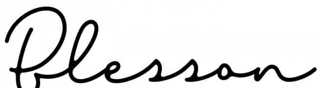
( Sronstudio - Yusron Billah )
A cursive, handwritten-style font with elegant, flowing characters.
![Blesson font caratteri gratis]() Scaricare 518 Downloads@WebFont
Scaricare 518 Downloads@WebFont -
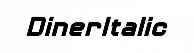
( Fonts by Pixel Sagas )
A bold, italic font with a modern, geometric style and rounded edges.
![Diner Italic font caratteri gratis]() Scaricare 518 Downloads@WebFont
Scaricare 518 Downloads@WebFont -
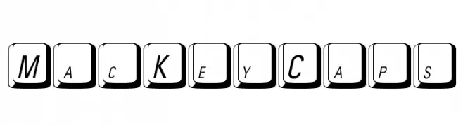
![MacKeyCaps font caratteri gratis]() Scaricare 518 Downloads@WebFont
Scaricare 518 Downloads@WebFont -
( Fonts by Jeri Ingalls - littlehouse.homestead.com )
A bold, playful display font with whimsical, decorative elements.
![JI Chimichanga font caratteri gratis]() Scaricare 518 Downloads@WebFont
Scaricare 518 Downloads@WebFont

Quali sono i font più popolari adesso?
Poppins, Roboto, Montserrat, Open Sans e Lato sono molto usati per le forme pulite e l'ampia applicabilità — dall'identità di marca alle landing page e ai poster.
Quali font si usano spesso nei loghi?
Le sans serif geometriche (es. Poppins, famiglie in stile Gotham) sono scelte comuni per un branding pulito e scalabile. Per un tocco personale restano valide script e stili manoscritti. Abbina un display deciso per i titoli a un corpo testo neutro per riconoscibilità ed equilibrio.
Ogni quanto si aggiorna la lista?
Con regolarità, in base ai download e all'attività reale. Torna spesso per scoprire in anticipo le nuove preferite.
💡 Consiglio: aggiungi ai preferiti — le tendenze cambiano in fretta e i font top di oggi possono ispirare il rebranding di domani.