Benvenuto nelle Font Più Popolari — dove popolarità e qualità si incontrano. Qui trovi i font più scaricati e usati dell'anno. Se cerchi scelte sicure per logo, web o social, inizia da qui.
Ogni font top si distingue per equilibrio, leggibilità e versatilità. Troverai sans serif moderne, script eleganti, serif vintage e display minimalisti.
-
 Scaricare 1747 Downloads@WebFont
 -
( Fonts by Khurasan )
A playful, rounded font with a friendly and whimsical style.
![Paybread font caratteri gratis]() Scaricare 1746 Downloads@WebFont
Scaricare 1746 Downloads@WebFont -
( Fonts by Cristiano Sobral - Personal-use only. For commercial use please contact owner. )
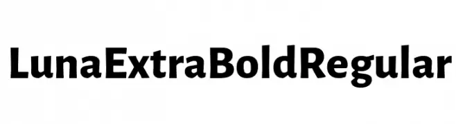
A bold and robust font with thick strokes and a strong presence.
![Luna Extra Bold Regular font caratteri gratis]() Scaricare 1746 Downloads@WebFont
Scaricare 1746 Downloads@WebFont -
( Fonts by Situjuh Nazara - 7ntypes.com - Personal-use only. For commercial use please contact owner. )
A bold, blocky font with a modern, geometric style.
![Gobold Blocky font caratteri gratis]() Scaricare 1746 Downloads@WebFont
Scaricare 1746 Downloads@WebFont -
( Fonts by Måns Grebäck )
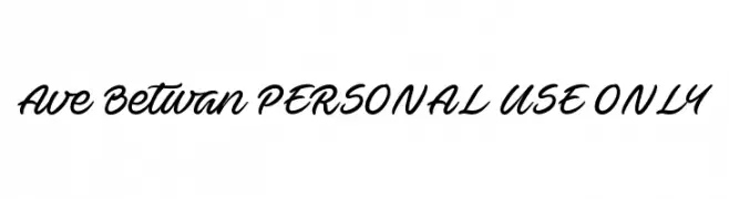
A cursive, handwritten-style font with elegant, flowing strokes.
![Ave Betwan PERSONAL USE ONLY font caratteri gratis]() Scaricare 1746 Downloads@WebFont
Scaricare 1746 Downloads@WebFont -
-
![Mundane Gothic Regular font caratteri gratis]() Scaricare 1746 Downloads@WebFont
Scaricare 1746 Downloads@WebFont -
( Fonts by www.gliphmaker.com. Personal-use only. For commercial use please contact owner. )
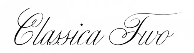
An elegant script font with intricate swashes and flowing lines.
![Classica Two font caratteri gratis]() Scaricare 1746 Downloads@WebFont
Scaricare 1746 Downloads@WebFont -
( Fonts by Pi Luo Chiu - thisisallenchiu.tumblr.com )
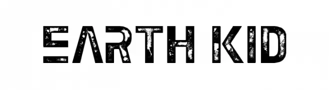
A bold, distressed font with a rugged, vintage appearance.
![Earth Kid font caratteri gratis]() Scaricare 1746 Downloads@WebFont
Scaricare 1746 Downloads@WebFont -
![Plain Cred font caratteri gratis]() Scaricare 1746 Downloads@WebFont
Scaricare 1746 Downloads@WebFont -
![Gourmand Italic font caratteri gratis]() Scaricare 1746 Downloads@WebFont
Scaricare 1746 Downloads@WebFont -
( Fonts by www.kimberlygeswein.com - Kimberly Geswein )
A playful, casual handwritten font with a friendly and informal style.
![KG Gloria Hallelujah font caratteri gratis]() Scaricare 1745 Downloads@WebFont
Scaricare 1745 Downloads@WebFont -
( Fonts by Sam Radian )
A modern, monospaced font ideal for coding and technical documents.
![Code New Roman font caratteri gratis]() Scaricare 1745 Downloads@WebFont
Scaricare 1745 Downloads@WebFont -
( Fonts by www.smeltery.net )
A bold, monospaced font with a modern, geometric style.
![Audimat Mono SmallCaps font caratteri gratis]() Scaricare 1745 Downloads@WebFont
Scaricare 1745 Downloads@WebFont -
![Khek Sangker font caratteri gratis]() Scaricare 1745 Downloads@WebFont
Scaricare 1745 Downloads@WebFont -
![Mexcellent 3D font caratteri gratis]() Scaricare 1745 Downloads@WebFont
Scaricare 1745 Downloads@WebFont -
![sai Font font caratteri gratis]() Scaricare 1745 Downloads@WebFont
Scaricare 1745 Downloads@WebFont -
( Neogrey Creative - www.neogrey.com )
A futuristic, geometric font with bold weight and clean lines.
![Arkitech Bold font caratteri gratis]() Scaricare 1744 Downloads@WebFont
Scaricare 1744 Downloads@WebFont -
( weknow - Wino S Kadir - www.creativefabrica.com/designer/weknow/ )
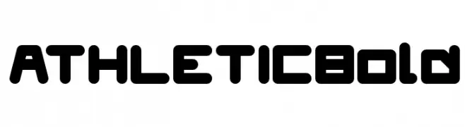
A bold, geometric font with rounded edges, perfect for modern and athletic designs.
![ATHLETIC Bold font caratteri gratis]() Scaricare 1744 Downloads@WebFont
Scaricare 1744 Downloads@WebFont -
( Iconian Fonts - Daniel Zadorozny - www.iconian.com )
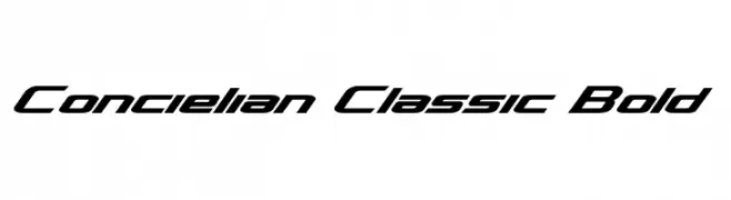
A bold, italicized font with a modern, dynamic style.
![Concielian Classic Bold font caratteri gratis]() Scaricare 1744 Downloads@WebFont
Scaricare 1744 Downloads@WebFont -
( Fontry - M.G. Adkins - www.thefontry.com/ )
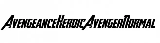
A bold, dynamic font with sharp angles and a superhero-inspired style.
![Avengeance Heroic Avenger Normal font caratteri gratis]() Scaricare 1744 Downloads@WebFont
Scaricare 1744 Downloads@WebFont -
( Copyright 2016 The Saira Project Authors (omnibus.type@gmail.com), with reserved font name "Saira". )
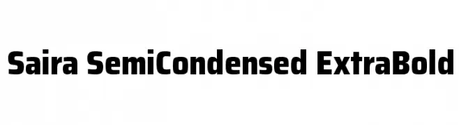
A bold, semi-condensed typeface perfect for impactful headlines.
![Saira SemiCondensed ExtraBold font caratteri gratis]() Scaricare 1744 Downloads@WebFont
Scaricare 1744 Downloads@WebFont -
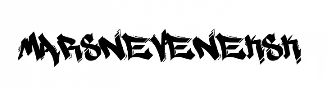
( Fonts by Ariq Sya - marsnev.com )
A bold, graffiti-inspired font with sharp, angular lines and a dynamic urban style.
![MARSNEVENEKSK font caratteri gratis]() Scaricare 1744 Downloads@WebFont
Scaricare 1744 Downloads@WebFont -
( Fonts by Manfred Klein. Free for private and charity use. Free for commercial with donation to organizations )
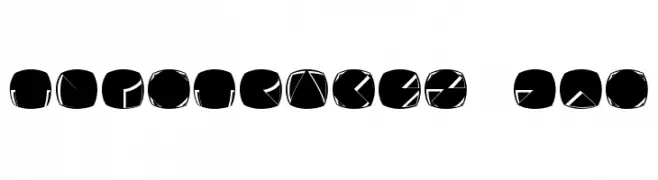
A modern, abstract font with characters formed by negative space within rounded squares.
![Typotraces-Zwo font caratteri gratis]() Scaricare 1744 Downloads@WebFont
Scaricare 1744 Downloads@WebFont -
( Fonts by Apostrophic Lab )
A bold, modern sans-serif font with expanded width and high legibility.
![Florencesans Exp Bold font caratteri gratis]() Scaricare 1744 Downloads@WebFont
Scaricare 1744 Downloads@WebFont -
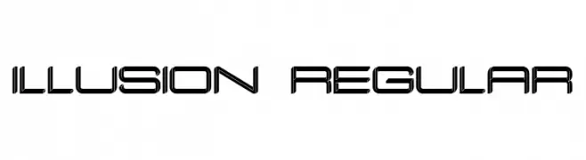
( Fonts by Vladimir Nikolic - https://www.creativefabrica.com/product/educated-deers/ref/144265/ - Personal-use only. For commercial use please contact owner. )
A futuristic, geometric font with outlined characters and a modern aesthetic.
![Illusion Regular font caratteri gratis]() Scaricare 1743 Downloads@WebFont
Scaricare 1743 Downloads@WebFont -
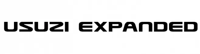
( Fonts by Daniel Zadorozny - www.iconian.com )
A bold, modern font with geometric, wide characters and rounded edges.
![Usuzi Expanded font caratteri gratis]() Scaricare 1743 Downloads@WebFont
Scaricare 1743 Downloads@WebFont -
( Fonts by a Neale Davidson - www.pixelsagas.com. Personal-use only. For commercial use please contact owner. )
A bold, geometric font with a futuristic, tech-inspired design.
![Protoculture font caratteri gratis]() Scaricare 1743 Downloads@WebFont
Scaricare 1743 Downloads@WebFont -
( Fonts by a Neale Davidson - www.pixelsagas.com. Personal-use only. For commercial use please contact owner. )
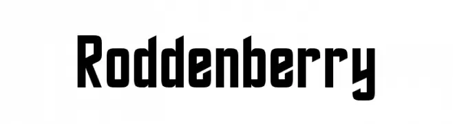
A bold, futuristic font with sharp, angular lines and a geometric structure.
![Roddenberry font caratteri gratis]() Scaricare 1743 Downloads@WebFont
Scaricare 1743 Downloads@WebFont -
( THESE ARE SHAREWARE FONTS ! NOT FREEWARE ! PLEASE VISIT www.fuelfonts.com )
A bold, playful font with rounded edges and a retro vibe.
![Dinghy font caratteri gratis]() Scaricare 1743 Downloads@WebFont
Scaricare 1743 Downloads@WebFont -
( Fonts by Manfred Klein. Free for private and charity use. Free for commercial with donation to organizations )
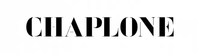
A bold, high-contrast serif font with a modern and dramatic style.
![Chaplone font caratteri gratis]() Scaricare 1743 Downloads@WebFont
Scaricare 1743 Downloads@WebFont -
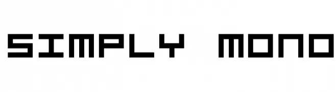
![Simply Mono font caratteri gratis]() Scaricare 1743 Downloads@WebFont
Scaricare 1743 Downloads@WebFont -
![Tycho font caratteri gratis]() Scaricare 1743 Downloads@WebFont
Scaricare 1743 Downloads@WebFont -
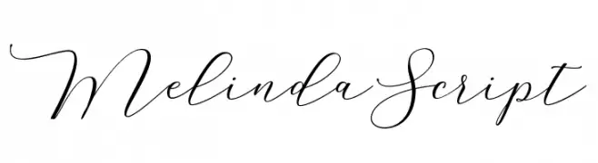
( Cooldesignlab - Kurniadi Saputra - creativemarket.com/cooldesignlab?u=cooldesignlab )
An elegant script font with fluid, cursive strokes and a refined, handwritten style.
![MelindaScript font caratteri gratis]() Scaricare 1742 Downloads@WebFont
Scaricare 1742 Downloads@WebFont -
![Playoffs font caratteri gratis]() Scaricare 1742 Downloads@WebFont
Scaricare 1742 Downloads@WebFont -
( Fonts by Dieter Steffmann )
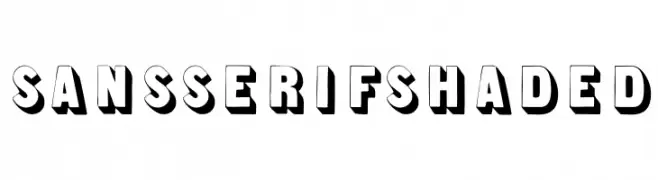
A bold, sans-serif font with a 3D shaded effect for a modern, impactful look.
![SansSerifShaded font caratteri gratis]() Scaricare 1742 Downloads@WebFont
Scaricare 1742 Downloads@WebFont


Quali sono i font più popolari adesso?
Poppins, Roboto, Montserrat, Open Sans e Lato sono molto usati per le forme pulite e l'ampia applicabilità — dall'identità di marca alle landing page e ai poster.
Quali font si usano spesso nei loghi?
Le sans serif geometriche (es. Poppins, famiglie in stile Gotham) sono scelte comuni per un branding pulito e scalabile. Per un tocco personale restano valide script e stili manoscritti. Abbina un display deciso per i titoli a un corpo testo neutro per riconoscibilità ed equilibrio.
Ogni quanto si aggiorna la lista?
Con regolarità, in base ai download e all'attività reale. Torna spesso per scoprire in anticipo le nuove preferite.
💡 Consiglio: aggiungi ai preferiti — le tendenze cambiano in fretta e i font top di oggi possono ispirare il rebranding di domani.