Benvenuto nelle Font Più Popolari — dove popolarità e qualità si incontrano. Qui trovi i font più scaricati e usati dell'anno. Se cerchi scelte sicure per logo, web o social, inizia da qui.
Ogni font top si distingue per equilibrio, leggibilità e versatilità. Troverai sans serif moderne, script eleganti, serif vintage e display minimalisti.
-
( Billy Argel - billyargel.com/ )
An elegant, bold cursive script with intricate loops and medium contrast.
 Scaricare 1762 Downloads@WebFont
 -
( Fonts by Dieter Steffmann )
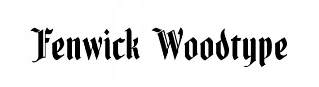
A bold blackletter font with sharp, angular strokes and ornate detailing.
![Fenwick Woodtype font caratteri gratis]() Scaricare 1762 Downloads@WebFont
Scaricare 1762 Downloads@WebFont -
( Fonts by Sinister Visions - Chad Savage - www.sinisterfonts.com )
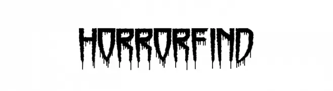
A spooky, dripping font perfect for horror themes.
![Horrorfind font caratteri gratis]() Scaricare 1762 Downloads@WebFont
Scaricare 1762 Downloads@WebFont -
( Fonts by Nick Curtis - www.nicksfonts.com )
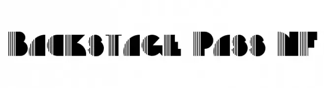
A bold, geometric font with a mix of solid and striped elements for a striking visual impact.
![Backstage Pass NF font caratteri gratis]() Scaricare 1762 Downloads@WebFont
Scaricare 1762 Downloads@WebFont -
![Copacetix font caratteri gratis]() Scaricare 1762 Downloads@WebFont
Scaricare 1762 Downloads@WebFont -
-
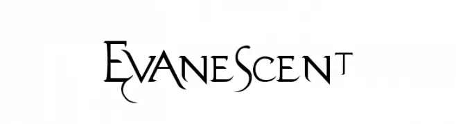
![Evanescent font caratteri gratis]() Scaricare 1762 Downloads@WebFont
Scaricare 1762 Downloads@WebFont -
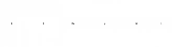
![RSPlaybill font caratteri gratis]() Scaricare 1762 Downloads
Scaricare 1762 Downloads -
![Acid Reflux [BRK] font caratteri gratis]() Scaricare 1762 Downloads@WebFont
Scaricare 1762 Downloads@WebFont -
Caratteri di defharo. For commercial use please contact the owner.
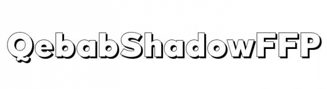
![QebabShadowFFP font caratteri gratis]() Scaricare 1761 Downloads@WebFont
Scaricare 1761 Downloads@WebFont -
( Copyright 2014 Ministry of Culture, Sports and Tourism and Korea Publishers Society (kopus@kopus.org) )
A classic serif font with elegant strokes and balanced proportions.
![KoPubBatang Regular font caratteri gratis]() Scaricare 1761 Downloads@WebFont
Scaricare 1761 Downloads@WebFont -
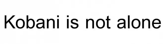
![Kobani is not alone font caratteri gratis]() Scaricare 1761 Downloads@WebFont
Scaricare 1761 Downloads@WebFont -
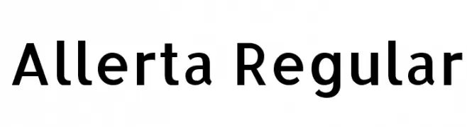
( Copyright (c) 2010, Matt McInerney (matt@pixelspread.com) )
A modern, geometric sans-serif font with clean lines and excellent legibility.
![Allerta Regular font caratteri gratis]() Scaricare 1761 Downloads@WebFont
Scaricare 1761 Downloads@WebFont -
( Fonts by uatype.faithweb.com - UnAuthorized Type )
A playful, hand-drawn font with irregular, sketch-like letterforms.
![Sketchbook font caratteri gratis]() Scaricare 1761 Downloads@WebFont
Scaricare 1761 Downloads@WebFont -
![Bewilder BRK font caratteri gratis]() Scaricare 1761 Downloads@WebFont
Scaricare 1761 Downloads@WebFont -
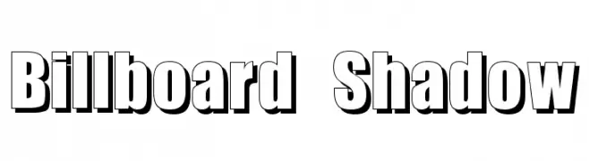
( Fonts by Typographer Mediengestaltung - Personal-use only. For commercial use please contact owner. )
A bold, shadowed font ideal for impactful headlines and signage.
![Billboard Shadow font caratteri gratis]() Scaricare 1760 Downloads@WebFont
Scaricare 1760 Downloads@WebFont -
![.VnArialH Bold Italic font caratteri gratis]() Scaricare 1760 Downloads
Scaricare 1760 Downloads -
![OMNIBLACK Outline font caratteri gratis]() Scaricare 1760 Downloads@WebFont
Scaricare 1760 Downloads@WebFont -
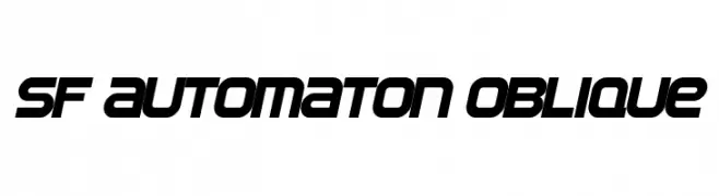
( Fonts by ShyFonts )
A bold, futuristic oblique font with a dynamic and geometric style.
![SF Automaton Oblique font caratteri gratis]() Scaricare 1760 Downloads@WebFont
Scaricare 1760 Downloads@WebFont -
( Fonts by Graham Meade - GemFonts )
A bold, decorative font with a striped pattern and three-dimensional outline.
![Phoenix Rising font caratteri gratis]() Scaricare 1760 Downloads@WebFont
Scaricare 1760 Downloads@WebFont -
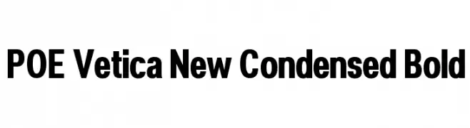
( Fonts by Dan P. Lyons - Personal-use only. For commercial use please contact owner. )
A bold, condensed sans-serif font with a modern and professional look.
![POE Vetica New Condensed Bold font caratteri gratis]() Scaricare 1759 Downloads@WebFont
Scaricare 1759 Downloads@WebFont -
( Fonts by Salvo Nicolosi - ficod.deviantart.com )
A clean, modern sans-serif font with geometric structure and uniform width.
![Atype 1 font caratteri gratis]() Scaricare 1759 Downloads@WebFont
Scaricare 1759 Downloads@WebFont -
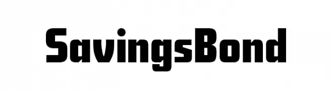
( Fonts by Harold Lohner - www.haroldsfonts.com )
A bold, modern font with blocky, uniform characters.
![SavingsBond font caratteri gratis]() Scaricare 1759 Downloads@WebFont
Scaricare 1759 Downloads@WebFont -
( Fonts by JoannaVu - https://ioannaladopoulou.design - Personal-use only. For commercial use please contact owner. )
A bold, angular font with a medieval, fantasy-inspired design.
![warcraft font caratteri gratis]() Scaricare 1758 Downloads@WebFont
Scaricare 1758 Downloads@WebFont -
( Copyright (c) 2015, Pablo Impallari, Rodrigo Fuenzalida (Modified by Dan O. Williams and USWDS) (https://github.com/uswds/public-sans) )
A bold, modern typeface with clean lines and strong visual impact.
![Public Sans Black font caratteri gratis]() Scaricare 1758 Downloads@WebFont
Scaricare 1758 Downloads@WebFont -
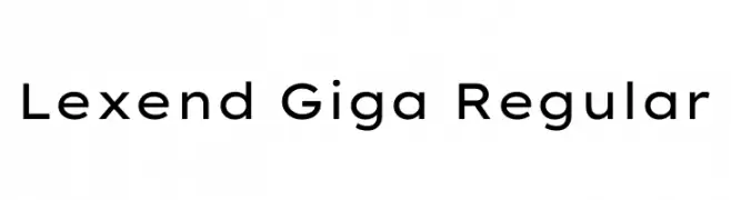
( Copyright 2018 The Lexend Project Authors (https://github.com/thomasjockin/lexend), with Reserved Font Name “RevReading Lexendâ€. )
A modern, clean sans-serif font with excellent readability.
![Lexend Giga Regular font caratteri gratis]() Scaricare 1758 Downloads@WebFont
Scaricare 1758 Downloads@WebFont -
( Zetafonts - www.zetafonts.com )
A bold, modern italic font with geometric shapes and clean lines.
![Cocogoose Pro Italic font caratteri gratis]() Scaricare 1758 Downloads@WebFont
Scaricare 1758 Downloads@WebFont -
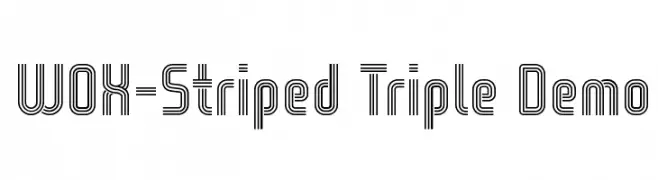
( Fonts by Studio Typo )
A triple-striped, geometric font with a bold and modern style.
![WOX-Striped Triple Demo font caratteri gratis]() Scaricare 1758 Downloads@WebFont
Scaricare 1758 Downloads@WebFont -
![Blooming Grove font caratteri gratis]() Scaricare 1758 Downloads@WebFont
Scaricare 1758 Downloads@WebFont -
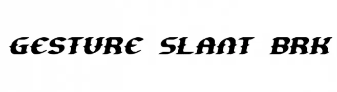
( Fonts by www.aenigmafonts.com )
A bold, slanted font with sharp, angular edges and consistent thickness.
![Gesture Slant BRK font caratteri gratis]() Scaricare 1758 Downloads@WebFont
Scaricare 1758 Downloads@WebFont -
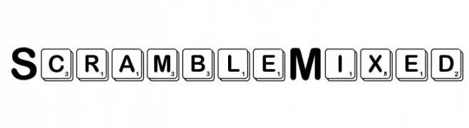
( Fonts by character - Personal-use only. For commercial use please contact owner. )
A bold, modern font with clean lines and balanced spacing.
![ScrambleMixed font caratteri gratis]() Scaricare 1757 Downloads@WebFont
Scaricare 1757 Downloads@WebFont -
![Riggle font caratteri gratis]() Scaricare 1757 Downloads
Scaricare 1757 Downloads -
( Fonts by Zetafonts - Personal-use only. For commercial use please contact owner. )
A bold, geometric font with a block border and hollow appearance.
![Cocogoose Pro Block Border font caratteri gratis]() Scaricare 1756 Downloads@WebFont
Scaricare 1756 Downloads@WebFont -
( imagex - www.imagex-fonts.com )
A bold, manga-inspired font with dynamic brush stroke effects.
![Manga Style font caratteri gratis]() Scaricare 1756 Downloads@WebFont
Scaricare 1756 Downloads@WebFont -
![Gaelle001 font caratteri gratis]() Scaricare 1756 Downloads@WebFont
Scaricare 1756 Downloads@WebFont -
( Copyright (c) 2011 by Sorkin Type Co (www.sorkintype.com) )
A bold, slab serif font with a vintage Western style.
![Arbutus font caratteri gratis]() Scaricare 1756 Downloads@WebFont
Scaricare 1756 Downloads@WebFont
![Acid Reflux [BRK] font caratteri gratis](https://d144mzi0q5mijx.cloudfront.net/img/A/C/Acid-Reflux-BRK.webp)


Quali sono i font più popolari adesso?
Poppins, Roboto, Montserrat, Open Sans e Lato sono molto usati per le forme pulite e l'ampia applicabilità — dall'identità di marca alle landing page e ai poster.
Quali font si usano spesso nei loghi?
Le sans serif geometriche (es. Poppins, famiglie in stile Gotham) sono scelte comuni per un branding pulito e scalabile. Per un tocco personale restano valide script e stili manoscritti. Abbina un display deciso per i titoli a un corpo testo neutro per riconoscibilità ed equilibrio.
Ogni quanto si aggiorna la lista?
Con regolarità, in base ai download e all'attività reale. Torna spesso per scoprire in anticipo le nuove preferite.
💡 Consiglio: aggiungi ai preferiti — le tendenze cambiano in fretta e i font top di oggi possono ispirare il rebranding di domani.