Benvenuto nelle Font Più Popolari — dove popolarità e qualità si incontrano. Qui trovi i font più scaricati e usati dell'anno. Se cerchi scelte sicure per logo, web o social, inizia da qui.
Ogni font top si distingue per equilibrio, leggibilità e versatilità. Troverai sans serif moderne, script eleganti, serif vintage e display minimalisti.
-
 Scaricare 504 Downloads@WebFont
 -
( Fonts by Typehand Studio )
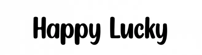
A playful, bold font with rounded edges and a friendly style.
![Happy Lucky font caratteri gratis]() Scaricare 504 Downloads@WebFont
Scaricare 504 Downloads@WebFont -
( Fonts by a Anonymous foundry. Personal-use only. For commercial use please contact owner. )
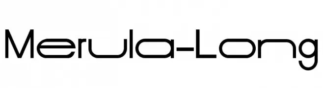
A modern, geometric typeface with uniform stroke width and high legibility.
![Merula-Long font caratteri gratis]() Scaricare 504 Downloads@WebFont
Scaricare 504 Downloads@WebFont -
( Fonts by Riyadh Rahman - Personal-use only. For commercial use please contact owner. )
An elegant and flowing script font with intricate letterforms and graceful curves.
![PeachCuties font caratteri gratis]() Scaricare 504 Downloads@WebFont
Scaricare 504 Downloads@WebFont -
![AKWinter Yawns font caratteri gratis]() Scaricare 504 Downloads@WebFont
Scaricare 504 Downloads@WebFont -
-
( Fonts by Tokopress )
Playful handwritten font with rounded edges.
![Claire Story font caratteri gratis]() Scaricare 504 Downloads@WebFont
Scaricare 504 Downloads@WebFont -
( Fonts by www.kimberlygeswein.com - Kimberly Geswein )
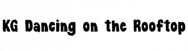
A bold, textured font with a playful, handcrafted feel.
![KG Dancing on the Rooftop font caratteri gratis]() Scaricare 504 Downloads@WebFont
Scaricare 504 Downloads@WebFont -
( Noto is a trademark of Google Inc. Noto fonts are open source. All Noto fonts are published under the SIL Open Font License, Version 1.1 )
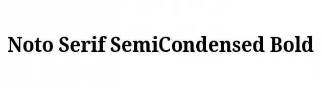
A bold, semi-condensed serif font with moderate contrast and classic styling.
![Noto Serif SemiCondensed Bold font caratteri gratis]() Scaricare 504 Downloads@WebFont
Scaricare 504 Downloads@WebFont -
![Minecraft Bold Italic font caratteri gratis]() Scaricare 504 Downloads@WebFont
Scaricare 504 Downloads@WebFont -
( Fonts by BLKBK Fonts - www.blkbk.shop - Personal-use only. For commercial use please contact owner. OFF SITE )
A bold, handwritten font with a playful and casual style.
![Casual Delight font caratteri gratis]() Scaricare 504 Downloads
Scaricare 504 Downloads


Quali sono i font più popolari adesso?
Poppins, Roboto, Montserrat, Open Sans e Lato sono molto usati per le forme pulite e l'ampia applicabilità — dall'identità di marca alle landing page e ai poster.
Quali font si usano spesso nei loghi?
Le sans serif geometriche (es. Poppins, famiglie in stile Gotham) sono scelte comuni per un branding pulito e scalabile. Per un tocco personale restano valide script e stili manoscritti. Abbina un display deciso per i titoli a un corpo testo neutro per riconoscibilità ed equilibrio.
Ogni quanto si aggiorna la lista?
Con regolarità, in base ai download e all'attività reale. Torna spesso per scoprire in anticipo le nuove preferite.
💡 Consiglio: aggiungi ai preferiti — le tendenze cambiano in fretta e i font top di oggi possono ispirare il rebranding di domani.