Benvenuto nelle Font Più Popolari — dove popolarità e qualità si incontrano. Qui trovi i font più scaricati e usati dell'anno. Se cerchi scelte sicure per logo, web o social, inizia da qui.
Ogni font top si distingue per equilibrio, leggibilità e versatilità. Troverai sans serif moderne, script eleganti, serif vintage e display minimalisti.
-
 Scaricare 503 Downloads@WebFont
 -
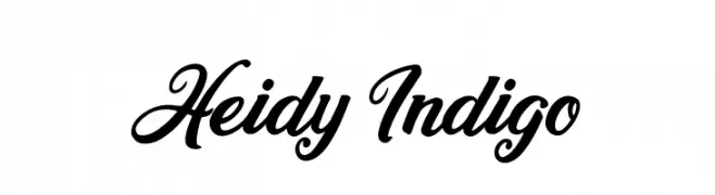
![Heidy Indigo font caratteri gratis]() Scaricare 503 Downloads@WebFont
Scaricare 503 Downloads@WebFont -
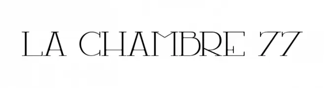
( Fonts by Maelle.K - Thomas Boucherie )
A modern, elegant serif font with high contrast and artistic flair.
![LA CHAMBRE 77 font caratteri gratis]() Scaricare 503 Downloads@WebFont
Scaricare 503 Downloads@WebFont -
( Fonts by Castcraft Software - OPTI Fonts Archive - opti.netii.net - Personal-use only. For commercial use please contact owner. )
A high-contrast, elegant font with elongated serifs and a modern aesthetic.
![OPTIRadar font caratteri gratis]() Scaricare 503 Downloads@WebFont
Scaricare 503 Downloads@WebFont -
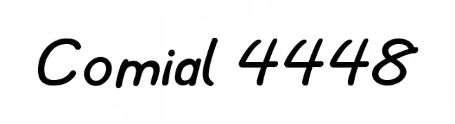
![Comial 4448 font caratteri gratis]() Scaricare 503 Downloads@WebFont
Scaricare 503 Downloads@WebFont -
-
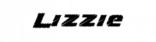
![Lizzie font caratteri gratis]() Scaricare 503 Downloads@WebFont
Scaricare 503 Downloads@WebFont -
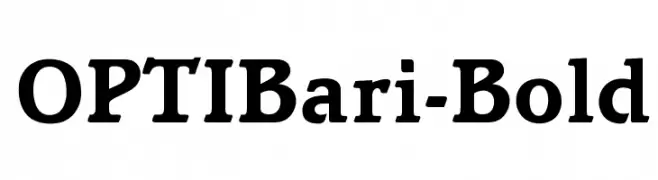
( Fonts by Castcraft Software - opti.netii.net - check the website before use )
A bold serif font with strong strokes and classic serifs.
![OPTIBari-Bold font caratteri gratis]() Scaricare 503 Downloads@WebFont
Scaricare 503 Downloads@WebFont -
( Fonts by Greg Medina - www.dcoxy.com - Personal-use only. For commercial use please contact owner. )
A dynamic and elegant script font with flowing cursive letters.
![Chardons font caratteri gratis]() Scaricare 503 Downloads@WebFont
Scaricare 503 Downloads@WebFont -
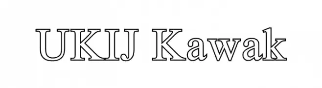
( Fonts by Adiljan Abliz (Uchqur) - Personal-use only. For commercial use please contact owner. )
A classic serif font with modern elegance and refined strokes.
![UKIJ Kawak font caratteri gratis]() Scaricare 503 Downloads@WebFont
Scaricare 503 Downloads@WebFont -
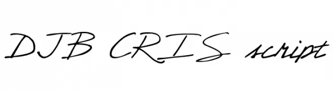
( Fonts by Darcy Baldwin - darcybaldwin.com. Free for personal use only )
A casual script font with fluid, handwritten strokes and a natural, elegant style.
![DJB CRIS script font caratteri gratis]() Scaricare 503 Downloads@WebFont
Scaricare 503 Downloads@WebFont


Quali sono i font più popolari adesso?
Poppins, Roboto, Montserrat, Open Sans e Lato sono molto usati per le forme pulite e l'ampia applicabilità — dall'identità di marca alle landing page e ai poster.
Quali font si usano spesso nei loghi?
Le sans serif geometriche (es. Poppins, famiglie in stile Gotham) sono scelte comuni per un branding pulito e scalabile. Per un tocco personale restano valide script e stili manoscritti. Abbina un display deciso per i titoli a un corpo testo neutro per riconoscibilità ed equilibrio.
Ogni quanto si aggiorna la lista?
Con regolarità, in base ai download e all'attività reale. Torna spesso per scoprire in anticipo le nuove preferite.
💡 Consiglio: aggiungi ai preferiti — le tendenze cambiano in fretta e i font top di oggi possono ispirare il rebranding di domani.