Benvenuto nelle Font Più Popolari — dove popolarità e qualità si incontrano. Qui trovi i font più scaricati e usati dell'anno. Se cerchi scelte sicure per logo, web o social, inizia da qui.
Ogni font top si distingue per equilibrio, leggibilità e versatilità. Troverai sans serif moderne, script eleganti, serif vintage e display minimalisti.
-
( Fonts by Peter Wiegel - www.peter-wiegel.de - Personal-use only. For commercial use please contact owner. )
A bold, distressed typewriter-style font with a vintage aesthetic.
 Scaricare 503 Downloads@WebFont
 -
( Fonts by ShyFonts )
A bold, italicized font with thick strokes and a modern, dynamic style.
![SF Port McKenzie Bold Italic font caratteri gratis]() Scaricare 503 Downloads@WebFont
Scaricare 503 Downloads@WebFont -
( Fonts by Chris Vile - fontmonger.com - Personal-use only. For commercial use please contact owner. )
A bold, vintage-inspired serif font with high contrast and strong serifs.
![Hells Rider font caratteri gratis]() Scaricare 503 Downloads@WebFont
Scaricare 503 Downloads@WebFont -
( Fonts by Adien Gunarta - fontasticindonesia.blogspot.com )
A decorative font with intricate geometric patterns within each character.
![Kawung Textile Regular font caratteri gratis]() Scaricare 503 Downloads@WebFont
Scaricare 503 Downloads@WebFont -
( Zansari - Zaffar Ansari - www.zansarifont.com )
A bold, dynamic brush-style font with fluid, expressive strokes.
![Gemini Brush font caratteri gratis]() Scaricare 503 Downloads@WebFont
Scaricare 503 Downloads@WebFont -
-
( Fonts by Apostrophic Lab )
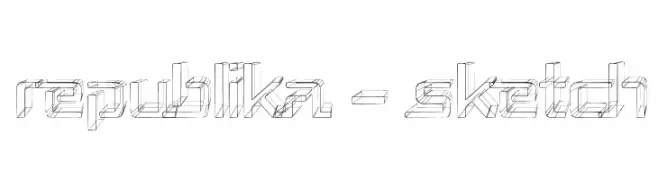
A sketch-style, three-dimensional font with geometric and artistic characteristics.
![Republika - Sketch font caratteri gratis]() Scaricare 503 Downloads@WebFont
Scaricare 503 Downloads@WebFont -
( Fonts by a Max Infeld - XEROGRAPHER FONTS - xerographer.blogspot.com . Personal-use only. For commercial use please contact owner. )
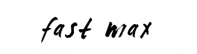
A bold, expressive brush script font with dynamic, hand-painted strokes.
![fast max font caratteri gratis]() Scaricare 503 Downloads@WebFont
Scaricare 503 Downloads@WebFont -
( Fonts by Apostrophic Lab )
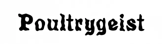
A bold, playful font with a whimsical, hand-drawn appearance.
![Poultrygeist font caratteri gratis]() Scaricare 503 Downloads@WebFont
Scaricare 503 Downloads@WebFont -
![HZHandwrite font caratteri gratis]() Scaricare 503 Downloads@WebFont
Scaricare 503 Downloads@WebFont -
![Triangle Normal font caratteri gratis]() Scaricare 503 Downloads@WebFont
Scaricare 503 Downloads@WebFont


Quali sono i font più popolari adesso?
Poppins, Roboto, Montserrat, Open Sans e Lato sono molto usati per le forme pulite e l'ampia applicabilità — dall'identità di marca alle landing page e ai poster.
Quali font si usano spesso nei loghi?
Le sans serif geometriche (es. Poppins, famiglie in stile Gotham) sono scelte comuni per un branding pulito e scalabile. Per un tocco personale restano valide script e stili manoscritti. Abbina un display deciso per i titoli a un corpo testo neutro per riconoscibilità ed equilibrio.
Ogni quanto si aggiorna la lista?
Con regolarità, in base ai download e all'attività reale. Torna spesso per scoprire in anticipo le nuove preferite.
💡 Consiglio: aggiungi ai preferiti — le tendenze cambiano in fretta e i font top di oggi possono ispirare il rebranding di domani.