Benvenuto nelle Font Più Popolari — dove popolarità e qualità si incontrano. Qui trovi i font più scaricati e usati dell'anno. Se cerchi scelte sicure per logo, web o social, inizia da qui.
Ogni font top si distingue per equilibrio, leggibilità e versatilità. Troverai sans serif moderne, script eleganti, serif vintage e display minimalisti.
-
( Fonts by Sealoung )
A playful, balloon-like font with rounded and elongated letterforms.
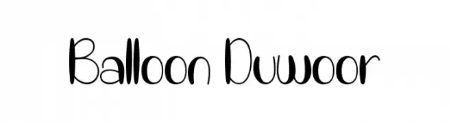 Scaricare 497 Downloads@WebFont
 -
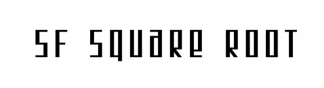
( Fonts by ShyFonts )
A geometric, modern font with a square-like structure and sharp angles.
![SF Square Root font caratteri gratis]() Scaricare 497 Downloads@WebFont
Scaricare 497 Downloads@WebFont -
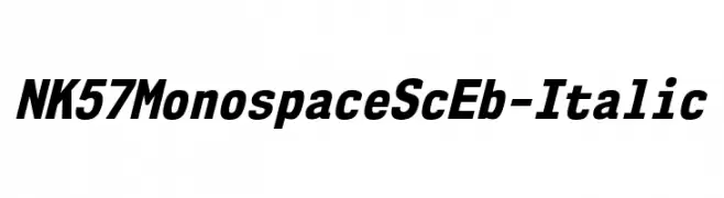
( Fonts by Typodermic Fonts )
Bold, italicized monospaced font with uniform spacing and strong visual impact.
![NK57MonospaceScEb-Italic font caratteri gratis]() Scaricare 497 Downloads@WebFont
Scaricare 497 Downloads@WebFont -
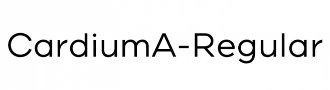
( Fonts by Yellow Design Studio - Ryan Martinson - Personal-use only. For commercial use please contact owner. )
A modern, geometric sans-serif font with clean lines and uniform strokes.
![CardiumA-Regular font caratteri gratis]() Scaricare 497 Downloads@WebFont
Scaricare 497 Downloads@WebFont -
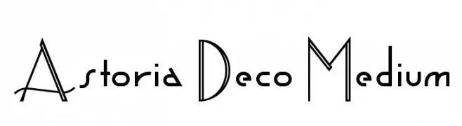
( Fonts by www.gliphmaker.com. Personal-use only. For commercial use please contact owner. )
An Art Deco-inspired font with geometric shapes and elegant lines.
![Astoria Deco Medium font caratteri gratis]() Scaricare 497 Downloads@WebFont
Scaricare 497 Downloads@WebFont -
-
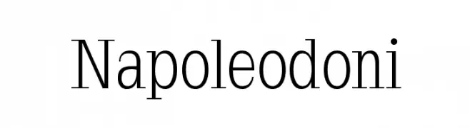
( Fonts by Manfred Klein - manfred-klein.ina-mar.com )
A classic serif typeface with elegant contrast and sharp serifs.
![Napoleodoni font caratteri gratis]() Scaricare 497 Downloads@WebFont
Scaricare 497 Downloads@WebFont -
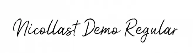
( Weape Design - creativemarket.com/weape?u=weape )
A dynamic, handwritten-style font with fluid strokes and expressive character.
![Nicollast Demo Regular font caratteri gratis]() Scaricare 497 Downloads@WebFont
Scaricare 497 Downloads@WebFont -
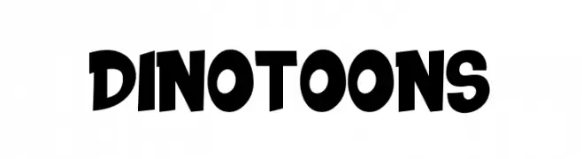
( Fonts by Fachran Heit )
A bold, cartoonish font with playful, exaggerated curves.
![DINOTOONS font caratteri gratis]() Scaricare 497 Downloads@WebFont
Scaricare 497 Downloads@WebFont -
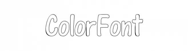
( Kids Fonts - kidsfonts.mivox.com/ )
A playful, hand-drawn font with rounded, bubbly characters and an outline style.
![ColorFont font caratteri gratis]() Scaricare 497 Downloads@WebFont
Scaricare 497 Downloads@WebFont -
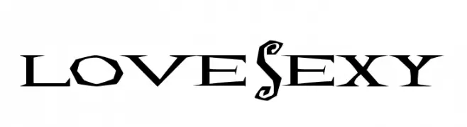
![Lovesexy font caratteri gratis]() Scaricare 497 Downloads@WebFont
Scaricare 497 Downloads@WebFont
Quali sono i font più popolari adesso?
Poppins, Roboto, Montserrat, Open Sans e Lato sono molto usati per le forme pulite e l'ampia applicabilità — dall'identità di marca alle landing page e ai poster.
Quali font si usano spesso nei loghi?
Le sans serif geometriche (es. Poppins, famiglie in stile Gotham) sono scelte comuni per un branding pulito e scalabile. Per un tocco personale restano valide script e stili manoscritti. Abbina un display deciso per i titoli a un corpo testo neutro per riconoscibilità ed equilibrio.
Ogni quanto si aggiorna la lista?
Con regolarità, in base ai download e all'attività reale. Torna spesso per scoprire in anticipo le nuove preferite.
💡 Consiglio: aggiungi ai preferiti — le tendenze cambiano in fretta e i font top di oggi possono ispirare il rebranding di domani.