Benvenuto nelle Font Più Popolari — dove popolarità e qualità si incontrano. Qui trovi i font più scaricati e usati dell'anno. Se cerchi scelte sicure per logo, web o social, inizia da qui.
Ogni font top si distingue per equilibrio, leggibilità e versatilità. Troverai sans serif moderne, script eleganti, serif vintage e display minimalisti.
-
( Fonts by Thirtypath - Personal-use only. For commercial use please contact owner. )
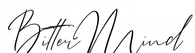
Elegant cursive font with fluid, interconnected strokes.
 Scaricare 497 Downloads@WebFont
 -
( Fonts by www.typodermicfonts.com - Ray Larabie )
A futuristic, geometric font with angular, block-like letterforms.
![Induction-Regular font caratteri gratis]() Scaricare 497 Downloads@WebFont
Scaricare 497 Downloads@WebFont -
( Fonts by www.peter-wiegel.de. Personal-use only. For commercial use please contact owner. )
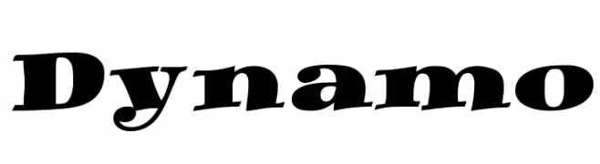
A bold, dynamic serif font with a slight slant and strong presence.
![Dynamo font caratteri gratis]() Scaricare 497 Downloads@WebFont
Scaricare 497 Downloads@WebFont -
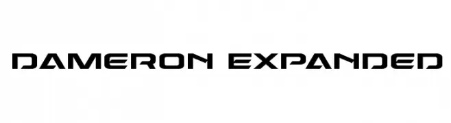
![Dameron Expanded font caratteri gratis]() Scaricare 497 Downloads@WebFont
Scaricare 497 Downloads@WebFont -
( Fonts by ARToni - Anthonie Van Hayu - Personal-use only. For commercial use please contact owner. )
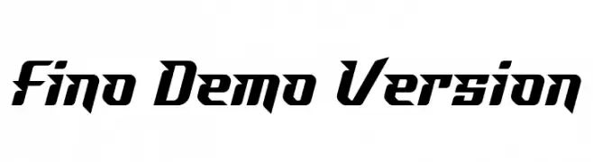
A bold, angular font with a dynamic, forward-leaning design.
![Fino Demo Version font caratteri gratis]() Scaricare 497 Downloads@WebFont
Scaricare 497 Downloads@WebFont -
-
( www.imagex-fonts.com )
A raw, hand-drawn font with playful and artistic characteristics.
![Raw Notice font caratteri gratis]() Scaricare 497 Downloads@WebFont
Scaricare 497 Downloads@WebFont -
( Fonts by www.chequered.ink - Chequered Ink - Personal-use only. For commercial use please contact owner. )
A bold, vintage-style font with a rugged, hand-painted look.
![TalkingBaseball font caratteri gratis]() Scaricare 497 Downloads@WebFont
Scaricare 497 Downloads@WebFont -
![Corporation font caratteri gratis]() Scaricare 497 Downloads@WebFont
Scaricare 497 Downloads@WebFont -
![Dearest Friend font caratteri gratis]() Scaricare 497 Downloads@WebFont
Scaricare 497 Downloads@WebFont -
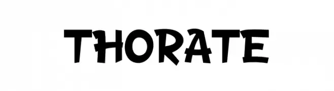
( Fonts by Murozakul Akhsan )
A playful, bold font with whimsical, cartoon-like characters.
![THORATE font caratteri gratis]() Scaricare 497 Downloads@WebFont
Scaricare 497 Downloads@WebFont

Quali sono i font più popolari adesso?
Poppins, Roboto, Montserrat, Open Sans e Lato sono molto usati per le forme pulite e l'ampia applicabilità — dall'identità di marca alle landing page e ai poster.
Quali font si usano spesso nei loghi?
Le sans serif geometriche (es. Poppins, famiglie in stile Gotham) sono scelte comuni per un branding pulito e scalabile. Per un tocco personale restano valide script e stili manoscritti. Abbina un display deciso per i titoli a un corpo testo neutro per riconoscibilità ed equilibrio.
Ogni quanto si aggiorna la lista?
Con regolarità, in base ai download e all'attività reale. Torna spesso per scoprire in anticipo le nuove preferite.
💡 Consiglio: aggiungi ai preferiti — le tendenze cambiano in fretta e i font top di oggi possono ispirare il rebranding di domani.