Benvenuto nelle Font Più Popolari — dove popolarità e qualità si incontrano. Qui trovi i font più scaricati e usati dell'anno. Se cerchi scelte sicure per logo, web o social, inizia da qui.
Ogni font top si distingue per equilibrio, leggibilità e versatilità. Troverai sans serif moderne, script eleganti, serif vintage e display minimalisti.
-
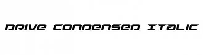
( Fonts by Daniel Zadorozny - www.iconian.com )
A modern, condensed italic font with a sleek, angular design.
 Scaricare 481 Downloads@WebFont
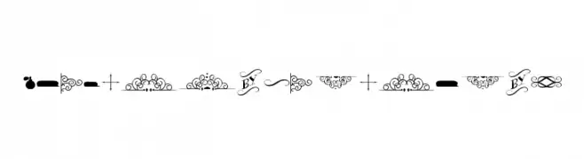
 -
![Bergamot Ornaments font caratteri gratis]() Scaricare 481 Downloads@WebFont
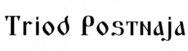
Scaricare 481 Downloads@WebFont -
![Triod Postnaja font caratteri gratis]() Scaricare 481 Downloads@WebFont
Scaricare 481 Downloads@WebFont -
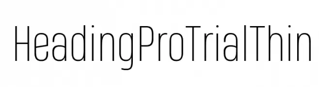
( Zetafonts - www.zetafonts.com )
A modern, thin sans-serif font with a sleek and minimalist design.
![Heading Pro Trial Thin font caratteri gratis]() Scaricare 481 Downloads@WebFont
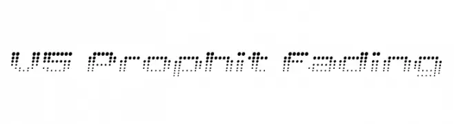
Scaricare 481 Downloads@WebFont -
![V5 Prophit Fading font caratteri gratis]() Scaricare 481 Downloads@WebFont
Scaricare 481 Downloads@WebFont -
-
( Fonts by Jayde Garrow - GarrowGlitch - http://jaydegarrow.wix.com/jaydefonts. Personal-use only. For commercial use please contact owner. )
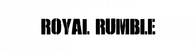
A bold, distressed stencil-style font with an industrial feel.
![Royal Rumble font caratteri gratis]() Scaricare 481 Downloads@WebFont
Scaricare 481 Downloads@WebFont -
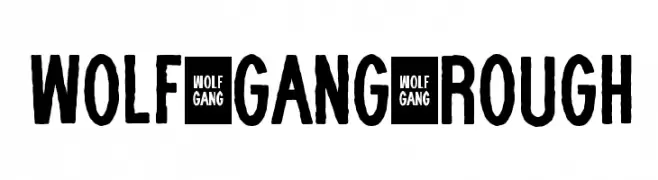
Caratteri di wisnu. For commercial use please contact the owner.
![WOLF GANG ROUGH font caratteri gratis]() Scaricare 481 Downloads@WebFont
Scaricare 481 Downloads@WebFont -
( Fonts by Rantau Type - rantaustudio.com - Personal-use only. For commercial use please contact owner. )
A graceful script font with flowing, cursive strokes and elegant flourishes.
![QalisthaRegular font caratteri gratis]() Scaricare 481 Downloads@WebFont
Scaricare 481 Downloads@WebFont -
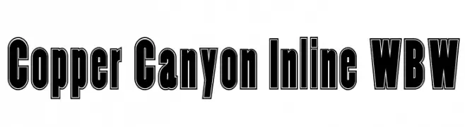
( Fonts by Nick Curtis - www.nicksfonts.com )
A bold, inline font with a strong, impactful presence.
![Copper Canyon Inline WBW font caratteri gratis]() Scaricare 481 Downloads@WebFont
Scaricare 481 Downloads@WebFont -
( Fonts by www.blambot.com )
Bold, outlined font with a strong, three-dimensional appearance.
![MutantAcademyDCBB font caratteri gratis]() Scaricare 481 Downloads@WebFont
Scaricare 481 Downloads@WebFont


Quali sono i font più popolari adesso?
Poppins, Roboto, Montserrat, Open Sans e Lato sono molto usati per le forme pulite e l'ampia applicabilità — dall'identità di marca alle landing page e ai poster.
Quali font si usano spesso nei loghi?
Le sans serif geometriche (es. Poppins, famiglie in stile Gotham) sono scelte comuni per un branding pulito e scalabile. Per un tocco personale restano valide script e stili manoscritti. Abbina un display deciso per i titoli a un corpo testo neutro per riconoscibilità ed equilibrio.
Ogni quanto si aggiorna la lista?
Con regolarità, in base ai download e all'attività reale. Torna spesso per scoprire in anticipo le nuove preferite.
💡 Consiglio: aggiungi ai preferiti — le tendenze cambiano in fretta e i font top di oggi possono ispirare il rebranding di domani.