Benvenuto nelle Font Più Popolari — dove popolarità e qualità si incontrano. Qui trovi i font più scaricati e usati dell'anno. Se cerchi scelte sicure per logo, web o social, inizia da qui.
Ogni font top si distingue per equilibrio, leggibilità e versatilità. Troverai sans serif moderne, script eleganti, serif vintage e display minimalisti.
-
( Copyright (c) 2014, Indian Type Foundry (info@indiantypefoundry.com). )
A modern, geometric sans-serif font with a condensed and uniform appearance.
 Scaricare 480 Downloads@WebFont
 -
( Fonts by Situjuh Nazara - 7ntypes.com - Personal-use only. For commercial use please contact owner. )
A playful, handwritten font with smooth curves and a casual style.
![Dehasta Momentos font caratteri gratis]() Scaricare 480 Downloads@WebFont
Scaricare 480 Downloads@WebFont -
( Copyright (c) 2010, Barry Schwartz (chemoelectric@chemoelectric.org) )
An elegant italic serif font with a classic and sophisticated style.
![OFL Sorts Mill Goudy TT Italic font caratteri gratis]() Scaricare 480 Downloads@WebFont
Scaricare 480 Downloads@WebFont -
![Yadou font caratteri gratis]() Scaricare 480 Downloads@WebFont
Scaricare 480 Downloads@WebFont -
( Fonts by billyargel.blogspot.com - Billy Argel )
A bold, gothic-inspired font with sharp, angular lines and intricate detailing.
![VATOS font caratteri gratis]() Scaricare 480 Downloads@WebFont
Scaricare 480 Downloads@WebFont -
-
( Fonts by Lionel Pailloncy )
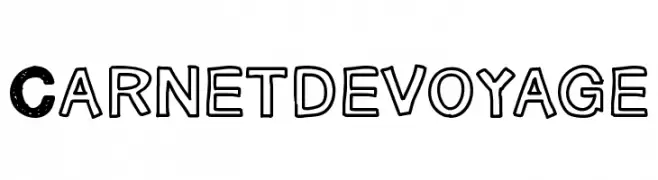
A bold, playful font with textured and outlined styles, perfect for vintage and modern designs.
![Carnetdevoyage font caratteri gratis]() Scaricare 480 Downloads@WebFont
Scaricare 480 Downloads@WebFont -
( Fonts by Christian Robertson )
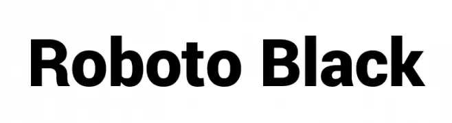
A bold, modern sans-serif typeface with a clean and impactful design.
![Roboto Black font caratteri gratis]() Scaricare 480 Downloads@WebFont
Scaricare 480 Downloads@WebFont -
( Fonts by Rika Kawamoto - http://home.alfasystem.co.jp/~kawamoto/ )
A decorative font with floral elements integrated into each character.
![flower3 font caratteri gratis]() Scaricare 480 Downloads@WebFont
Scaricare 480 Downloads@WebFont -
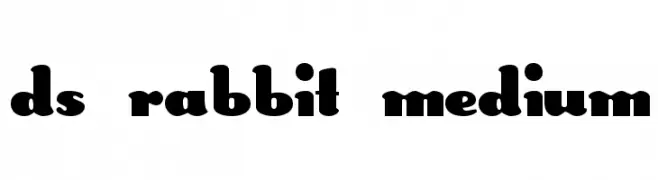
![DS Rabbit Medium font caratteri gratis]() Scaricare 480 Downloads@WebFont
Scaricare 480 Downloads@WebFont -
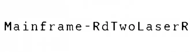
( Fonts by Castcraft Software - opti.netii.net - check the website before use )
A retro, typewriter-style font with a vintage, worn look.
![Mainframe-RdTwoLaserR font caratteri gratis]() Scaricare 480 Downloads@WebFont
Scaricare 480 Downloads@WebFont


Quali sono i font più popolari adesso?
Poppins, Roboto, Montserrat, Open Sans e Lato sono molto usati per le forme pulite e l'ampia applicabilità — dall'identità di marca alle landing page e ai poster.
Quali font si usano spesso nei loghi?
Le sans serif geometriche (es. Poppins, famiglie in stile Gotham) sono scelte comuni per un branding pulito e scalabile. Per un tocco personale restano valide script e stili manoscritti. Abbina un display deciso per i titoli a un corpo testo neutro per riconoscibilità ed equilibrio.
Ogni quanto si aggiorna la lista?
Con regolarità, in base ai download e all'attività reale. Torna spesso per scoprire in anticipo le nuove preferite.
💡 Consiglio: aggiungi ai preferiti — le tendenze cambiano in fretta e i font top di oggi possono ispirare il rebranding di domani.