Benvenuto nelle Font Più Popolari — dove popolarità e qualità si incontrano. Qui trovi i font più scaricati e usati dell'anno. Se cerchi scelte sicure per logo, web o social, inizia da qui.
Ogni font top si distingue per equilibrio, leggibilità e versatilità. Troverai sans serif moderne, script eleganti, serif vintage e display minimalisti.
-
Caratteri di Qbotype. For commercial use please contact the owner.
( Fonts by www.phuxerdesigns.com.ar - Non-commercial use of any typeface free version, only buying the full version )
A bold, industrial font with a textured, mechanical appearance.
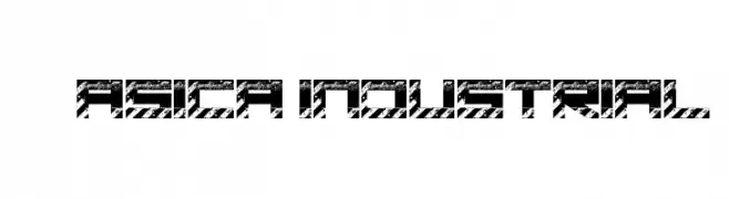 Scaricare 480 Downloads@WebFont
 -
( Fonts by Steve Gardner - www.explogos.com. Personal-use only. For commercial use please contact owner. )
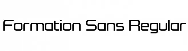
A modern, geometric font with clean lines and uniform width.
![Formation Sans Regular font caratteri gratis]() Scaricare 480 Downloads@WebFont
Scaricare 480 Downloads@WebFont -
( Fonts by Dieter Steffmann )
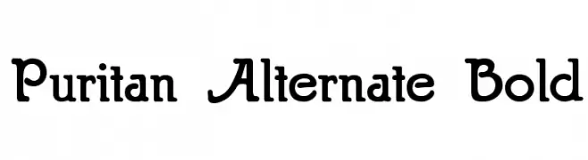
A bold, rounded serif font with a classic yet approachable style.
![Puritan Alternate Bold font caratteri gratis]() Scaricare 480 Downloads@WebFont
Scaricare 480 Downloads@WebFont -
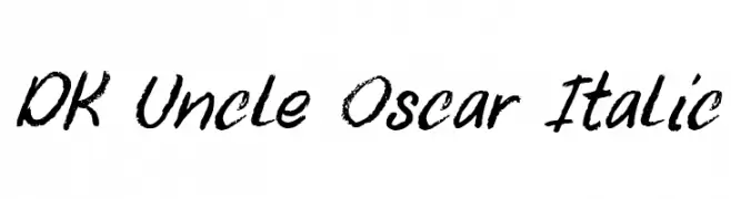
![DK Uncle Oscar Italic font caratteri gratis]() Scaricare 480 Downloads@WebFont
Scaricare 480 Downloads@WebFont -
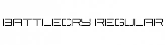
![Battlecry Regular font caratteri gratis]() Scaricare 480 Downloads@WebFont
Scaricare 480 Downloads@WebFont -
-
( Fonts by www.chequered.ink - Chequered Ink - Personal-use only. For commercial use please contact owner. )
A bold, rounded font with a strong, cohesive presence.
![Snow Deep font caratteri gratis]() Scaricare 480 Downloads@WebFont
Scaricare 480 Downloads@WebFont -
( Fonts by Jérémie Dupuis )
A classic serif font with bold strokes and high contrast, offering a traditional and authoritative appearance.
![Ghostlight-Regular font caratteri gratis]() Scaricare 480 Downloads@WebFont
Scaricare 480 Downloads@WebFont -
![Steelfish Dots font caratteri gratis]() Scaricare 479 Downloads@WebFont
Scaricare 479 Downloads@WebFont -
( Fonts by Ahmad Syarif Afandi - https://delapan.studio - Personal-use only. For commercial use please contact owner. )
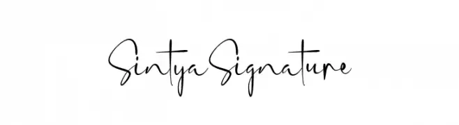
A modern, handwritten script font with elegant, flowing strokes.
![SintyaSignature font caratteri gratis]() Scaricare 479 Downloads@WebFont
Scaricare 479 Downloads@WebFont -
( Fonts by Måns Grebäck )
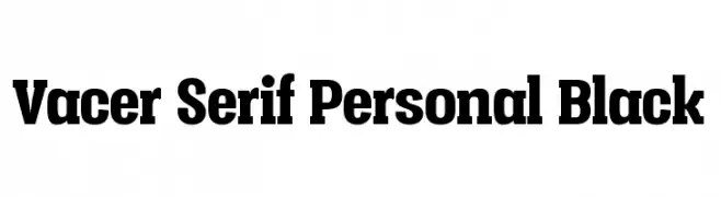
A bold serif font with strong, commanding presence and modern versatility.
![Vacer Serif Personal Black font caratteri gratis]() Scaricare 479 Downloads@WebFont
Scaricare 479 Downloads@WebFont


Quali sono i font più popolari adesso?
Poppins, Roboto, Montserrat, Open Sans e Lato sono molto usati per le forme pulite e l'ampia applicabilità — dall'identità di marca alle landing page e ai poster.
Quali font si usano spesso nei loghi?
Le sans serif geometriche (es. Poppins, famiglie in stile Gotham) sono scelte comuni per un branding pulito e scalabile. Per un tocco personale restano valide script e stili manoscritti. Abbina un display deciso per i titoli a un corpo testo neutro per riconoscibilità ed equilibrio.
Ogni quanto si aggiorna la lista?
Con regolarità, in base ai download e all'attività reale. Torna spesso per scoprire in anticipo le nuove preferite.
💡 Consiglio: aggiungi ai preferiti — le tendenze cambiano in fretta e i font top di oggi possono ispirare il rebranding di domani.