Benvenuto nelle Font Più Popolari — dove popolarità e qualità si incontrano. Qui trovi i font più scaricati e usati dell'anno. Se cerchi scelte sicure per logo, web o social, inizia da qui.
Ogni font top si distingue per equilibrio, leggibilità e versatilità. Troverai sans serif moderne, script eleganti, serif vintage e display minimalisti.
-
( Fonts by Galdino Otten - Personal-use only. For commercial use please contact owner. )
A playful and artistic font with unique twists and dynamic letterforms.
 Scaricare 65 Downloads@WebFont
 -
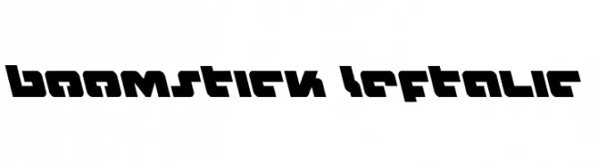
( Fonts by Iconian Fonts )
A bold, angular, and futuristic font with a dynamic slant.
![Boomstick Leftalic font caratteri gratis]() Scaricare 65 Downloads@WebFont
Scaricare 65 Downloads@WebFont -
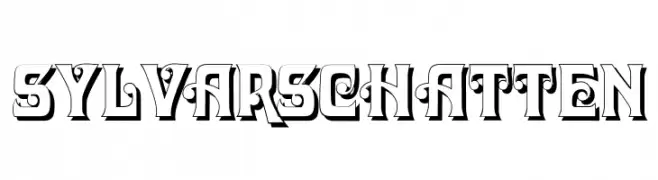
( Fonts by Peter Wiegel - www.peter-wiegel.de - Personal-use only. For commercial use please contact owner. )
A bold, decorative font with a three-dimensional shadow effect.
![SylvarSchatten font caratteri gratis]() Scaricare 65 Downloads@WebFont
Scaricare 65 Downloads@WebFont -
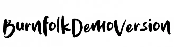
( Fonts by Allouse Studio - Personal-use only. For commercial use please contact owner. )
A bold, expressive handwritten font with brush-like strokes and dynamic flow.
![Burnfolk Demo Version font caratteri gratis]() Scaricare 65 Downloads@WebFont
Scaricare 65 Downloads@WebFont -
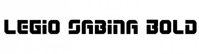
( Iconian Fonts - Daniel Zadorozny - www.iconian.com )
A bold, geometric typeface with strong, angular lines and a modern aesthetic.
![Legio Sabina Bold font caratteri gratis]() Scaricare 65 Downloads@WebFont
Scaricare 65 Downloads@WebFont -
-
( Fonts by Billy Argel Fonts - www.billyargel.com - Personal-use only. For commercial use please contact owner. )
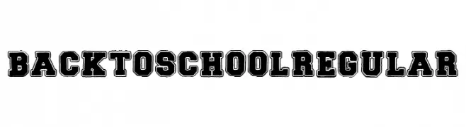
A bold, vintage-style font with a rugged, distressed texture.
![BACK TO SCHOOL Regular font caratteri gratis]() Scaricare 65 Downloads@WebFont
Scaricare 65 Downloads@WebFont -
( Fonts by Wahyu Eka Prasetya - wepfont.com - Personal-use only. For commercial use please contact owner. )
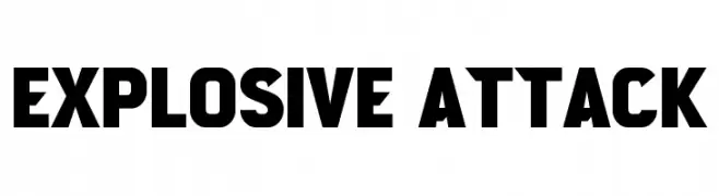
A bold, geometric font with strong, impactful letterforms.
![Explosive Attack font caratteri gratis]() Scaricare 65 Downloads@WebFont
Scaricare 65 Downloads@WebFont -
( Fonts by Theinkpot - Personal-use only. For commercial use please contact owner. )
A playful, hand-drawn font with a whimsical and informal style.
![Goedemorgen, Luc[as] font caratteri gratis]() Scaricare 65 Downloads
Scaricare 65 Downloads -
( Fonts by Vladimir Nikolic - www.creativefabrica.com/designer/vladimirnikolic/ - Personal-use only. For commercial use please contact owner. )
A decorative font with characters enclosed in ornate, stamp-like frames.
![Impression Regular font caratteri gratis]() Scaricare 65 Downloads@WebFont
Scaricare 65 Downloads@WebFont -
( Fonts by Kong Font - Personal-use only. For commercial use please contact owner. )
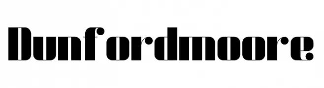
A bold, high-contrast font with wide, striking characters.
![Dunford moore font caratteri gratis]() Scaricare 65 Downloads@WebFont
Scaricare 65 Downloads@WebFont -
( Fonts by Kat`s Fun Fonts - Personal-use only. For commercial use please contact owner. )
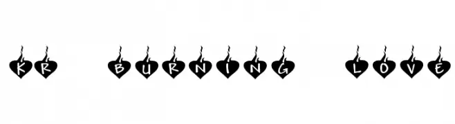
A playful, heart-themed font with bold, rounded letters and decorative flame accents.
![KR Burning Love font caratteri gratis]() Scaricare 64 Downloads@WebFont
Scaricare 64 Downloads@WebFont -
( Fonts by Omotu Studio - Ibnu Utomo - Personal-use only. For commercial use please contact owner. )
A bold, handwritten font with dynamic and expressive strokes.
![Olive _DEMO font caratteri gratis]() Scaricare 64 Downloads@WebFont
Scaricare 64 Downloads@WebFont -
( Fonts by olivetype )
Playful handwritten font with smooth curves.
![Sparkling Demo font caratteri gratis]() Scaricare 64 Downloads@WebFont
Scaricare 64 Downloads@WebFont -
( Noto is a trademark of Google Inc. Noto fonts are open source. All Noto fonts are published under the SIL Open Font License, Version 1.1 )
A geometric, modern font designed for the Shavian alphabet with a focus on clarity and uniformity.
![Noto Sans Shavian Regular font caratteri gratis]() Scaricare 64 Downloads@WebFont
Scaricare 64 Downloads@WebFont -
( Fonts by Vladimir Nikolic )
A bold, mechanical font with interconnected circular and linear elements.
![Brigadier Light Negative Regular font caratteri gratis]() Scaricare 64 Downloads@WebFont
Scaricare 64 Downloads@WebFont -
( Fonts by GFR Creative - Personal-use only. For commercial use please contact owner. )
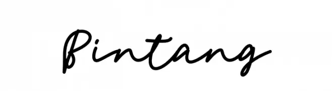
A cursive, handwritten-style font with smooth, flowing strokes.
![Bintang font caratteri gratis]() Scaricare 64 Downloads@WebFont
Scaricare 64 Downloads@WebFont -
( Fonts by www.junkohanhero.com - Personal-use only. For commercial use please contact owner. )
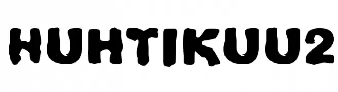
A bold, playful font with a hand-drawn, organic style.
![Huhtikuu2 font caratteri gratis]() Scaricare 64 Downloads@WebFont
Scaricare 64 Downloads@WebFont -
( Fonts by vilogsign - Nur Kholis - Personal-use only. For commercial use please contact owner. )
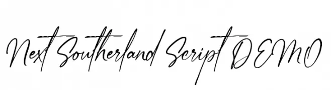
A dynamic and elegant script font with fluid, cursive letterforms.
![Next Southerland Script DEMO font caratteri gratis]() Scaricare 64 Downloads@WebFont
Scaricare 64 Downloads@WebFont -
( Luc Mahler )
A modern, geometric font with narrow, elongated characters and sharp angles.
![Pacotillenarrow light font caratteri gratis]() Scaricare 64 Downloads@WebFont
Scaricare 64 Downloads@WebFont -
( Fonts by StringLabs - stringlabscreative.com - Personal-use only. For commercial use please contact owner. )
A graceful script font with flowing, connected strokes and elegant details.
![WhetiyaScript font caratteri gratis]() Scaricare 64 Downloads@WebFont
Scaricare 64 Downloads@WebFont -
( BessAsher Rebel )
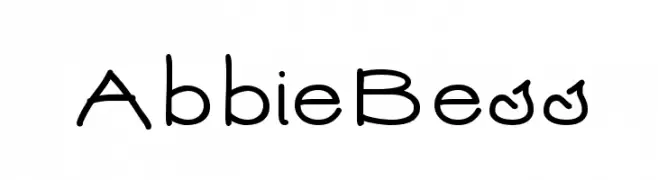
A playful, hand-drawn font with rounded, irregular letterforms.
![AbbieBess font caratteri gratis]() Scaricare 64 Downloads@WebFont
Scaricare 64 Downloads@WebFont -
( Fonts by Muhammad Halomoan )
A dynamic and fluid handwritten script with elegant, flowing strokes.
![Ganboster [Demo] font caratteri gratis]() Scaricare 64 Downloads@WebFont
Scaricare 64 Downloads@WebFont -
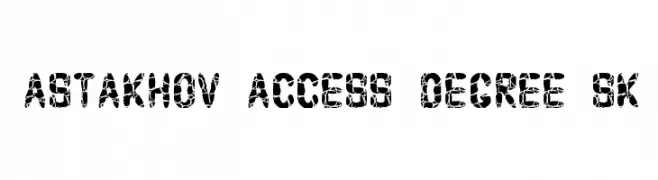
( Fonts by Dmitry Astakhov - www.behance.net/adonis-abe1e - Personal-use only. For commercial use please contact owner. )
A bold, textured font with a cracked, distressed appearance for edgy designs.
![Astakhov Access Degree Sk font caratteri gratis]() Scaricare 64 Downloads@WebFont
Scaricare 64 Downloads@WebFont -
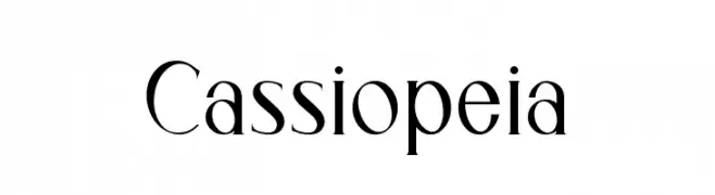
( Fonts by Salsabiyl Studio - Royhan Salsabiyl - Personal-use only. For commercial use please contact owner. )
A modern serif font with high contrast and elegant, refined lines.
![Cassiopeia font caratteri gratis]() Scaricare 64 Downloads@WebFont
Scaricare 64 Downloads@WebFont -
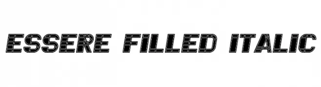
( Vladimir Nikolic - www.coroflot.com/vladimirnikolic )
A bold, filled, italic font with geometric and dynamic design elements.
![Essere Filled Italic font caratteri gratis]() Scaricare 64 Downloads@WebFont
Scaricare 64 Downloads@WebFont -
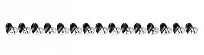
( LeChefRene - members.aol.com/lcrfonts/ )
A whimsical font with characters inside patchwork hearts, ideal for creative projects.
![LCR Works of Heart font caratteri gratis]() Scaricare 64 Downloads@WebFont
Scaricare 64 Downloads@WebFont -
( Fonts by Darrell Flood )
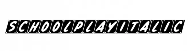
A playful, handwritten italic font with medium contrast and unique framed characters.
![School Play Italic font caratteri gratis]() Scaricare 64 Downloads@WebFont
Scaricare 64 Downloads@WebFont -
( Fonts by NubeFonts - nubefonts.blogspot.com - Personal-use only. For commercial use please contact owner. )
A bold, decorative font with abstract, alien-like symbols and playful curves.
![Disney's Zombese font caratteri gratis]() Scaricare 64 Downloads@WebFont
Scaricare 64 Downloads@WebFont -
( Fonts by Kong Font - Personal-use only. For commercial use please contact owner. )
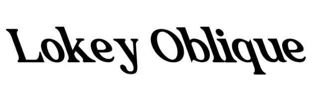
A bold, oblique font with a modern, dynamic style.
![Lokey Oblique font caratteri gratis]() Scaricare 64 Downloads@WebFont
Scaricare 64 Downloads@WebFont -
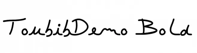
( JBFoundry - Jean Boyault - jean.boyault.pagesperso-orange.fr/ )
A playful, casual handwritten font with dynamic strokes and a relaxed vibe.
![ToubibDemo Bold font caratteri gratis]() Scaricare 64 Downloads@WebFont
Scaricare 64 Downloads@WebFont -
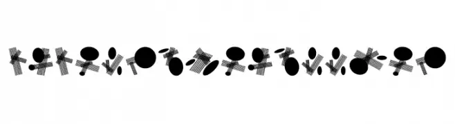
( Fonts by Vladimir Nikolic )
An abstract, geometric font using circles and lines for artistic expression.
![Circle and Line Regular font caratteri gratis]() Scaricare 64 Downloads@WebFont
Scaricare 64 Downloads@WebFont -
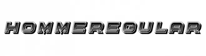
( Fonts by Vladimir Nikolic - www.creativefabrica.com/designer/vladimirnikolic/ - Personal-use only. For commercial use please contact owner. )
A bold, three-dimensional font with a textured, shadowed design.
![Homme Regular font caratteri gratis]() Scaricare 64 Downloads@WebFont
Scaricare 64 Downloads@WebFont -
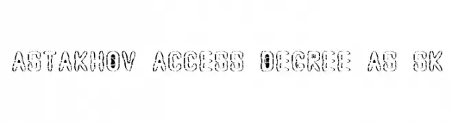
( Fonts by Dmitry Astakhov - www.behance.net/adonis-abe1e - Personal-use only. For commercial use please contact owner. )
A bold, distressed decorative font with a rugged, stencil-like appearance.
![Astakhov Access Degree AS Sk font caratteri gratis]() Scaricare 64 Downloads@WebFont
Scaricare 64 Downloads@WebFont -
( Fonts by DYSA Studio - Yusup Saputra - Personal-use only. For commercial use please contact owner. )
A fluid and elegant handwritten font with thin, flowing strokes.
![Pantai Bali font caratteri gratis]() Scaricare 64 Downloads@WebFont
Scaricare 64 Downloads@WebFont -
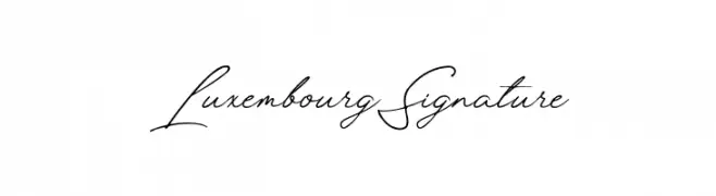
( Fonts by Letterium Studio - Personal-use only. For commercial use please contact owner. )
A sophisticated script font with graceful, flowing lines and a handwritten signature style.
![Luxembourg Signature font caratteri gratis]() Scaricare 64 Downloads@WebFont
Scaricare 64 Downloads@WebFont
![Goedemorgen, Luc[as] font caratteri gratis](https://d144mzi0q5mijx.cloudfront.net/img/G/O/Goedemorgen-Luc-as.webp)


![Ganboster [Demo] font caratteri gratis](https://d144mzi0q5mijx.cloudfront.net/img/G/A/Ganboster-Demo.webp)


Quali sono i font più popolari adesso?
Poppins, Roboto, Montserrat, Open Sans e Lato sono molto usati per le forme pulite e l'ampia applicabilità — dall'identità di marca alle landing page e ai poster.
Quali font si usano spesso nei loghi?
Le sans serif geometriche (es. Poppins, famiglie in stile Gotham) sono scelte comuni per un branding pulito e scalabile. Per un tocco personale restano valide script e stili manoscritti. Abbina un display deciso per i titoli a un corpo testo neutro per riconoscibilità ed equilibrio.
Ogni quanto si aggiorna la lista?
Con regolarità, in base ai download e all'attività reale. Torna spesso per scoprire in anticipo le nuove preferite.
💡 Consiglio: aggiungi ai preferiti — le tendenze cambiano in fretta e i font top di oggi possono ispirare il rebranding di domani.