Benvenuto nelle Font Più Popolari — dove popolarità e qualità si incontrano. Qui trovi i font più scaricati e usati dell'anno. Se cerchi scelte sicure per logo, web o social, inizia da qui.
Ogni font top si distingue per equilibrio, leggibilità e versatilità. Troverai sans serif moderne, script eleganti, serif vintage e display minimalisti.
-
 Scaricare 1650 Downloads@WebFont
 -
( Fonts by Jacob Fisher - www.pizzadude.dk )
A playful, bold font with a bubbly, hand-drawn style.
![JellyBelly font caratteri gratis]() Scaricare 1650 Downloads@WebFont
Scaricare 1650 Downloads@WebFont -
( Fonts by www.fontmesa.com )
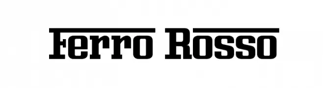
A bold, geometric font with strong, consistent strokes and an industrial feel.
![Ferro Rosso font caratteri gratis]() Scaricare 1650 Downloads@WebFont
Scaricare 1650 Downloads@WebFont -
( americasuena.cl )
A bold, hand-painted style font with dynamic, irregular strokes.
![Müller font caratteri gratis]() Scaricare 1649 Downloads@WebFont
Scaricare 1649 Downloads@WebFont -
( Fonts by CannotIntoSpaceFonts - KineticPlasma Fonts - Personal-use only. For commercial use please contact owner. )
A bold, super extended sans-serif typeface ideal for impactful headlines.
![Warsaw Gothic SuperExtended font caratteri gratis]() Scaricare 1649 Downloads@WebFont
Scaricare 1649 Downloads@WebFont -
-
( Fonts by Castcraft Software - OPTI Fonts Archive - opti.netii.net - Personal-use only. For commercial use please contact owner. )
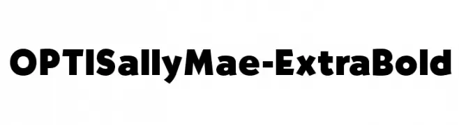
A bold, impactful font with thick strokes and rounded edges.
![OPTISallyMae-ExtraBold font caratteri gratis]() Scaricare 1649 Downloads@WebFont
Scaricare 1649 Downloads@WebFont -
![SPAM font caratteri gratis]() Scaricare 1649 Downloads@WebFont
Scaricare 1649 Downloads@WebFont -
( Fonts by Paul Lloyd )
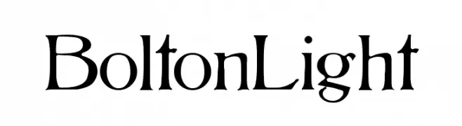
An elegant serif font with classic, sophisticated styling.
![BoltonLight font caratteri gratis]() Scaricare 1649 Downloads@WebFont
Scaricare 1649 Downloads@WebFont -
( Fonts by Almarkhatype )
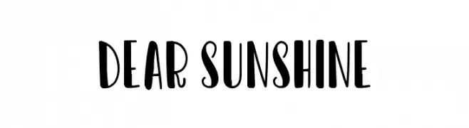
A playful, bold font with rounded, whimsical letterforms.
![Dear Sunshine font caratteri gratis]() Scaricare 1648 Downloads@WebFont
Scaricare 1648 Downloads@WebFont -
( Fonts by Peter Wiegel )
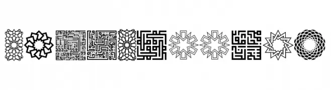
Ornamental geometric font with Islamic art influences.
![KufiPattern font caratteri gratis]() Scaricare 1648 Downloads@WebFont
Scaricare 1648 Downloads@WebFont -
( Fonts by Daniel Gellatley. Personal-use only. For commercial use please contact owner. )
A bold, modern sans-serif font with tall, narrow uppercase letters and consistent numerals.
![Nike Total 90 font caratteri gratis]() Scaricare 1648 Downloads@WebFont
Scaricare 1648 Downloads@WebFont -
( Fonts by Alit Suarnegara )
A decorative cursive font with elegant swirls and loops.
![Valledofasjustpersonalonly font caratteri gratis]() Scaricare 1648 Downloads@WebFont
Scaricare 1648 Downloads@WebFont -
( Fonts by a Pilaster Davy . Personal-use only. For commercial use please contact owner. )
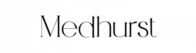
A modern, elegant font with high contrast and sharp serifs.
![Medhurst font caratteri gratis]() Scaricare 1648 Downloads@WebFont
Scaricare 1648 Downloads@WebFont -
( Fonts by www.peter-wiegel.de. Personal-use only. For commercial use please contact owner. )
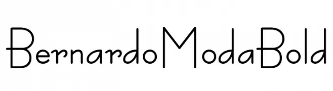
A modern, geometric font with rounded edges and consistent stroke widths.
![BernardoModaBold font caratteri gratis]() Scaricare 1648 Downloads@WebFont
Scaricare 1648 Downloads@WebFont -
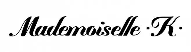
( Fonts by Maelle.K - Thomas Boucherie )
An elegant script font with flowing, cursive strokes and decorative flourishes.
![Mademoiselle ·K· font caratteri gratis]() Scaricare 1648 Downloads@WebFont
Scaricare 1648 Downloads@WebFont -
![Consola Mono font caratteri gratis]() Scaricare 1648 Downloads@WebFont
Scaricare 1648 Downloads@WebFont -
( Fonts by www.haroldsfonts.com )
A bold, brush-style font with a lively, hand-painted appearance.
![Good Vibes font caratteri gratis]() Scaricare 1648 Downloads@WebFont
Scaricare 1648 Downloads@WebFont -
![Federation TNG Title font caratteri gratis]() Scaricare 1648 Downloads@WebFont
Scaricare 1648 Downloads@WebFont -
![Electric Toaster font caratteri gratis]() Scaricare 1648 Downloads@WebFont
Scaricare 1648 Downloads@WebFont -
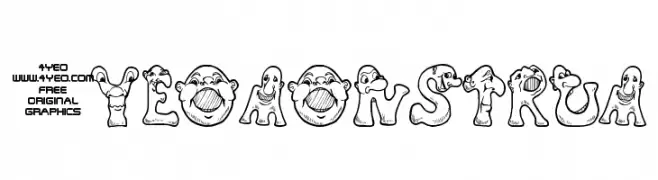
![4YEOmonstrum font caratteri gratis]() Scaricare 1648 Downloads@WebFont
Scaricare 1648 Downloads@WebFont -
( Fonts by wep )
A bold, rounded font with a playful and whimsical style.
![Gombal font caratteri gratis]() Scaricare 1647 Downloads@WebFont
Scaricare 1647 Downloads@WebFont -
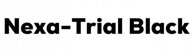
( Fonts by Fontfabric - Svetoslav Simov - Personal-use only. For commercial use please contact owner. )
A bold, modern font with clean, geometric lines and excellent readability.
![Nexa-Trial Black font caratteri gratis]() Scaricare 1647 Downloads@WebFont
Scaricare 1647 Downloads@WebFont -
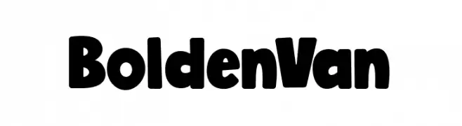
( Fonts by Alexa )
A bold, playful font with thick, rounded characters and a friendly vibe.
![BoldenVan font caratteri gratis]() Scaricare 1647 Downloads@WebFont
Scaricare 1647 Downloads@WebFont -
![Jirogi font caratteri gratis]() Scaricare 1647 Downloads@WebFont
Scaricare 1647 Downloads@WebFont -
( Roger White - web.archive.org/web/20120416090521/www.rogersfonts.org.uk/ )
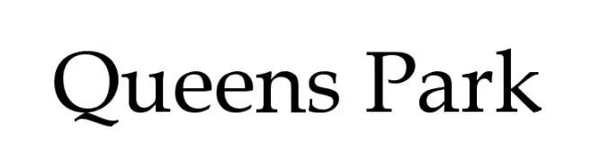
A classic serif font with elegant strokes and refined proportions.
![Queens Park font caratteri gratis]() Scaricare 1647 Downloads@WebFont
Scaricare 1647 Downloads@WebFont -
( Pablo Impallari - www.impallari.com/ )
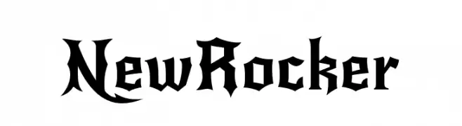
A bold, gothic-inspired font with sharp, angular lines and dramatic serifs.
![NewRocker font caratteri gratis]() Scaricare 1647 Downloads@WebFont
Scaricare 1647 Downloads@WebFont -
( Fonts by www.tipometar.org )
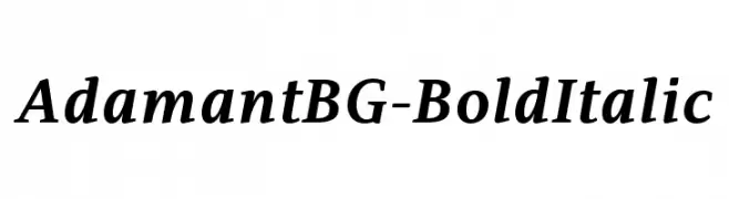
A bold and italic font with a dynamic slant and elegant curves.
![AdamantBG-BoldItalic font caratteri gratis]() Scaricare 1647 Downloads@WebFont
Scaricare 1647 Downloads@WebFont -
![Glitch0 font caratteri gratis]() Scaricare 1647 Downloads@WebFont
Scaricare 1647 Downloads@WebFont -
( Fonts by Nick Curtis - www.nicksfonts.com )
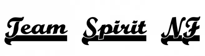
A bold, cursive font with a shadow effect, perfect for decorative and branding uses.
![Team Spirit NF font caratteri gratis]() Scaricare 1647 Downloads@WebFont
Scaricare 1647 Downloads@WebFont -
( Fonts by wepfont - Wahyu Eka Prasetya - Personal-use only. For commercial use please contact owner. )
A bold, modern sans-serif font with clean lines and strong legibility.
![AREA KILOMETER 50 font caratteri gratis]() Scaricare 1646 Downloads@WebFont
Scaricare 1646 Downloads@WebFont -
( Fonts by Castcraft Software - OPTI Fonts Archive - opti.netii.net - Personal-use only. For commercial use please contact owner. )
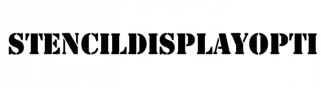
A bold, stencil-style font with distinct breaks, ideal for impactful headlines.
![StencilDisplayOpti font caratteri gratis]() Scaricare 1646 Downloads@WebFont
Scaricare 1646 Downloads@WebFont -
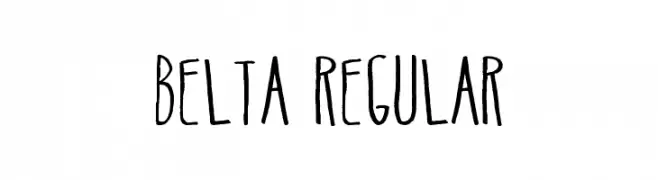
Caratteri di antipixel. For commercial use please contact the owner.
![Belta Regular font caratteri gratis]() Scaricare 1646 Downloads@WebFont
Scaricare 1646 Downloads@WebFont -
![Backcab Extra Crispy font caratteri gratis]() Scaricare 1646 Downloads@WebFont
Scaricare 1646 Downloads@WebFont -
![Enigmatic font caratteri gratis]() Scaricare 1646 Downloads@WebFont
Scaricare 1646 Downloads@WebFont -
( Michael D. Adams - www.triskele.com/roadgeek-fonts/ )
A bold, geometric typeface with strong lines and excellent readability.
![Roadgeek 2005 Transport Heavy font caratteri gratis]() Scaricare 1645 Downloads@WebFont
Scaricare 1645 Downloads@WebFont


Quali sono i font più popolari adesso?
Poppins, Roboto, Montserrat, Open Sans e Lato sono molto usati per le forme pulite e l'ampia applicabilità — dall'identità di marca alle landing page e ai poster.
Quali font si usano spesso nei loghi?
Le sans serif geometriche (es. Poppins, famiglie in stile Gotham) sono scelte comuni per un branding pulito e scalabile. Per un tocco personale restano valide script e stili manoscritti. Abbina un display deciso per i titoli a un corpo testo neutro per riconoscibilità ed equilibrio.
Ogni quanto si aggiorna la lista?
Con regolarità, in base ai download e all'attività reale. Torna spesso per scoprire in anticipo le nuove preferite.
💡 Consiglio: aggiungi ai preferiti — le tendenze cambiano in fretta e i font top di oggi possono ispirare il rebranding di domani.