Benvenuto nelle Font Più Popolari — dove popolarità e qualità si incontrano. Qui trovi i font più scaricati e usati dell'anno. Se cerchi scelte sicure per logo, web o social, inizia da qui.
Ogni font top si distingue per equilibrio, leggibilità e versatilità. Troverai sans serif moderne, script eleganti, serif vintage e display minimalisti.
-
( Google Web Fonts )
A bold, horror-themed font with a dripping, irregular design.
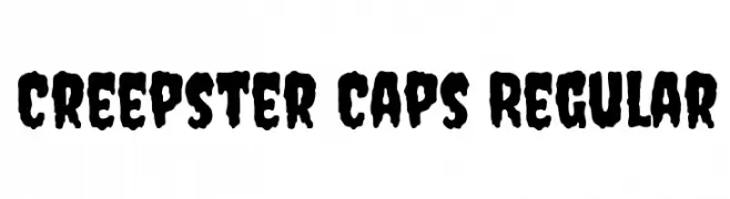 Scaricare 1668 Downloads@WebFont
 -
( Fonts by Jacob Fisher - www.pizzadude.dk )
A playful, rounded font with bold, smooth curves and a friendly appearance.
![Bubbleboy font caratteri gratis]() Scaricare 1668 Downloads@WebFont
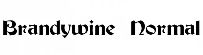
Scaricare 1668 Downloads@WebFont -
![Brandywine Normal font caratteri gratis]() Scaricare 1668 Downloads@WebFont
Scaricare 1668 Downloads@WebFont -
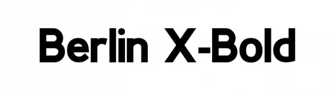
( Fonts by Antonio Rodrigues Jr - Personal-use only. For commercial use please contact owner. )
A bold, geometric sans-serif font with clean lines and uniform strokes.
![Berlin X-Bold font caratteri gratis]() Scaricare 1667 Downloads@WebFont
Scaricare 1667 Downloads@WebFont -
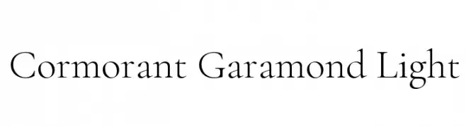
( Copyright (c) 2015, Christian Thalmann and the Cormorant Project Authors (github.com/CatharsisFonts/Cormorant) )
A classic serif font with high contrast and elegant thin strokes.
![Cormorant Garamond Light font caratteri gratis]() Scaricare 1667 Downloads@WebFont
Scaricare 1667 Downloads@WebFont -
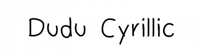
-
![Dudu Cyrillic font caratteri gratis]() Scaricare 1667 Downloads@WebFont
Scaricare 1667 Downloads@WebFont -
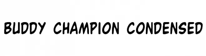
( Fonts by Daniel Zadorozny - www.iconian.com - Free for personal use )
A playful, bold, and hand-drawn font with rounded edges and a condensed style.
![Buddy Champion Condensed font caratteri gratis]() Scaricare 1667 Downloads@WebFont
Scaricare 1667 Downloads@WebFont -
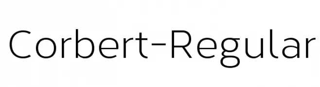
( The Northern Block - Jonathan Hill - www.thenorthernblock.co.uk )
A modern, geometric sans-serif font with balanced proportions and uniform stroke width.
![Corbert-Regular font caratteri gratis]() Scaricare 1666 Downloads@WebFont
Scaricare 1666 Downloads@WebFont -
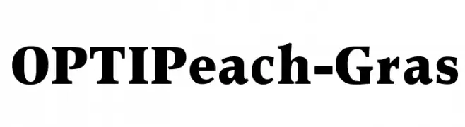
( Fonts by Castcraft Software - OPTI Fonts Archive - opti.netii.net - Personal-use only. For commercial use please contact owner. )
A bold, classic serif font with strong strokes and pronounced serifs.
![OPTIPeach-Gras font caratteri gratis]() Scaricare 1666 Downloads@WebFont
Scaricare 1666 Downloads@WebFont -
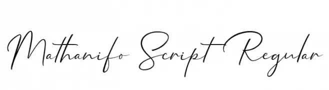
( Cotbada Studio - Isfani - creativemarket.com/Cotbada_studio )
A modern, elegant script font with a flowing, handwritten style.
![Mathanifo Script Regular font caratteri gratis]() Scaricare 1665 Downloads@WebFont
Scaricare 1665 Downloads@WebFont -
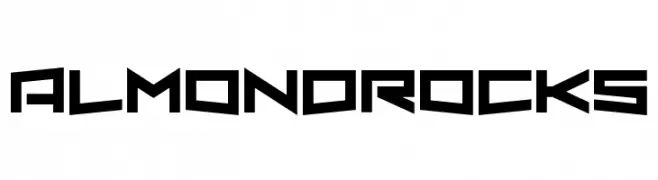
( Fonts by Chequered Ink )
A bold, geometric font with sharp angles and a futuristic style.
![Almond Rocks font caratteri gratis]() Scaricare 1665 Downloads@WebFont
Scaricare 1665 Downloads@WebFont -
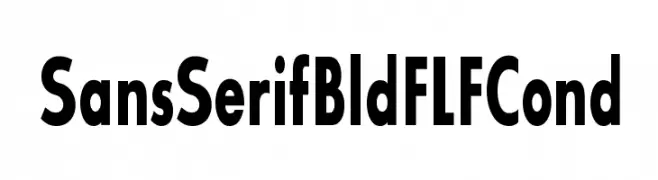
( Fonts by Casady & Greene )
A bold, condensed sans-serif font with a modern and clean appearance.
![SansSerifBldFLFCond font caratteri gratis]() Scaricare 1665 Downloads@WebFont
Scaricare 1665 Downloads@WebFont -
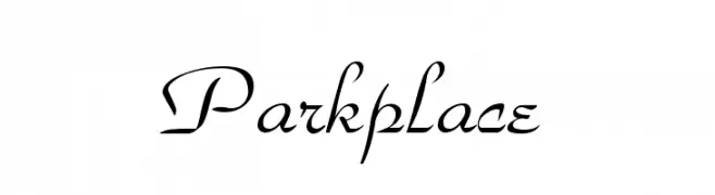
![Parkplace font caratteri gratis]() Scaricare 1665 Downloads
Scaricare 1665 Downloads -
![Hootie! font caratteri gratis]() Scaricare 1665 Downloads@WebFont
Scaricare 1665 Downloads@WebFont -
Caratteri di glyphstyle. For commercial use please contact the owner.
( NOTE: This demo font is for PERSONAL USE ONLY! But any donation are very appreciated. Paypal account for donation : https://www.paypal.me/dimasardhi full version: https://www.glyphstyle.net/mofulina/ contact us at styleglyph@gmail.com And follow my i )
A bold, high-contrast serif font with elegant and classic styling.
![Mofulina Regular font caratteri gratis]() Scaricare 1664 Downloads@WebFont
Scaricare 1664 Downloads@WebFont -
( Fonts by Octotype - www.foundmyfont.com - Personal-use only. For commercial use please contact owner. )
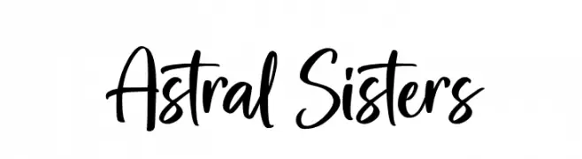
A lively handwritten font with dynamic, flowing letterforms.
![Astral Sisters font caratteri gratis]() Scaricare 1664 Downloads@WebFont
Scaricare 1664 Downloads@WebFont -
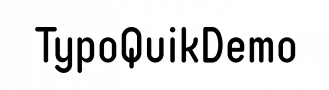
( Fonts by www.studiotypo.com - Personal-use only. For commercial use please contact owner. )
A modern, rounded sans-serif font with excellent readability.
![Typo Quik Demo font caratteri gratis]() Scaricare 1664 Downloads@WebFont
Scaricare 1664 Downloads@WebFont -
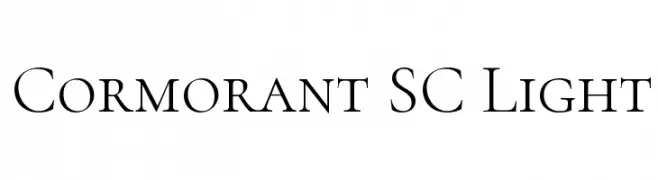
( Copyright (c) 2015, Christian Thalmann and the Cormorant Project Authors (github.com/CatharsisFonts/Cormorant) )
Elegant serif font with high contrast and refined strokes.
![Cormorant SC Light font caratteri gratis]() Scaricare 1664 Downloads@WebFont
Scaricare 1664 Downloads@WebFont -
![101! Witches Hat font caratteri gratis]() Scaricare 1664 Downloads@WebFont
Scaricare 1664 Downloads@WebFont -
( Fonts by K. Steens )
A modern script font with geometric accents and a dynamic, flowing style.
![Velocette font caratteri gratis]() Scaricare 1664 Downloads@WebFont
Scaricare 1664 Downloads@WebFont -
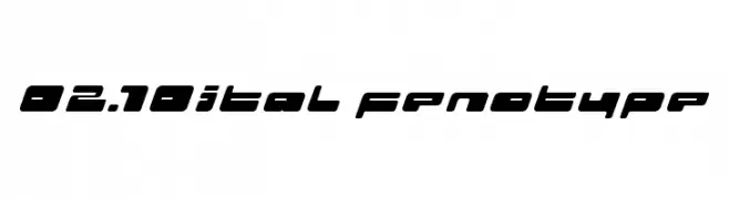
( Fonts by Emil Bertell - www.fenotype.com )
A bold, futuristic font with geometric shapes and smooth curves, slightly italicized for a dynamic look.
![02.10ital fenotype font caratteri gratis]() Scaricare 1664 Downloads@WebFont
Scaricare 1664 Downloads@WebFont -
( Fonts by Barland )
An elegant script font with flowing lines and decorative swirls.
![hellifademo font caratteri gratis]() Scaricare 1663 Downloads@WebFont
Scaricare 1663 Downloads@WebFont -
![AButterflyOnaDaffodil font caratteri gratis]() Scaricare 1663 Downloads@WebFont
Scaricare 1663 Downloads@WebFont -
( Fonts by Casady & Greene )
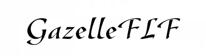
A sophisticated, calligraphic font with elegant, flowing strokes and sharp serifs.
![GazelleFLF font caratteri gratis]() Scaricare 1663 Downloads@WebFont
Scaricare 1663 Downloads@WebFont -
![Rothenburg Decorative Normal font caratteri gratis]() Scaricare 1663 Downloads
Scaricare 1663 Downloads -
![ER Bukinist Mac Bold font caratteri gratis]() Scaricare 1663 Downloads@WebFont
Scaricare 1663 Downloads@WebFont -
( Fonts by Daniel Zadorozny - www.iconian.com - Free for personal use )
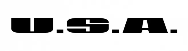
A bold, geometric stencil-style font with strong, angular lines.
![U.S.A. font caratteri gratis]() Scaricare 1663 Downloads@WebFont
Scaricare 1663 Downloads@WebFont -
![Aovel Neo font caratteri gratis]() Scaricare 1662 Downloads@WebFont
Scaricare 1662 Downloads@WebFont -
( Fonts by a Anton Krylov . Personal-use only. For commercial use please contact owner. )
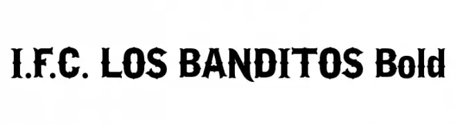
A bold, decorative font with a Western-inspired design, featuring sharp edges and unique serifs.
![I.F.C. LOS BANDITOS Bold font caratteri gratis]() Scaricare 1662 Downloads@WebFont
Scaricare 1662 Downloads@WebFont -
![Likhari_R Normal font caratteri gratis]() Scaricare 1662 Downloads@WebFont
Scaricare 1662 Downloads@WebFont -
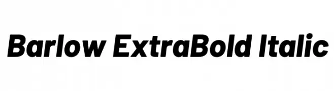
( Copyright 2017 The Barlow Project Authors (https://github.com/jpt/barlow) )
A bold, modern italic typeface with a clean and dynamic style.
![Barlow ExtraBold Italic font caratteri gratis]() Scaricare 1661 Downloads@WebFont
Scaricare 1661 Downloads@WebFont -
( Fonts by Jovanny Lemonad - typetype.ru - Personal-use only. For commercial use please contact owner. )
A lively, handwritten-style font with dynamic strokes and a casual feel.
![HitchHike font caratteri gratis]() Scaricare 1661 Downloads@WebFont
Scaricare 1661 Downloads@WebFont -
( Fonts by Kimberly Geswein )
A playful, chunky font with rounded, bold letters perfect for children's materials.
![KG Miss Kindy Chunky font caratteri gratis]() Scaricare 1661 Downloads@WebFont
Scaricare 1661 Downloads@WebFont -
![NCAA Washington Huskies font caratteri gratis]() Scaricare 1661 Downloads@WebFont
Scaricare 1661 Downloads@WebFont -
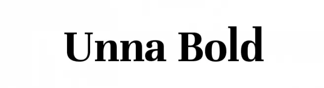
( Copyright 2016 The Unna Project Authors (omnibus.type@gmail.com) )
A bold serif font with strong vertical strokes and subtle curves, offering a classic yet modern appeal.
![Unna Bold font caratteri gratis]() Scaricare 1661 Downloads@WebFont
Scaricare 1661 Downloads@WebFont


Quali sono i font più popolari adesso?
Poppins, Roboto, Montserrat, Open Sans e Lato sono molto usati per le forme pulite e l'ampia applicabilità — dall'identità di marca alle landing page e ai poster.
Quali font si usano spesso nei loghi?
Le sans serif geometriche (es. Poppins, famiglie in stile Gotham) sono scelte comuni per un branding pulito e scalabile. Per un tocco personale restano valide script e stili manoscritti. Abbina un display deciso per i titoli a un corpo testo neutro per riconoscibilità ed equilibrio.
Ogni quanto si aggiorna la lista?
Con regolarità, in base ai download e all'attività reale. Torna spesso per scoprire in anticipo le nuove preferite.
💡 Consiglio: aggiungi ai preferiti — le tendenze cambiano in fretta e i font top di oggi possono ispirare il rebranding di domani.