Benvenuto nelle Font Più Popolari — dove popolarità e qualità si incontrano. Qui trovi i font più scaricati e usati dell'anno. Se cerchi scelte sicure per logo, web o social, inizia da qui.
Ogni font top si distingue per equilibrio, leggibilità e versatilità. Troverai sans serif moderne, script eleganti, serif vintage e display minimalisti.
-
 Scaricare 464 Downloads@WebFont
 -
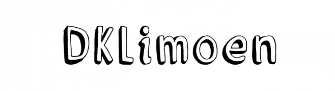
( Fonts by David Kerkhoff - www.hanodedphotography.com )
A playful, hand-drawn font with a bold, three-dimensional effect.
![DKLimoen font caratteri gratis]() Scaricare 464 Downloads@WebFont
Scaricare 464 Downloads@WebFont -
Caratteri di Delcane. For commercial use please contact the owner.
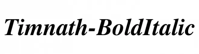
( Classic roman typeface, modified and curated from the STIX Fonts (TM). Free for unlimited private and commercial use. SIL Open Font Licence (OFL) Version 1.1. )
A bold, italicized font with classic elegance and dynamic flair.
![Timnath-BoldItalic font caratteri gratis]() Scaricare 464 Downloads@WebFont
Scaricare 464 Downloads@WebFont -
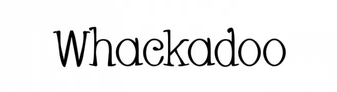
( Fonts by Apostrophic Lab )
A playful and whimsical font with curly, irregular letterforms.
![Whackadoo font caratteri gratis]() Scaricare 464 Downloads@WebFont
Scaricare 464 Downloads@WebFont -
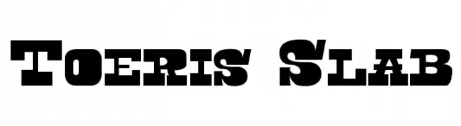
( Fonts by Fernando Carvente - serifdechocolate.wordpress.com )
A bold slab serif font with strong, block-like serifs and a robust presence.
![Toeris Slab font caratteri gratis]() Scaricare 464 Downloads@WebFont
Scaricare 464 Downloads@WebFont -
-
( Fonts by Uusimaa Type Foundry Inc - Personal-use only. For commercial use please contact owner. )
A modern sans-serif font with clean lines and a geometric touch.
![splekta font caratteri gratis]() Scaricare 464 Downloads@WebFont
Scaricare 464 Downloads@WebFont -
( Fonts by Castcraft Software - OPTI Fonts Archive - opti.netii.net - Personal-use only. For commercial use please contact owner. )
An elegant serif font with sharp angles and a classic style.
![OPTIRoyal font caratteri gratis]() Scaricare 464 Downloads@WebFont
Scaricare 464 Downloads@WebFont -
( Fonts by www.fontscafe.com )
A vintage, distressed serif font with a textured, aged appearance.
![Old printing press_FREE-version font caratteri gratis]() Scaricare 464 Downloads@WebFont
Scaricare 464 Downloads@WebFont -
( Copyright (c) 2015 Indian Type Foundry (info@indiantypefoundry.com) )
A clean, modern sans-serif font with a light weight and excellent readability.
![Hind Kochi Light font caratteri gratis]() Scaricare 464 Downloads@WebFont
Scaricare 464 Downloads@WebFont -
( bitanga.co )
A bold, playful font with rounded, thick strokes and a whimsical touch.
![Oneer font caratteri gratis]() Scaricare 464 Downloads@WebFont
Scaricare 464 Downloads@WebFont


Quali sono i font più popolari adesso?
Poppins, Roboto, Montserrat, Open Sans e Lato sono molto usati per le forme pulite e l'ampia applicabilità — dall'identità di marca alle landing page e ai poster.
Quali font si usano spesso nei loghi?
Le sans serif geometriche (es. Poppins, famiglie in stile Gotham) sono scelte comuni per un branding pulito e scalabile. Per un tocco personale restano valide script e stili manoscritti. Abbina un display deciso per i titoli a un corpo testo neutro per riconoscibilità ed equilibrio.
Ogni quanto si aggiorna la lista?
Con regolarità, in base ai download e all'attività reale. Torna spesso per scoprire in anticipo le nuove preferite.
💡 Consiglio: aggiungi ai preferiti — le tendenze cambiano in fretta e i font top di oggi possono ispirare il rebranding di domani.