Benvenuto nelle Font Più Popolari — dove popolarità e qualità si incontrano. Qui trovi i font più scaricati e usati dell'anno. Se cerchi scelte sicure per logo, web o social, inizia da qui.
Ogni font top si distingue per equilibrio, leggibilità e versatilità. Troverai sans serif moderne, script eleganti, serif vintage e display minimalisti.
-
 Scaricare 465 Downloads@WebFont
 -
![Malifaux Rodent Edition Normal font caratteri gratis]() Scaricare 465 Downloads@WebFont
Scaricare 465 Downloads@WebFont -
( Fonts by Garisman Studio )
A bold, playful font with rounded, hand-drawn characters.
![CORDON font caratteri gratis]() Scaricare 465 Downloads@WebFont
Scaricare 465 Downloads@WebFont -
( Fonts by Daniel Zadorozny - www.iconian.com )
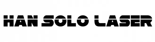
A bold, geometric font with a futuristic, sci-fi style.
![Han Solo Laser font caratteri gratis]() Scaricare 465 Downloads@WebFont
Scaricare 465 Downloads@WebFont -
( Fonts by Rodrigo German - RASDESIGN )
Cartoon mascot font with bold outlines and playful characters.
![HELLO CONDORITO font caratteri gratis]() Scaricare 465 Downloads@WebFont
Scaricare 465 Downloads@WebFont -
-
( Fonts by Kurdz - vividbluezz.weebly.com )
A bold, energetic handwritten font with expressive strokes and a playful vibe.
![Rodi de Asis font caratteri gratis]() Scaricare 465 Downloads@WebFont
Scaricare 465 Downloads@WebFont -
( Fonts by Omega Font Labs )
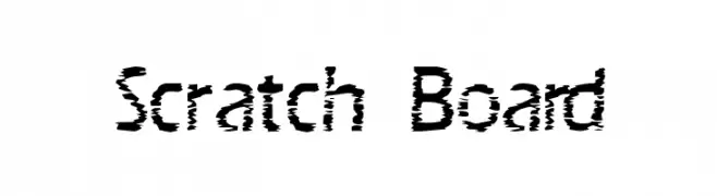
A bold, distressed font with a scratched, edgy appearance.
![Scratch Board font caratteri gratis]() Scaricare 465 Downloads@WebFont
Scaricare 465 Downloads@WebFont -
( Fonts by Situjuh Nazara - 7ntypes.com - Personal-use only. For commercial use please contact owner. )
A dynamic script font with fluid, cursive strokes and a handwritten feel.
![Hamilyn font caratteri gratis]() Scaricare 465 Downloads@WebFont
Scaricare 465 Downloads@WebFont -
( Fonts by Sora Sagano - www.dotcolon.net )
A modern, geometric font with sleek lines and rounded edges.
![Eunomia font caratteri gratis]() Scaricare 465 Downloads@WebFont
Scaricare 465 Downloads@WebFont -
( Fonts by Maelle.K - Thomas Boucherie )
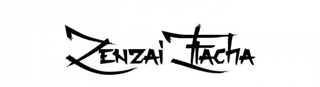
A bold, graffiti-inspired font with sharp angles and dynamic strokes.
![Zenzai Itacha font caratteri gratis]() Scaricare 465 Downloads@WebFont
Scaricare 465 Downloads@WebFont


Quali sono i font più popolari adesso?
Poppins, Roboto, Montserrat, Open Sans e Lato sono molto usati per le forme pulite e l'ampia applicabilità — dall'identità di marca alle landing page e ai poster.
Quali font si usano spesso nei loghi?
Le sans serif geometriche (es. Poppins, famiglie in stile Gotham) sono scelte comuni per un branding pulito e scalabile. Per un tocco personale restano valide script e stili manoscritti. Abbina un display deciso per i titoli a un corpo testo neutro per riconoscibilità ed equilibrio.
Ogni quanto si aggiorna la lista?
Con regolarità, in base ai download e all'attività reale. Torna spesso per scoprire in anticipo le nuove preferite.
💡 Consiglio: aggiungi ai preferiti — le tendenze cambiano in fretta e i font top di oggi possono ispirare il rebranding di domani.