Benvenuto nelle Font Più Popolari — dove popolarità e qualità si incontrano. Qui trovi i font più scaricati e usati dell'anno. Se cerchi scelte sicure per logo, web o social, inizia da qui.
Ogni font top si distingue per equilibrio, leggibilità e versatilità. Troverai sans serif moderne, script eleganti, serif vintage e display minimalisti.
-
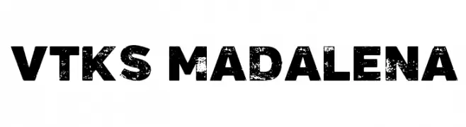
( Fonts by douglas vitkauskas - Personal-use only. For commercial use please contact owner. )
A bold, distressed font with a textured, vintage appearance.
 Scaricare 457 Downloads@WebFont
 -
( Fonts by Ef Studio - Luthfi Ef - Personal-use only. For commercial use please contact owner. )
An elegant script font with flowing, interconnected letters and intricate flourishes.
![milove font caratteri gratis]() Scaricare 457 Downloads@WebFont
Scaricare 457 Downloads@WebFont -
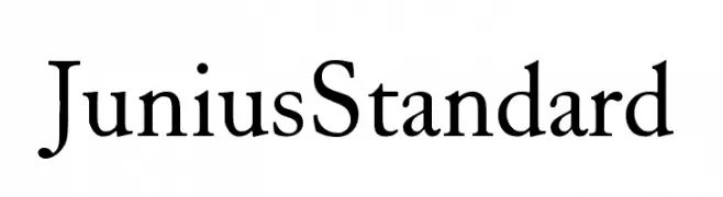
( Peter S. Baker - faculty.virginia.edu/oldenglish/ )
A classic serif font with elegant and refined characteristics.
![JuniusStandard font caratteri gratis]() Scaricare 457 Downloads@WebFont
Scaricare 457 Downloads@WebFont -
![The Quickest Shift font caratteri gratis]() Scaricare 457 Downloads@WebFont
Scaricare 457 Downloads@WebFont -
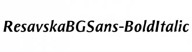
( Fonts by www.tipometar.org )
A bold, italic sans-serif font with a modern and dynamic style.
![ResavskaBGSans-BoldItalic font caratteri gratis]() Scaricare 457 Downloads@WebFont
Scaricare 457 Downloads@WebFont -
-
( Fonts by Satriotype - Satriotype - Bagas Satrio - Personal-use only. For commercial use please contact owner. )
A bold, flowing script font with elegant cursive letterforms.
![Miganty font caratteri gratis]() Scaricare 457 Downloads@WebFont
Scaricare 457 Downloads@WebFont -
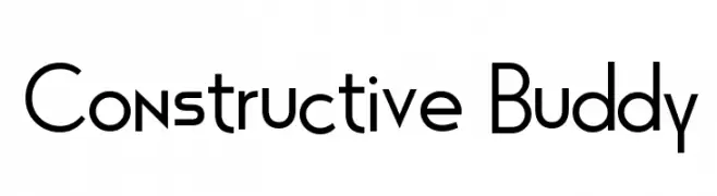
![Constructive Buddy font caratteri gratis]() Scaricare 457 Downloads@WebFont
Scaricare 457 Downloads@WebFont -
( Fonts by www.peter-wiegel.de. Personal-use only. For commercial use please contact owner. )
A futuristic, geometric font with sharp angles and clean lines.
![Casa Sans font caratteri gratis]() Scaricare 457 Downloads@WebFont
Scaricare 457 Downloads@WebFont -
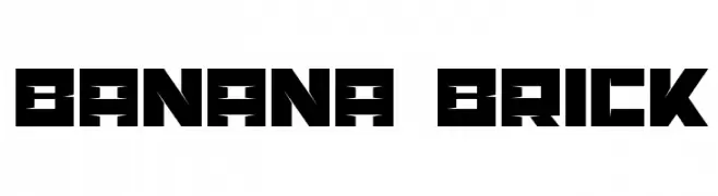
( Artmaker - www.behance.net/artmaker )
A bold, geometric font with a blocky, industrial style.
![Banana Brick font caratteri gratis]() Scaricare 457 Downloads@WebFont
Scaricare 457 Downloads@WebFont -
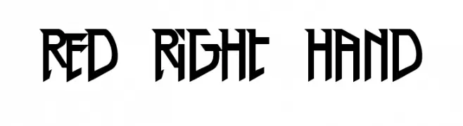
( Fonts by Nate Piekos - www.blambot.com )
A bold, angular font with a modern and edgy design.
![Red Right Hand font caratteri gratis]() Scaricare 457 Downloads@WebFont
Scaricare 457 Downloads@WebFont


Quali sono i font più popolari adesso?
Poppins, Roboto, Montserrat, Open Sans e Lato sono molto usati per le forme pulite e l'ampia applicabilità — dall'identità di marca alle landing page e ai poster.
Quali font si usano spesso nei loghi?
Le sans serif geometriche (es. Poppins, famiglie in stile Gotham) sono scelte comuni per un branding pulito e scalabile. Per un tocco personale restano valide script e stili manoscritti. Abbina un display deciso per i titoli a un corpo testo neutro per riconoscibilità ed equilibrio.
Ogni quanto si aggiorna la lista?
Con regolarità, in base ai download e all'attività reale. Torna spesso per scoprire in anticipo le nuove preferite.
💡 Consiglio: aggiungi ai preferiti — le tendenze cambiano in fretta e i font top di oggi possono ispirare il rebranding di domani.