Benvenuto nelle Font Più Popolari — dove popolarità e qualità si incontrano. Qui trovi i font più scaricati e usati dell'anno. Se cerchi scelte sicure per logo, web o social, inizia da qui.
Ogni font top si distingue per equilibrio, leggibilità e versatilità. Troverai sans serif moderne, script eleganti, serif vintage e display minimalisti.
-
( Fonts by MonkeyRoodles Fonts )
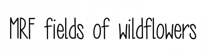
A playful, handwritten font with tall, narrow letters and consistent stroke width.
 Scaricare 456 Downloads@WebFont
 -
( Fonts by Valiant Project )
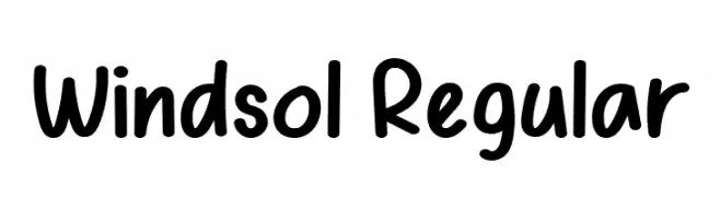
Casual handwritten font with rounded edges.
![Windsol Regular font caratteri gratis]() Scaricare 456 Downloads@WebFont
Scaricare 456 Downloads@WebFont -
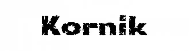
![Kornik font caratteri gratis]() Scaricare 456 Downloads@WebFont
Scaricare 456 Downloads@WebFont -
( Fonts by Wahyu Eka Prasetya - wepfont.com - Personal-use only. For commercial use please contact owner. )
A bold, playful handwritten font with thick strokes and dynamic shapes.
![Gusta font caratteri gratis]() Scaricare 456 Downloads@WebFont
Scaricare 456 Downloads@WebFont -
( Fonts by Levi Szekeres - www.loremipsum.ro. Personal-use only. For commercial use please contact owner. )
A bold, expressive handwritten font with a marker-like appearance.
![LeviMarker font caratteri gratis]() Scaricare 456 Downloads@WebFont
Scaricare 456 Downloads@WebFont -
-
( Copyright 2016 The Nunito Project Authors (contact@sansoxygen.com) )
A modern, bold, and italic sans-serif font with a friendly and approachable style.
![Nunito Sans ExtraBold Italic font caratteri gratis]() Scaricare 456 Downloads@WebFont
Scaricare 456 Downloads@WebFont -
( Fonts by Typodermic Fonts )
A bold, monospaced font with a modern and structured design.
![NK57MonospaceExEb-Regular font caratteri gratis]() Scaricare 456 Downloads@WebFont
Scaricare 456 Downloads@WebFont -
( JoeeCreative - Joe Creative - creativemarket.com/JoeeCreative )
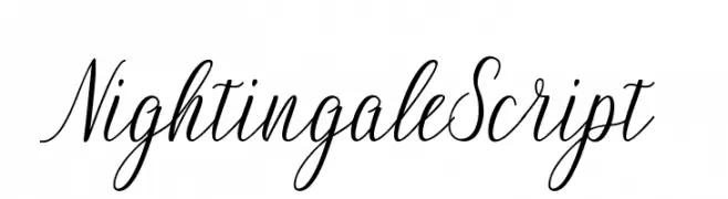
A refined and elegant script font with flowing, connected letters.
![NightingaleScript font caratteri gratis]() Scaricare 456 Downloads@WebFont
Scaricare 456 Downloads@WebFont -
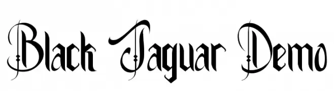
( Fonts by VinType )
An ornate, gothic-inspired font with decorative flourishes.
![Black Jaguar Demo font caratteri gratis]() Scaricare 456 Downloads@WebFont
Scaricare 456 Downloads@WebFont -
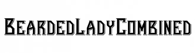
( Fonts by FlatWheat Studios )
A bold, decorative font with sharp angles and intricate details.
![Bearded Lady Combined font caratteri gratis]() Scaricare 456 Downloads@WebFont
Scaricare 456 Downloads@WebFont


Quali sono i font più popolari adesso?
Poppins, Roboto, Montserrat, Open Sans e Lato sono molto usati per le forme pulite e l'ampia applicabilità — dall'identità di marca alle landing page e ai poster.
Quali font si usano spesso nei loghi?
Le sans serif geometriche (es. Poppins, famiglie in stile Gotham) sono scelte comuni per un branding pulito e scalabile. Per un tocco personale restano valide script e stili manoscritti. Abbina un display deciso per i titoli a un corpo testo neutro per riconoscibilità ed equilibrio.
Ogni quanto si aggiorna la lista?
Con regolarità, in base ai download e all'attività reale. Torna spesso per scoprire in anticipo le nuove preferite.
💡 Consiglio: aggiungi ai preferiti — le tendenze cambiano in fretta e i font top di oggi possono ispirare il rebranding di domani.