Benvenuto nelle Font Più Popolari — dove popolarità e qualità si incontrano. Qui trovi i font più scaricati e usati dell'anno. Se cerchi scelte sicure per logo, web o social, inizia da qui.
Ogni font top si distingue per equilibrio, leggibilità e versatilità. Troverai sans serif moderne, script eleganti, serif vintage e display minimalisti.
-
( Fonts by www.type-together.com )
A bold, geometric font with angular lines and a three-dimensional effect.
 Scaricare 455 Downloads@WebFont
 -
( Jonhson Subianto )
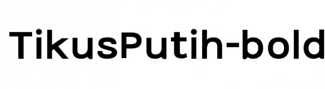
A bold, modern sans-serif font with clean lines and uniform strokes.
![TikusPutih-bold font caratteri gratis]() Scaricare 455 Downloads@WebFont
Scaricare 455 Downloads@WebFont -
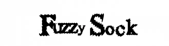
![FuzzySock font caratteri gratis]() Scaricare 455 Downloads@WebFont
Scaricare 455 Downloads@WebFont -
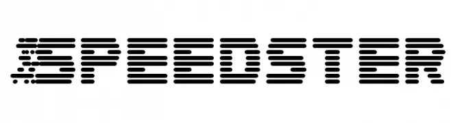
![Speedster font caratteri gratis]() Scaricare 455 Downloads@WebFont
Scaricare 455 Downloads@WebFont -
( Fonts by Kong Font - fontkong.com - Personal-use only. For commercial use please contact owner. )
A playful, casual handwritten font with smooth, flowing letterforms.
![Arbery font caratteri gratis]() Scaricare 455 Downloads@WebFont
Scaricare 455 Downloads@WebFont -
-
( Fonts by www.fontalicious.com )
A bold, geometric font with a 3D effect and sharp angles.
![Dreamy font caratteri gratis]() Scaricare 455 Downloads@WebFont
Scaricare 455 Downloads@WebFont -
( Fonts by HungLan Design - www.hunglandesign.com )
A bold, playful, hand-drawn font with a whimsical and energetic style.
![HL Fantasy1 font caratteri gratis]() Scaricare 455 Downloads@WebFont
Scaricare 455 Downloads@WebFont -
![Comic FX font caratteri gratis]() Scaricare 455 Downloads@WebFont
Scaricare 455 Downloads@WebFont -
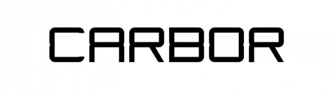
( Marc Clancy - www.marcclancy.com/ )
A futuristic, geometric font with consistent stroke width and angular shapes.
![Carbor font caratteri gratis]() Scaricare 455 Downloads@WebFont
Scaricare 455 Downloads@WebFont -
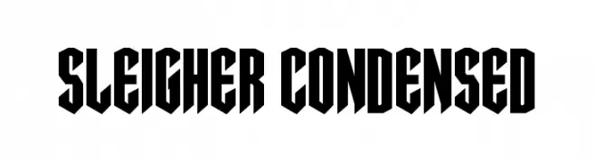
( Fonts by Daniel Zadorozny - www.iconian.com - Personal-use only. For commercial use please contact owner. )
A bold, condensed font with sharp, angular edges and a striking, aggressive appearance.
![Sleigher Condensed font caratteri gratis]() Scaricare 455 Downloads@WebFont
Scaricare 455 Downloads@WebFont


Quali sono i font più popolari adesso?
Poppins, Roboto, Montserrat, Open Sans e Lato sono molto usati per le forme pulite e l'ampia applicabilità — dall'identità di marca alle landing page e ai poster.
Quali font si usano spesso nei loghi?
Le sans serif geometriche (es. Poppins, famiglie in stile Gotham) sono scelte comuni per un branding pulito e scalabile. Per un tocco personale restano valide script e stili manoscritti. Abbina un display deciso per i titoli a un corpo testo neutro per riconoscibilità ed equilibrio.
Ogni quanto si aggiorna la lista?
Con regolarità, in base ai download e all'attività reale. Torna spesso per scoprire in anticipo le nuove preferite.
💡 Consiglio: aggiungi ai preferiti — le tendenze cambiano in fretta e i font top di oggi possono ispirare il rebranding di domani.