Benvenuto nelle Font Più Popolari — dove popolarità e qualità si incontrano. Qui trovi i font più scaricati e usati dell'anno. Se cerchi scelte sicure per logo, web o social, inizia da qui.
Ogni font top si distingue per equilibrio, leggibilità e versatilità. Troverai sans serif moderne, script eleganti, serif vintage e display minimalisti.
-
( Fonts by PutraCetol Studio )
A bold, decorative font with a snowflake pattern, perfect for festive themes.
 Scaricare 62 Downloads@WebFont
 -
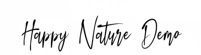
( Fonts by Edric Studio - Personal-use only. For commercial use please contact owner. )
A lively script font with fluid, dynamic strokes and a handwritten calligraphy style.
![Happy Nature Demo font caratteri gratis]() Scaricare 62 Downloads@WebFont
Scaricare 62 Downloads@WebFont -
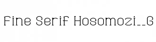
( Fonts by Goma Shin - www.geocities.jp/gomarice_font/ - Personal-use only. For commercial use please contact owner. )
A modern serif font with fine lines and elegant curves.
![Fine Serif Hosomozi__G font caratteri gratis]() Scaricare 62 Downloads@WebFont
Scaricare 62 Downloads@WebFont -
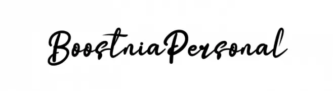
( Fonts by twinletter - Rozikan - Personal-use only. For commercial use please contact owner. )
A cursive, elegant script font with a flowing, handwritten style.
![Boostnia Personal font caratteri gratis]() Scaricare 62 Downloads@WebFont
Scaricare 62 Downloads@WebFont -
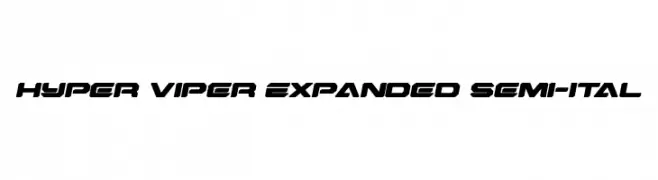
( Fonts by Daniel Zadorozny - www.iconian.com - Personal-use only. For commercial use please contact owner. )
A bold, expanded, and semi-italicized font with a futuristic, angular design.
![Hyper Viper Expanded Semi-Ital font caratteri gratis]() Scaricare 62 Downloads@WebFont
Scaricare 62 Downloads@WebFont -
( Fonts by GGBotNet - Personal-use only. For commercial use please contact owner. )
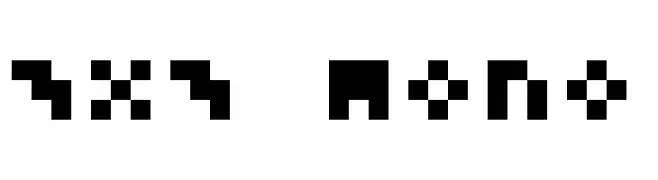
A pixelated, monospaced font with a retro digital aesthetic.
![3x3 Mono font caratteri gratis]() Scaricare 62 Downloads@WebFont
Scaricare 62 Downloads@WebFont -
( Fonts by weknow - Wino S Kadir - Personal-use only. For commercial use please contact owner. )
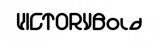
A bold, rounded, and futuristic font with a geometric design.
![VICTORY Bold font caratteri gratis]() Scaricare 62 Downloads@WebFont
Scaricare 62 Downloads@WebFont -
( Fonts by lyanatha - Ana Natalia - Personal-use only. For commercial use please contact owner. )
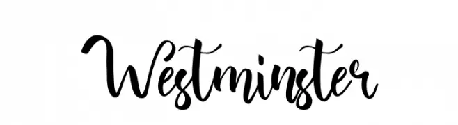
A modern, cursive font with a handwritten, elegant style.
![Westminster font caratteri gratis]() Scaricare 62 Downloads@WebFont
Scaricare 62 Downloads@WebFont -
( Fonts by Wahyu Eka Prasetya - wepfont.com - Personal-use only. For commercial use please contact owner. )
A bold, brush-style font with a hand-painted, artistic appearance.
![Heliuma font caratteri gratis]() Scaricare 62 Downloads@WebFont
Scaricare 62 Downloads@WebFont -
( Fonts by Hendrick Rolandez - Personal-use only. For commercial use please contact owner. )
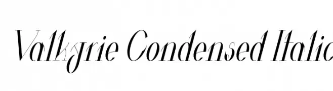
A sleek, condensed italic font with high contrast and elegant design.
![Valkyrie Condensed Italic font caratteri gratis]() Scaricare 62 Downloads@WebFont
Scaricare 62 Downloads@WebFont -
( Fonts by zone108.main.jp - Personal-use only. For commercial use please contact owner. )
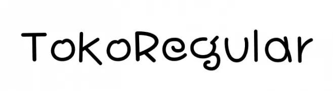
A playful, handwritten font with rounded, smooth strokes and a casual aesthetic.
![Toko Regular font caratteri gratis]() Scaricare 62 Downloads@WebFont
Scaricare 62 Downloads@WebFont -
( Fonts by Md Shohail Bhuian - Personal-use only. For commercial use please contact owner. )
A playful, hand-drawn font with tall, narrow letters and a whimsical style.
![Stay Happy font caratteri gratis]() Scaricare 62 Downloads@WebFont
Scaricare 62 Downloads@WebFont -
( Fonts by deFharo - Fernando Haro - Personal-use only. For commercial use please contact owner. )
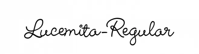
A flowing, cursive font with elegant, connected characters.
![Lucemita-Regular font caratteri gratis]() Scaricare 62 Downloads@WebFont
Scaricare 62 Downloads@WebFont -
( Fonts by Darrell Flood - Personal-use only. For commercial use please contact owner. )
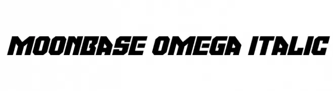
A bold, futuristic italic font with sharp, angular lines and a geometric design.
![Moonbase Omega Italic font caratteri gratis]() Scaricare 62 Downloads@WebFont
Scaricare 62 Downloads@WebFont -
( Fonts by Saridezra - Personal-use only. For commercial use please contact owner. )
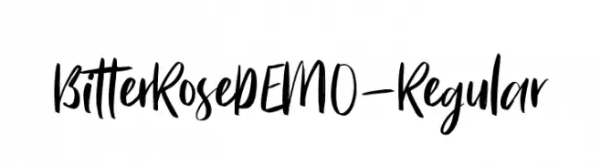
A bold, expressive handwritten font with a brush-like appearance.
![BitterRoseDEMO-Regular font caratteri gratis]() Scaricare 62 Downloads@WebFont
Scaricare 62 Downloads@WebFont -
( Fonts by Lauren Thompson - Personal-use only. For commercial use please contact owner. )
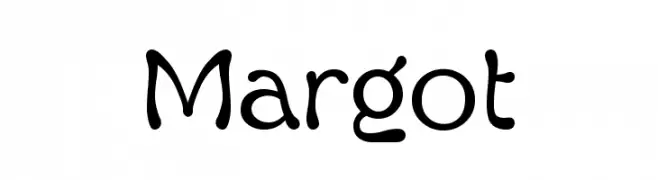
A playful, hand-drawn font with rounded, flowing strokes.
![Margot font caratteri gratis]() Scaricare 62 Downloads@WebFont
Scaricare 62 Downloads@WebFont -
( Nils Stahl )
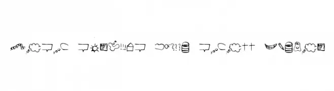
A playful and eclectic mix of hand-drawn symbols and doodles with a whimsical style.
![just symbols and stuff Medium font caratteri gratis]() Scaricare 62 Downloads@WebFont
Scaricare 62 Downloads@WebFont -
( weknow - Wino S Kadir - www.creativefabrica.com/designer/weknow/ )
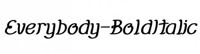
A bold, italic font with a playful and dynamic style.
![Everybody-BoldItalic font caratteri gratis]() Scaricare 62 Downloads@WebFont
Scaricare 62 Downloads@WebFont -
( Andrew Lander - formerly at home.earthlink.net/~landerfam/fonts.html )
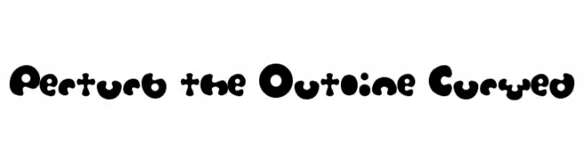
A bold, playful font with rounded, exaggerated curves and a whimsical style.
![Perturb the Outline Curved font caratteri gratis]() Scaricare 62 Downloads@WebFont
Scaricare 62 Downloads@WebFont -
( Fonts by Nick Curtis - Personal-use only. For commercial use please contact owner. )
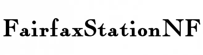
A classic serif font with bold, elegant serifs and a vintage feel.
![FairfaxStationNF font caratteri gratis]() Scaricare 62 Downloads@WebFont
Scaricare 62 Downloads@WebFont -
( Fonts by Edric Studio - Personal-use only. For commercial use please contact owner. )
An elegant, flowing script font with high contrast and graceful loops.
![Alloycia Demo font caratteri gratis]() Scaricare 62 Downloads@WebFont
Scaricare 62 Downloads@WebFont -
( Fonts by Perspectype Studio - Personal-use only. For commercial use please contact owner. )
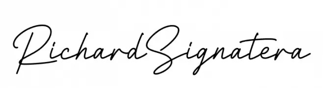
A graceful, cursive script font with a natural handwriting style.
![Richard Signatera font caratteri gratis]() Scaricare 62 Downloads@WebFont
Scaricare 62 Downloads@WebFont -
( Fonts by Pablo Impallari, Rodrigo Fuenzalida (Modified by Dan O. Williams) - Personal-use only. For commercial use please contact owner. )
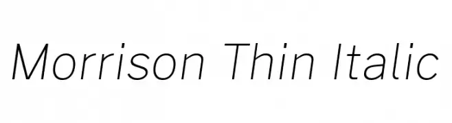
A sleek, thin, and italic font with a modern and elegant design.
![Morrison Thin Italic font caratteri gratis]() Scaricare 62 Downloads@WebFont
Scaricare 62 Downloads@WebFont -
( Fonts by Daniel Zadorozny - www.iconian.com - Personal-use only. For commercial use please contact owner. )
A bold, modern font with a halftone gradient effect and geometric shapes.
![Sleigher Halftone font caratteri gratis]() Scaricare 62 Downloads@WebFont
Scaricare 62 Downloads@WebFont -
( Iconian Fonts - Daniel Zadorozny - www.iconian.com )
A sleek, semi-italic font with geometric precision and a modern aesthetic.
![Fox on the Run Semi-Italic font caratteri gratis]() Scaricare 62 Downloads@WebFont
Scaricare 62 Downloads@WebFont -
( weknow - Wino S Kadir - www.creativefabrica.com/designer/weknow/ )
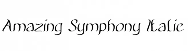
An elegant, italicized font with a flowing, cursive-like style.
![Amazing Symphony Italic font caratteri gratis]() Scaricare 62 Downloads@WebFont
Scaricare 62 Downloads@WebFont -
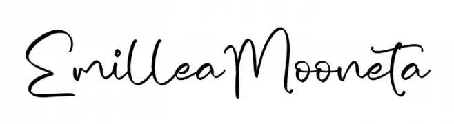
( Fonts by Integritype Studio )
Casual handwritten script with playful, flowing lines.
![Emillea Mooneta font caratteri gratis]() Scaricare 62 Downloads@WebFont
Scaricare 62 Downloads@WebFont -
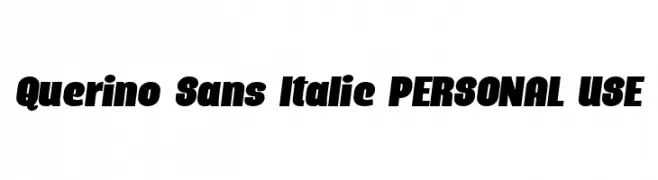
( Fonts by Mans Greback - Personal-use only. For commercial use please contact owner. )
A bold, italicized font with a dynamic and impactful style.
![Querino Sans Italic PERSONAL USE font caratteri gratis]() Scaricare 62 Downloads@WebFont
Scaricare 62 Downloads@WebFont -
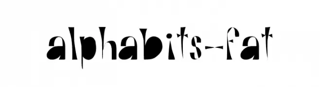
( Heather T. - oohlalaartsy.blogspot.com )
A bold, playful font with exaggerated curves and high contrast, perfect for creative projects.
![Alphabits-Fat font caratteri gratis]() Scaricare 62 Downloads@WebFont
Scaricare 62 Downloads@WebFont -
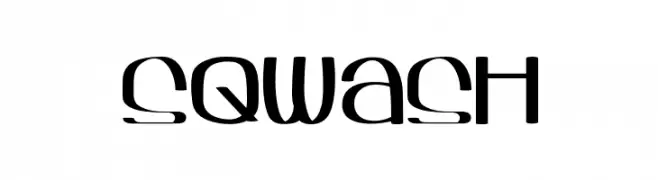
( Heather T. - oohlalaartsy.blogspot.com )
A playful, modern font with elongated, curved characters.
![Sqwash font caratteri gratis]() Scaricare 62 Downloads@WebFont
Scaricare 62 Downloads@WebFont -
( Fonts by Stefani Letter )
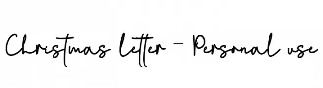
A playful handwritten font with fluid, dynamic strokes and a casual style.
![Christmas letter - Personal use font caratteri gratis]() Scaricare 62 Downloads@WebFont
Scaricare 62 Downloads@WebFont -
( Noto is a trademark of Google Inc. Noto fonts are open source. All Noto fonts are published under the SIL Open Font License, Version 1.1 )
A medium weight, extra condensed font designed for clarity and space efficiency, ideal for Khmer script.
![Noto Serif Khmer ExtraCondensed Medium font caratteri gratis]() Scaricare 62 Downloads@WebFont
Scaricare 62 Downloads@WebFont -
( Fonts by TypeType Foundry )
A geometric, angular font with octagonal shapes and a modern, technical appearance.
![TT Octosquares Trl Cnd Th font caratteri gratis]() Scaricare 62 Downloads@WebFont
Scaricare 62 Downloads@WebFont -
( Noto is a trademark of Google Inc. Noto fonts are open source. All Noto fonts are published under the SIL Open Font License, Version 1.1 )
A modern, clean sans-serif typeface designed for clarity and readability.
![Noto Sans Bengali ExtraLight font caratteri gratis]() Scaricare 62 Downloads@WebFont
Scaricare 62 Downloads@WebFont -
( Fonts by Woodcutter - woodcutter Manero - Personal-use only. For commercial use please contact owner. )
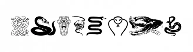
A decorative, snake-themed font with artistic, bold designs.
![Snake mix font caratteri gratis]() Scaricare 62 Downloads@WebFont
Scaricare 62 Downloads@WebFont


Quali sono i font più popolari adesso?
Poppins, Roboto, Montserrat, Open Sans e Lato sono molto usati per le forme pulite e l'ampia applicabilità — dall'identità di marca alle landing page e ai poster.
Quali font si usano spesso nei loghi?
Le sans serif geometriche (es. Poppins, famiglie in stile Gotham) sono scelte comuni per un branding pulito e scalabile. Per un tocco personale restano valide script e stili manoscritti. Abbina un display deciso per i titoli a un corpo testo neutro per riconoscibilità ed equilibrio.
Ogni quanto si aggiorna la lista?
Con regolarità, in base ai download e all'attività reale. Torna spesso per scoprire in anticipo le nuove preferite.
💡 Consiglio: aggiungi ai preferiti — le tendenze cambiano in fretta e i font top di oggi possono ispirare il rebranding di domani.