Benvenuto nelle Font Più Popolari — dove popolarità e qualità si incontrano. Qui trovi i font più scaricati e usati dell'anno. Se cerchi scelte sicure per logo, web o social, inizia da qui.
Ogni font top si distingue per equilibrio, leggibilità e versatilità. Troverai sans serif moderne, script eleganti, serif vintage e display minimalisti.
-
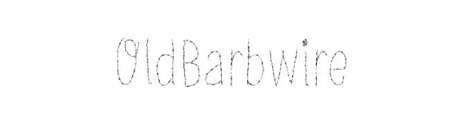
( Fonts by Galdino Otten - Personal-use only. For commercial use please contact owner. )
A rugged, barbed wire-inspired font with a hand-drawn appearance.
 Scaricare 60 Downloads@WebFont
 -
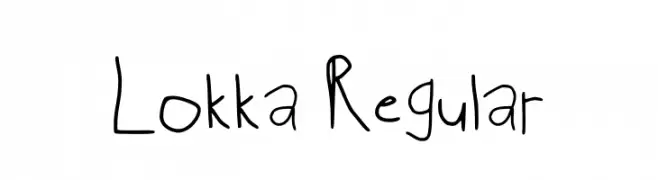
( Fonts by perefect-schraub.jimdosite.com - Personal-use only. For commercial use please contact owner. )
A playful, handwritten font with irregular strokes and a casual style.
![Lokka Regular font caratteri gratis]() Scaricare 60 Downloads@WebFont
Scaricare 60 Downloads@WebFont -
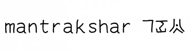
![mantrakshar X02 font caratteri gratis]() Scaricare 60 Downloads@WebFont
Scaricare 60 Downloads@WebFont -
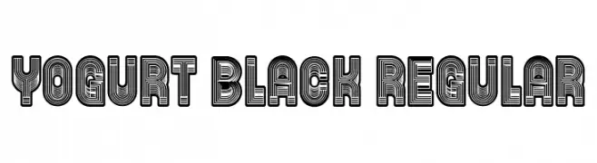
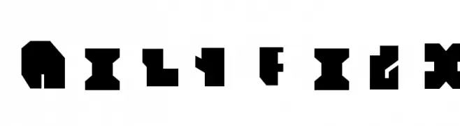
( Fonts by Vladimir Nikolic - https://www.creativefabrica.com/product/educated-deers/ref/144265/ - Personal-use only. For commercial use please contact owner. )
A bold, decorative font with layered line effects creating a modern, dynamic look.
![Yogurt Black Regular font caratteri gratis]() Scaricare 60 Downloads@WebFont
Scaricare 60 Downloads@WebFont -
( Fonts by Azetype Studio - Muh. Aswar - Personal-use only. For commercial use please contact owner. )
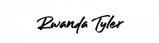
A bold, expressive handwritten font with dynamic strokes.
![Rwanda Tyler font caratteri gratis]() Scaricare 60 Downloads@WebFont
Scaricare 60 Downloads@WebFont -
( Fonts by Darrell Flood - Personal-use only. For commercial use please contact owner. )
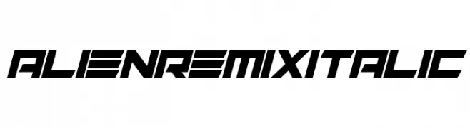
A futuristic, angular italic font with a bold, dynamic style.
![Alien Remix Italic font caratteri gratis]() Scaricare 60 Downloads@WebFont
Scaricare 60 Downloads@WebFont -
( Fonts by Vladimir Nikolic )
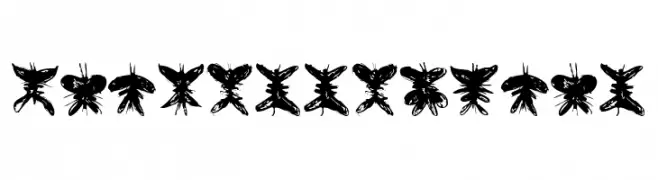
A decorative font with characters designed as butterfly silhouettes.
![Falter Regular font caratteri gratis]() Scaricare 60 Downloads@WebFont
Scaricare 60 Downloads@WebFont -
( Fonts by Vladimir Nikolic - www.creativefabrica.com/designer/vladimirnikolic/ - Personal-use only. For commercial use please contact owner. )
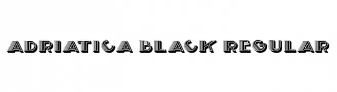
A bold, decorative font with a 3D layered effect and geometric shapes.
![Adriatica Black Regular font caratteri gratis]() Scaricare 60 Downloads@WebFont
Scaricare 60 Downloads@WebFont -
( Fonts by da_only_aan - Personal-use only. For commercial use please contact owner. )
A bold, playful font with rounded edges and a modern, energetic style.
![Alusans font caratteri gratis]() Scaricare 60 Downloads@WebFont
Scaricare 60 Downloads@WebFont -
( Fonts by weknow - Wino S Kadir - Personal-use only. For commercial use please contact owner. )
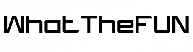
A modern, geometric font with a bold, block-like structure and uniform thickness.
![What The FUN font caratteri gratis]() Scaricare 60 Downloads@WebFont
Scaricare 60 Downloads@WebFont -
( Fonts by Billy Argel Fonts - www.billyargel.com - Personal-use only. For commercial use please contact owner. )
A dynamic, hand-drawn font with a bold, textured appearance.
![QUICKLY PERSONAL USE Regular font caratteri gratis]() Scaricare 60 Downloads@WebFont
Scaricare 60 Downloads@WebFont -
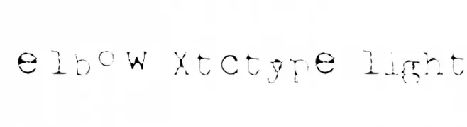
( Elbow - www.elbow.com/fonts )
A distressed, grunge-style font with irregular edges and a worn-out look.
![Elbow-xtctype-Light font caratteri gratis]() Scaricare 59 Downloads@WebFont
Scaricare 59 Downloads@WebFont -
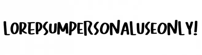
( Fonts by Kong Font )
A bold, playful handwritten font with thick strokes and a casual style.
![Lorepsum PERSONAL USE ONLY! font caratteri gratis]() Scaricare 59 Downloads@WebFont
Scaricare 59 Downloads@WebFont -
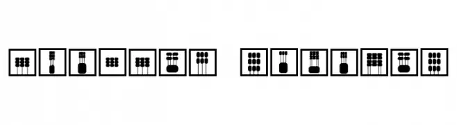
( Fonts by Vladimir Nikolic )
Abstract geometric design with characters in square frames.
![Mouvman Regular font caratteri gratis]() Scaricare 59 Downloads@WebFont
Scaricare 59 Downloads@WebFont -
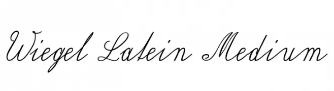
( Fonts by Peter Wiegel - www.peter-wiegel.de - Personal-use only. For commercial use please contact owner. )
An elegant script font with flowing, cursive letters and a classic, sophisticated style.
![Wiegel Latein Medium font caratteri gratis]() Scaricare 59 Downloads@WebFont
Scaricare 59 Downloads@WebFont -
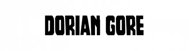
( Fonts by Iconian Fonts - Daniel Zadorozny - Personal-use only. For commercial use please contact owner. )
A bold, blocky font with a vintage poster style, perfect for impactful headlines.
![Dorian Gore font caratteri gratis]() Scaricare 59 Downloads@WebFont
Scaricare 59 Downloads@WebFont -
( Fonts by Iconian Fonts - Daniel Zadorozny - Personal-use only. For commercial use please contact owner. )
A bold, angular font with a futuristic and dynamic design.
![Boomhauer Expanded font caratteri gratis]() Scaricare 59 Downloads@WebFont
Scaricare 59 Downloads@WebFont -
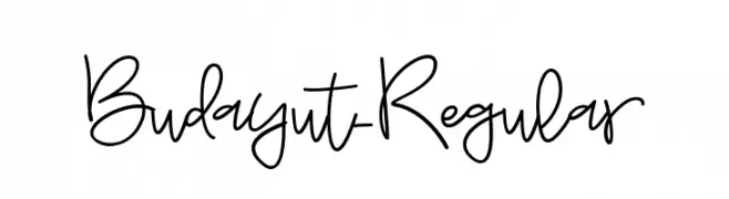
( Fonts by Awanstudioz - Personal-use only. For commercial use please contact owner. )
A playful, handwritten font with fluid and organic strokes.
![Budayut-Regular font caratteri gratis]() Scaricare 59 Downloads@WebFont
Scaricare 59 Downloads@WebFont -
( pointlab studio - creativemarket.com/pointlab )
A graceful script font with elegant loops and high contrast strokes.
![LatashaScript font caratteri gratis]() Scaricare 59 Downloads@WebFont
Scaricare 59 Downloads@WebFont -
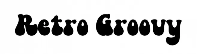
( Fonts by HansCo )
A bold, retro-inspired font with rounded, bubbly letterforms.
![Retro Groovy font caratteri gratis]() Scaricare 59 Downloads@WebFont
Scaricare 59 Downloads@WebFont -
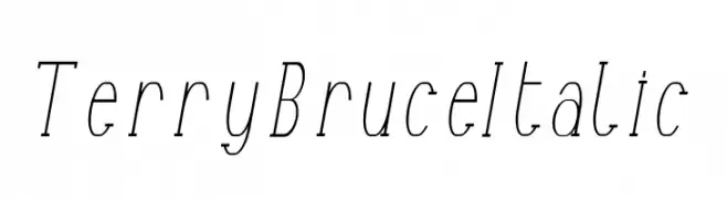
( Fonts by Edric Studio www.creativefabrica.com/designer/edricstudio/ - Personal-use only. For commercial use please contact owner. )
A sleek, elegant italic font with thin, elongated letterforms and a subtle slant.
![Terry Bruce Italic font caratteri gratis]() Scaricare 59 Downloads@WebFont
Scaricare 59 Downloads@WebFont -
( Fonts by Daniel Zadorozny - www.iconian.com - Personal-use only. For commercial use please contact owner. )
Bold, italicized outline font with a modern and dynamic style.
![Elephant Gun Outline Italic font caratteri gratis]() Scaricare 59 Downloads@WebFont
Scaricare 59 Downloads@WebFont -
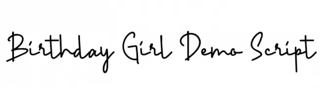
( Fonts by Edric Studio - Personal-use only. For commercial use please contact owner. )
A playful, handwritten script font with a modern and whimsical style.
![Birthday Girl Demo Script font caratteri gratis]() Scaricare 59 Downloads@WebFont
Scaricare 59 Downloads@WebFont -
( Fonts by Faris Graphic Art - Personal-use only. For commercial use please contact owner. )
A bold, playful font with rounded edges and a modern, friendly style.
![Create font caratteri gratis]() Scaricare 59 Downloads@WebFont
Scaricare 59 Downloads@WebFont -
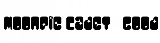
( Font-a-licious - www.fontalicious.com/ )
A bold, space-themed font with playful star cutouts and geometric shapes.
![MoonPie Cadet Good font caratteri gratis]() Scaricare 59 Downloads@WebFont
Scaricare 59 Downloads@WebFont -
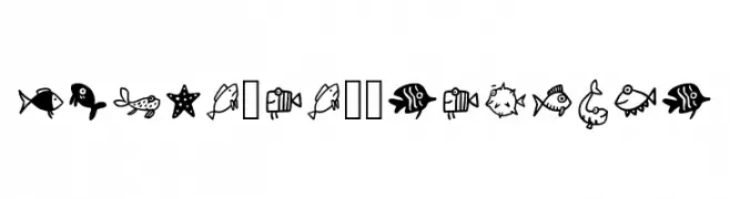
( Fonts by Elia Hvalic )
A whimsical font featuring fish and sea-themed icons in a playful, cartoonish style.
![Fisch_eh01 Regular font caratteri gratis]() Scaricare 59 Downloads@WebFont
Scaricare 59 Downloads@WebFont -
( Misti's Fonts - mistifonts.com/ )
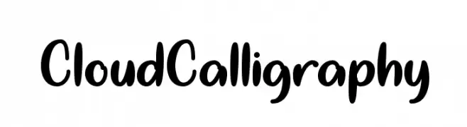
A playful, handwritten font with smooth, rounded edges and a whimsical style.
![CloudCalligraphy font caratteri gratis]() Scaricare 59 Downloads@WebFont
Scaricare 59 Downloads@WebFont -
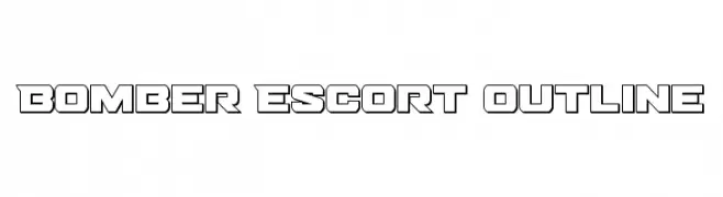
( Fonts by Daniel Zadorozny - www.iconian.com - Personal-use only. For commercial use please contact owner. )
A bold, outlined font with a futuristic and angular design.
![Bomber Escort Outline font caratteri gratis]() Scaricare 59 Downloads@WebFont
Scaricare 59 Downloads@WebFont -
( Fonts by Anwar - Personal-use only. For commercial use please contact owner. )
A lively, handwritten font with dynamic strokes and artistic flair.
![Lettersmith font caratteri gratis]() Scaricare 59 Downloads@WebFont
Scaricare 59 Downloads@WebFont -
( Fonts by Kat`s Fun Fonts - Personal-use only. For commercial use please contact owner. )
A decorative collection of floral and ornamental motifs.
![KR Simple Fleur 3 font caratteri gratis]() Scaricare 59 Downloads@WebFont
Scaricare 59 Downloads@WebFont -
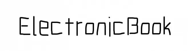
( Fonts by CannotIntoSpaceFonts - KineticPlasma Fonts - Personal-use only. For commercial use please contact owner. )
A playful, hand-drawn font with a modern, informal style.
![Electronic Book font caratteri gratis]() Scaricare 59 Downloads@WebFont
Scaricare 59 Downloads@WebFont -
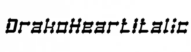
( weknow - Wino S Kadir - www.creativefabrica.com/designer/weknow/ )
A bold, angular, and italicized font with sharp edges and high contrast.
![Drako Heart Italic font caratteri gratis]() Scaricare 59 Downloads@WebFont
Scaricare 59 Downloads@WebFont -
( Giedi Prime )
A bold, geometric font with angular shapes and a futuristic style.
![Tiresian font caratteri gratis]() Scaricare 59 Downloads@WebFont
Scaricare 59 Downloads@WebFont -
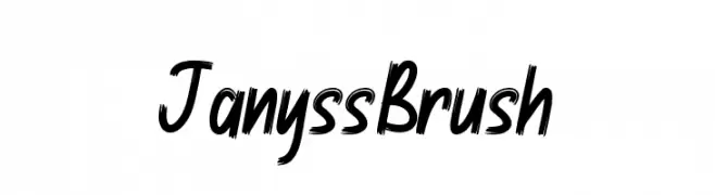
( Fonts by StringLabs - stringlabscreative.com - Personal-use only. For commercial use please contact owner. )
A bold, brush-style font with dynamic and expressive strokes.
![Janyss Brush font caratteri gratis]() Scaricare 59 Downloads@WebFont
Scaricare 59 Downloads@WebFont -
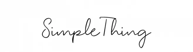
( Fonts by Erik Studio - Personal-use only. For commercial use please contact owner. )
A casual, handwritten font with a modern, flowing style.
![Simple Thing font caratteri gratis]() Scaricare 59 Downloads@WebFont
Scaricare 59 Downloads@WebFont


Quali sono i font più popolari adesso?
Poppins, Roboto, Montserrat, Open Sans e Lato sono molto usati per le forme pulite e l'ampia applicabilità — dall'identità di marca alle landing page e ai poster.
Quali font si usano spesso nei loghi?
Le sans serif geometriche (es. Poppins, famiglie in stile Gotham) sono scelte comuni per un branding pulito e scalabile. Per un tocco personale restano valide script e stili manoscritti. Abbina un display deciso per i titoli a un corpo testo neutro per riconoscibilità ed equilibrio.
Ogni quanto si aggiorna la lista?
Con regolarità, in base ai download e all'attività reale. Torna spesso per scoprire in anticipo le nuove preferite.
💡 Consiglio: aggiungi ai preferiti — le tendenze cambiano in fretta e i font top di oggi possono ispirare il rebranding di domani.