Benvenuto nelle Font Più Popolari — dove popolarità e qualità si incontrano. Qui trovi i font più scaricati e usati dell'anno. Se cerchi scelte sicure per logo, web o social, inizia da qui.
Ogni font top si distingue per equilibrio, leggibilità e versatilità. Troverai sans serif moderne, script eleganti, serif vintage e display minimalisti.
-
( Fonts by Get Studio - Hermansyah , - Personal-use only. For commercial use please contact owner. )
A playful, handwritten font with tall, narrow letters and a casual style.
 Scaricare 57 Downloads@WebFont
 -
( Fonts by Zetafonts - Personal-use only. For commercial use please contact owner. )
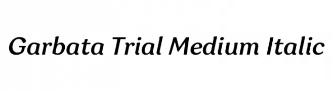
A modern, italic font with clean lines and smooth curves.
![Garbata Trial Medium Italic font caratteri gratis]() Scaricare 57 Downloads@WebFont
Scaricare 57 Downloads@WebFont -
( Fonts by Garisman Studio - Risman Ginarwan - Personal-use only. For commercial use please contact owner. )
A bold, playful font with a hand-drawn, whimsical style.
![Maxtield font caratteri gratis]() Scaricare 57 Downloads@WebFont
Scaricare 57 Downloads@WebFont -
( Kevin Richey )
A playful, hand-drawn font with irregular strokes and a whimsical style.
![Zippittey Regular font caratteri gratis]() Scaricare 57 Downloads@WebFont
Scaricare 57 Downloads@WebFont -
( Fonts by Human Design - Gilang Ramadhan - Personal-use only. For commercial use please contact owner. )
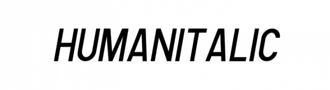
A modern, italic sans-serif font with a sleek and dynamic style.
![Human Italic font caratteri gratis]() Scaricare 57 Downloads@WebFont
Scaricare 57 Downloads@WebFont -
( Fonts by Edric Studio - Personal-use only. For commercial use please contact owner. )
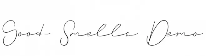
A delicate, flowing script font with elegant, continuous strokes.
![Good Smells Demo font caratteri gratis]() Scaricare 57 Downloads@WebFont
Scaricare 57 Downloads@WebFont -
( Noto is a trademark of Google Inc. Noto fonts are open source. All Noto fonts are published under the SIL Open Font License, Version 1.1 )
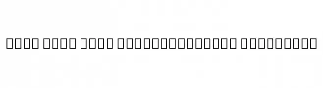
A modern, extra-condensed, extra-bold sans-serif font with tight spacing.
![Noto Sans Thai ExtraCondensed ExtraBold font caratteri gratis]() Scaricare 57 Downloads@WebFont
Scaricare 57 Downloads@WebFont -
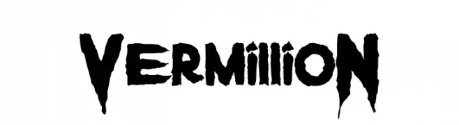
( Fonts by Arendx Studio - Personal-use only. For commercial use please contact owner. )
A bold, jagged font with a fierce and energetic style.
![VermillioN font caratteri gratis]() Scaricare 57 Downloads@WebFont
Scaricare 57 Downloads@WebFont -
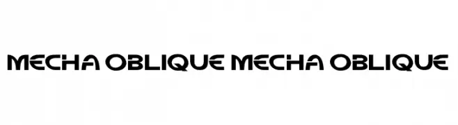
( Fonts by Kong Font - Personal-use only. For commercial use please contact owner. )
A bold, angular font with a futuristic, mechanical design.
![Mecha Oblique Mecha Oblique font caratteri gratis]() Scaricare 57 Downloads@WebFont
Scaricare 57 Downloads@WebFont -
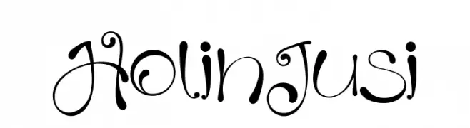
( Fonts by Ibram Syah - Personal-use only. For commercial use please contact owner. )
A whimsical and playful font with curly, looping strokes and decorative swirls.
![HolinJusi font caratteri gratis]() Scaricare 57 Downloads@WebFont
Scaricare 57 Downloads@WebFont -
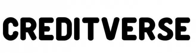
( Fonts by MaxiGamer - Maxime Maynard - Personal-use only. For commercial use please contact owner. )
A bold, rounded font with a modern and friendly style.
![Creditverse font caratteri gratis]() Scaricare 57 Downloads@WebFont
Scaricare 57 Downloads@WebFont -
( Fonts by Vunira Design )
A bold, flowing script font with elegant curves and connected strokes.
![Raymond font caratteri gratis]() Scaricare 57 Downloads@WebFont
Scaricare 57 Downloads@WebFont -
( Fonts by NJ Studio )
Bold, playful handwritten script font.
![hello bella bold Bold font caratteri gratis]() Scaricare 57 Downloads@WebFont
Scaricare 57 Downloads@WebFont -
( Fonts by Garisman Studio - Risman Ginarwan - Personal-use only. For commercial use please contact owner. )
A bold, dynamic script font with fluid, cursive letterforms.
![DakwartLetter font caratteri gratis]() Scaricare 57 Downloads@WebFont
Scaricare 57 Downloads@WebFont -
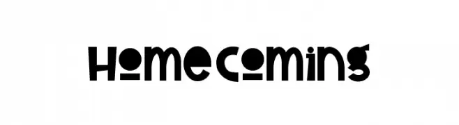
( Fonts by Andang Prasetyo )
A bold, playful font with quirky, uneven strokes and a whimsical style.
![Home Coming font caratteri gratis]() Scaricare 57 Downloads@WebFont
Scaricare 57 Downloads@WebFont -
( Noto is a trademark of Google Inc. Noto fonts are open source. All Noto fonts are published under the SIL Open Font License, Version 1.1 )
A modern, condensed sans-serif font with a semi-bold weight, ideal for clear and professional text.
![Noto Sans Tamil UI Condensed SemiBold font caratteri gratis]() Scaricare 57 Downloads@WebFont
Scaricare 57 Downloads@WebFont -
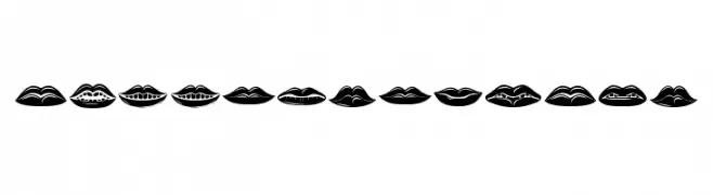
( Fonts by Vladimir Nikolic - https://www.creativefabrica.com/product/educated-deers/ref/144265/ - Personal-use only. For commercial use please contact owner. )
A decorative lips-themed font with expressive, bold glyphs.
![Lippen Regular font caratteri gratis]() Scaricare 57 Downloads@WebFont
Scaricare 57 Downloads@WebFont -
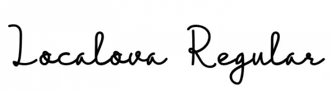
( Fonts by inst.ink-type - Galih S Aji - Personal-use only. For commercial use please contact owner. )
A playful, handwritten font with whimsical loops and curves.
![Localova Regular font caratteri gratis]() Scaricare 57 Downloads@WebFont
Scaricare 57 Downloads@WebFont -
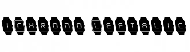
( Iconian Fonts - Daniel Zadorozny - www.iconian.com )
A pixelated, digital watch-inspired font with characters enclosed in watch outlines.
![iChrono Leftalic font caratteri gratis]() Scaricare 57 Downloads@WebFont
Scaricare 57 Downloads@WebFont -
( Iconian Fonts - Daniel Zadorozny - www.iconian.com )
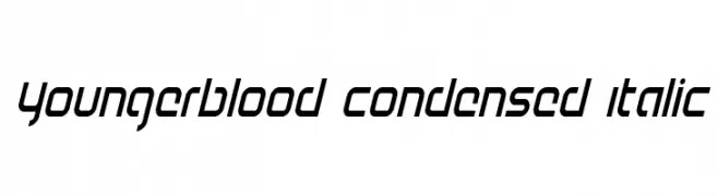
A modern, condensed italic font with a sleek and dynamic appearance.
![Youngerblood Condensed Italic font caratteri gratis]() Scaricare 57 Downloads@WebFont
Scaricare 57 Downloads@WebFont -
( Fonts by Iconian Fonts - Daniel Zadorozny - Personal-use only. For commercial use please contact owner. )
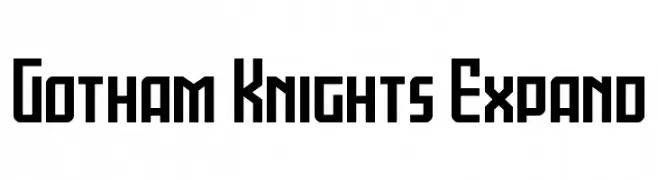
A bold, geometric font with a modern, tech-inspired design.
![Gotham Knights Expand font caratteri gratis]() Scaricare 57 Downloads@WebFont
Scaricare 57 Downloads@WebFont -
( Fonts by Kong Font - Personal-use only. For commercial use please contact owner. )
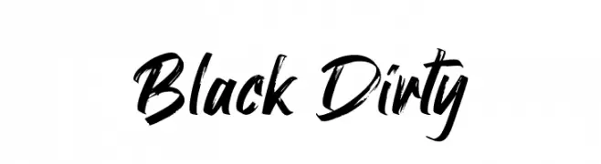
A bold, brush-style font with dynamic, irregular strokes.
![Black Dirty font caratteri gratis]() Scaricare 57 Downloads@WebFont
Scaricare 57 Downloads@WebFont -
( Fonts by Szymon Furjan - Personal-use only. For commercial use please contact owner. )
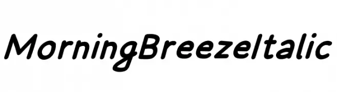
A smooth, flowing italic font with a playful and elegant style.
![Morning Breeze Italic font caratteri gratis]() Scaricare 57 Downloads@WebFont
Scaricare 57 Downloads@WebFont -
( Fonts by Wahyu Eka Prasetya - wepfont.com - Personal-use only. For commercial use please contact owner. )
A bold, playful font with a hand-drawn, friendly appearance.
![Folking font caratteri gratis]() Scaricare 57 Downloads@WebFont
Scaricare 57 Downloads@WebFont -
( Fonts by Fontfabric - Svetoslav Simov - Personal-use only. For commercial use please contact owner. )
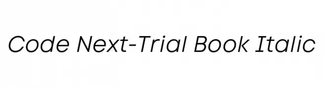
A sleek, modern italic font with clean lines and consistent stroke width.
![Code Next-Trial Book Italic font caratteri gratis]() Scaricare 57 Downloads@WebFont
Scaricare 57 Downloads@WebFont -
( Fonts by S.P.M.H - Slyzi Hadi - Personal-use only. For commercial use please contact owner. )
A tall, narrow, and modern font with clean lines and minimal contrast.
![KrempengSans font caratteri gratis]() Scaricare 57 Downloads@WebFont
Scaricare 57 Downloads@WebFont -
( Fonts by Weape Studio - Wahyu Andi - Personal-use only. For commercial use please contact owner. )
A bold, handwritten-style font with high contrast and expressive character.
![Anditya font caratteri gratis]() Scaricare 57 Downloads@WebFont
Scaricare 57 Downloads@WebFont -
( Fonts by alphArtype - Agung Rohmat - Personal-use only. For commercial use please contact owner. )
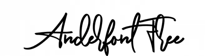
A fluid and dynamic handwritten script font with elegant loops and swashes.
![AnderfontFree font caratteri gratis]() Scaricare 57 Downloads@WebFont
Scaricare 57 Downloads@WebFont -
( Fonts by Graphix Line Studio - Personal-use only. For commercial use please contact owner. )
A playful, handwritten font with smooth, rounded strokes and a casual, energetic style.
![Stay Positive font caratteri gratis]() Scaricare 57 Downloads@WebFont
Scaricare 57 Downloads@WebFont -
( Xerographer Fonts - Max Infeld - xerographer.blogspot.com )
A textured, hand-drawn font with a vintage, artisanal style.
![Substrate font caratteri gratis]() Scaricare 57 Downloads@WebFont
Scaricare 57 Downloads@WebFont -
( Fonts by StringLabs - stringlabscreative.com - Personal-use only. For commercial use please contact owner. )
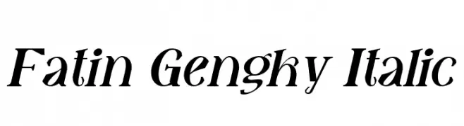
A classic italic typeface with a refined and elegant style.
![Fatin Gengky Italic font caratteri gratis]() Scaricare 57 Downloads@WebFont
Scaricare 57 Downloads@WebFont -
( Fonts by Hedi Miftah - Personal-use only. For commercial use please contact owner. )
A bold, geometric font with a modern and futuristic style.
![Monta font caratteri gratis]() Scaricare 57 Downloads@WebFont
Scaricare 57 Downloads@WebFont -
( Fonts by Letterrendra - Personal-use only. For commercial use please contact owner. )
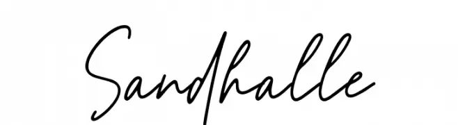
A lively handwritten font with fluid, spontaneous strokes.
![Sandhalle font caratteri gratis]() Scaricare 57 Downloads@WebFont
Scaricare 57 Downloads@WebFont -
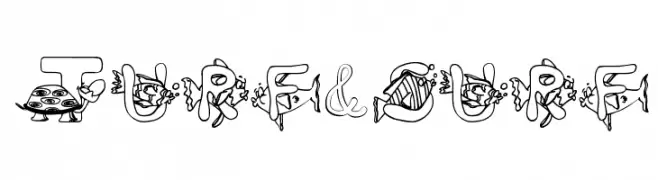
( Character )
A whimsical, cartoonish font with unique illustrations in each character.
![Turf&surf font caratteri gratis]() Scaricare 57 Downloads@WebFont
Scaricare 57 Downloads@WebFont -
( Noto is a trademark of Google Inc. Noto fonts are open source. All Noto fonts are published under the SIL Open Font License, Version 1.1 )
A thin, modern sans-serif font with a clean and minimalistic design.
![Noto Sans Sinhala UI Thin font caratteri gratis]() Scaricare 57 Downloads@WebFont
Scaricare 57 Downloads@WebFont


Quali sono i font più popolari adesso?
Poppins, Roboto, Montserrat, Open Sans e Lato sono molto usati per le forme pulite e l'ampia applicabilità — dall'identità di marca alle landing page e ai poster.
Quali font si usano spesso nei loghi?
Le sans serif geometriche (es. Poppins, famiglie in stile Gotham) sono scelte comuni per un branding pulito e scalabile. Per un tocco personale restano valide script e stili manoscritti. Abbina un display deciso per i titoli a un corpo testo neutro per riconoscibilità ed equilibrio.
Ogni quanto si aggiorna la lista?
Con regolarità, in base ai download e all'attività reale. Torna spesso per scoprire in anticipo le nuove preferite.
💡 Consiglio: aggiungi ai preferiti — le tendenze cambiano in fretta e i font top di oggi possono ispirare il rebranding di domani.