Benvenuto nelle Font Più Popolari — dove popolarità e qualità si incontrano. Qui trovi i font più scaricati e usati dell'anno. Se cerchi scelte sicure per logo, web o social, inizia da qui.
Ogni font top si distingue per equilibrio, leggibilità e versatilità. Troverai sans serif moderne, script eleganti, serif vintage e display minimalisti.
-
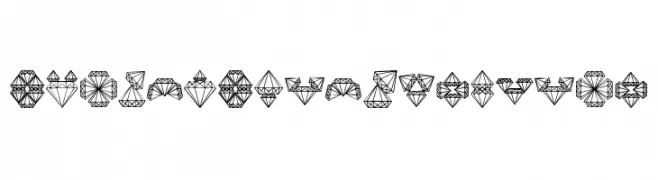
( Fonts by Vladimir Nikolic - https://www.creativefabrica.com/product/educated-deers/ref/144265/ - Personal-use only. For commercial use please contact owner. )
A decorative font with characters resembling intricate diamond shapes.
 Scaricare 55 Downloads@WebFont
 -
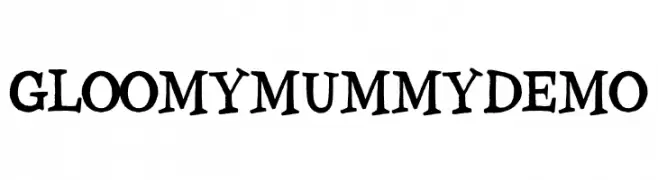
( Fonts by Allouse Studio - Personal-use only. For commercial use please contact owner. )
A playful, hand-drawn font with wavy lines and a spooky aesthetic.
![Gloomy Mummy Demo font caratteri gratis]() Scaricare 55 Downloads@WebFont
Scaricare 55 Downloads@WebFont -
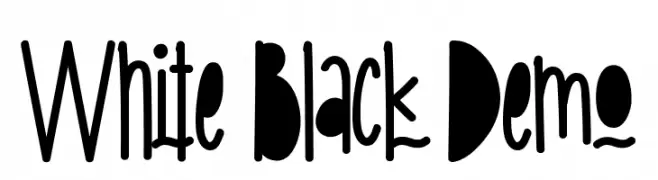
( Fonts by CalligraphyFonts - Personal-use only. For commercial use please contact owner. )
A bold, high-contrast font with playful, artistic elements and varied stroke widths.
![White Black Demo font caratteri gratis]() Scaricare 55 Downloads@WebFont
Scaricare 55 Downloads@WebFont -
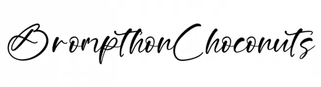
( Fonts by Letterena Studios )
Handwritten cursive script with smooth, connected strokes.
![Brompthon Choconuts font caratteri gratis]() Scaricare 55 Downloads@WebFont
Scaricare 55 Downloads@WebFont -
( Fonts by Maulana Creative - Gilang Maulana - Personal-use only. For commercial use please contact owner. )
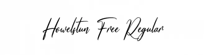
A flowing, elegant script font with a modern calligraphic style.
![Howelstun Free Regular font caratteri gratis]() Scaricare 55 Downloads@WebFont
Scaricare 55 Downloads@WebFont -
-
( Fonts by Erik Studio - Personal-use only. For commercial use please contact owner. )
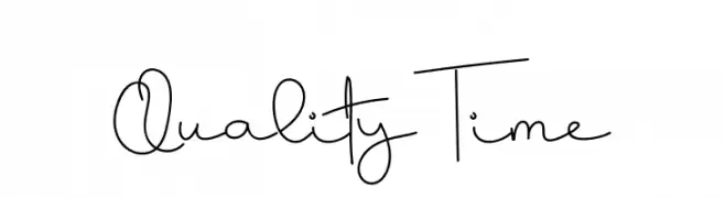
A whimsical handwritten font with fluid, continuous strokes and a playful style.
![Quality Time font caratteri gratis]() Scaricare 55 Downloads@WebFont
Scaricare 55 Downloads@WebFont -
( Fonts by Fiqiart - Fiqi Febriyanto - Personal-use only. For commercial use please contact owner. )
A playful and elegant script font with fluid, cursive strokes.
![Kitti Script font caratteri gratis]() Scaricare 55 Downloads@WebFont
Scaricare 55 Downloads@WebFont -
( Fonts by Green Adventure Studio - Ardi Parwito - Personal-use only. For commercial use please contact owner. )
A playful and elegant cursive font with flowing, graceful strokes.
![Milli Nathan font caratteri gratis]() Scaricare 55 Downloads@WebFont
Scaricare 55 Downloads@WebFont -
( Fonts by Kurnia Setyadi - Personal-use only. For commercial use please contact owner. )
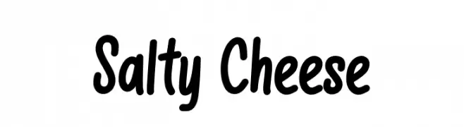
A playful, bold handwritten font with thick, rounded strokes.
![Salty Cheese font caratteri gratis]() Scaricare 55 Downloads@WebFont
Scaricare 55 Downloads@WebFont -
( Fonts by CannotIntoSpaceFonts - KineticPlasma Fonts - Personal-use only. For commercial use please contact owner. )
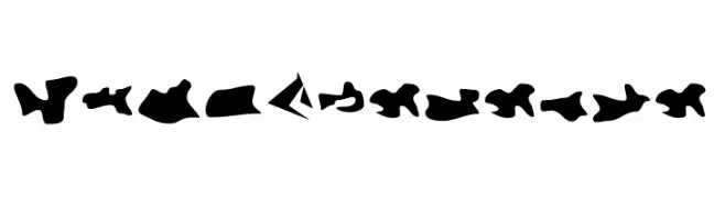
An abstract, artistic font with bold, organic shapes and a dynamic flow.
![Camo3 Reverse font caratteri gratis]() Scaricare 55 Downloads@WebFont
Scaricare 55 Downloads@WebFont -
( Fonts by Wahyu Eka Prasetya - wepfont.com - Personal-use only. For commercial use please contact owner. )
A bold, playful handwritten font with thick, rounded strokes.
![Herba font caratteri gratis]() Scaricare 55 Downloads@WebFont
Scaricare 55 Downloads@WebFont -
( Fonts by vilogsign - Nur Kholis - Personal-use only. For commercial use please contact owner. )
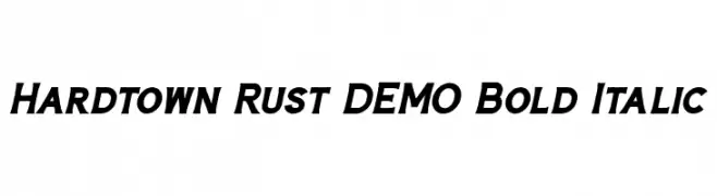
Bold, italicized font with a dynamic and modern style.
![Hardtown Rust DEMO Bold Italic font caratteri gratis]() Scaricare 55 Downloads@WebFont
Scaricare 55 Downloads@WebFont -
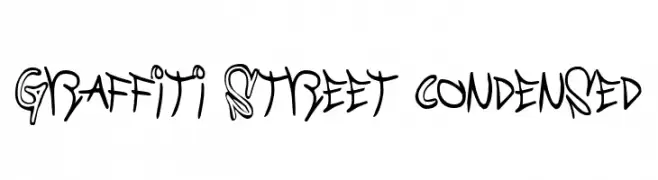
![Graffiti Street Condensed font caratteri gratis]() Scaricare 55 Downloads@WebFont
Scaricare 55 Downloads@WebFont -
( Fonts by Allouse Studio - Personal-use only. For commercial use please contact owner. )
A bold, dynamic brush script font with expressive strokes.
![Moviecal font caratteri gratis]() Scaricare 55 Downloads@WebFont
Scaricare 55 Downloads@WebFont -
( Fonts by 3rieart - Bagas Satriawan - Personal-use only. For commercial use please contact owner. )
A delicate, handwritten cursive font with elegant, flowing strokes.
![saitama font caratteri gratis]() Scaricare 55 Downloads@WebFont
Scaricare 55 Downloads@WebFont -
( Fonts by Daniel Zadorozny - www.iconian.com - Personal-use only. For commercial use please contact owner. )
A bold, italicized font with a futuristic and angular design.
![Night Traveler Title Italic font caratteri gratis]() Scaricare 55 Downloads@WebFont
Scaricare 55 Downloads@WebFont -
( Fonts by Michal Král - Personal-use only. For commercial use please contact owner. )
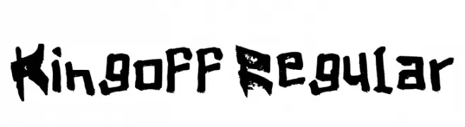
A bold, distressed font with a grungy, hand-painted appearance.
![Kingoff Regular font caratteri gratis]() Scaricare 55 Downloads@WebFont
Scaricare 55 Downloads@WebFont -
( Out of Step Font Company - Dan Steinbok - outofstepfontco.com )
A geometric, modern font with tall, narrow characters and sharp angles.
![Tall Boy West Demo font caratteri gratis]() Scaricare 55 Downloads@WebFont
Scaricare 55 Downloads@WebFont -
( Fonts by WolfBainX - Personal-use only. For commercial use please contact owner. )
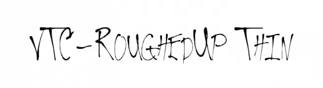
A rough, hand-drawn font with thin, irregular strokes and a dynamic, edgy style.
![VTC-RoughedUp Thin font caratteri gratis]() Scaricare 55 Downloads@WebFont
Scaricare 55 Downloads@WebFont -
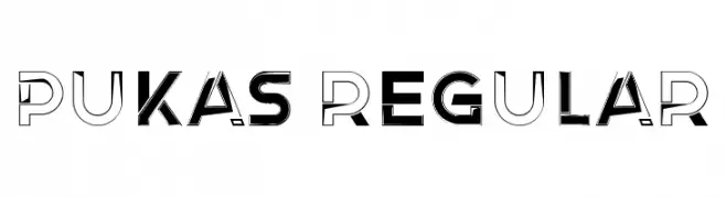
( Fonts by Vladimir Nikolic - www.creativefabrica.com/designer/vladimirnikolic/ - Personal-use only. For commercial use please contact owner. )
A bold, modern font with geometric shapes and striking contrast.
![Pukas Regular font caratteri gratis]() Scaricare 55 Downloads@WebFont
Scaricare 55 Downloads@WebFont -
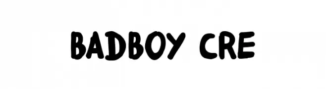
( Fonts by Fred Cre - Personal-use only. For commercial use please contact owner. )
A bold, playful, hand-drawn font with rounded edges.
![badboy cre font caratteri gratis]() Scaricare 55 Downloads@WebFont
Scaricare 55 Downloads@WebFont -
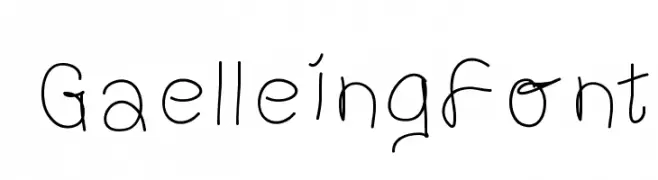
( Gaelleing )
A whimsical and playful font with curly, flowing letterforms.
![GaelleingFont font caratteri gratis]() Scaricare 55 Downloads@WebFont
Scaricare 55 Downloads@WebFont -
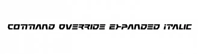
( Iconian Fonts - Daniel Zadorozny - www.iconian.com )
A bold, futuristic font with angular, expanded, and italicized characters.
![Command Override Expanded Italic font caratteri gratis]() Scaricare 55 Downloads@WebFont
Scaricare 55 Downloads@WebFont -
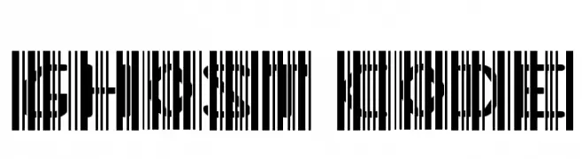
( imagex - www.imagex-fonts.com )
An abstract, barcode-like design with fragmented characters, ideal for tech or avant-garde themes.
![Ghost Code font caratteri gratis]() Scaricare 55 Downloads@WebFont
Scaricare 55 Downloads@WebFont -
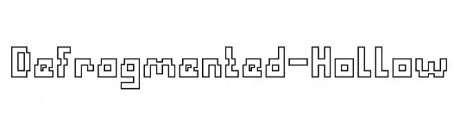
( weknow - Wino S Kadir - www.creativefabrica.com/designer/weknow/ )
A hollow, geometric font with a digital, fragmented style.
![Defragmented-Hollow font caratteri gratis]() Scaricare 55 Downloads@WebFont
Scaricare 55 Downloads@WebFont -
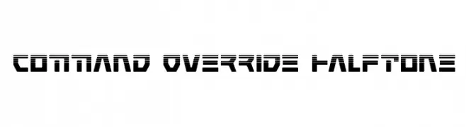
( Iconian Fonts - Daniel Zadorozny - www.iconian.com )
A bold, futuristic font with a halftone effect and geometric design.
![Command Override Halftone font caratteri gratis]() Scaricare 55 Downloads@WebFont
Scaricare 55 Downloads@WebFont -
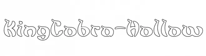
( weknow - Wino S Kadir - www.creativefabrica.com/designer/weknow/ )
A decorative, hollow font with bold, curvy outlines and a playful style.
![King Cobra-Hollow font caratteri gratis]() Scaricare 55 Downloads@WebFont
Scaricare 55 Downloads@WebFont -
( LeChefRene - members.aol.com/lcrfonts/ )
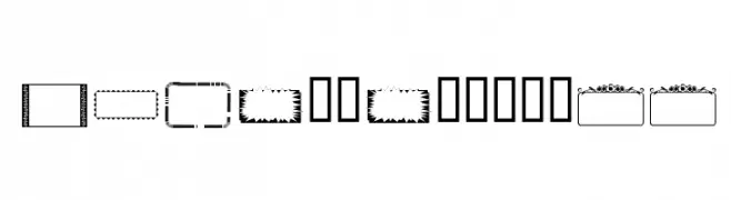
A novelty font made up of assorted decorative frame outlines.
![LCR Fun Frames II font caratteri gratis]() Scaricare 55 Downloads@WebFont
Scaricare 55 Downloads@WebFont -
( Fonts by DN Creative )
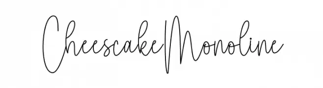
Tall, thin monoline handwritten script with playful, casual style.
![Cheescake Monoline font caratteri gratis]() Scaricare 55 Downloads@WebFont
Scaricare 55 Downloads@WebFont -
( Fonts by Daniel Zadorozny - www.iconian.com - Personal-use only. For commercial use please contact owner. )
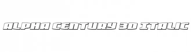
A bold, 3D italic font with a futuristic and dynamic style.
![Alpha Century 3D Italic font caratteri gratis]() Scaricare 55 Downloads@WebFont
Scaricare 55 Downloads@WebFont -
( Fonts by Edric Studio - Personal-use only. For commercial use please contact owner. )
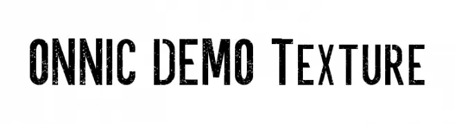
A bold, textured font with a distressed, vintage look.
![ONNIC DEMO Texture font caratteri gratis]() Scaricare 55 Downloads@WebFont
Scaricare 55 Downloads@WebFont -
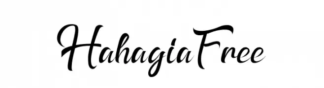
( Fonts by Aditya Rezki Apriyadi - Personal-use only. For commercial use please contact owner. )
A dynamic and elegant script font with fluid, cursive strokes.
![HahagiaFree font caratteri gratis]() Scaricare 55 Downloads@WebFont
Scaricare 55 Downloads@WebFont -
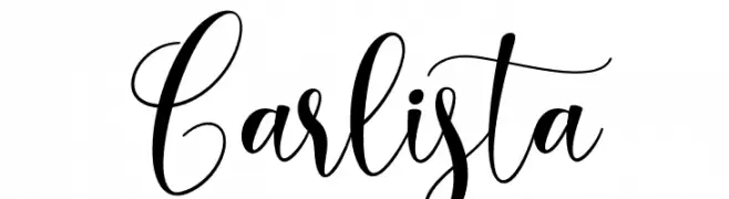
( Fonts by Yumna Family - yumna Type - Personal-use only. For commercial use please contact owner. )
An elegant, flowing script font with sophisticated cursive letterforms.
![Carlista font caratteri gratis]() Scaricare 55 Downloads@WebFont
Scaricare 55 Downloads@WebFont -
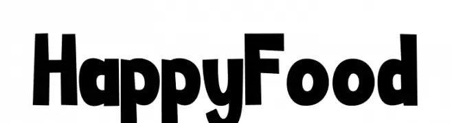
( Fonts by Letterena Studios - letterena.com - Personal-use only. For commercial use please contact owner. )
A playful, bold font with thick, uneven strokes and a whimsical style.
![Happy Food font caratteri gratis]() Scaricare 55 Downloads@WebFont
Scaricare 55 Downloads@WebFont -
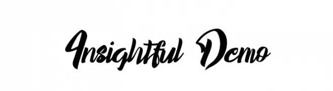
( Fonts by Noah Type - noahtype.com - Personal-use only. For commercial use please contact owner. )
A bold, expressive script font with high contrast and dynamic flow.
![Insightful Demo font caratteri gratis]() Scaricare 55 Downloads@WebFont
Scaricare 55 Downloads@WebFont


Quali sono i font più popolari adesso?
Poppins, Roboto, Montserrat, Open Sans e Lato sono molto usati per le forme pulite e l'ampia applicabilità — dall'identità di marca alle landing page e ai poster.
Quali font si usano spesso nei loghi?
Le sans serif geometriche (es. Poppins, famiglie in stile Gotham) sono scelte comuni per un branding pulito e scalabile. Per un tocco personale restano valide script e stili manoscritti. Abbina un display deciso per i titoli a un corpo testo neutro per riconoscibilità ed equilibrio.
Ogni quanto si aggiorna la lista?
Con regolarità, in base ai download e all'attività reale. Torna spesso per scoprire in anticipo le nuove preferite.
💡 Consiglio: aggiungi ai preferiti — le tendenze cambiano in fretta e i font top di oggi possono ispirare il rebranding di domani.