Benvenuto nelle Font Più Popolari — dove popolarità e qualità si incontrano. Qui trovi i font più scaricati e usati dell'anno. Se cerchi scelte sicure per logo, web o social, inizia da qui.
Ogni font top si distingue per equilibrio, leggibilità e versatilità. Troverai sans serif moderne, script eleganti, serif vintage e display minimalisti.
-
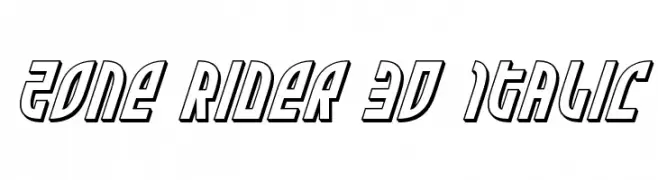
( Fonts by Iconian Fonts )
A bold, 3D italic font with a futuristic and dynamic style.
 Scaricare 53 Downloads@WebFont
 -
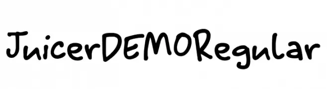
( Fonts by Hanoded - David Kerkhoff - Personal-use only. For commercial use please contact owner. )
A playful, handwritten font with bold, rounded strokes and unique citrus-themed numbers.
![Juicer DEMO Regular font caratteri gratis]() Scaricare 53 Downloads@WebFont
Scaricare 53 Downloads@WebFont -
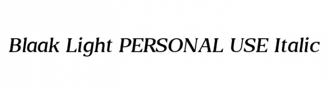
( Fonts by Mans Greback - Personal-use only. For commercial use please contact owner. )
An elegant serif italic font with medium contrast and balanced proportions.
![Blaak Light PERSONAL USE Italic font caratteri gratis]() Scaricare 53 Downloads@WebFont
Scaricare 53 Downloads@WebFont -
( Fonts by FontGrube AH - Andreas Höfeld - Personal-use only. For commercial use please contact owner. )
A whimsical and artistic font with elongated, curved strokes and decorative elements.
![Lansbury FG font caratteri gratis]() Scaricare 53 Downloads@WebFont
Scaricare 53 Downloads@WebFont -
( Fonts by Kimberly Geswein )
A playful, casual handwritten font with smooth curves and balanced contrast.
![KG So It Goes font caratteri gratis]() Scaricare 53 Downloads@WebFont
Scaricare 53 Downloads@WebFont -
-
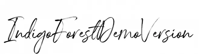
( Fonts by Letteralle Studios - Annas Yahya - Personal-use only. For commercial use please contact owner. )
A dynamic, expressive handwritten font with fluid, cursive strokes.
![IndigoForestDemoVersion font caratteri gratis]() Scaricare 53 Downloads@WebFont
Scaricare 53 Downloads@WebFont -
( Fonts by Letterhend Studio - Hendry Juanda - Personal-use only. For commercial use please contact owner. )
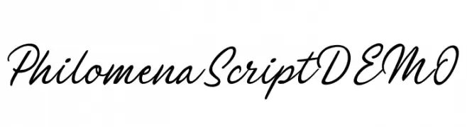
A flowing, elegant script font with a handwritten appearance.
![PhilomenaScriptDEMO font caratteri gratis]() Scaricare 53 Downloads@WebFont
Scaricare 53 Downloads@WebFont -
( Fonts by Iconian Fonts - Daniel Zadorozny - Personal-use only. For commercial use please contact owner. )
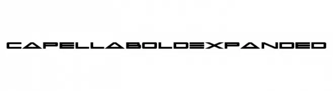
A bold, expanded, and futuristic font with geometric shapes and sharp edges.
![Capella Bold Expanded font caratteri gratis]() Scaricare 53 Downloads@WebFont
Scaricare 53 Downloads@WebFont -
( Fonts by Khurasan - Syaf Rizal - Personal-use only. For commercial use please contact owner. )
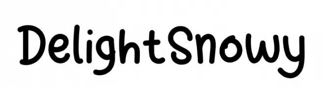
A playful, rounded font with a hand-drawn appearance.
![Delight Snowy font caratteri gratis]() Scaricare 53 Downloads@WebFont
Scaricare 53 Downloads@WebFont -
( Fonts by Bangkit Tri Setiadi )
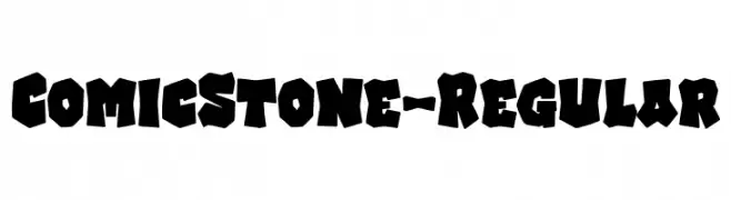
A bold, playful font with a comic-inspired, hand-drawn style.
![ComicStone-Regular font caratteri gratis]() Scaricare 53 Downloads@WebFont
Scaricare 53 Downloads@WebFont -
( Noto is a trademark of Google Inc. Noto fonts are open source. All Noto fonts are published under the SIL Open Font License, Version 1.1 )
Extra condensed, extra bold Hebrew serif font.
![Noto Serif Hebrew ExtraCondensed ExtraBold font caratteri gratis]() Scaricare 53 Downloads@WebFont
Scaricare 53 Downloads@WebFont -
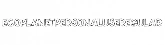
( Fonts by Billy Argel Fonts - www.billyargel.com - Personal-use only. For commercial use please contact owner. )
A playful, hand-drawn font with bold, irregular outlines and a whimsical style.
![ECOPLANET PERSONAL USE Regular font caratteri gratis]() Scaricare 53 Downloads@WebFont
Scaricare 53 Downloads@WebFont -
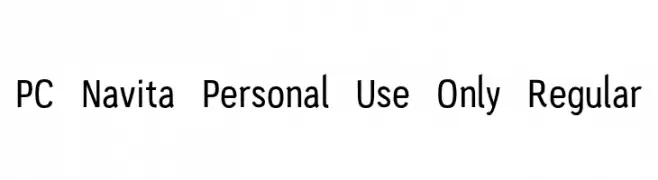
( Fonts by Parker Creative - Alan Parker - Personal-use only. For commercial use please contact owner. )
A modern sans-serif font with clean, geometric letterforms and excellent readability.
![PC-Navita-Personal-Use-Only-Regular font caratteri gratis]() Scaricare 53 Downloads@WebFont
Scaricare 53 Downloads@WebFont -
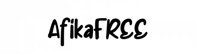
( Fonts by Vunira Design - Personal-use only. For commercial use please contact owner. )
A playful, bold handwritten font with smooth, rounded edges.
![AfikaFREE font caratteri gratis]() Scaricare 53 Downloads@WebFont
Scaricare 53 Downloads@WebFont -
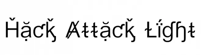
( Fonts by Daniel Zadorozny - www.iconian.com - Personal-use only. For commercial use please contact owner. )
A modern, geometric sans-serif font with a clean and professional appearance.
![Hack Attack Light font caratteri gratis]() Scaricare 53 Downloads@WebFont
Scaricare 53 Downloads@WebFont -
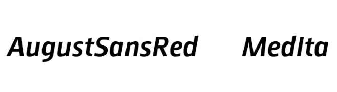
( Fonts by ingoFonts - Ingo Zimmermann - Personal-use only. For commercial use please contact owner. )
A modern sans-serif font with an italic slant and balanced proportions.
![AugustSansRed-66MedIta font caratteri gratis]() Scaricare 53 Downloads@WebFont
Scaricare 53 Downloads@WebFont -
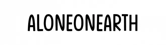
( Fonts by The Docallisme - Amry Al Mursalaat - Personal-use only. For commercial use please contact owner. )
A playful, handwritten font with rounded edges and a casual style.
![Alone On Earth font caratteri gratis]() Scaricare 53 Downloads@WebFont
Scaricare 53 Downloads@WebFont -
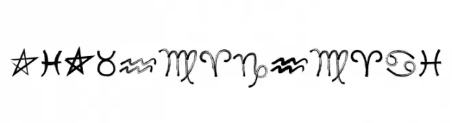
( Fonts by Misti Hammers - mistifonts.com - Personal-use only. For commercial use please contact owner. )
A decorative font featuring artistic zodiac symbols with a mystical flair.
![MF Zodiac Dings font caratteri gratis]() Scaricare 53 Downloads@WebFont
Scaricare 53 Downloads@WebFont -
( Joorgemoron@gmail.com )
A classic, italic typewriter-style font with monospaced characters.
![JMHTypewriter-Italic font caratteri gratis]() Scaricare 53 Downloads@WebFont
Scaricare 53 Downloads@WebFont -
( Fonts by Colllab Studio - Personal-use only. For commercial use please contact owner. )
A dynamic, expressive handwritten font with fluid, flowing letterforms.
![Aesslhine font caratteri gratis]() Scaricare 53 Downloads@WebFont
Scaricare 53 Downloads@WebFont -
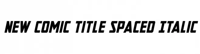
( Fonts by Iconian Fonts - Daniel Zadorozny - Personal-use only. For commercial use please contact owner. )
A bold, italicized font with a modern, dynamic style and normal spacing.
![New Comic Title Spaced Italic font caratteri gratis]() Scaricare 53 Downloads@WebFont
Scaricare 53 Downloads@WebFont -
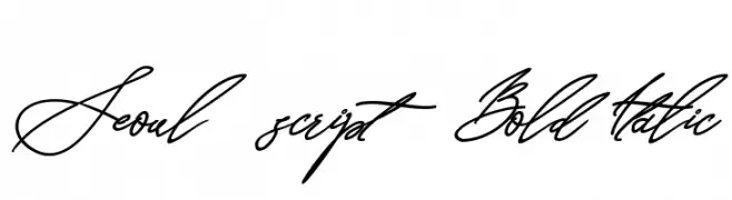
( Fonts by Letterara - Thomas Aradea - Personal-use only. For commercial use please contact owner. )
A bold, italic script font with fluid, interconnected strokes and high contrast.
![Seoul script Bold Italic font caratteri gratis]() Scaricare 53 Downloads@WebFont
Scaricare 53 Downloads@WebFont -
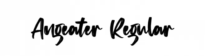
( Fonts by Vz Type - Personal-use only. For commercial use please contact owner. )
A bold, handwritten font with dynamic brush strokes and an energetic style.
![Angeater Regular font caratteri gratis]() Scaricare 53 Downloads@WebFont
Scaricare 53 Downloads@WebFont -
( Noto is a trademark of Google Inc. Noto fonts are open source. All Noto fonts are published under the SIL Open Font License, Version 1.1 )
A bold, condensed sans-serif font with high contrast and modern style.
![Noto Sans Devanagari UI Condensed Black font caratteri gratis]() Scaricare 53 Downloads@WebFont
Scaricare 53 Downloads@WebFont -
( Fonts by 3rieart - Bagas Satriawan - Personal-use only. For commercial use please contact owner. )
A playful and dynamic font with bold uppercase and script-like lowercase letters.
![leonie font caratteri gratis]() Scaricare 53 Downloads@WebFont
Scaricare 53 Downloads@WebFont -
( Fonts by Soft Cr - Abdusselam Öndin - Personal-use only. For commercial use please contact owner. )
A sleek, modern font with thin, elongated letterforms and a minimalist design.
![Lamon Light font caratteri gratis]() Scaricare 53 Downloads@WebFont
Scaricare 53 Downloads@WebFont -
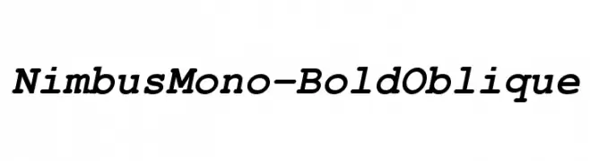
( Fonts by URW++ - Personal-use only. For commercial use please contact owner. )
A bold, oblique, monospaced font with a modern and dynamic style.
![NimbusMono-BoldOblique font caratteri gratis]() Scaricare 53 Downloads@WebFont
Scaricare 53 Downloads@WebFont -
( Fonts by Peter Wiegel - www.peter-wiegel.de - Personal-use only. For commercial use please contact owner. )
A bold, italic slab serif typeface with strong, impactful characters.
![Erica Type Bold Italic font caratteri gratis]() Scaricare 53 Downloads@WebFont
Scaricare 53 Downloads@WebFont -
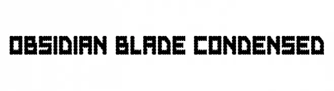
( Fonts by Daniel Zadorozny - www.iconian.com - Personal-use only. For commercial use please contact owner. )
A bold, jagged, and condensed font with sharp, angular edges.
![Obsidian Blade Condensed font caratteri gratis]() Scaricare 53 Downloads@WebFont
Scaricare 53 Downloads@WebFont -
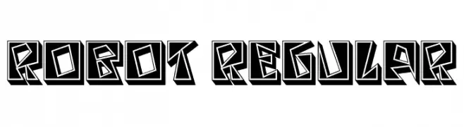
( Fonts by Vladimir Nikolic - www.creativefabrica.com/designer/vladimirnikolic/ - Personal-use only. For commercial use please contact owner. )
A bold, geometric font with a futuristic, three-dimensional design.
![Robot Regular font caratteri gratis]() Scaricare 53 Downloads@WebFont
Scaricare 53 Downloads@WebFont -
( Fonts by Kong Font - Personal-use only. For commercial use please contact owner. )
A playful handwritten font with smooth, rounded edges and a casual style.
![Elione font caratteri gratis]() Scaricare 53 Downloads@WebFont
Scaricare 53 Downloads@WebFont -
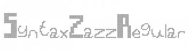
( Font Bureau - beinghairless.com )
A playful, star-patterned decorative font with a modern geometric style.
![Syntax Zazz Regular font caratteri gratis]() Scaricare 53 Downloads@WebFont
Scaricare 53 Downloads@WebFont -
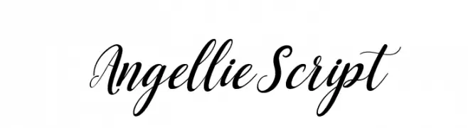
( Fonts by Creative Lab - Creative LAB - Personal-use only. For commercial use please contact owner. )
An elegant script font with flowing, cursive letters and high contrast.
![AngellieScript font caratteri gratis]() Scaricare 53 Downloads@WebFont
Scaricare 53 Downloads@WebFont -
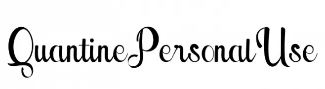
( Fonts by Din Studio - Donis Miftahudin - Personal-use only. For commercial use please contact owner. )
A modern script font with elegant, flowing curves and decorative elements.
![Quantine Personal Use font caratteri gratis]() Scaricare 53 Downloads@WebFont
Scaricare 53 Downloads@WebFont -
( Fonts by ingoFonts - Ingo Zimmermann - Personal-use only. For commercial use please contact owner. )
A pixelated, retro-style font inspired by early digital typography.
![DePixel-Illegible font caratteri gratis]() Scaricare 53 Downloads@WebFont
Scaricare 53 Downloads@WebFont


Quali sono i font più popolari adesso?
Poppins, Roboto, Montserrat, Open Sans e Lato sono molto usati per le forme pulite e l'ampia applicabilità — dall'identità di marca alle landing page e ai poster.
Quali font si usano spesso nei loghi?
Le sans serif geometriche (es. Poppins, famiglie in stile Gotham) sono scelte comuni per un branding pulito e scalabile. Per un tocco personale restano valide script e stili manoscritti. Abbina un display deciso per i titoli a un corpo testo neutro per riconoscibilità ed equilibrio.
Ogni quanto si aggiorna la lista?
Con regolarità, in base ai download e all'attività reale. Torna spesso per scoprire in anticipo le nuove preferite.
💡 Consiglio: aggiungi ai preferiti — le tendenze cambiano in fretta e i font top di oggi possono ispirare il rebranding di domani.