Benvenuto nelle Font Più Popolari — dove popolarità e qualità si incontrano. Qui trovi i font più scaricati e usati dell'anno. Se cerchi scelte sicure per logo, web o social, inizia da qui.
Ogni font top si distingue per equilibrio, leggibilità e versatilità. Troverai sans serif moderne, script eleganti, serif vintage e display minimalisti.
-
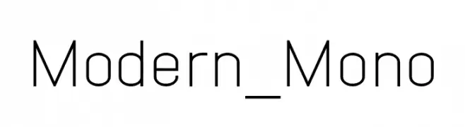
( Fonts by Fortress Tech - Personal-use only. For commercial use please contact owner. )
A modern, monospaced font with a clean and minimalistic design.
 Scaricare 51 Downloads@WebFont
 -
( Fonts by Letterara - Thomas Aradea - Personal-use only. For commercial use please contact owner. )
A bold, jagged font with a horror-metal aesthetic, featuring sharp, thorn-like edges.
![Horror Metal font caratteri gratis]() Scaricare 51 Downloads@WebFont
Scaricare 51 Downloads@WebFont -
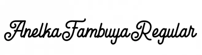
( Fonts by StringLabs - stringlabscreative.com - Personal-use only. For commercial use please contact owner. )
A playful and elegant script font with decorative swirls and loops.
![Anelka Fambuya Regular font caratteri gratis]() Scaricare 51 Downloads@WebFont
Scaricare 51 Downloads@WebFont -
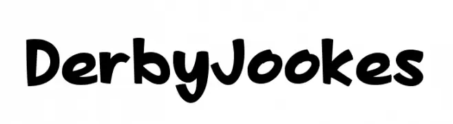
( Fonts by DumadiStyle - Toni Dzulham - Personal-use only. For commercial use please contact owner. )
A playful, bold handwritten font with rounded, irregular letters.
![Derby Jookes font caratteri gratis]() Scaricare 51 Downloads@WebFont
Scaricare 51 Downloads@WebFont -
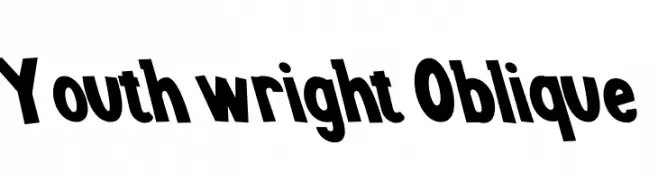
( Fonts by Kong Font - fontkong.com - Personal-use only. For commercial use please contact owner. )
A bold, oblique font with a playful and dynamic style.
![Youth wright Oblique font caratteri gratis]() Scaricare 51 Downloads@WebFont
Scaricare 51 Downloads@WebFont -
-
( Fonts by Daniel Zadorozny - www.iconian.com - Personal-use only. For commercial use please contact owner. )
A futuristic, italic font with bold, geometric characters and a dynamic style.
![Vertical Horizon Laser Italic font caratteri gratis]() Scaricare 51 Downloads@WebFont
Scaricare 51 Downloads@WebFont -
( Fonts by Garisman Studio - Risman Ginarwan - Personal-use only. For commercial use please contact owner. )
A stylish and elegant script font with fluid, connected letterforms.
![Signation font caratteri gratis]() Scaricare 51 Downloads@WebFont
Scaricare 51 Downloads@WebFont -
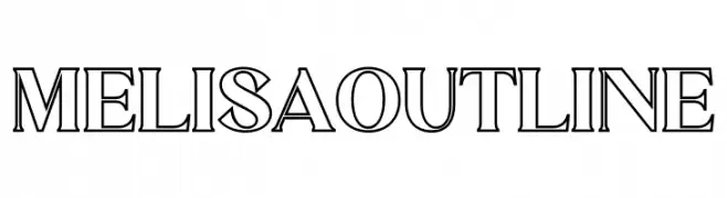
( Fonts by Letterena Studios - letterena.com - Personal-use only. For commercial use please contact owner. )
An outlined font with geometric structure and consistent design.
![MELISA OUTLINE font caratteri gratis]() Scaricare 51 Downloads@WebFont
Scaricare 51 Downloads@WebFont -
( Noto is a trademark of Google Inc. Noto fonts are open source. All Noto fonts are published under the SIL Open Font License, Version 1.1 )
A condensed, semi-bold serif font for Hebrew text, offering clarity and modern style.
![Noto Serif Hebrew Condensed SemiBold font caratteri gratis]() Scaricare 51 Downloads@WebFont
Scaricare 51 Downloads@WebFont -
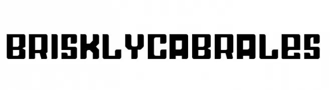
( Fonts by Eifetstype - Stefie Justprince - Personal-use only. For commercial use please contact owner. )
A bold, geometric font with strong, angular lines and a modern aesthetic.
![BrisklyCabrales font caratteri gratis]() Scaricare 51 Downloads@WebFont
Scaricare 51 Downloads@WebFont -
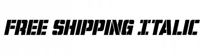
( Fonts by Iconian Fonts - Daniel Zadorozny - Personal-use only. For commercial use please contact owner. )
Bold, italic stencil-style font with angular, fragmented characters.
![Free Shipping Italic font caratteri gratis]() Scaricare 51 Downloads@WebFont
Scaricare 51 Downloads@WebFont -
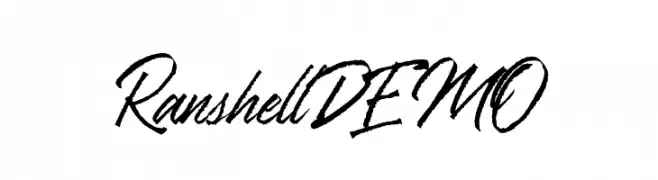
( Fonts by Letterhend Studio - Hendry Juanda - Personal-use only. For commercial use please contact owner. )
A dynamic, cursive script font with bold, sweeping strokes.
![RanshellDEMO font caratteri gratis]() Scaricare 51 Downloads@WebFont
Scaricare 51 Downloads@WebFont -
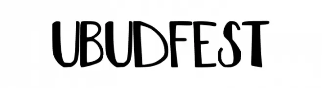
( Fonts by The Docallisme - Amry Al Mursalaat - Personal-use only. For commercial use please contact owner. )
A playful, hand-drawn font with bold, irregular characters.
![UBUD FEST font caratteri gratis]() Scaricare 51 Downloads@WebFont
Scaricare 51 Downloads@WebFont -
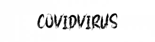
( Fonts by AminMario - Amin Mario - Personal-use only. For commercial use please contact owner. )
A bold, textured font with a chaotic, brush-stroke style.
![COVID VIRUS font caratteri gratis]() Scaricare 51 Downloads@WebFont
Scaricare 51 Downloads@WebFont -
( Fonts by www.chequered.ink - Chequered Ink - Personal-use only. For commercial use please contact owner. )
A geometric, modular font with bold, block-like shapes and a futuristic aesthetic.
![Ipscrik font caratteri gratis]() Scaricare 51 Downloads@WebFont
Scaricare 51 Downloads@WebFont -
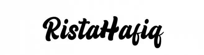
( Fonts by StringLabs - stringlabscreative.com - Personal-use only. For commercial use please contact owner. )
A bold, cursive script font with interconnected characters and a playful style.
![Rista Hafiq font caratteri gratis]() Scaricare 51 Downloads@WebFont
Scaricare 51 Downloads@WebFont -
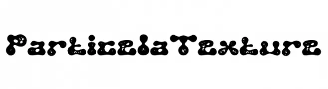
( Fonts by PutraCetol Studio )
A textured, playful font with a bubbly, organic design.
![Particela Texture font caratteri gratis]() Scaricare 51 Downloads@WebFont
Scaricare 51 Downloads@WebFont -
( Fonts by Daniel Zadorozny - www.iconian.com - Personal-use only. For commercial use please contact owner. )
A playful, bold font with thick, uneven strokes and a hand-drawn feel.
![Charmling font caratteri gratis]() Scaricare 51 Downloads@WebFont
Scaricare 51 Downloads@WebFont -
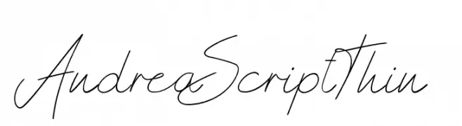
( Fonts by Don Marciano - Personal-use only. For commercial use please contact owner. )
A thin, elegant script font with flowing, cursive strokes.
![AndreaScriptThin font caratteri gratis]() Scaricare 51 Downloads@WebFont
Scaricare 51 Downloads@WebFont -
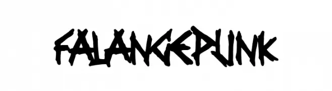
( Fonts by Woodcutter - woodcutter Manero - Personal-use only. For commercial use please contact owner. )
A bold, jagged, and edgy font with a punk-inspired, graffiti-like style.
![Falange Punk font caratteri gratis]() Scaricare 51 Downloads@WebFont
Scaricare 51 Downloads@WebFont -
( Fonts by Endri Sulistyawan - Personal-use only. For commercial use please contact owner. )
A playful and whimsical font with tall, narrow letterforms and dynamic strokes.
![Anayu font caratteri gratis]() Scaricare 51 Downloads@WebFont
Scaricare 51 Downloads@WebFont -
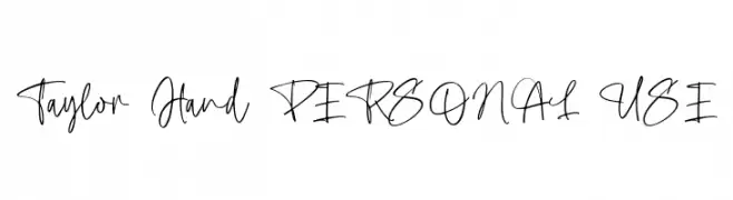
( Fonts by Mans Greback - Personal-use only. For commercial use please contact owner. )
A casual, flowing handwritten font with interconnected cursive letters.
![Taylor Hand PERSONAL USE font caratteri gratis]() Scaricare 51 Downloads@WebFont
Scaricare 51 Downloads@WebFont -
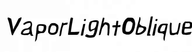
( Fonts by CannotIntoSpaceFonts - KineticPlasma Fonts - Personal-use only. For commercial use please contact owner. )
A dynamic, oblique font with a playful, hand-drawn style.
![Vapor Light Oblique font caratteri gratis]() Scaricare 51 Downloads@WebFont
Scaricare 51 Downloads@WebFont -
( Fonts by Manuel - Personal-use only. For commercial use please contact owner. )
A bold, playful font with whimsical curves and moderate contrast.
![Bromato font caratteri gratis]() Scaricare 51 Downloads@WebFont
Scaricare 51 Downloads@WebFont -
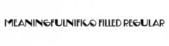
( Fonts by Vladimir Nikolic - www.creativefabrica.com/designer/vladimirnikolic/ - Personal-use only. For commercial use please contact owner. )
A bold, modern font with geometric shapes and thick outlines.
![Meaningfulnifico Filled Regular font caratteri gratis]() Scaricare 51 Downloads@WebFont
Scaricare 51 Downloads@WebFont -
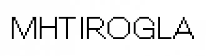
( Fonts by Brando Corradini - Personal-use only. For commercial use please contact owner. )
A pixelated, retro-style font with a blocky, geometric design.
![MHTIROGLA font caratteri gratis]() Scaricare 51 Downloads@WebFont
Scaricare 51 Downloads@WebFont -
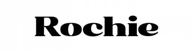
( Fonts by sronstudio - Yusron Billah - Personal-use only. For commercial use please contact owner. )
A bold, high-contrast serif font with sharp serifs and a dramatic style.
![Rochie font caratteri gratis]() Scaricare 51 Downloads@WebFont
Scaricare 51 Downloads@WebFont -
( Fonts by Kong Font - https://fontkong.com/ - Personal-use only. For commercial use please contact owner. )
A dynamic and expressive handwritten script font with a modern flair.
![Eniceplay Origin font caratteri gratis]() Scaricare 51 Downloads@WebFont
Scaricare 51 Downloads@WebFont -
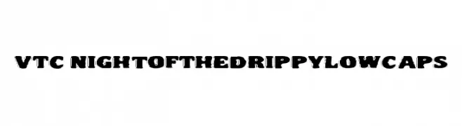
( Fonts by Vigilante Typeface Corporation Larry Yerkes. Personal-use only. For commercial use please contact owner. )
A bold, playful font with a dripping effect, ideal for creative projects.
![VTC NightOfTheDrippyLowCaps font caratteri gratis]() Scaricare 51 Downloads@WebFont
Scaricare 51 Downloads@WebFont -
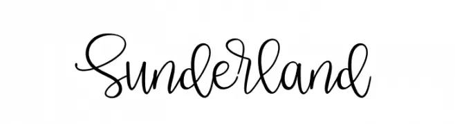
( Fonts by Four Lines - zain Fahroni - Personal-use only. For commercial use please contact owner. )
A lively, cursive handwritten font with fluid, connected letterforms.
![Sunderland font caratteri gratis]() Scaricare 51 Downloads@WebFont
Scaricare 51 Downloads@WebFont -
( Fonts by Sungi Creative - Ivan Pranata - Personal-use only. For commercial use please contact owner. )
A bold, flowing script font with a modern and elegant style.
![Amberllee font caratteri gratis]() Scaricare 51 Downloads@WebFont
Scaricare 51 Downloads@WebFont -
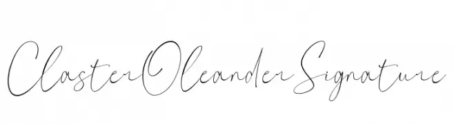
( Fonts by ToniStudio - Fatoni Nurman - Personal-use only. For commercial use please contact owner. )
A sophisticated, cursive script font with elegant, flowing strokes.
![Claster Oleander Signature font caratteri gratis]() Scaricare 51 Downloads@WebFont
Scaricare 51 Downloads@WebFont -
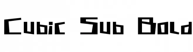
( Roland Huse Design - www.rolandhuse.com )
A bold, geometric font with angular, blocky letterforms.
![Cubic Sub Bold font caratteri gratis]() Scaricare 51 Downloads@WebFont
Scaricare 51 Downloads@WebFont -
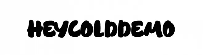
( Fonts by FadeLine Studio - Personal-use only. For commercial use please contact owner. )
A bold, playful script font with thick, rounded strokes and close character spacing.
![HeycoldDEMO font caratteri gratis]() Scaricare 51 Downloads@WebFont
Scaricare 51 Downloads@WebFont -
( Fonts by Letterena Studios - letterena.com - Personal-use only. For commercial use please contact owner. )
A classic serif font with high contrast and elegant strokes.
![Gishella Morely font caratteri gratis]() Scaricare 51 Downloads@WebFont
Scaricare 51 Downloads@WebFont


Quali sono i font più popolari adesso?
Poppins, Roboto, Montserrat, Open Sans e Lato sono molto usati per le forme pulite e l'ampia applicabilità — dall'identità di marca alle landing page e ai poster.
Quali font si usano spesso nei loghi?
Le sans serif geometriche (es. Poppins, famiglie in stile Gotham) sono scelte comuni per un branding pulito e scalabile. Per un tocco personale restano valide script e stili manoscritti. Abbina un display deciso per i titoli a un corpo testo neutro per riconoscibilità ed equilibrio.
Ogni quanto si aggiorna la lista?
Con regolarità, in base ai download e all'attività reale. Torna spesso per scoprire in anticipo le nuove preferite.
💡 Consiglio: aggiungi ai preferiti — le tendenze cambiano in fretta e i font top di oggi possono ispirare il rebranding di domani.