Benvenuto nelle Font Più Popolari — dove popolarità e qualità si incontrano. Qui trovi i font più scaricati e usati dell'anno. Se cerchi scelte sicure per logo, web o social, inizia da qui.
Ogni font top si distingue per equilibrio, leggibilità e versatilità. Troverai sans serif moderne, script eleganti, serif vintage e display minimalisti.
-
( Fonts by Amru ID - Personal-use only. For commercial use please contact owner. )
A modern, clean sans-serif font with a minimalist design.
 Scaricare 51 Downloads@WebFont
 -
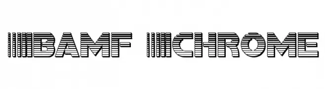
( Iconian Fonts - Daniel Zadorozny - www.iconian.com )
A bold, geometric font with horizontal stripes for a modern, energetic look.
![Bamf Chrome font caratteri gratis]() Scaricare 51 Downloads@WebFont
Scaricare 51 Downloads@WebFont -
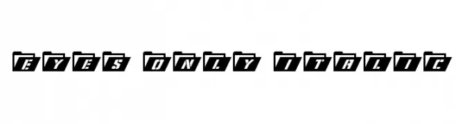
( Iconian Fonts - Daniel Zadorozny - www.iconian.com )
A bold, italicized font with a futuristic, tech-inspired design.
![Eyes Only Italic font caratteri gratis]() Scaricare 51 Downloads@WebFont
Scaricare 51 Downloads@WebFont -
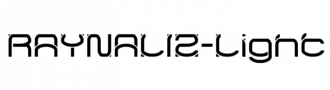
( weknow - Wino S Kadir - www.creativefabrica.com/designer/weknow/ )
A modern, geometric font with clean lines and rounded edges.
![RAYNALIZ-Light font caratteri gratis]() Scaricare 51 Downloads@WebFont
Scaricare 51 Downloads@WebFont -
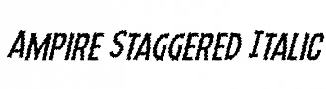
( Fonts by Daniel Zadorozny - www.iconian.com - Personal-use only. For commercial use please contact owner. )
A bold, staggered italic font with jagged edges and dynamic style.
![Ampire Staggered Italic font caratteri gratis]() Scaricare 51 Downloads@WebFont
Scaricare 51 Downloads@WebFont -
-
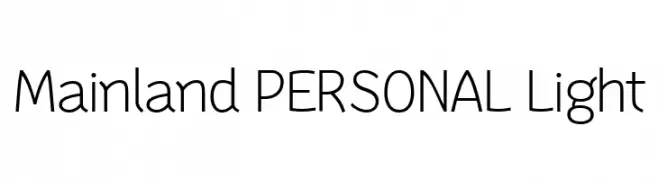
( Fonts by Mans Greback - Personal-use only. For commercial use please contact owner. )
A modern, light sans-serif font with clean lines and balanced proportions.
![Mainland PERSONAL Light font caratteri gratis]() Scaricare 51 Downloads@WebFont
Scaricare 51 Downloads@WebFont -
( Fonts by Tigadestd - Doli Harahap - Personal-use only. For commercial use please contact owner. )
A playful, hand-drawn font with rounded, bold characters.
![Laillaland font caratteri gratis]() Scaricare 51 Downloads@WebFont
Scaricare 51 Downloads@WebFont -
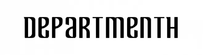
( Fonts by Iconian Fonts - Daniel Zadorozny - Personal-use only. For commercial use please contact owner. )
A bold, modern font with tall, narrow characters and a geometric influence.
![Department H font caratteri gratis]() Scaricare 51 Downloads@WebFont
Scaricare 51 Downloads@WebFont -
( Fonts by Serge Shi - Personal-use only. For commercial use please contact owner. )
A bold, geometric Art Deco font with a double-line effect.
![SS_Adec2.0_main font caratteri gratis]() Scaricare 51 Downloads@WebFont
Scaricare 51 Downloads@WebFont -
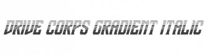
( Fonts by Daniel Zadorozny - www.iconian.com - Personal-use only. For commercial use please contact owner. )
A bold, italicized font with a futuristic gradient line design.
![Drive Corps Gradient Italic font caratteri gratis]() Scaricare 51 Downloads@WebFont
Scaricare 51 Downloads@WebFont -
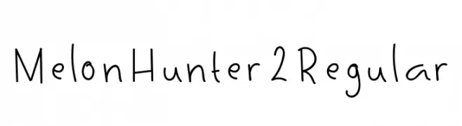
( Fonts by Mightyfire - Agustian Eko Saputro - Personal-use only. For commercial use please contact owner. )
A playful, handwritten font with smooth, rounded strokes and a casual feel.
![MelonHunter2Regular font caratteri gratis]() Scaricare 51 Downloads@WebFont
Scaricare 51 Downloads@WebFont -
( Noto is a trademark of Google Inc. Noto fonts are open source. All Noto fonts are published under the SIL Open Font License, Version 1.1 )
A bold, extra-condensed sans-serif font with tight spacing and high legibility.
![Noto Sans Tamil UI ExtraCondensed Bold font caratteri gratis]() Scaricare 51 Downloads@WebFont
Scaricare 51 Downloads@WebFont -
( Noto is a trademark of Google Inc. Noto fonts are open source. All Noto fonts are published under the SIL Open Font License, Version 1.1 )
Invalid font sample.
![Noto Sans Myanmar UI ExtraCondensed font caratteri gratis]() Scaricare 51 Downloads@WebFont
Scaricare 51 Downloads@WebFont -
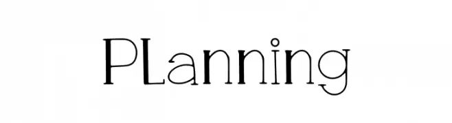
( Fonts by Choirul Masruroh - Personal-use only. For commercial use please contact owner. )
A modern-vintage font with geometric shapes and playful serifs, offering medium contrast and versatility.
![Planning font caratteri gratis]() Scaricare 51 Downloads@WebFont
Scaricare 51 Downloads@WebFont -
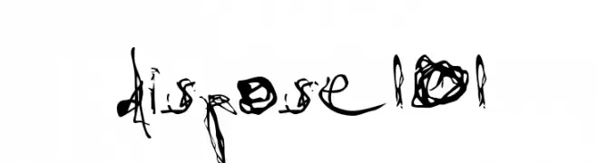
( Fonts by Christopher Young - Personal-use only. For commercial use please contact owner. )
A chaotic, scribbled font with thick, uneven strokes and a dynamic, artistic flair.
![dispose101 font caratteri gratis]() Scaricare 51 Downloads@WebFont
Scaricare 51 Downloads@WebFont -
( Fonts by Vladimir Nikolic - https://www.creativefabrica.com/product/educated-deers/ref/144265/ - Personal-use only. For commercial use please contact owner. )
A bold, geometric font with characters enclosed in decorative octagonal frames, ideal for impactful designs.
![Capitalismo 6 Regular font caratteri gratis]() Scaricare 51 Downloads@WebFont
Scaricare 51 Downloads@WebFont -
( Fonts by GFR Creative - Personal-use only. For commercial use please contact owner. )
A lively, cursive script font with medium contrast and fluid strokes.
![Rosta font caratteri gratis]() Scaricare 51 Downloads@WebFont
Scaricare 51 Downloads@WebFont -
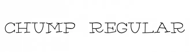
( AdultHuman - Alex - twitter.com/AdultHumanType )
A playful, hand-drawn font with whimsical, irregular strokes.
![Chump-Regular font caratteri gratis]() Scaricare 51 Downloads@WebFont
Scaricare 51 Downloads@WebFont -
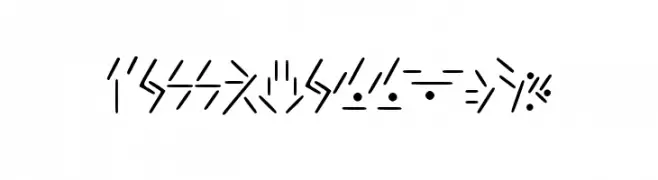
( Fallkhar - Leon Dzojic - www.creativefabrica.com/designer/fallkhar/ )
Intricate, cryptic symbols resembling ancient runes.
![Fallkhar_Runes font caratteri gratis]() Scaricare 51 Downloads@WebFont
Scaricare 51 Downloads@WebFont -
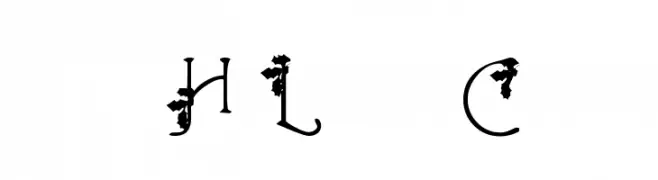
( Dani Foster Herring - dani3d.com/ )
A decorative font with floral embellishments and whimsical, artistic style.
![HolLeigh Caps font caratteri gratis]() Scaricare 51 Downloads@WebFont
Scaricare 51 Downloads@WebFont -
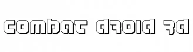
( Fonts by Daniel Zadorozny - www.iconian.com - Personal-use only. For commercial use please contact owner. )
A bold, futuristic font with a 3D effect and geometric design.
![Combat Droid 3D font caratteri gratis]() Scaricare 51 Downloads@WebFont
Scaricare 51 Downloads@WebFont -
( Fonts by Daniel Zadorozny - www.iconian.com - Personal-use only. For commercial use please contact owner. )
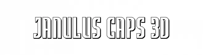
A bold, 3D outlined font with a modern, dynamic style.
![Janulus Caps 3D font caratteri gratis]() Scaricare 51 Downloads@WebFont
Scaricare 51 Downloads@WebFont -
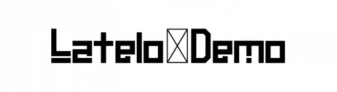
( Fonts by Esa Nugroho - Esa Prasetio Nugroho - Personal-use only. For commercial use please contact owner. )
A bold, geometric font with a modern and futuristic style.
![Latelo-Demo font caratteri gratis]() Scaricare 51 Downloads@WebFont
Scaricare 51 Downloads@WebFont -
![bitstorm maximumcondensed oblique font caratteri gratis]() Scaricare 51 Downloads@WebFont
Scaricare 51 Downloads@WebFont -
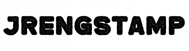
( Fonts by twinletter - Rozikan - Personal-use only. For commercial use please contact owner. )
A bold, distressed font with a textured, stamp-like appearance.
![Jreng Stamp font caratteri gratis]() Scaricare 51 Downloads@WebFont
Scaricare 51 Downloads@WebFont -
( Fonts by Vladimir Nikolic )
The image features animated sheep characters, not a font.
![Animasyon Regular font caratteri gratis]() Scaricare 51 Downloads@WebFont
Scaricare 51 Downloads@WebFont -
( Noto is a trademark of Google Inc. Noto fonts are open source. All Noto fonts are published under the SIL Open Font License, Version 1.1 )
The image shows placeholder symbols instead of a valid font.
![Noto Serif Thai ExtraCondensed SemiBold font caratteri gratis]() Scaricare 51 Downloads@WebFont
Scaricare 51 Downloads@WebFont -
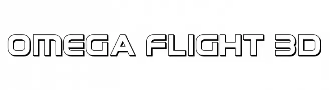
( Fonts by Daniel Zadorozny - www.iconian.com - Personal-use only. For commercial use please contact owner. )
A bold, futuristic font with a 3D effect and geometric design.
![Omega Flight 3D font caratteri gratis]() Scaricare 51 Downloads@WebFont
Scaricare 51 Downloads@WebFont -
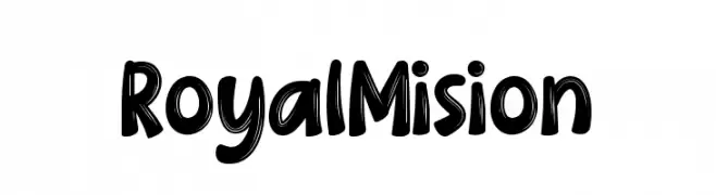
( Fonts by DumadiStyle - Toni Dzulham - Personal-use only. For commercial use please contact owner. )
A bold, playful font with a hand-drawn, brush-like texture.
![Royal Mision font caratteri gratis]() Scaricare 51 Downloads@WebFont
Scaricare 51 Downloads@WebFont -
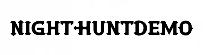
( Fonts by Ronin Design - Personal-use only. For commercial use please contact owner. )
A bold, angular serif font with a modern and striking design.
![Night Hunt Demo font caratteri gratis]() Scaricare 51 Downloads@WebFont
Scaricare 51 Downloads@WebFont -
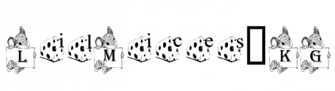
( Katz Fontz - katzfonts.50megs.com/kg.html )
A whimsical font with mouse-themed uppercase and cheese-themed lowercase letters.
![Lil Mices _KG font caratteri gratis]() Scaricare 51 Downloads@WebFont
Scaricare 51 Downloads@WebFont -
( Noto is a trademark of Google Inc. Noto fonts are open source. All Noto fonts are published under the SIL Open Font License, Version 1.1 )
A clean, modern sans-serif font with uniform stroke width and high readability.
![Noto Sans Devanagari UI ExtraLight font caratteri gratis]() Scaricare 51 Downloads@WebFont
Scaricare 51 Downloads@WebFont -
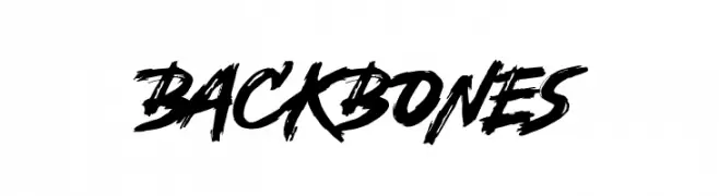
( Fonts by Tigadestd - Doli Harahap - Personal-use only. For commercial use please contact owner. )
A bold, brush-style font with dynamic, hand-drawn strokes.
![Backbones font caratteri gratis]() Scaricare 51 Downloads@WebFont
Scaricare 51 Downloads@WebFont -
( Fonts by Friendly Fonts - Paul IJsendoorn - Personal-use only. For commercial use please contact owner. )
A playful, handwritten script font with smooth, connected letters.
![Fineliner Script font caratteri gratis]() Scaricare 51 Downloads@WebFont
Scaricare 51 Downloads@WebFont -
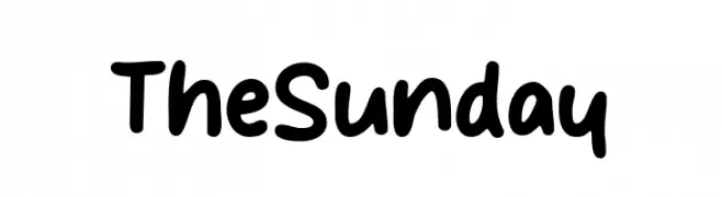
( Fonts by Mans Greback - www.mansgreback.com - Personal-use only. For commercial use please contact owner. )
A bold, handwritten font with rounded edges and a playful style.
![The Sunday font caratteri gratis]() Scaricare 51 Downloads@WebFont
Scaricare 51 Downloads@WebFont


Quali sono i font più popolari adesso?
Poppins, Roboto, Montserrat, Open Sans e Lato sono molto usati per le forme pulite e l'ampia applicabilità — dall'identità di marca alle landing page e ai poster.
Quali font si usano spesso nei loghi?
Le sans serif geometriche (es. Poppins, famiglie in stile Gotham) sono scelte comuni per un branding pulito e scalabile. Per un tocco personale restano valide script e stili manoscritti. Abbina un display deciso per i titoli a un corpo testo neutro per riconoscibilità ed equilibrio.
Ogni quanto si aggiorna la lista?
Con regolarità, in base ai download e all'attività reale. Torna spesso per scoprire in anticipo le nuove preferite.
💡 Consiglio: aggiungi ai preferiti — le tendenze cambiano in fretta e i font top di oggi possono ispirare il rebranding di domani.