Benvenuto nelle Font Più Popolari — dove popolarità e qualità si incontrano. Qui trovi i font più scaricati e usati dell'anno. Se cerchi scelte sicure per logo, web o social, inizia da qui.
Ogni font top si distingue per equilibrio, leggibilità e versatilità. Troverai sans serif moderne, script eleganti, serif vintage e display minimalisti.
-
( Fonts by Daniel Zadorozny - www.iconian.com - Personal-use only. For commercial use please contact owner. )
A futuristic, bold, and angular font with expanded and italicized characters.
 Scaricare 48 Downloads@WebFont
 -
( Fonts by Daniel Zadorozny - www.iconian.com - Personal-use only. For commercial use please contact owner. )
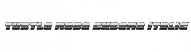
A bold, three-dimensional, chrome-like italic font with a futuristic style.
![Turtle Mode Chrome Italic font caratteri gratis]() Scaricare 48 Downloads@WebFont
Scaricare 48 Downloads@WebFont -
( Fonts by Abo Daniel Studio - Panggah Laksono - Personal-use only. For commercial use please contact owner. )
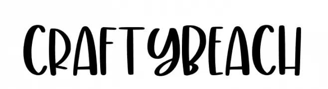
A bold, playful handwritten font with rounded, whimsical letterforms.
![CraftyBeach font caratteri gratis]() Scaricare 48 Downloads@WebFont
Scaricare 48 Downloads@WebFont -
( Fonts by Marhandam Palindung - Personal-use only. For commercial use please contact owner. )
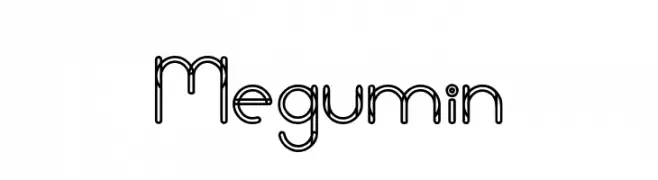
A modern, double-line geometric font with a playful and airy design.
![Megumin font caratteri gratis]() Scaricare 48 Downloads@WebFont
Scaricare 48 Downloads@WebFont -
( Fonts by PutraCetol Studio - www.putracetol.com - Personal-use only. For commercial use please contact owner. )
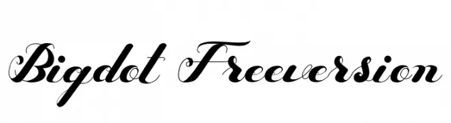
An elegant script font with flowing cursive style and intricate swashes.
![Bigdot Freeversion font caratteri gratis]() Scaricare 48 Downloads@WebFont
Scaricare 48 Downloads@WebFont -
-
( Fonts by Valency Graphics - Sean Grady - Personal-use only. For commercial use please contact owner. )
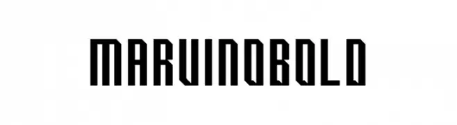
A bold, geometric font with sharp angles and a modern aesthetic.
![Marvino Bold font caratteri gratis]() Scaricare 48 Downloads@WebFont
Scaricare 48 Downloads@WebFont -
( Fonts by Weape Studio - Wahyu Andi - Personal-use only. For commercial use please contact owner. )
A playful handwritten font with smooth, rounded strokes and a casual style.
![Notebook font caratteri gratis]() Scaricare 48 Downloads@WebFont
Scaricare 48 Downloads@WebFont -
( Fonts by wep - Wahyu Eka Prasetya - Personal-use only. For commercial use please contact owner. )
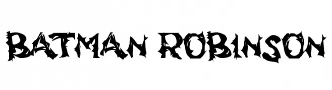
A bold, jagged font with sharp, thorn-like edges.
![BATMAN ROBINSON font caratteri gratis]() Scaricare 48 Downloads@WebFont
Scaricare 48 Downloads@WebFont -
( Fonts by Type Graphy - Personal-use only. For commercial use please contact owner. )
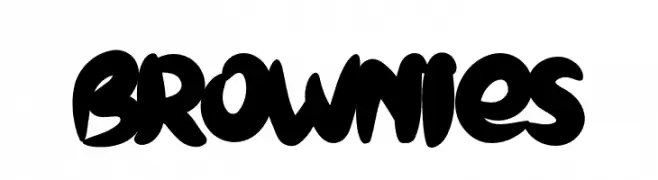
A bold, playful font with thick, rounded strokes and a lively appearance.
![BROWNIES font caratteri gratis]() Scaricare 48 Downloads@WebFont
Scaricare 48 Downloads@WebFont -
( Fonts by Kong Font - https://fontkong.com/ - Personal-use only. For commercial use please contact owner. )
A bold, cursive script font with dynamic strokes and elegant flourishes.
![Masicha font caratteri gratis]() Scaricare 48 Downloads@WebFont
Scaricare 48 Downloads@WebFont -
( Fonts by Colative Studio - Personal-use only. For commercial use please contact owner. )
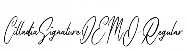
An elegant cursive script font with fluid, handwritten strokes.
![CilladiaSignatureDEMO-Regular font caratteri gratis]() Scaricare 48 Downloads@WebFont
Scaricare 48 Downloads@WebFont -
( Fonts by Valency Graphics - Sean Grady - Personal-use only. For commercial use please contact owner. )
A geometric and angular font with a modern, sleek design.
![Marvino Light font caratteri gratis]() Scaricare 48 Downloads@WebFont
Scaricare 48 Downloads@WebFont -
( Xerographer Fonts - Max Infeld - xerographer.blogspot.com )
A bold, geometric font with a modern and futuristic style.
![Retailistic font caratteri gratis]() Scaricare 48 Downloads@WebFont
Scaricare 48 Downloads@WebFont -
( Kevin Richey )
A playful, hand-drawn font with a rough, textured edge.
![TypeO font caratteri gratis]() Scaricare 48 Downloads@WebFont
Scaricare 48 Downloads@WebFont -
( Fonts by Peter Wiegel - www.peter-wiegel.de - Personal-use only. For commercial use please contact owner. )
A playful, casual handwritten font with fluid, connected strokes.
![Morado Felt font caratteri gratis]() Scaricare 48 Downloads@WebFont
Scaricare 48 Downloads@WebFont -
( Fonts by Alfaraby Studio - Personal-use only. For commercial use please contact owner. )
A bold, cursive font with dynamic, flowing script and decorative flourishes.
![Shanella font caratteri gratis]() Scaricare 48 Downloads@WebFont
Scaricare 48 Downloads@WebFont -
( Fonts by Kong Font - Personal-use only. For commercial use please contact owner. )
A decorative font with elegant swashes and flourishes, perfect for artistic projects.
![Agustin Swash font caratteri gratis]() Scaricare 48 Downloads@WebFont
Scaricare 48 Downloads@WebFont -
( Fonts by Marhandam Palindung - Personal-use only. For commercial use please contact owner. )
A geometric, rune-like font with angular lines and diamond accents.
![Shalltear font caratteri gratis]() Scaricare 48 Downloads@WebFont
Scaricare 48 Downloads@WebFont -
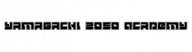
( Fonts by Daniel Zadorozny - www.iconian.com - Personal-use only. For commercial use please contact owner. )
A bold, futuristic font with geometric, outlined characters.
![Yamagachi 2050 Academy font caratteri gratis]() Scaricare 48 Downloads@WebFont
Scaricare 48 Downloads@WebFont -
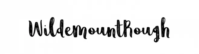
( Fonts by Brittney Murphy Design - Brittney Murphy - Personal-use only. For commercial use please contact owner. )
A bold, hand-drawn font with a rough, textured appearance and playful style.
![WildemountRough font caratteri gratis]() Scaricare 48 Downloads@WebFont
Scaricare 48 Downloads@WebFont -
( Fonts by JunCreative - Personal-use only. For commercial use please contact owner. )
A lively, flowing script font with elegant loops and a natural handwriting style.
![babylittle font caratteri gratis]() Scaricare 48 Downloads@WebFont
Scaricare 48 Downloads@WebFont -
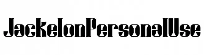
( Fonts by Miracledsign - Anton Septiawan - Personal-use only. For commercial use please contact owner. )
A bold, Gothic-inspired font with sharp angles and thick strokes.
![Jackelon Personal Use font caratteri gratis]() Scaricare 48 Downloads@WebFont
Scaricare 48 Downloads@WebFont -
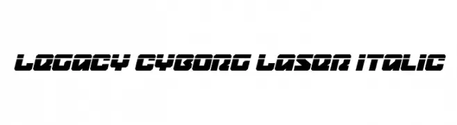
( Fonts by Daniel Zadorozny - www.iconian.com - Personal-use only. For commercial use please contact owner. )
A futuristic, bold, and italic font with sharp angles and a high-tech aesthetic.
![Legacy Cyborg Laser Italic font caratteri gratis]() Scaricare 48 Downloads@WebFont
Scaricare 48 Downloads@WebFont -
( Fonts by Daniel Zadorozny - www.iconian.com - Personal-use only. For commercial use please contact owner. )
A bold, geometric font with characters enclosed in hexagonal shapes, offering a modern and futuristic look.
![HeXkEy Solid font caratteri gratis]() Scaricare 48 Downloads@WebFont
Scaricare 48 Downloads@WebFont -
( Fonts by Letterative Studio - Personal-use only. For commercial use please contact owner. )
A dynamic, cursive script font with fluid, expressive strokes.
![Solitude font caratteri gratis]() Scaricare 48 Downloads@WebFont
Scaricare 48 Downloads@WebFont -
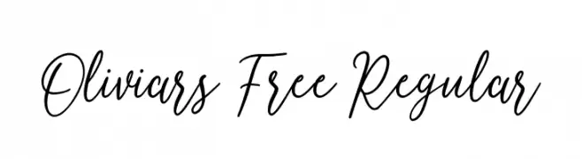
( Fonts by Maulana Creative - Gilang Maulana - Personal-use only. For commercial use please contact owner. )
An elegant, flowing script font with smooth, cursive strokes.
![Oliviars Free Regular font caratteri gratis]() Scaricare 48 Downloads@WebFont
Scaricare 48 Downloads@WebFont -
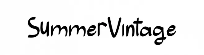
( Fonts by Roni Studio - Muhammad Zamroni - Personal-use only. For commercial use please contact owner. )
A playful, handwritten-style font with a vintage touch.
![Summer Vintage font caratteri gratis]() Scaricare 48 Downloads@WebFont
Scaricare 48 Downloads@WebFont -
( Patricio Zambra )
A hand-drawn, artistic font with elongated, irregular letterforms.
![Etiketafont font caratteri gratis]() Scaricare 48 Downloads@WebFont
Scaricare 48 Downloads@WebFont -
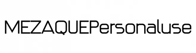
( Fonts by Miracledsign - Anton Septiawan - Personal-use only. For commercial use please contact owner. )
A modern, geometric sans-serif font with clean lines and a futuristic feel.
![MEZAQUE Personaluse font caratteri gratis]() Scaricare 48 Downloads@WebFont
Scaricare 48 Downloads@WebFont -
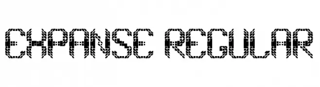
( Fonts by Rikyozone - Riccardo Zanotti - Personal-use only. For commercial use please contact owner. )
A geometric, pixelated font with a futuristic and decorative style.
![Expanse Regular font caratteri gratis]() Scaricare 48 Downloads@WebFont
Scaricare 48 Downloads@WebFont -
( Fonts by Graphicfresh - Personal-use only. For commercial use please contact owner. )
A bold, geometric font with angular lines and unique cutouts, perfect for modern designs.
![Rehab font caratteri gratis]() Scaricare 48 Downloads@WebFont
Scaricare 48 Downloads@WebFont -
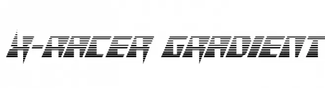
( Fonts by Iconian Fonts - Daniel Zadorozny - Personal-use only. For commercial use please contact owner. )
A bold, angular font with horizontal striping, evoking speed and modernity.
![X-Racer Gradient font caratteri gratis]() Scaricare 48 Downloads@WebFont
Scaricare 48 Downloads@WebFont -
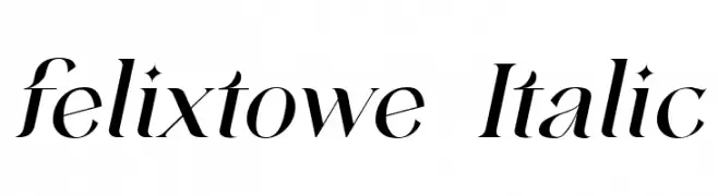
( Fonts by VampStudio - Personal-use only. For commercial use please contact owner. )
An elegant italic font with smooth, flowing lines and moderate contrast.
![felixtowe Italic font caratteri gratis]() Scaricare 48 Downloads@WebFont
Scaricare 48 Downloads@WebFont -
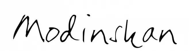
( Fontomen - www.algonet.se/~j-j/ )
A casual, handwritten font with a playful and informal style.
![Modinskan font caratteri gratis]() Scaricare 48 Downloads@WebFont
Scaricare 48 Downloads@WebFont -
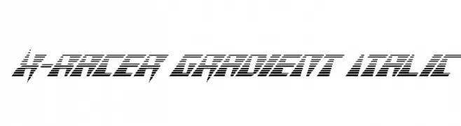
( Fonts by Iconian Fonts - Daniel Zadorozny - Personal-use only. For commercial use please contact owner. )
A dynamic, italicized font with a gradient line effect, exuding speed and modernity.
![X-Racer Gradient Italic font caratteri gratis]() Scaricare 48 Downloads@WebFont
Scaricare 48 Downloads@WebFont


Quali sono i font più popolari adesso?
Poppins, Roboto, Montserrat, Open Sans e Lato sono molto usati per le forme pulite e l'ampia applicabilità — dall'identità di marca alle landing page e ai poster.
Quali font si usano spesso nei loghi?
Le sans serif geometriche (es. Poppins, famiglie in stile Gotham) sono scelte comuni per un branding pulito e scalabile. Per un tocco personale restano valide script e stili manoscritti. Abbina un display deciso per i titoli a un corpo testo neutro per riconoscibilità ed equilibrio.
Ogni quanto si aggiorna la lista?
Con regolarità, in base ai download e all'attività reale. Torna spesso per scoprire in anticipo le nuove preferite.
💡 Consiglio: aggiungi ai preferiti — le tendenze cambiano in fretta e i font top di oggi possono ispirare il rebranding di domani.