Benvenuto nelle Font Più Popolari — dove popolarità e qualità si incontrano. Qui trovi i font più scaricati e usati dell'anno. Se cerchi scelte sicure per logo, web o social, inizia da qui.
Ogni font top si distingue per equilibrio, leggibilità e versatilità. Troverai sans serif moderne, script eleganti, serif vintage e display minimalisti.
-
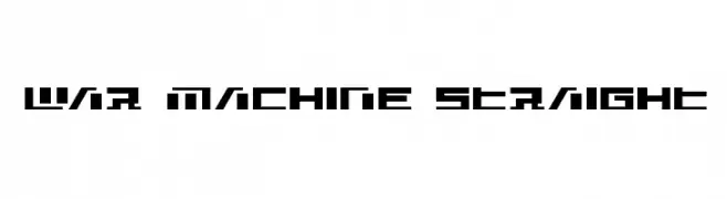
( Iconian Fonts - Daniel Zadorozny - www.iconian.com )
A bold, geometric font with a futuristic and industrial design.
 Scaricare 48 Downloads@WebFont
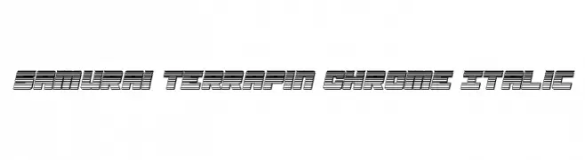
 -
![Samurai Terrapin Chrome Italic font caratteri gratis]() Scaricare 48 Downloads@WebFont
Scaricare 48 Downloads@WebFont -
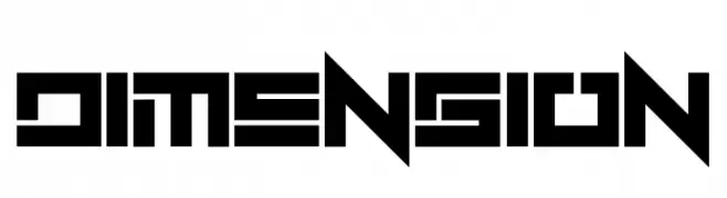
( Fonts by Erik Studio - Personal-use only. For commercial use please contact owner. )
A bold, geometric font with a futuristic and digital aesthetic.
![Dimension font caratteri gratis]() Scaricare 48 Downloads@WebFont
Scaricare 48 Downloads@WebFont -
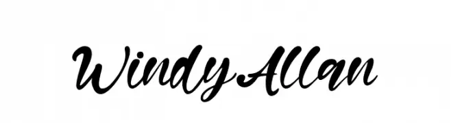
( Fonts by Kong Font - fontkong.com - Personal-use only. For commercial use please contact owner. )
A bold, cursive font with flowing, connected letters and strong visual impact.
![Windy Allan font caratteri gratis]() Scaricare 48 Downloads@WebFont
Scaricare 48 Downloads@WebFont -
( Fonts by Daniel Zadorozny - www.iconian.com - Personal-use only. For commercial use please contact owner. )
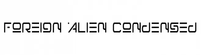
A futuristic, geometric font with condensed letterforms and angular cuts.
![Foreign Alien Condensed font caratteri gratis]() Scaricare 48 Downloads@WebFont
Scaricare 48 Downloads@WebFont -
-
( Fonts by DmLetter31 - Dimas Prasetyo - Personal-use only. For commercial use please contact owner. )
A playful, handwritten-style font with smooth, rounded characters.
![La Rosie font caratteri gratis]() Scaricare 48 Downloads@WebFont
Scaricare 48 Downloads@WebFont -
( Fonts by Zetafonts - Personal-use only. For commercial use please contact owner. )
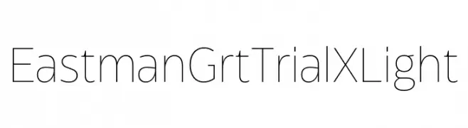
A minimalist, modern font with thin, uniform strokes and geometric shapes.
![Eastman Grt Trial XLight font caratteri gratis]() Scaricare 48 Downloads@WebFont
Scaricare 48 Downloads@WebFont -
( Fonts by StringLabs - stringlabscreative.com - Personal-use only. For commercial use please contact owner. )
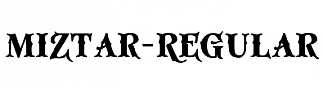
A bold, decorative font with high contrast and vintage flair.
![Miztar-Regular font caratteri gratis]() Scaricare 48 Downloads@WebFont
Scaricare 48 Downloads@WebFont -
( Fonts by mlkwsn - www.mlkwsn.com - Personal-use only. For commercial use please contact owner. )
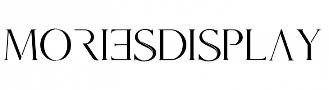
A high-contrast, elegant serif font with sharp serifs and modern style.
![Mories Display font caratteri gratis]() Scaricare 48 Downloads@WebFont
Scaricare 48 Downloads@WebFont -
( Fonts by Beautypes - Bhakti Al Akbar Pasaribu - Personal-use only. For commercial use please contact owner. )
A classic and elegant script font with flowing, cursive letterforms.
![Sallim font caratteri gratis]() Scaricare 48 Downloads@WebFont
Scaricare 48 Downloads@WebFont -
( Haksen Letters - Sarwo Edhi Prayitno )
A playful and elegant script font with bold, flowing uppercase and smooth, handwritten lowercase letters.
![Mellisa font caratteri gratis]() Scaricare 48 Downloads@WebFont
Scaricare 48 Downloads@WebFont -
( Fonts by Peter Wiegel - www.peter-wiegel.de - Personal-use only. For commercial use please contact owner. )
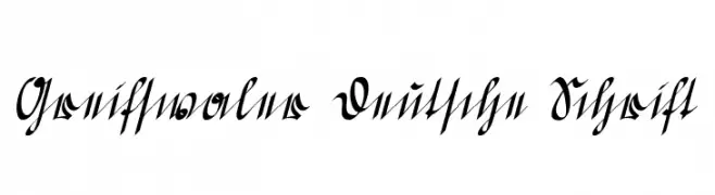
An ornate and decorative script font with a classic German style.
![Greifswaler Deutsche Schrift font caratteri gratis]() Scaricare 48 Downloads@WebFont
Scaricare 48 Downloads@WebFont -
( Fonts by Ibra Creative - Personal-use only. For commercial use please contact owner. )
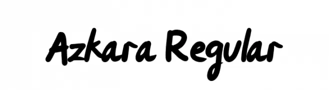
A bold, handwritten font with a playful and casual style.
![Azkara Regular font caratteri gratis]() Scaricare 48 Downloads@WebFont
Scaricare 48 Downloads@WebFont -
( Fonts by sronstudio - Yusron Billah - Personal-use only. For commercial use please contact owner. )
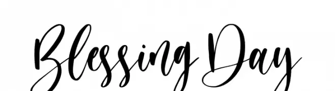
A lively, expressive script font with flowing, connected letters and dynamic strokes.
![Blessing Day font caratteri gratis]() Scaricare 48 Downloads@WebFont
Scaricare 48 Downloads@WebFont -
( London's Letters - www.londonsletters.com/ )
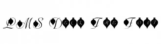
An elegant, ornament-themed decorative font with high contrast script characters.
![LMS Deck The Font font caratteri gratis]() Scaricare 48 Downloads@WebFont
Scaricare 48 Downloads@WebFont -
( Fonts by Vladimir Nikolic - https://www.creativefabrica.com/product/educated-deers/ref/144265/ - Personal-use only. For commercial use please contact owner. )
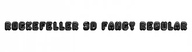
A bold, 3D decorative font with intricate dot and line details.
![Rockefeller 3D Fancy Regular font caratteri gratis]() Scaricare 48 Downloads@WebFont
Scaricare 48 Downloads@WebFont -
( Iconian Fonts - Daniel Zadorozny - www.iconian.com )
A bold, italicized font with a retro-futuristic halftone effect.
![Disco Duck Halftone Italic font caratteri gratis]() Scaricare 48 Downloads@WebFont
Scaricare 48 Downloads@WebFont -
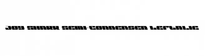
![Joy Shark Semi-Condensed Leftalic font caratteri gratis]() Scaricare 48 Downloads@WebFont
Scaricare 48 Downloads@WebFont -
( Fonts by Daniel Zadorozny - www.iconian.com - Personal-use only. For commercial use please contact owner. )
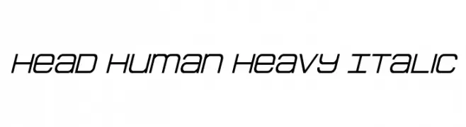
A modern, italicized font with sleek, angular characters and medium contrast.
![Head Human Heavy Italic font caratteri gratis]() Scaricare 48 Downloads@WebFont
Scaricare 48 Downloads@WebFont -
( Fonts by Kong Font - Personal-use only. For commercial use please contact owner. )
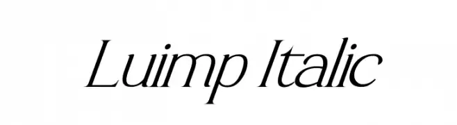
An elegant italic font with thin, flowing strokes and a sophisticated style.
![Luimp Italic font caratteri gratis]() Scaricare 48 Downloads@WebFont
Scaricare 48 Downloads@WebFont -
( Fonts by weknow - Wino S Kadir - Personal-use only. For commercial use please contact owner. )
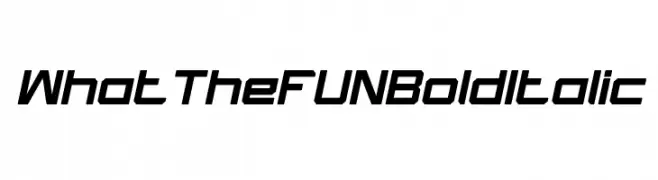
A bold, italic, and modern font with a futuristic design.
![What The FUN Bold Italic font caratteri gratis]() Scaricare 48 Downloads@WebFont
Scaricare 48 Downloads@WebFont -
( David Koffe - sarna.cl/client/web )
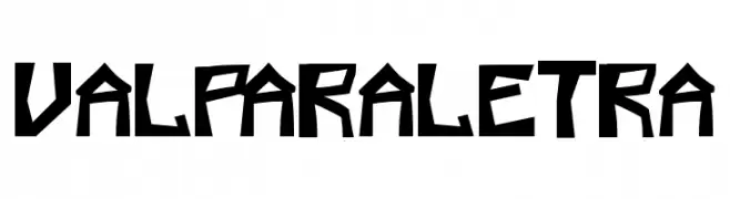
A bold, angular font with a modern, geometric style.
![valparaletra font caratteri gratis]() Scaricare 48 Downloads@WebFont
Scaricare 48 Downloads@WebFont -
( Fonts by Vladimir Nikolic - www.creativefabrica.com/designer/vladimirnikolic/ - Personal-use only. For commercial use please contact owner. )
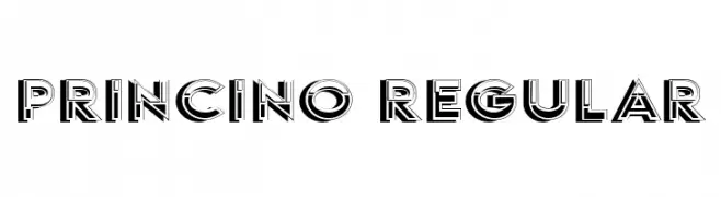
A bold, three-dimensional font with a vintage art deco style.
![Princino Regular font caratteri gratis]() Scaricare 48 Downloads@WebFont
Scaricare 48 Downloads@WebFont -
( Fonts by Andri Bhae - Personal-use only. For commercial use please contact owner. )
A modern, rounded sans-serif font with uniform stroke width and clear readability.
![Verno Normal font caratteri gratis]() Scaricare 48 Downloads@WebFont
Scaricare 48 Downloads@WebFont -
( Fonts by Font People - Personal-use only. For commercial use please contact owner. )
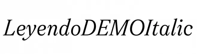
An elegant italic serif font with smooth, flowing lines and moderate contrast.
![Leyendo DEMO Italic font caratteri gratis]() Scaricare 48 Downloads@WebFont
Scaricare 48 Downloads@WebFont -
( Fonts by Lemonthe - Dwi Ahidian - Personal-use only. For commercial use please contact owner. )
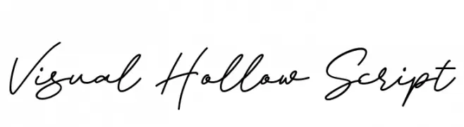
A flowing, cursive font with elegant, sweeping lines and a handwritten appearance.
![Visual Hollow Script font caratteri gratis]() Scaricare 48 Downloads@WebFont
Scaricare 48 Downloads@WebFont -
( Fonts by Vz Type - Personal-use only. For commercial use please contact owner. )
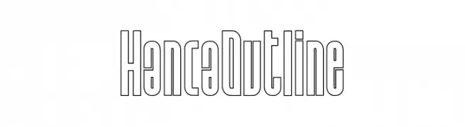
A modern, outline-style font with tall, narrow characters and consistent stroke width.
![Hanca Outline font caratteri gratis]() Scaricare 48 Downloads@WebFont
Scaricare 48 Downloads@WebFont -
( Fonts by Mans Greback - www.mansgreback.com - Personal-use only. For commercial use please contact owner. )
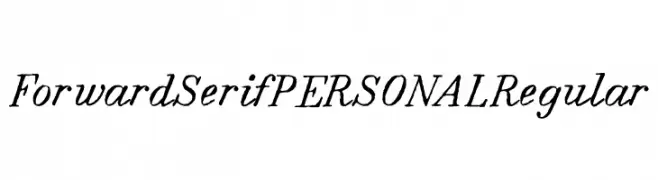
A classic serif font with elegant, slightly slanted characters and medium contrast.
![Forward Serif PERSONAL Regular font caratteri gratis]() Scaricare 48 Downloads@WebFont
Scaricare 48 Downloads@WebFont -
( Fonts by Daniel Zadorozny - www.iconian.com - Personal-use only. For commercial use please contact owner. )
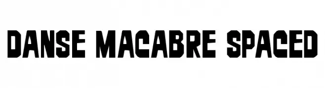
A bold, angular font with a modern, geometric style.
![Danse Macabre Spaced font caratteri gratis]() Scaricare 48 Downloads@WebFont
Scaricare 48 Downloads@WebFont -
( Fonts by Vladimir Nikolic - www.creativefabrica.com/designer/vladimirnikolic/ - Personal-use only. For commercial use please contact owner. )
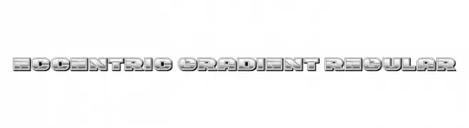
A bold, decorative font with a vintage gradient effect and three-dimensional style.
![Eccentric Gradient Regular font caratteri gratis]() Scaricare 48 Downloads@WebFont
Scaricare 48 Downloads@WebFont -
( Fonts by Letterena Studios - letterena.com - Personal-use only. For commercial use please contact owner. )
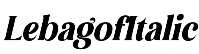
A bold, italic serif font with dynamic slant and strong presence.
![Lebagof Italic font caratteri gratis]() Scaricare 48 Downloads@WebFont
Scaricare 48 Downloads@WebFont -
( Fonts by Vultype - Candra Hamdani - Personal-use only. For commercial use please contact owner. )
An elegant, flowing script font with smooth, cursive strokes and graceful curves.
![Acelire Rosse font caratteri gratis]() Scaricare 48 Downloads@WebFont
Scaricare 48 Downloads@WebFont -
( Fonts by Kong Font - fontkong.com - Personal-use only. For commercial use please contact owner. )
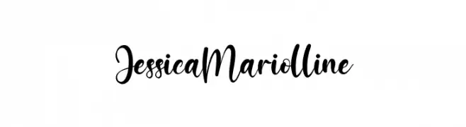
A flowing, cursive font with elegant, interconnected characters.
![JessicaMariolline font caratteri gratis]() Scaricare 48 Downloads@WebFont
Scaricare 48 Downloads@WebFont -
( Fonts by Vladimir Nikolic - https://www.creativefabrica.com/product/educated-deers/ref/144265/ - Personal-use only. For commercial use please contact owner. )
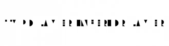
A geometric, abstract font with bold, fragmented characters and a modern aesthetic.
![Typo Layer Inferior Layer font caratteri gratis]() Scaricare 48 Downloads@WebFont
Scaricare 48 Downloads@WebFont -
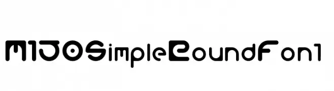
( Fonts by M 150 - Personal-use only. For commercial use please contact owner. )
A modern, rounded font with a playful and futuristic design.
![M150SimpleRoundFont font caratteri gratis]() Scaricare 48 Downloads@WebFont
Scaricare 48 Downloads@WebFont


Quali sono i font più popolari adesso?
Poppins, Roboto, Montserrat, Open Sans e Lato sono molto usati per le forme pulite e l'ampia applicabilità — dall'identità di marca alle landing page e ai poster.
Quali font si usano spesso nei loghi?
Le sans serif geometriche (es. Poppins, famiglie in stile Gotham) sono scelte comuni per un branding pulito e scalabile. Per un tocco personale restano valide script e stili manoscritti. Abbina un display deciso per i titoli a un corpo testo neutro per riconoscibilità ed equilibrio.
Ogni quanto si aggiorna la lista?
Con regolarità, in base ai download e all'attività reale. Torna spesso per scoprire in anticipo le nuove preferite.
💡 Consiglio: aggiungi ai preferiti — le tendenze cambiano in fretta e i font top di oggi possono ispirare il rebranding di domani.