Benvenuto nelle Font Più Popolari — dove popolarità e qualità si incontrano. Qui trovi i font più scaricati e usati dell'anno. Se cerchi scelte sicure per logo, web o social, inizia da qui.
Ogni font top si distingue per equilibrio, leggibilità e versatilità. Troverai sans serif moderne, script eleganti, serif vintage e display minimalisti.
-
( Copyright (c) 2011, Pablo Impallari (www.impallari.com|impallari@gmail.com) )
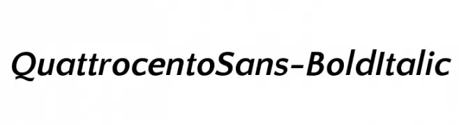
A bold, italicized sans-serif font with a modern and elegant style.
 Scaricare 400 Downloads@WebFont
 -
( Fonts by Graham Meade - GemFonts )
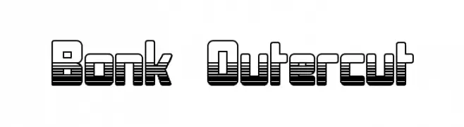
A bold, layered font with a three-dimensional, futuristic design.
![Bonk Outercut font caratteri gratis]() Scaricare 400 Downloads@WebFont
Scaricare 400 Downloads@WebFont -
![R. Squiddy Fancy font caratteri gratis]() Scaricare 400 Downloads@WebFont
Scaricare 400 Downloads@WebFont -
( Fonts by a www.fontfabric.com. Personal-use only. For commercial use please contact owner. )
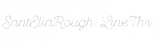
A cursive, hand-drawn font with a rough, artistic style.
![SantEliaRough-LineThr font caratteri gratis]() Scaricare 400 Downloads@WebFont
Scaricare 400 Downloads@WebFont -
( K-Type Freebies (Free for Personal Use Only) FROM http://www.k-type.com )
A modern, tall, and narrow font with a clean and elegant design.
![Susanna font caratteri gratis]() Scaricare 400 Downloads@WebFont
Scaricare 400 Downloads@WebFont -
-
( Fonts by www.chequered.ink - Chequered Ink - Personal-use only. For commercial use please contact owner. )
A bold, modern font with tall, narrow uppercase letters and balanced lowercase characters.
![Acetate font caratteri gratis]() Scaricare 400 Downloads@WebFont
Scaricare 400 Downloads@WebFont -
( Fonts by Darrell Flood )
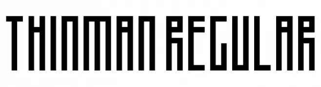
A geometric, pixelated font with a retro digital aesthetic.
![Thinman Regular font caratteri gratis]() Scaricare 400 Downloads@WebFont
Scaricare 400 Downloads@WebFont -
( Fonts by Ana )
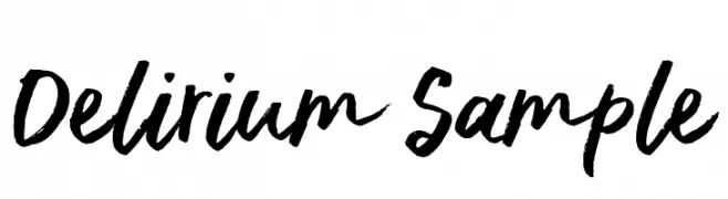
A bold, expressive handwritten font with dynamic strokes.
![Delirium Sample font caratteri gratis]() Scaricare 400 Downloads@WebFont
Scaricare 400 Downloads@WebFont -
( Fonts by Yicong Faith )
A playful, rounded font with smooth curves and a whimsical style.
![hellogiraffe font caratteri gratis]() Scaricare 400 Downloads@WebFont
Scaricare 400 Downloads@WebFont -
![Ratty Tatty font caratteri gratis]() Scaricare 400 Downloads@WebFont
Scaricare 400 Downloads@WebFont


Quali sono i font più popolari adesso?
Poppins, Roboto, Montserrat, Open Sans e Lato sono molto usati per le forme pulite e l'ampia applicabilità — dall'identità di marca alle landing page e ai poster.
Quali font si usano spesso nei loghi?
Le sans serif geometriche (es. Poppins, famiglie in stile Gotham) sono scelte comuni per un branding pulito e scalabile. Per un tocco personale restano valide script e stili manoscritti. Abbina un display deciso per i titoli a un corpo testo neutro per riconoscibilità ed equilibrio.
Ogni quanto si aggiorna la lista?
Con regolarità, in base ai download e all'attività reale. Torna spesso per scoprire in anticipo le nuove preferite.
💡 Consiglio: aggiungi ai preferiti — le tendenze cambiano in fretta e i font top di oggi possono ispirare il rebranding di domani.