Benvenuto nelle Font Più Popolari — dove popolarità e qualità si incontrano. Qui trovi i font più scaricati e usati dell'anno. Se cerchi scelte sicure per logo, web o social, inizia da qui.
Ogni font top si distingue per equilibrio, leggibilità e versatilità. Troverai sans serif moderne, script eleganti, serif vintage e display minimalisti.
-
( Free for Personal Use. To use commercially please visit the www.bvfonts.com )
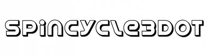
A bold, modern font with a three-dimensional outline style and geometric shapes.
 Scaricare 400 Downloads@WebFont
 -
( Fonts by 38.lineart - Muhammad Ridha Agusni - Personal-use only. For commercial use please contact owner. )
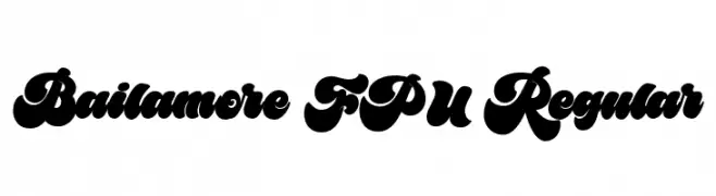
A bold, playful font with thick, rounded strokes and a whimsical style.
![Bailamore FPU Regular font caratteri gratis]() Scaricare 400 Downloads@WebFont
Scaricare 400 Downloads@WebFont -
( Fonts by Iconian Fonts )
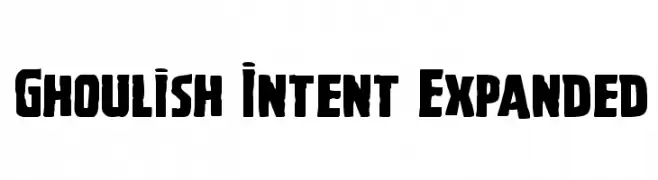
A bold, expanded font with a vintage horror vibe, perfect for eye-catching designs.
![Ghoulish Intent Expanded font caratteri gratis]() Scaricare 400 Downloads@WebFont
Scaricare 400 Downloads@WebFont -
( Fonts by a Neale Davidson - www.pixelsagas.com. Personal-use only. For commercial use please contact owner. )
A bold, italicized font with sharp, angular characters and a dynamic style.
![Bidan Bold Italic font caratteri gratis]() Scaricare 400 Downloads@WebFont
Scaricare 400 Downloads@WebFont -
( Fonts by Style-7 - www.styleseven.com - Personal-use only. For commercial use please contact owner. )
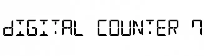
A digital, seven-segment display style font with a geometric and technical look.
![Digital Counter 7 font caratteri gratis]() Scaricare 400 Downloads@WebFont
Scaricare 400 Downloads@WebFont -
-
( Copyright (c) 2011, Hjort Nidudsson (http://caudex.sf.net) )
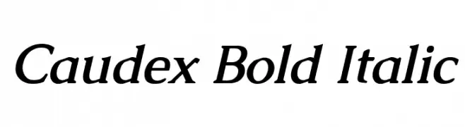
A bold, italic serif font with a classic and elegant style.
![Caudex Bold Italic font caratteri gratis]() Scaricare 400 Downloads@WebFont
Scaricare 400 Downloads@WebFont -
( Fonts by Mans Greback - www.mansgreback.com - Personal-use only. For commercial use please contact owner. )
A playful, handwritten font with bold, lively strokes and a whimsical charm.
![Smile Kids font caratteri gratis]() Scaricare 400 Downloads@WebFont
Scaricare 400 Downloads@WebFont -
( Fonts by Dieter Steffmann )
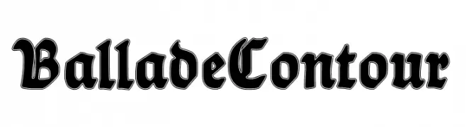
A bold, blackletter font with a contour effect, offering a dramatic, Gothic style.
![BalladeContour font caratteri gratis]() Scaricare 400 Downloads@WebFont
Scaricare 400 Downloads@WebFont -
![Coptic Normal font caratteri gratis]() Scaricare 400 Downloads@WebFont
Scaricare 400 Downloads@WebFont -
( Fonts by Castcraft Software - OPTI Fonts Archive - opti.netii.net - Personal-use only. For commercial use please contact owner. )
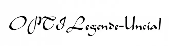
An elegant uncial-style font with flowing, calligraphic curves.
![OPTILegende-Uncial font caratteri gratis]() Scaricare 400 Downloads@WebFont
Scaricare 400 Downloads@WebFont


Quali sono i font più popolari adesso?
Poppins, Roboto, Montserrat, Open Sans e Lato sono molto usati per le forme pulite e l'ampia applicabilità — dall'identità di marca alle landing page e ai poster.
Quali font si usano spesso nei loghi?
Le sans serif geometriche (es. Poppins, famiglie in stile Gotham) sono scelte comuni per un branding pulito e scalabile. Per un tocco personale restano valide script e stili manoscritti. Abbina un display deciso per i titoli a un corpo testo neutro per riconoscibilità ed equilibrio.
Ogni quanto si aggiorna la lista?
Con regolarità, in base ai download e all'attività reale. Torna spesso per scoprire in anticipo le nuove preferite.
💡 Consiglio: aggiungi ai preferiti — le tendenze cambiano in fretta e i font top di oggi possono ispirare il rebranding di domani.