Benvenuto nelle Font Più Popolari — dove popolarità e qualità si incontrano. Qui trovi i font più scaricati e usati dell'anno. Se cerchi scelte sicure per logo, web o social, inizia da qui.
Ogni font top si distingue per equilibrio, leggibilità e versatilità. Troverai sans serif moderne, script eleganti, serif vintage e display minimalisti.
-
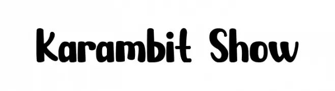
( Fonts by Priogi Rahayu )
A playful, bold font with rounded edges and a whimsical style.
 Scaricare 395 Downloads@WebFont
 -
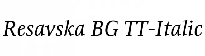
( Fonts by www.tipometar.org )
An elegant serif italic font with smooth lines and moderate contrast.
![Resavska BG TT-Italic font caratteri gratis]() Scaricare 395 Downloads@WebFont
Scaricare 395 Downloads@WebFont -
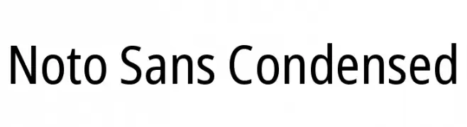
( Fonts by Google )
A modern, condensed sans-serif font with uniform strokes and excellent readability.
![Noto Sans Condensed font caratteri gratis]() Scaricare 395 Downloads@WebFont
Scaricare 395 Downloads@WebFont -
( Fonts by Greg Medina - www.dcoxy.com - Personal-use only. For commercial use please contact owner. )
A dynamic and flowing script font with elegant curves and smooth transitions.
![Bichette font caratteri gratis]() Scaricare 395 Downloads@WebFont
Scaricare 395 Downloads@WebFont -
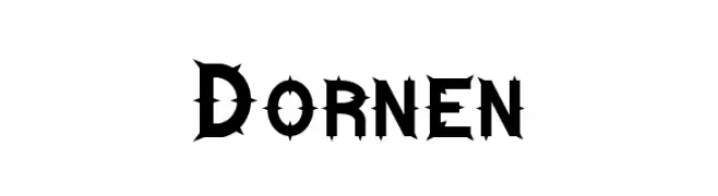
( Fonts by Dieter Schumacher )
A bold, thorny font with sharp accents for an edgy, gothic look.
![Dornen font caratteri gratis]() Scaricare 395 Downloads@WebFont
Scaricare 395 Downloads@WebFont -
-
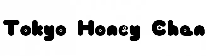
( Fonts by Baka - Kyakirun - bakafonts.kyakirun.com )
A playful, bold font with rounded, bubbly characters and a whimsical style.
![Tokyo Honey Chan font caratteri gratis]() Scaricare 395 Downloads@WebFont
Scaricare 395 Downloads@WebFont -
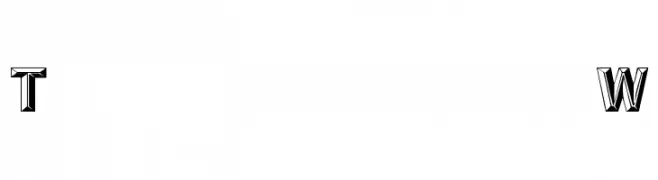
( Fonts by David Rakowski )
A bold, 3D decorative font with high contrast and a modern style.
![Tejaratchi Wd font caratteri gratis]() Scaricare 395 Downloads@WebFont
Scaricare 395 Downloads@WebFont -
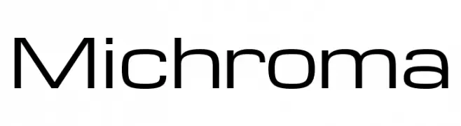
( Fonts by Vernon Adams )
A modern, geometric font with clean lines and rounded edges.
![Michroma font caratteri gratis]() Scaricare 395 Downloads@WebFont
Scaricare 395 Downloads@WebFont -
( Fonts by Altsys Metamorphosis )
A whimsical and playful font with tall, narrow letters and decorative curves.
![Weehah font caratteri gratis]() Scaricare 395 Downloads@WebFont
Scaricare 395 Downloads@WebFont -
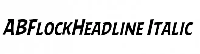
Caratteri di AlexBird2581HD. For commercial use please contact the owner.
![ABFlockHeadline Italic font caratteri gratis]() Scaricare 395 Downloads@WebFont
Scaricare 395 Downloads@WebFont


Quali sono i font più popolari adesso?
Poppins, Roboto, Montserrat, Open Sans e Lato sono molto usati per le forme pulite e l'ampia applicabilità — dall'identità di marca alle landing page e ai poster.
Quali font si usano spesso nei loghi?
Le sans serif geometriche (es. Poppins, famiglie in stile Gotham) sono scelte comuni per un branding pulito e scalabile. Per un tocco personale restano valide script e stili manoscritti. Abbina un display deciso per i titoli a un corpo testo neutro per riconoscibilità ed equilibrio.
Ogni quanto si aggiorna la lista?
Con regolarità, in base ai download e all'attività reale. Torna spesso per scoprire in anticipo le nuove preferite.
💡 Consiglio: aggiungi ai preferiti — le tendenze cambiano in fretta e i font top di oggi possono ispirare il rebranding di domani.