Benvenuto nelle Font Più Popolari — dove popolarità e qualità si incontrano. Qui trovi i font più scaricati e usati dell'anno. Se cerchi scelte sicure per logo, web o social, inizia da qui.
Ogni font top si distingue per equilibrio, leggibilità e versatilità. Troverai sans serif moderne, script eleganti, serif vintage e display minimalisti.
-
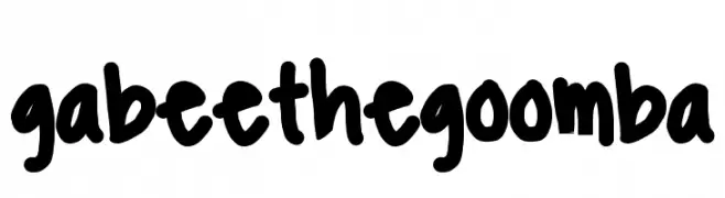
( www.dropdeadgabee.tumblr.com )
A bold, playful handwritten font with thick, rounded strokes.
 Scaricare 392 Downloads@WebFont
 -
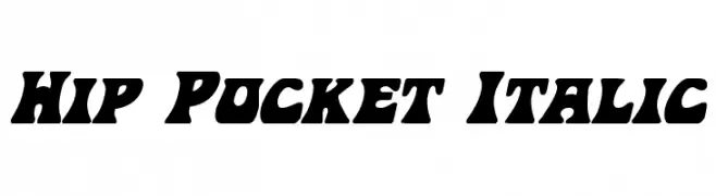
( Fonts by Daniel Zadorozny - www.iconian.com )
A bold, italicized font with thick strokes and playful curves.
![Hip Pocket Italic font caratteri gratis]() Scaricare 392 Downloads@WebFont
Scaricare 392 Downloads@WebFont -
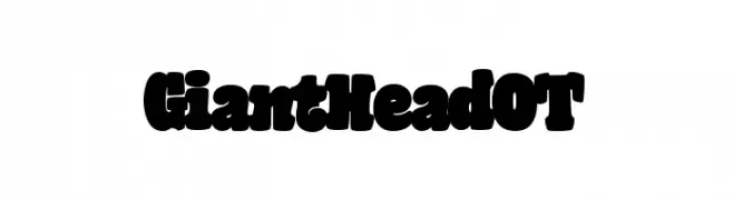
( Fonts by Blue Vinyl - Jess Latham - www.bvfonts.com )
A bold, playful font with thick, rounded characters and a whimsical style.
![GiantHeadOT font caratteri gratis]() Scaricare 392 Downloads@WebFont
Scaricare 392 Downloads@WebFont -
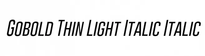
( Fonts by a Situjuh Nazara - c7n1.wordpress.com. Personal-use only. For commercial use please contact owner. )
A sleek, modern, and italicized font with thin, consistent strokes and a condensed form.
![Gobold Thin Light Italic Italic font caratteri gratis]() Scaricare 392 Downloads@WebFont
Scaricare 392 Downloads@WebFont -
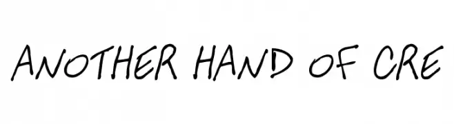
( fredcre.free.fr )
A casual, handwritten font with a playful and informal style.
![ANOTHER HAND OF CRE font caratteri gratis]() Scaricare 392 Downloads@WebFont
Scaricare 392 Downloads@WebFont -
-
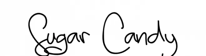
( Fonts by madeDeduk )
A playful, whimsical handwritten font with fluid strokes and dynamic movement.
![Sugar Candy font caratteri gratis]() Scaricare 392 Downloads@WebFont
Scaricare 392 Downloads@WebFont -
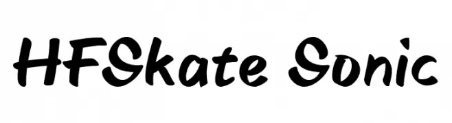
( Fonts by HyFont Studio - www.hyfont.com - Personal-use only. For commercial use please contact owner. )
A bold, brush-style font with dynamic and playful strokes.
![HFSkate Sonic font caratteri gratis]() Scaricare 392 Downloads@WebFont
Scaricare 392 Downloads@WebFont -
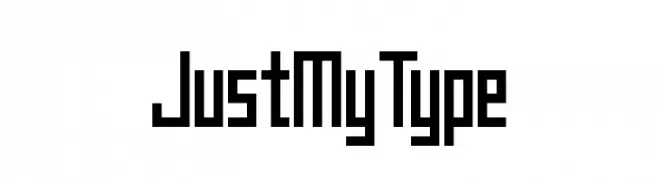
( Chequered Ink - chequered.ink/ )
A bold, geometric font with a modern, tech-inspired aesthetic.
![Just My Type font caratteri gratis]() Scaricare 392 Downloads@WebFont
Scaricare 392 Downloads@WebFont -
![Unionform font caratteri gratis]() Scaricare 392 Downloads@WebFont
Scaricare 392 Downloads@WebFont -
![JaySetch font caratteri gratis]() Scaricare 392 Downloads@WebFont
Scaricare 392 Downloads@WebFont
Quali sono i font più popolari adesso?
Poppins, Roboto, Montserrat, Open Sans e Lato sono molto usati per le forme pulite e l'ampia applicabilità — dall'identità di marca alle landing page e ai poster.
Quali font si usano spesso nei loghi?
Le sans serif geometriche (es. Poppins, famiglie in stile Gotham) sono scelte comuni per un branding pulito e scalabile. Per un tocco personale restano valide script e stili manoscritti. Abbina un display deciso per i titoli a un corpo testo neutro per riconoscibilità ed equilibrio.
Ogni quanto si aggiorna la lista?
Con regolarità, in base ai download e all'attività reale. Torna spesso per scoprire in anticipo le nuove preferite.
💡 Consiglio: aggiungi ai preferiti — le tendenze cambiano in fretta e i font top di oggi possono ispirare il rebranding di domani.