Benvenuto nelle Font Più Popolari — dove popolarità e qualità si incontrano. Qui trovi i font più scaricati e usati dell'anno. Se cerchi scelte sicure per logo, web o social, inizia da qui.
Ogni font top si distingue per equilibrio, leggibilità e versatilità. Troverai sans serif moderne, script eleganti, serif vintage e display minimalisti.
-
( Fonts by Octotype - www.foundmyfont.com - Personal-use only. For commercial use please contact owner. )
An elegant and flowing script font with interconnected cursive strokes.
 Scaricare 396 Downloads@WebFont
 -
( Fonts by junkohanhero )
A distressed, vintage-style font with a rugged, textured appearance.
![Sound of silence font caratteri gratis]() Scaricare 396 Downloads@WebFont
Scaricare 396 Downloads@WebFont -
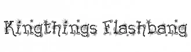
( Font by kingthingsfonts.co.uk )
A whimsical and decorative font with star-like bursts and circular embellishments.
![Kingthings Flashbang font caratteri gratis]() Scaricare 396 Downloads@WebFont
Scaricare 396 Downloads@WebFont -
( Fonts by Sam Wang )
A bold, dynamic brush-style font with expressive strokes.
![LampoonBrush2 Brush2:001.001 font caratteri gratis]() Scaricare 396 Downloads@WebFont
Scaricare 396 Downloads@WebFont -
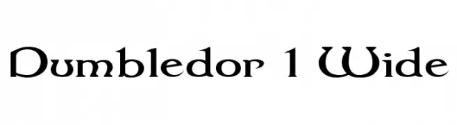
( Fonts by Graham Meade - GemFonts )
A bold, medieval-inspired serif font with sharp, angular features.
![Dumbledor 1 Wide font caratteri gratis]() Scaricare 396 Downloads@WebFont
Scaricare 396 Downloads@WebFont -
-
![GIANTYPO font caratteri gratis]() Scaricare 396 Downloads@WebFont
Scaricare 396 Downloads@WebFont -
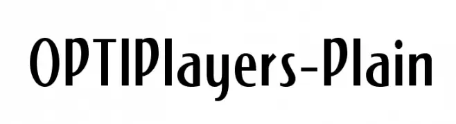
( Fonts by Castcraft Software - OPTI Fonts Archive - opti.netii.net - Personal-use only. For commercial use please contact owner. )
A modern vintage font with tall, narrow letterforms and art deco influences.
![OPTIPlayers-Plain font caratteri gratis]() Scaricare 396 Downloads@WebFont
Scaricare 396 Downloads@WebFont -
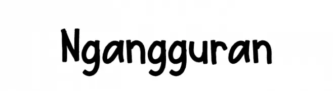
( Fonts by Studio Hello Good )
A playful, bold handwritten font with a casual and friendly style.
![Ngangguran font caratteri gratis]() Scaricare 396 Downloads@WebFont
Scaricare 396 Downloads@WebFont -
( Fonts by Namara Creative Studio - Personal-use only. For commercial use please contact owner. )
A bold, modern sans-serif font with clean lines and a strong presence.
![NCS Radhiumz font caratteri gratis]() Scaricare 396 Downloads@WebFont
Scaricare 396 Downloads@WebFont -
![Copyright Renewed font caratteri gratis]() Scaricare 396 Downloads@WebFont
Scaricare 396 Downloads@WebFont


Quali sono i font più popolari adesso?
Poppins, Roboto, Montserrat, Open Sans e Lato sono molto usati per le forme pulite e l'ampia applicabilità — dall'identità di marca alle landing page e ai poster.
Quali font si usano spesso nei loghi?
Le sans serif geometriche (es. Poppins, famiglie in stile Gotham) sono scelte comuni per un branding pulito e scalabile. Per un tocco personale restano valide script e stili manoscritti. Abbina un display deciso per i titoli a un corpo testo neutro per riconoscibilità ed equilibrio.
Ogni quanto si aggiorna la lista?
Con regolarità, in base ai download e all'attività reale. Torna spesso per scoprire in anticipo le nuove preferite.
💡 Consiglio: aggiungi ai preferiti — le tendenze cambiano in fretta e i font top di oggi possono ispirare il rebranding di domani.